Anomaly Detection
Overview
Anomaly Detection is an intelligence feature within CleverTap Analytics that automatically identifies statistically significant deviations in your trend data. Instead of manually scanning dashboards for unusual spikes or drops, you can scan any trendline on demand and let CleverTap detect outliers using a seasonality-aware algorithm.
Once anomalies are detected, you can run a Root Cause Analysis (RCA) to understand which user properties or event properties drove the change. You can then use the Deep Dive with Ask AI feature to generate a natural language summary of findings and suggested next steps.
This feature is available on Trends charts and supports the following metrics:
- Event count (Total)
- Unique users
Private BetaThis feature is released in Private Beta. For more information about this feature or any queries, contact your Customer Success Manager or the CleverTap Support.
How Anomaly Detection Works?
CleverTap uses a Prophet-based detection model to identify anomalies. The algorithm builds a confidence band around the expected trendline based on historical data and seasonality patterns. Any data point that falls outside this band is flagged as an anomaly.
The detection process involves two key components:
- Confidence band: The upper and lower bounds of the expected value range for each data point.
- Anomaly marker: A visual indicator placed on data points that fall outside the confidence band.
When you run an anomaly scan, the system evaluates the selected time series and derives anomaly and baseline periods from the chart context.
Prerequisites
Before you use Anomaly Detection, make sure you meet the following requirements:
- You have access to the CleverTap Analytics module.
- You have a Trends chart configured with at least one metric (Event count or Unique users).
- The chart has sufficient historical data for the algorithm to establish a baseline.
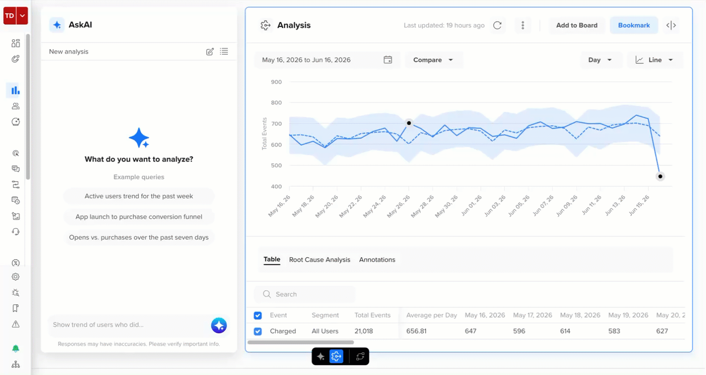
Scan for Anomalies
This section explains how to scan a Trends chart for anomalies. To start an anomaly scan:
- Go to Analytics > Trends Beta and view a Trends analysis.
- Hover over a data point (node) on a trendline and click the
 icon to open the contextual action menu.
 - Click Scan for Anomalies.
The system begins scanning the selected line. A loading indicator appears while the system processes the request (approximately two to three seconds).
Scan for Anomalies
Scan Limit at Once Per ChartOnly one scan can run per chart at a time. If you navigate away from the chart before the scan completes, the scan is canceled. Results are retained only if the scan completes successfully.
View Scan Results
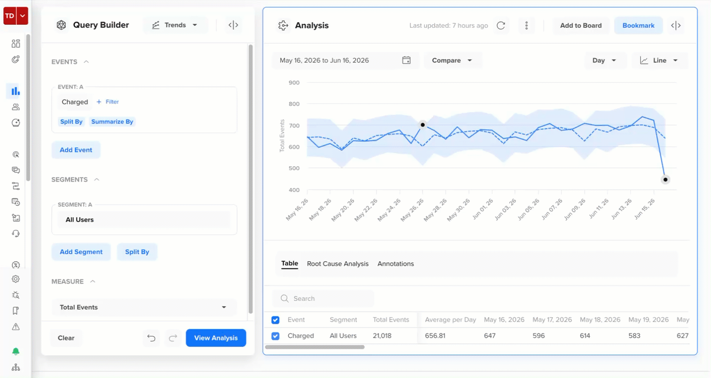
When the scan completes, a success message appears, showing the number of anomalies detected.
- If anomalies are found, the count is displayed, and the detected anomalies appear as markers on the trendline.
- If no anomalies are found, the success message shows zero with the same layout.
Detected anomalies appear as markers on the trendline. A confidence band (upper and lower bounds) is drawn around the scanned line to show the expected range of the value.
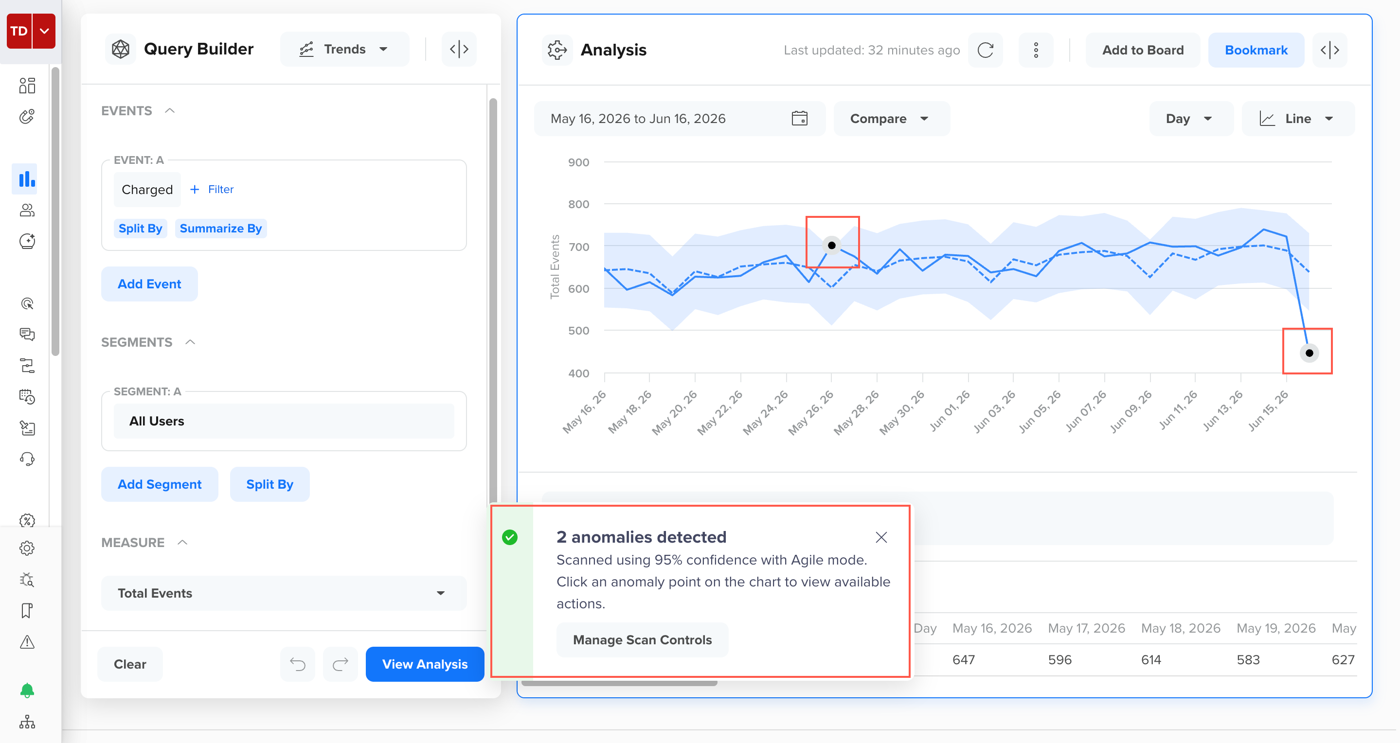
View Anomaly Scan Results
Inspect Anomaly
Hover over any anomaly marker on the chart to view a tooltip that shows the following details:
- Expected value: The value the algorithm predicted based on historical patterns.
- Actual value: The observed value at that data point.
- Deviation: The percentage spike or drop from the expected value.
The tooltip supports both positive deviations (spikes) and negative deviations (drops).
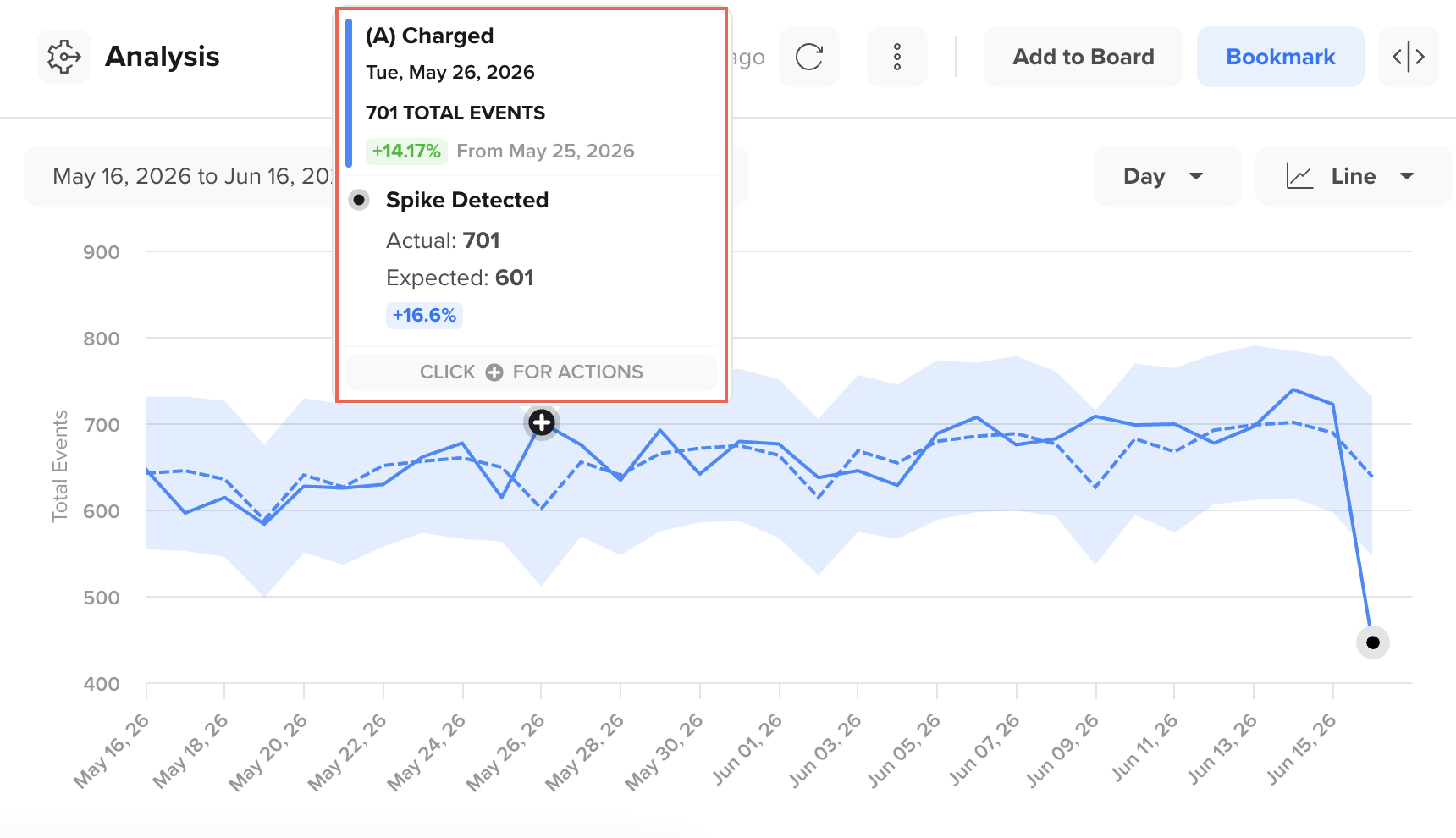
Preview Detected Anomalies
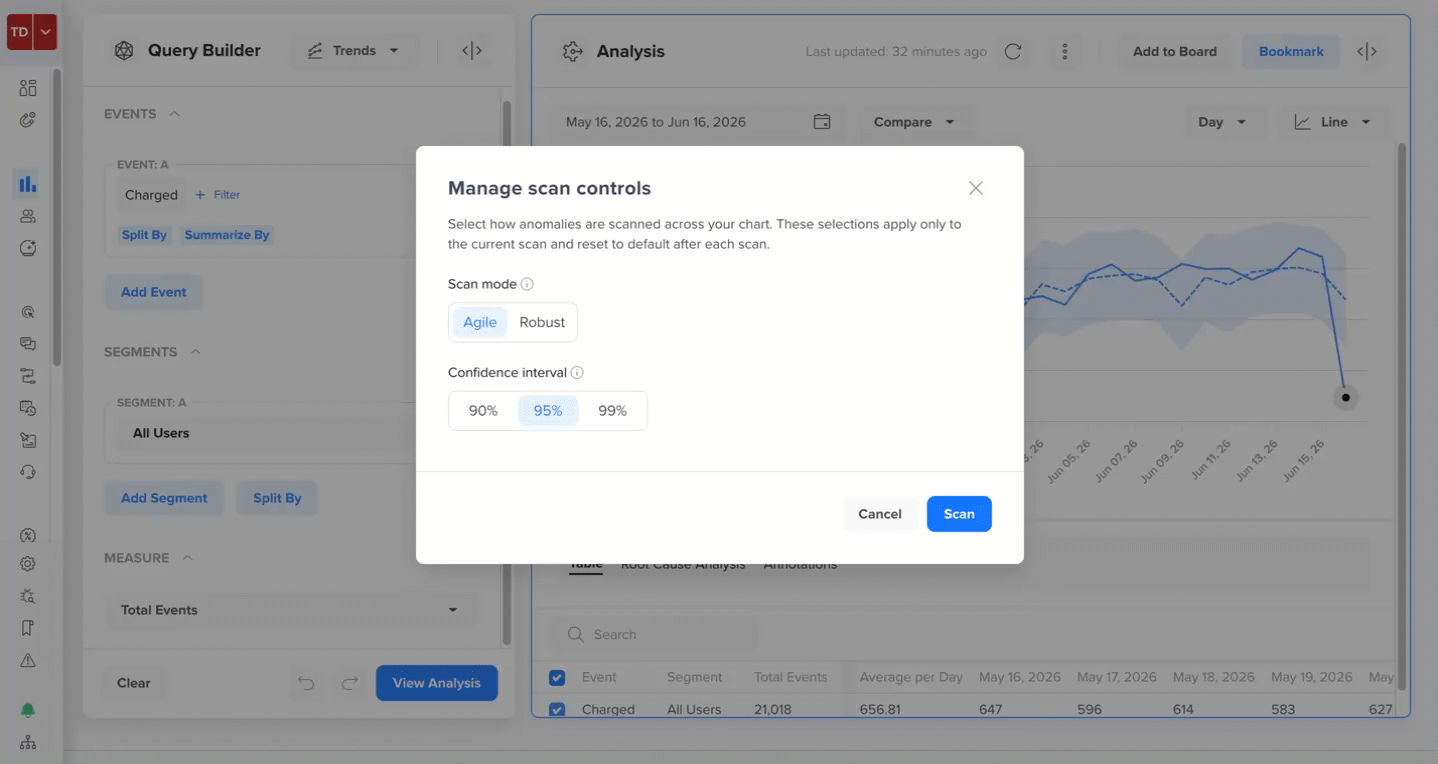
Manage Scan Controls
In the scan results, the Manage Scan Controls call to action (CTA) also appears. You can adjust the scan's sensitivity and behavior in these scan controls. These scan controls let you modify how the system's algorithm detects anomalies.
To open scan controls, click Manage Scan Controls in the post-scan modal, or access it directly from the chart action menu.
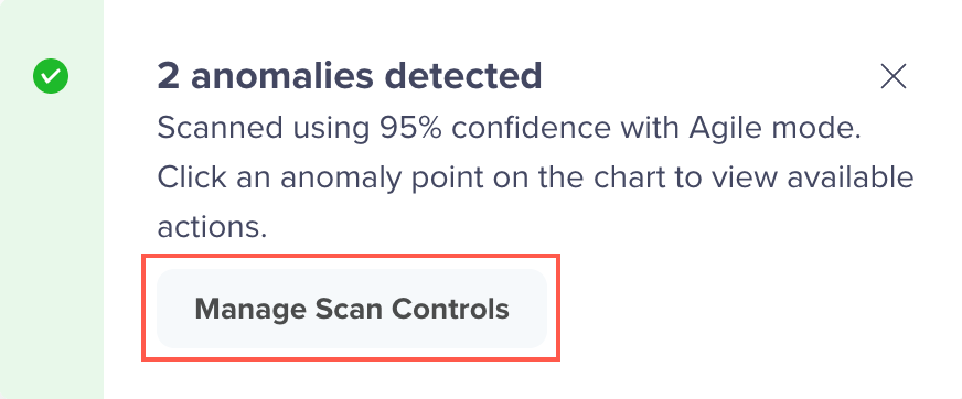
Manage Scan Controls
You can adjust the following two settings:
Scan Mode
The scan modes determine the training algorithm used to build the expected trendline.
| Mode | Behavior |
|---|---|
| Agile | Default mode. Adapts quickly to recent changes in the data. Use this for dynamic or rapidly changing metrics. |
| Robust | More stable and conservative mode. Suitable for metrics with stable long-term trends. |
Confidence Interval
The confidence interval controls the strictness of anomaly detection.
| Interval | Behavior |
|---|---|
| 99% | Detects fewer anomalies, flagging only the strongest deviations. |
| 95% | Default setting, balancing sensitivity and precision. |
| 90% | Detects more anomalies, flagging smaller deviations. |
After you update any preference, click Scan to trigger a re-scan. The re-scan runs on the same line and the same visible time range.
Re-scan Anomalies After Changing Scan Controls
Analyze Root Cause
Root Cause Analysis (RCA) identifies which user properties or event properties contributed most to the anomaly. RCA compares data from the anomaly period with a baseline period and ranks properties by their contribution to the deviation.
For example, suppose your Charged event shows an unexpected 40% spike on November 8. RCA might reveal that users in the Gold membership tier who received a seasonal discount drove the spike, while users in other tiers behaved normally. Instead of manually building breakdowns across City, Platform, and Membership Type, RCA surfaces the top drivers automatically so you can act quickly.
RCA Limit at Once Per AnomalyRCA supports only one anomaly at a time and only on a single selected line. Batch RCA across multiple anomalies or multiple lines is not supported.
To start an RCA:
- Complete an anomaly scan on the Trends chart. Anomaly markers must be present on the chart.
- Click an anomaly marker to open the action menu.
- Click Analyze Root Cause.
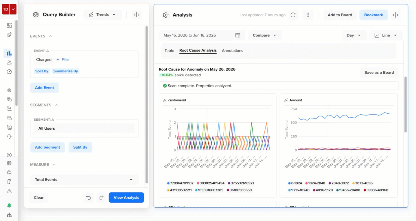
The Root Cause Analysis tab opens automatically. A progress indicator shows the scan status as the system evaluates the properties. The selected anomaly node remains highlighted while the RCA runs.
Analyze Root Cause of an Anomaly
RCA Limit at Once Per ChartYou cannot run a duplicate RCA on the same chart while one is already in progress.
View RCA Results
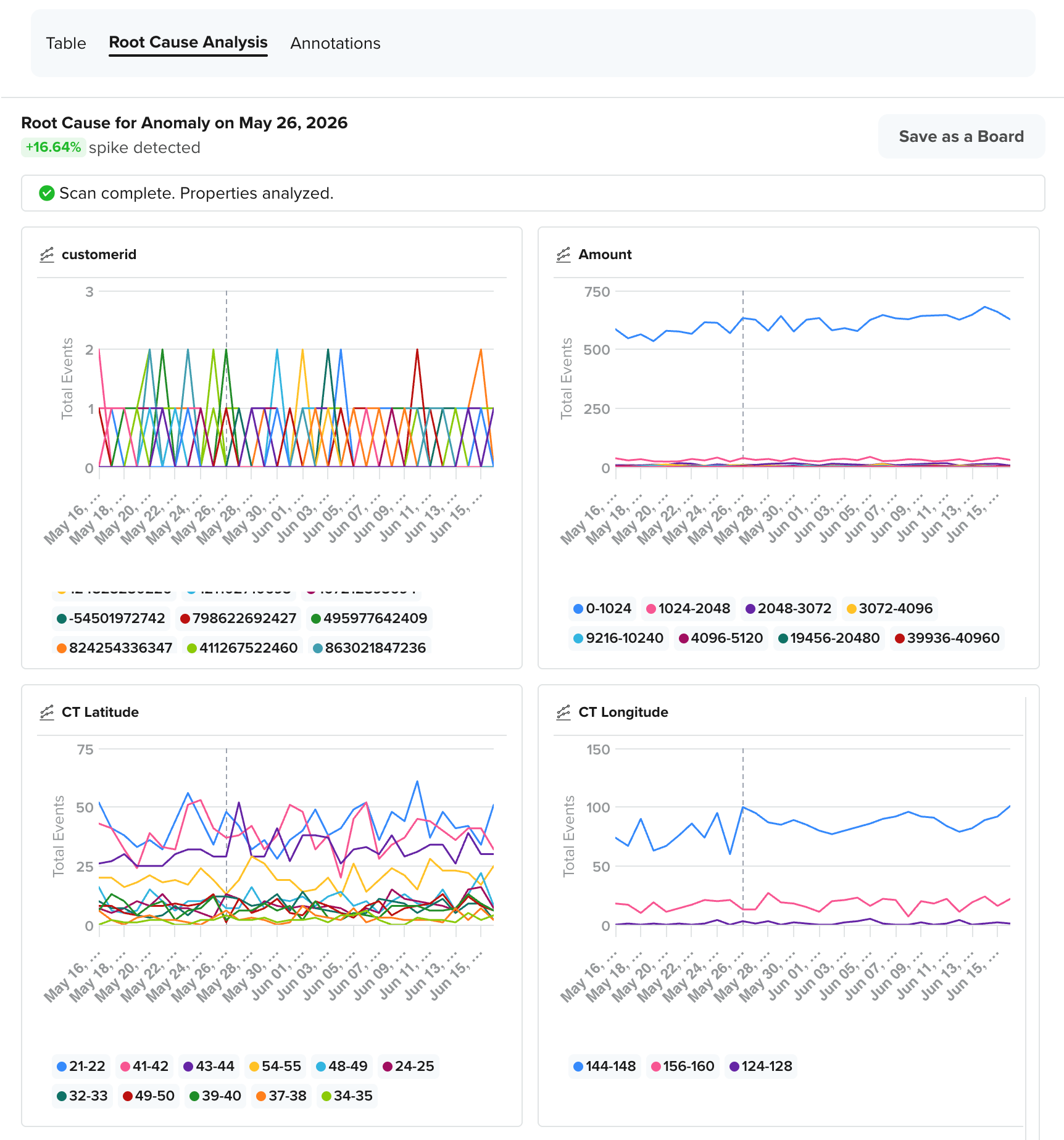
When the analysis completes, the Root Cause Analysis tab presents the following two levels of information:
- RCA Summary: A summary appears at the top and gives you a quick read of what happened. It shows the anomaly date, whether a spike or drop was detected, the magnitude of the change, and the total number of properties analyzed. This tells you immediately whether the anomaly is significant and how broadly the system investigated it.
- Contributing Property Charts: The summary also appears as individual tiles, one per top contributing property. Each tile shows a mini trend chart for that property with a vertical reference line marking the exact anomaly date. This makes it easy to view which property value spiked or dropped in lockstep with the anomaly. For example, for the +16.64% spike detected on May 26, 2026, in the Charged event, RCA surfaces the following tiles in order of their maximum contribution to the anomaly:
- customerid (showing which individual customers contributed most to the spike)
- Amount (showing the transaction amount range that drove the increase)
- CT Latitude (showing the geographic latitude bands where the spike was concentrated)
- CT Longitude (showing the geographic longitude bands associated with the spike)
View RCA Results
Each tile shows not just the anomaly date but also the trend leading up to it, giving you context for whether the change was sudden or gradual.
The property value most responsible for the anomaly, also called the Faulting Value, is always shown in the chart tile, even if it does not rank in the top values by overall volume. Showing the Faulting Value prevents high-traffic but unaffected segments from burying the actual cause.
Save RCA as Board
You can save your RCA findings as a board for future reference or to share them with your team.
To save the RCA output, click Save as a Board on the Root Cause Analysis tab, and the dashboard saves the top 20 RCA property tiles as a board on the Boards list page.
Save an RCA as a Board
Understand How RCA is Computed
RCA works by comparing the same metric, broken down by each property, across the following two time windows:
- Anomaly period
- Baseline period
The anomaly period is the day the anomaly occurred, and the baseline period is a recent normal day just before it. The property that changed the most between those two days is ranked as the top contributor.
For example, if your Charged event shows a spike on November 8. RCA uses yesterday (November 7, a normal day within the confidence band) as the baseline. It then checks every property, such as City, Platform, Membership Tier, Payment Method, and so on, and asks, Which of these had the biggest jump between November 7 and November 8? If purchases from users in Madrid jumped from 200 to 800, while every other City stayed flat, then City = Madrid gets the highest ranking and appears as the top contributing property tile.
Here is how the computation works step by step:
- Select the two periods: The anomaly period is the timestamp of the flagged data point. The baseline period is the most recent data point that still falls within the confidence band. For example, the previous day on a daily chart, or the previous week on a weekly chart.
- Break the metric by property: For each candidate property, such as City, Platform, or Membership Tier, the system counts the metric value for each property value during both periods. For example,
City = Madridand 800 purchases on November 8 versus 200 on November 7. - Compute the delta: Calculates the difference between the anomaly period and the baseline period using
Delta = Anomaly period value − Baseline period value. ForCity = Madrid, that is800 − 200 = 600. - Rank by absolute change: Properties are ranked by the size of their delta, regardless of whether the change was a spike or a drop. The larger the absolute change, the higher the rank.
- Surface the top contributors: The properties with the highest-ranked deltas appear as individual chart tiles in the RCA results.
Partial Results
RCA runs in three internal stages. Stages 1 and 2 compute which properties contributed to the anomaly and by how much. Stage 3 generates the individual chart tiles you view in the results. If Stage 3 times out for some properties, RCA still shows you what it could complete, rather than failing silently.
For example, suppose RCA analyzes 20 properties for the May 26 spike. Stages 1 and 2 were completed successfully, and all 20 properties were ranked. In Stage 3, 17 property charts render correctly, but the charts for Payment Method, Device Model, and App Version time out. In this case, you see 17 property tiles in the results, a clear note that RCA could not generate 3 charts, and the RCA summary and rankings are fully intact.
Here is how partial results work depending on what fails:
- If some property charts time out, CleverTap shows the successfully computed tiles and silently omits the ones that failed.
- If all property charts fail, the RCA summary and the ranked property list are still shown. A fallback message appears in the charts section to let you know that the RCA could not load the tiles.
Deep Dive with Ask AI
After you complete an RCA, you can use Deep Dive with Ask AI to generate a natural language explanation of the anomaly, its impact, and recommended next steps.
Ask AI reviews the chart context and RCA findings to produce a contextual summary. The summary includes the following sections:
- Summary: A brief overview of the anomaly, the date it occurred, the event affected, the actual versus expected values, and whether it was a spike or a drop.
- Primary Drivers: The top properties that contributed most to the anomaly, with a plain-language explanation of how each property behaved during the anomaly period.
- Contextual Signals: External factors checked against the anomaly window, such as active campaigns, A/B tests, audit logs, or annotations, to help determine whether a known activity triggered the change.
- Impact Assessment: The scale and distribution of the anomaly across segments, geographies, and user groups, including whether the change is likely a data quality issue or a genuine user behavior shift.
- Possible Explanations: A ranked list of hypotheses that may explain the anomaly, based on the property patterns surfaced during RCA.
- Suggested Next Steps: Specific actions you can take to investigate further or respond to the anomaly.
To use the Deep Dive with Ask AI option:
- Complete an RCA on the anomaly.
- In the Root Cause Analysis tab, click Deep Dive with Ask AI.
- Optionally, type a question in the Ask AI input to refine the analysis. For example, deep dive on the May 26 anomaly.
- Ask AI processes the query and returns a summary.
Deep Dive with Ask AI
Verify AI Summaries Against Source DataAsk AI responses may not always be 100% accurate. Verify important findings against your source data before taking action.
FAQs
Find answers to the following common questions about using ̉Anomaly Detection:
Which chart types support Anomaly Detection?
Anomaly Detection is supported only on Trends charts.
Can I scan multiple lines at once?
No. Currently, multi-line scanning is not supported. You must select a single line before scanning.
What is the difference between Agile and Robust scan modes?
Agile mode adapts quickly to recent data changes and is best for dynamic metrics. The Robust mode is more stable and conservative, suitable for metrics with steady, long-term trends.
What does the confidence interval control?
The confidence interval controls the width of the expected value band. A higher interval (99%) results in a wider band, so only extreme deviations are flagged. A lower interval (90%) yields a narrower band, leading to more data points flagged as anomalies.
Can I run RCA on more than one anomaly?
No. RCA supports only one anomaly at a time in Phase 1.
What happens if I navigate away during a scan?
The scan is canceled. Results are retained only if the scan completes successfully before you navigate away.
Can I save the RCA results?
Yes. Use Save as a Board from the Root Cause Analysis tab to save the findings as a CleverTap Board.
Why am I seeing No anomalies detected when I can see an obvious spike in the analysis?
Try lowering the Confidence Interval to 90% in Scan Controls and re-scan. A higher confidence interval requires stronger deviations before flagging them.
Why does the RCA tab show no results?
RCA requires a completed anomaly scan. Confirm that anomaly markers are visible on the chart before opening the RCA tab. If Stage 1 or Stage 2 of the RCA computation failed, no partial results are shown. In these cases, try running the scan again.
What should I do if the Ask AI shows inaccurate information?
Ask AI generates summaries based on chart context and may not accurately reflect all the data. Always cross-check the AI summary with the raw RCA property charts.