Web Pop-up Editor
Overview
The Web Pop-up Editor is a feature available when building a Web Pop-up message in CleverTap. It enables you to add content to pre-built templates or customize and build them. After creating a Web Pop-up template, you can use it in the current campaign or save it for future campaigns.
From the What section in the Web Pop-up builder, Select Message Type and click Go to Editor.
The Web Pop-up Editor tool displays.

Select Web Pop-up Editor Type
Editors and Templates
There are three types of editors available:
- Basic Editor
- Custom HTML Editor
- Advanced Web Popup Builder
Basic Editor
You can choose from the following types of templates under Basic editor:
- Basic Editor
- Basic Templates: Different types of popup layouts.
- Ratings Templates : Used for gathering feedback and rating.
- Lead Generation Templates : Used to generate new leads by recording anonymous users' email addresses and mobile numbers.
Basic Templates
At a high level, one can choose from four styles of popup layouts available under Basic Templates:
- Box - It is a small popup that can be placed at the desired corners of the browser window.
- Banner- It is a wide horizontal popup that can be placed at the top or bottom of the browser window.
- Interstitial - It is a center-aligned popup for driving better engagements.
- Image only - As the name suggests, this template can render an image as a popup on your website. The Image can have all the content like title, description, and CTA as part of it.
Ratings Template
Marketers can now create feedback-related popups (Interstitials only) for their website users using the Ratings Template.
Marketers can now create the following types of rating templates for gathering feedback from their customers:
- NPS
- NPS with Follow-up Question
- User Rating
- User Rating with Follow-up Question
The following images represent a sample user rating popup and an NPS popup.
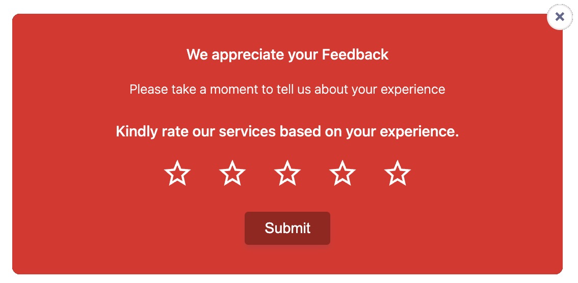
User Ratings Popup
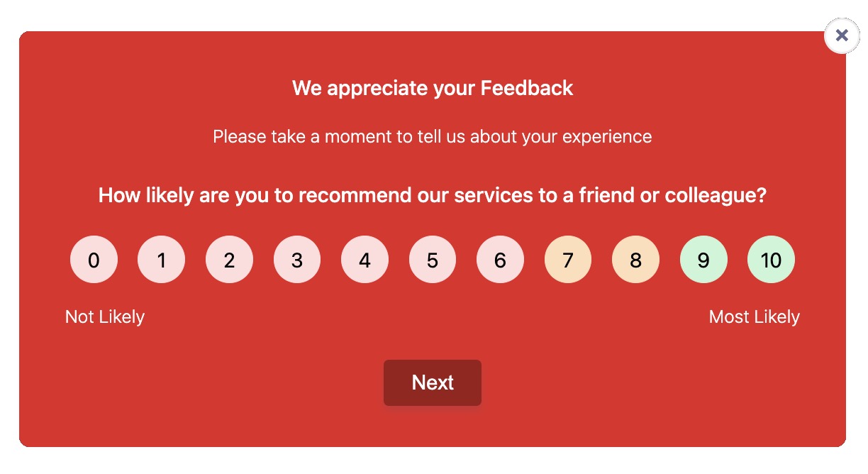
NPS Ratings Popup
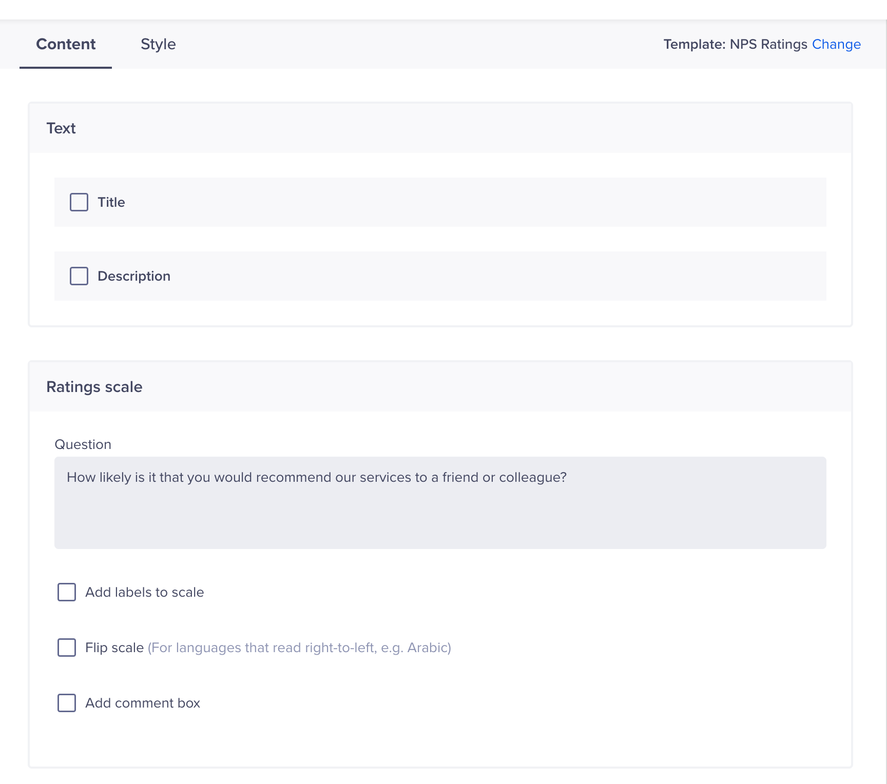
Marketers get the complete flexibility to explicitly define the rating scale, style, its shape (Star, Heart, Emojis), labels, and the overall content of the popup. One can also add a comment box to get accurate user feedback/comments.

Define Element Style
Besides, additional styling, such as the background color of the notification, text color, button color, and the color of the rating scale, is also possible from the editor, as shown in the image above. To learn more about tracking and monitoring user rating data, refer to the Analyzing User Rating.
The web popup notification text fields in the following image can be personalized for every user based on specific user property or event property values. For more information, refer to User Profiles and Events.
Add all the required information. You can also flip the scale for languages that read from left to right. For example, Hebrew, Arabic, and so on.
Personalize Web Popup
NPS Campaign Video Tutorial
Here's a video tutorial that demonstrates how you can create an NPS campaign on CleverTap:
Follow-up Question Templates
A follow-up question to your ratings can provide more insights about the user experience. CleverTap provides the following Follow-up Question templates:
- NPS with Follow-up Question
- User Ratings with Follow-up Question
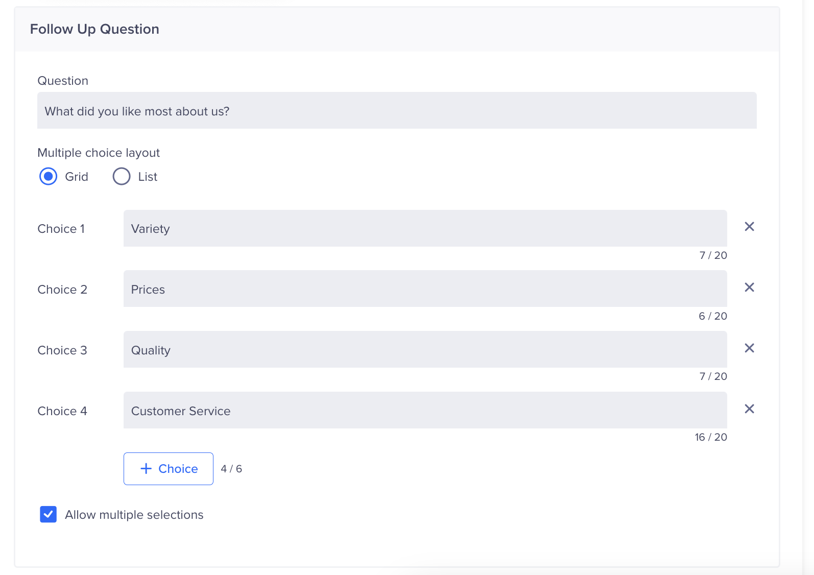
For example, after a user has submitted a rating on your app, you can ask follow-up questions such as What did you like most about us? and provide reply choices such as Variety, Prices, Quality, Customer Service, Delivery Process, and Website Usability. This can help you get more specific feedback to improve your product and services.
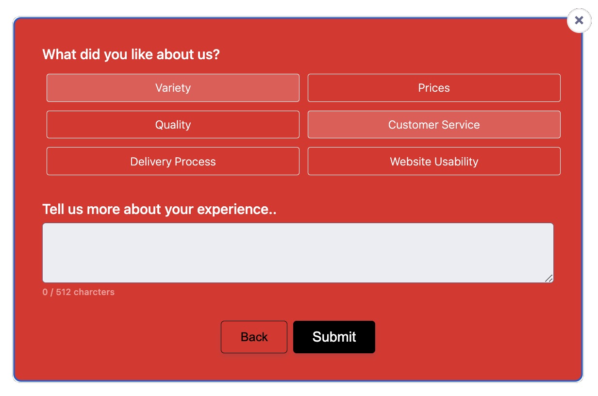
Short Keyword-Based Choices
You can also list descriptive choices such as, I like the available options and variety, I like the quality and durability of the products, and so on.
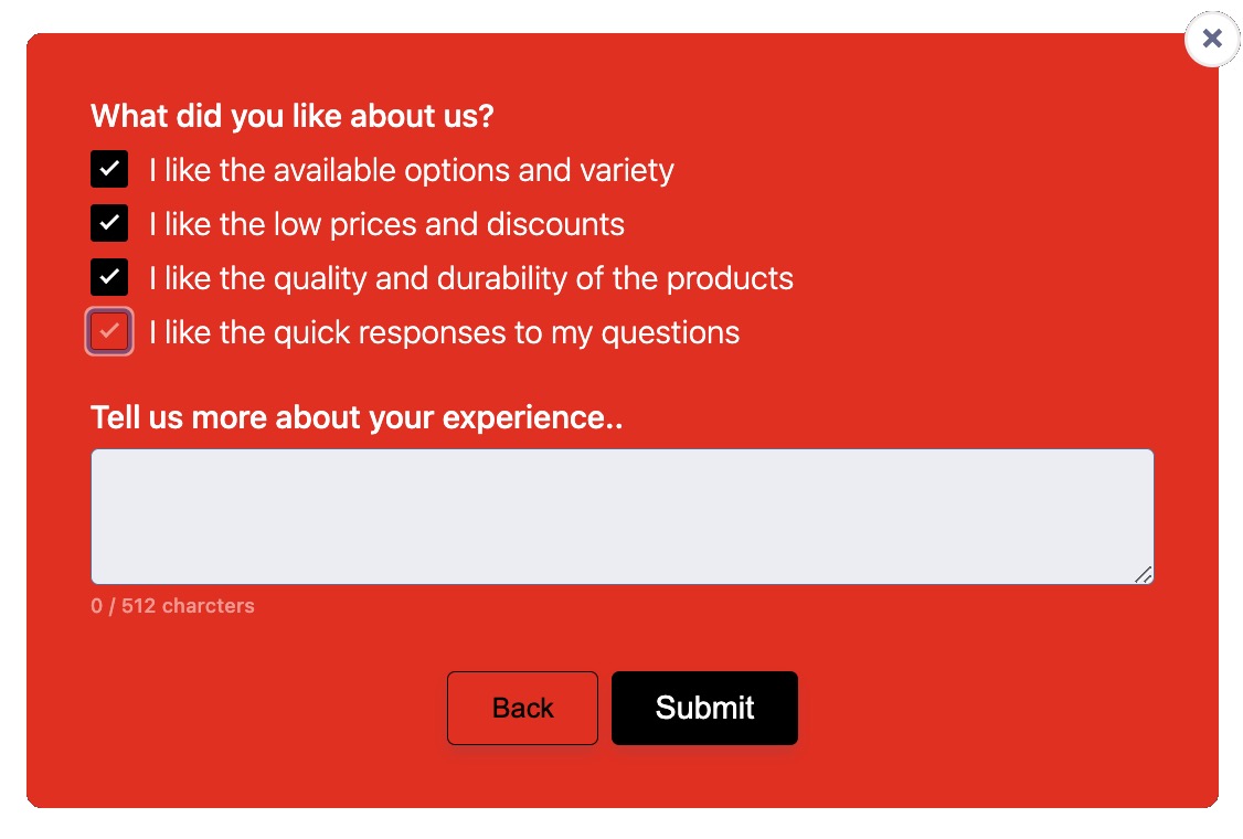
Descriptive Choices
You can configure the follow-up question from the Web Popup editor with a short keyword-based grid (up to six choices) or a longer sentence-based list (up to four choices).
The label will be the text you want to display to your users. If you want to allow the user to select multiple choices, select Allow multiple selections.
Configure Follow-up Popup
NoteIn the case of the User Ratings template, the Notification Clicked event is raised that records the user's clicks on the CTA buttons and the Close button.
Lead Generation Templates
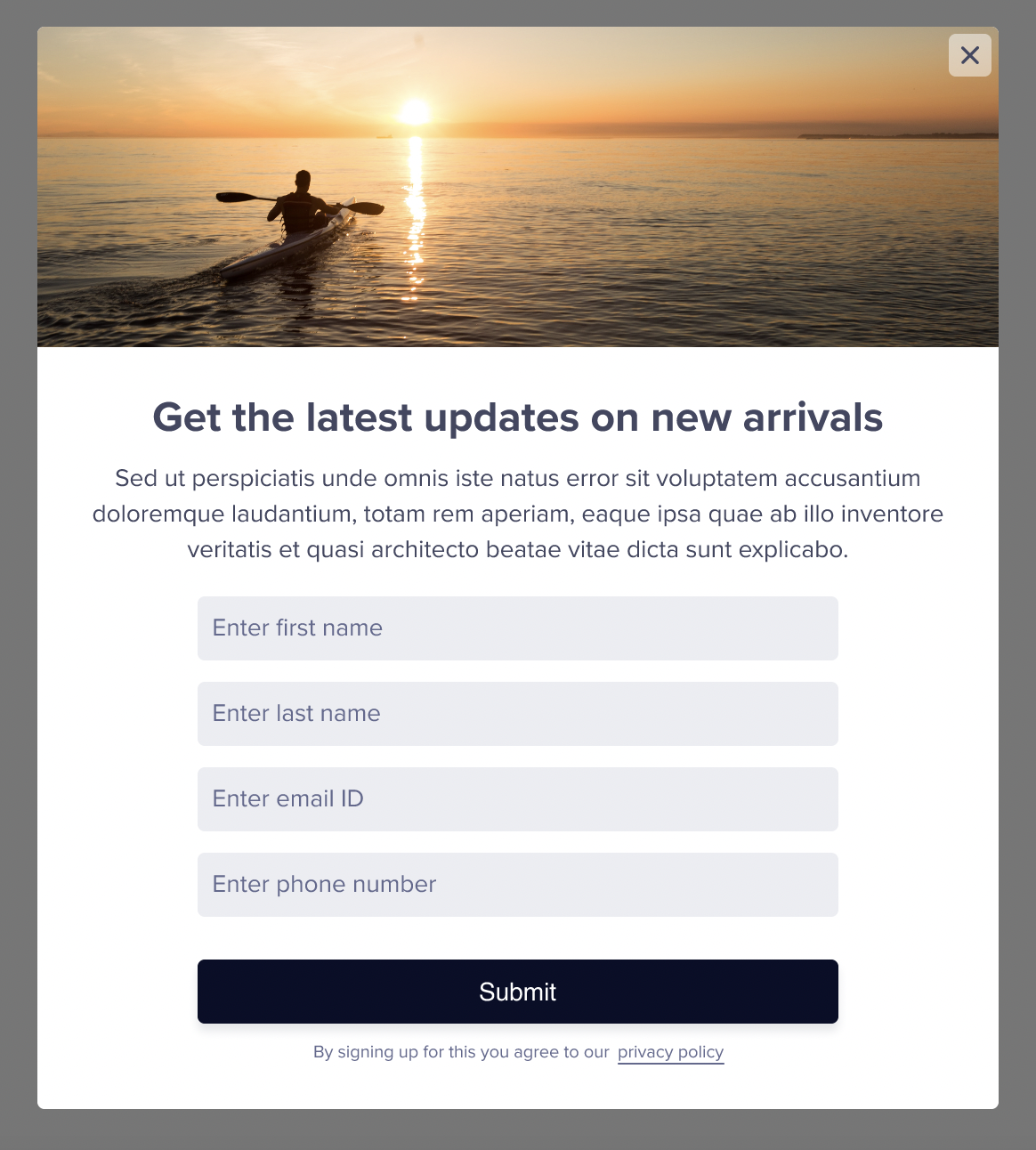
We know that a significant number of website visitors remain anonymous. This poses a challenge to continue engaging with potential customers after they leave a website. A lead generation template can solve this issue.
By integrating a lead generation form on your website, you can get important customer details such as name, email address, phone number, and so on. This information is helpful for further communication through channels such as SMS, Email, WhatsApp, and others. This post-visit communication not only helps to stay connected with your audience but also opens doors for future business opportunities. You can turn anonymous visitors into loyal customers with the CleverTap Lead Generation template.

Sample Lead Generation Template
Lead Generation Campaign Video Tutorial
Post Submit Actions
When a user submits information on your Lead Generation template:
-
A Notification Clicked event is raised that records the user's clicks on the CTA and the Close buttons.
-
A custom event named Lead Submitted records the details submitted by the user as event properties. Following is a sample form image:
Form Submit Actions
Following is a table that records the relevant event properties for the fields displayed on the form:
| Submitted Event Properties | Sample Property Value |
|---|---|
| First Name | John |
| Last Name | Smith |
| Email ID | [email protected] |
| Phone Number | +11234567890 |
| Campaign ID | 121110987654 |
| Variant | wzrk_default |
- The user profile is automatically updated with the submitted event properties. For example, the lead generation template can ask for additional details from an anonymous user, such as first name, last name, email, and phone number. His profile will be updated with these details, and now you can identify the user as John Smith.
Lead Generation Template Variants
The Lead Generation template has the following three variants:
- Text Only
- Image On Side
- Image On Top
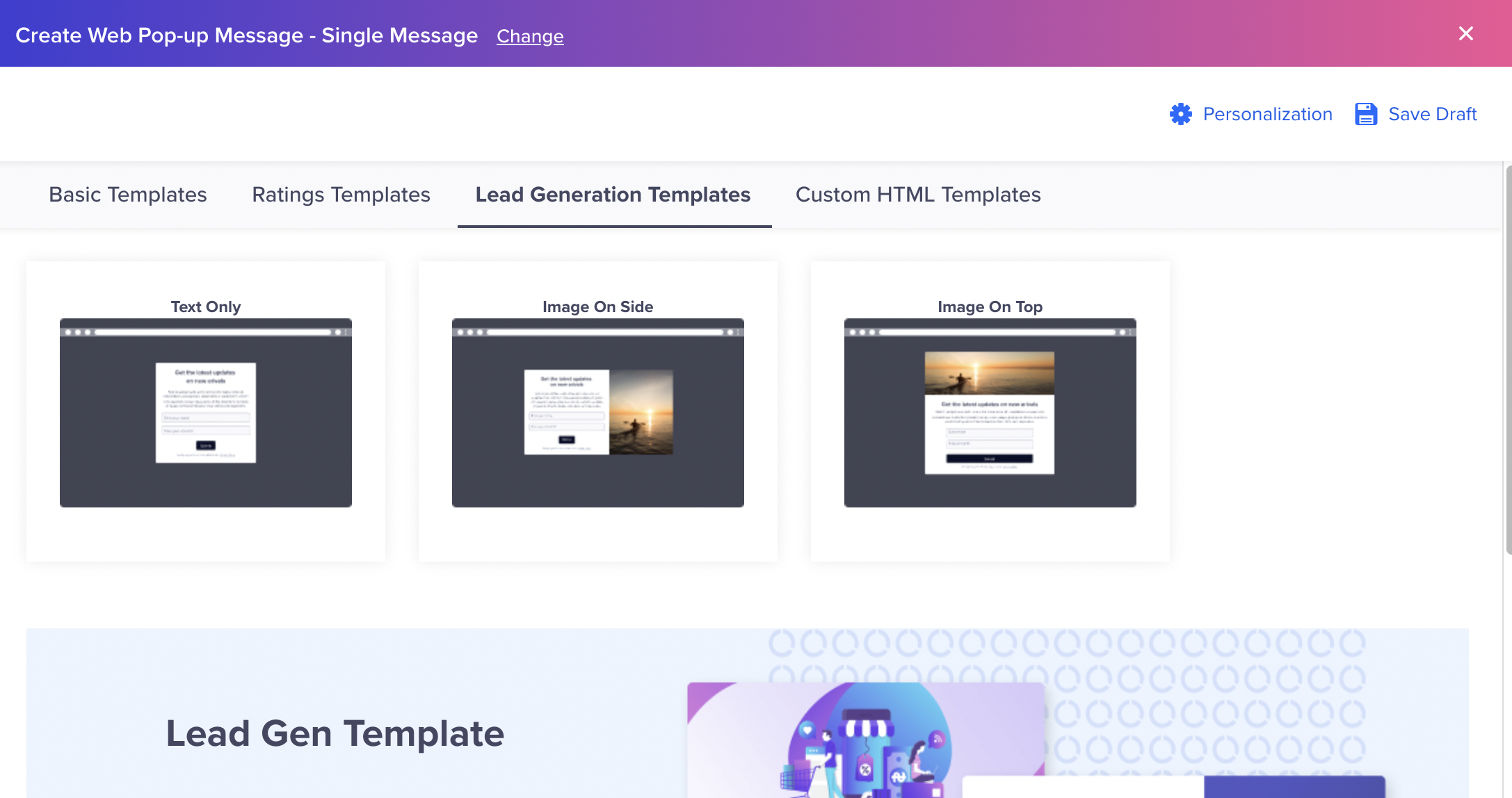
Lead Generation Template Types
Select any of the variants to create your Lead Generation template.
Lead Generation Content
Create the content to record information from your users. The following image displays a preview of the form:

Create Lead Generation Template in Editor
Enter all the required information.
- Text: Personalize the Title and Description.
- Media: Add the image URL or upload an image.
- Input Fields: You can add up to four input fields. Select input fields such as Name, Phone Number, Birthday, or Email Address for the template.

Upto Four Input Fields
- Buttons: The Close button is selected by default. Add a button name such as Submit or Upload.
- Subtext: Add subtext such as privacy policy to your lead generation template.

Add Subtext
The hyperlinked part must be closed between two asterisks. Add the URL in the following URL box. This is the URL where the user will be directed. You can also add a checkbox for your subtext.

Subtext and redirect URL
- Acknowledgement: You can show appreciation to your user by adding an Acknowledgement popup. Select the auto-close timer for the popup.
Lead Generation Template Style
You can select the layout and card position from this screen. You can also select the color of the text, input fields, and buttons.
Mobile ViewThe Mobile view can display images only at the Top, Bottom or in the Center.

Style Elements for Lead Generation
Custom HTML Editor
A Custom HTML Editor is used to create templates with custom HTML scripts. Users have a choice to customize their popup's appearance using the Box, Banner, and Interstitial templates. Insert the custom HTML scripts for the respective template layout in the HTML editor.
Manually Configured Click Tracking?If you are already raising the Notification Clicked event manually in your template, then ensure to disable the Enable click tracking for Custom HTML checkbox to avoid overcounting.
To track the campaign stats, such as the number of total clicks and CTRs, marketers must select the Enable click tracking for Custom HTML checkbox.
Track Campaign Stats
On Click Actions
The On Click Actions feature allows customers to trigger specific actions (such as opening a link, running a function, and so on) when a user clicks a web popup or the button within the popup. This functionality is essential for creating interactive and dynamic web experiences, giving customers greater control over how elements behave in response to user interactions.
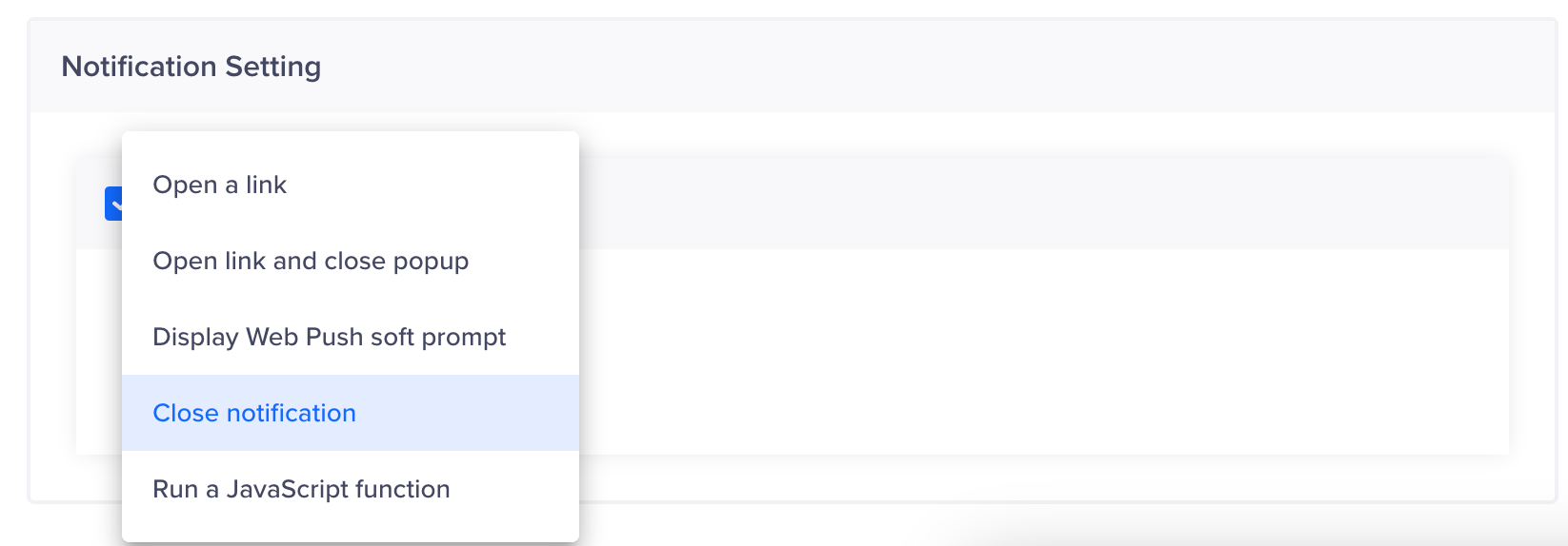
On click Actions
Available Actions:
- Open Link
Description: Opens a specified link in the new browser tab.
Use Case: Ideal for campaigns that use navigation buttons, external links, or any element that redirects users to a different webpage. - Open Link and Close Popup
Description: Opens a specified link and closes any open popups.
Use Case: Ideal for campaigns that use buttons within popups that redirect users while also cleaning up the user interface by closing the popup. - Send Prompt to Allow Notifications
Description: Sends a browser prompt requesting the user to allow notifications from the website.
Use Case: Ideal for web applications that rely on browser notifications for real-time updates, alerts, or promotional messages. - Close Notification
Description: Closes the current notification popup.
Use Case: Ideal for campaigns allowing users to dismiss notifications or popups without taking any further action, ensuring a clean user interface. - Run a JavaScript Function
Description: Executes a specified JavaScript function when the element is clicked.
Use Case: Ideal for campaigns that require running custom scripts for advanced actions, such as form validation, data submission, or trigger animations.