Cohorts
Overview
Cohort analysis is a way to group users who are similarly based on who or what they have done and to track their behavior over time. Cohorts let you isolate a group of users who have performed a certain event and determine how long it takes for them to come back and perform a second event.
Cohorts provide the capability to understand how people are using your applications and are commonly used to measure user retention and churn. You can use cohort analysis to answer questions, such as:
- What is my 4th-week retention like for new users?
- How many repeat buyers does my e-commerce application have?
- How soon do new users uninstall my music application if they don't create playlists?
You can also use cohorts for more nuanced use cases that involve different segments. For example, one use case of cohorts is to validate hypotheses where you have a video application. Your hypothesis could be, "People return to watch videos in my applications because of the recommendations section of my application."
You can use cohorts to validate this hypothesis.
Your First event and Return event would both be video watched and this would help you answer the question, "How many people who watched videos came back to watch videos on my application?"
You can view this cohort with two segments of users. In the advanced filter, you can first view your video watched cohort for people who have used the recommendations feature, then you can compare it to people who have not used the recommendations feature.
Create a Cohort
To create a cohort, perform the following steps:
- Navigate to Analytics > Cohorts.
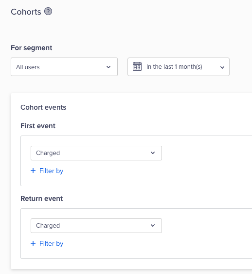
- Select your desired first event and its properties. This is the event that users must perform to qualify for your analysis.
- Select your return event and its properties. Users who have performed the first event must perform the return event to be considered for cohorts.
Create a Cohort
Compare by User Properties
While creating your cohort, you can compare your analysis by:
- Geography: User's last known country, region, and city.
- Session details: UTM source/medium/campaign and session source/referrer for the first event.
- Technographics: Browser/device/OS.
Compare by Segments
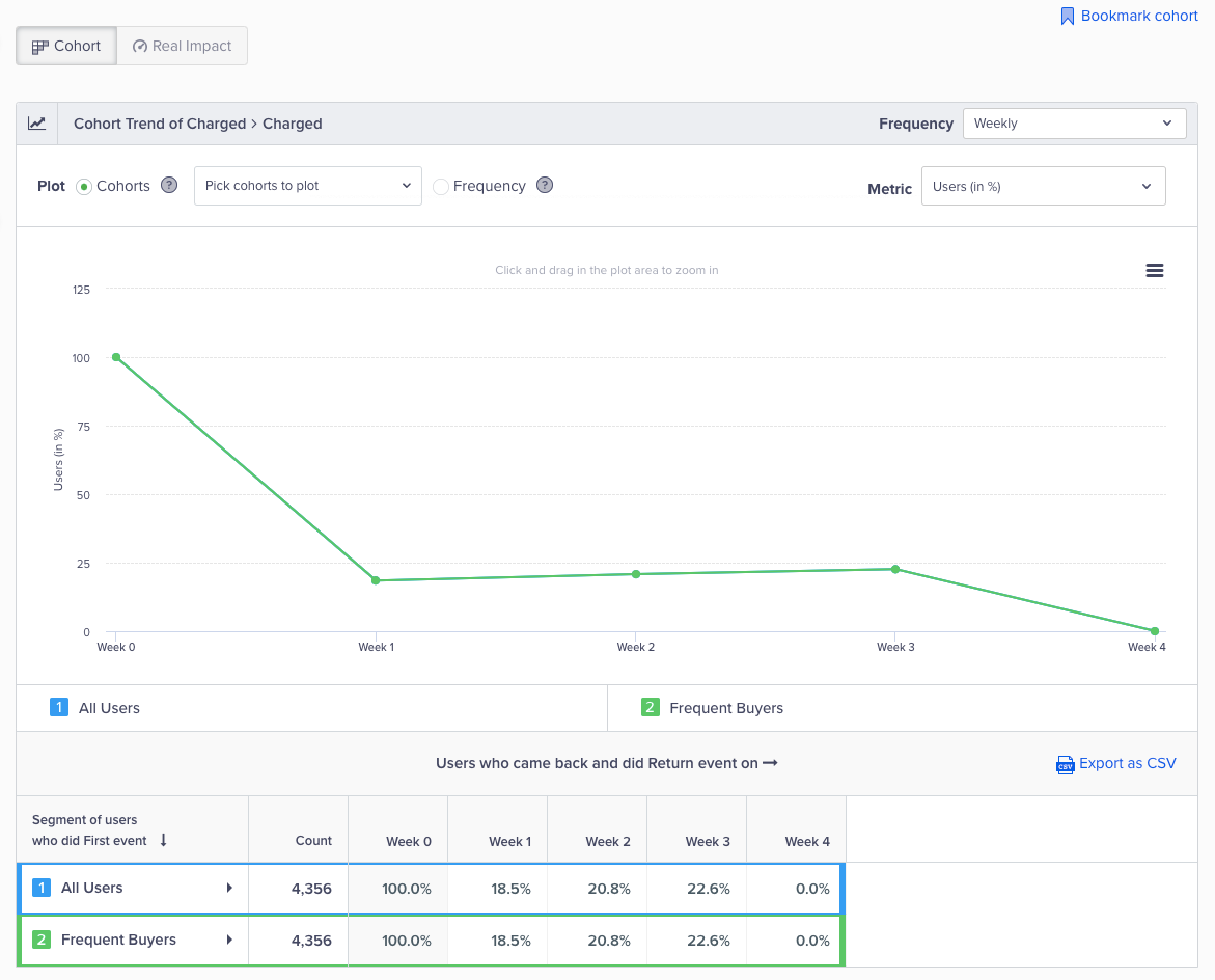
You can also compare your retention across different segments. For example, compare the retention for Charged to Charged event across the All Users segment and the Frequent Buyers segment. The differences in the retention trends could reveal a difference in the behavior of your users in each segment providing you invaluable insights. You can then dig deeper into buyer behavior.
To compare retention across segments, perform the following steps:
- Navigate to Analytics > Cohorts.
- Select the first and return event to analyze and view the retention cohort.
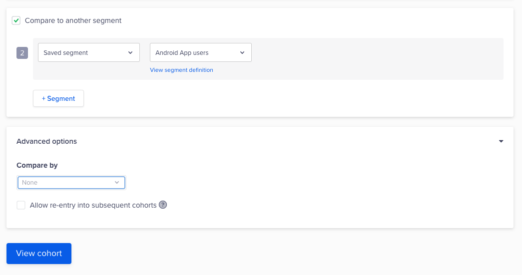
- Select the Compare to another segment box. Select a segment from the list or create an adhoc segment. For more information, refer to Segments.
- Click View cohort.
Compare Cohorts
The results display.
View Cohort Results
Comparison ConsiderationsWhen comparing, consider the following:
- You can compare by a saved or an ad-hoc segment.
- You can compare a maximum of five segments.
- You cannot simultaneously compare your retention by user property and segments.
Retention Modes
CleverTap offers multiple retention modes. You can use our retention modes to track user behavior and increase retention with additional insights into user behavior. You can group your users by behavior and track their usage over a timeline. You can also define a goal, compare your marketing strategy, and get actionable insights.
Nth Day
This mode shows user actions on specific days. For example, a user reads the news on Week 2 but not on Week 1 or Week 3. If you view a cohort for three weeks, you see the following:
| Week 0 | Week 1 | Week 2 | Week 3 |
|---|---|---|---|
| 50% | 0 | 75% | 0 |
Week 0 shows the first user action, such as App Installed or App Launched.
In another example, you want to engage users who have installed your news app. You have managed to convince them to use the app but you want to ensure they are engaged. Some of these users installed the app and have started reading the news regularly. However, some of these users may install the app and still not read the news. You need to identify the trend for these users because they are a churn risk.
We select the first user action as App Installed and the second action (Return event) as Read news.
The Week 0 cohort tells you how many users installed your app in the past three weeks. Next, you can check the number of users who installed your app and actually read the news. The Nth day cohort shows you user behavior for three weeks after the users have installed the app.
Cohort Retention Nth Chart
The table shows you the actual retention percentages. The Week 0 is when the user qualified for the cohort.
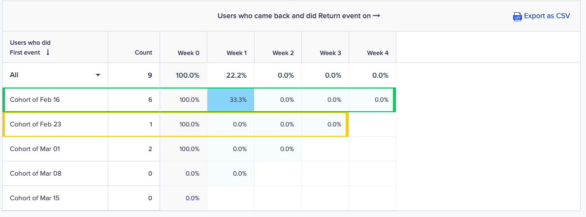
View Cohort Table
Power User
Power users are the cornerstone of a company’s success. These are the users who are most engaged, the most likely to give great feedback, the most profitable in terms of customer lifetime value, and they contribute invaluable data to your business. These can be the users who play songs daily, hail a ride every day, or read the news every hour.
You can use this retention mode to analyze the frequency of their return and gain insight into their behavior and experience.
For example, you want to see how many users play songs over a month. You can select the first event as App Launched. You can select the return event as Song Listened. Select a 30-day period and then click the View cohort button to analyze user behavior over a month.
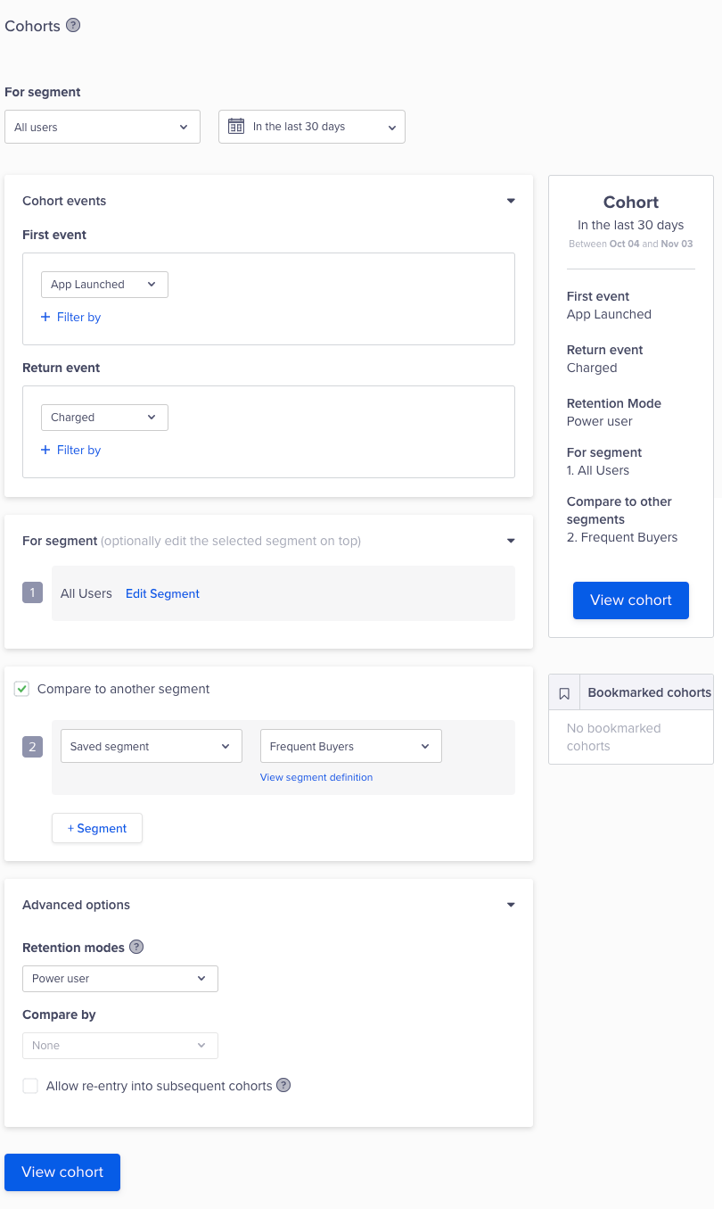
Select Retention Mode
An ideal power user curve is a smile curve that shows user engagement over a period. When more of your users return daily, the smile will shift to the right.
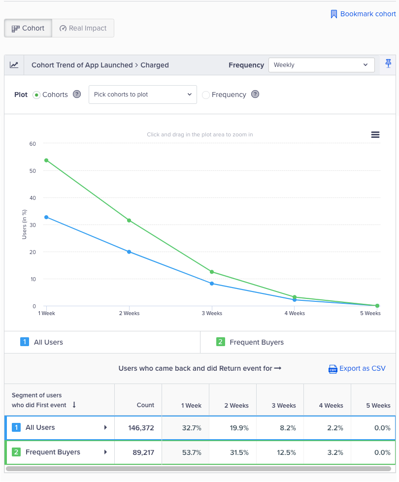
Cohort for Power Users
The point at which the curve bends is the inflection point in user behavior. You can cross-reference your app features or offering to the curve and see what value it brings to your power users.
Testing TipYou can test your product features or offerings with Product Experiences, then come back to check the power user curve. This gives you a more comprehensive understanding of your user reactions before you roll them out to your most coveted users.
Unbounded
An unbounded retention cohort shows your user retention over a time period but more importantly, it measures if your users return after a given point in time. For example, you can find out if a user returns to the app after day 10. This retention is especially useful if your user engagement is spread out over a longer time period. Some of these users might be those who want to book vacations, buy/renew insurance, or credit their online wallet. These user actions do not have a fixed date for the return action; however, you want to know when they perform an action after a specified time period. Here, you can use the unbounded retention mode.
For example, you want to see how many users bought groceries after two weeks. You can select the first event as Purchased, then you can select the return event again as Purchased. Select a one-month period and then click the View cohort button to analyze user behavior over a month.
The cohort results tells you how many times your users are buying groceries after their first shopping experience. This result can give you insight into the user activity and point you to the period when there is a dip in shopping. You can use our engagement channels to engage and retain your users over this time period.
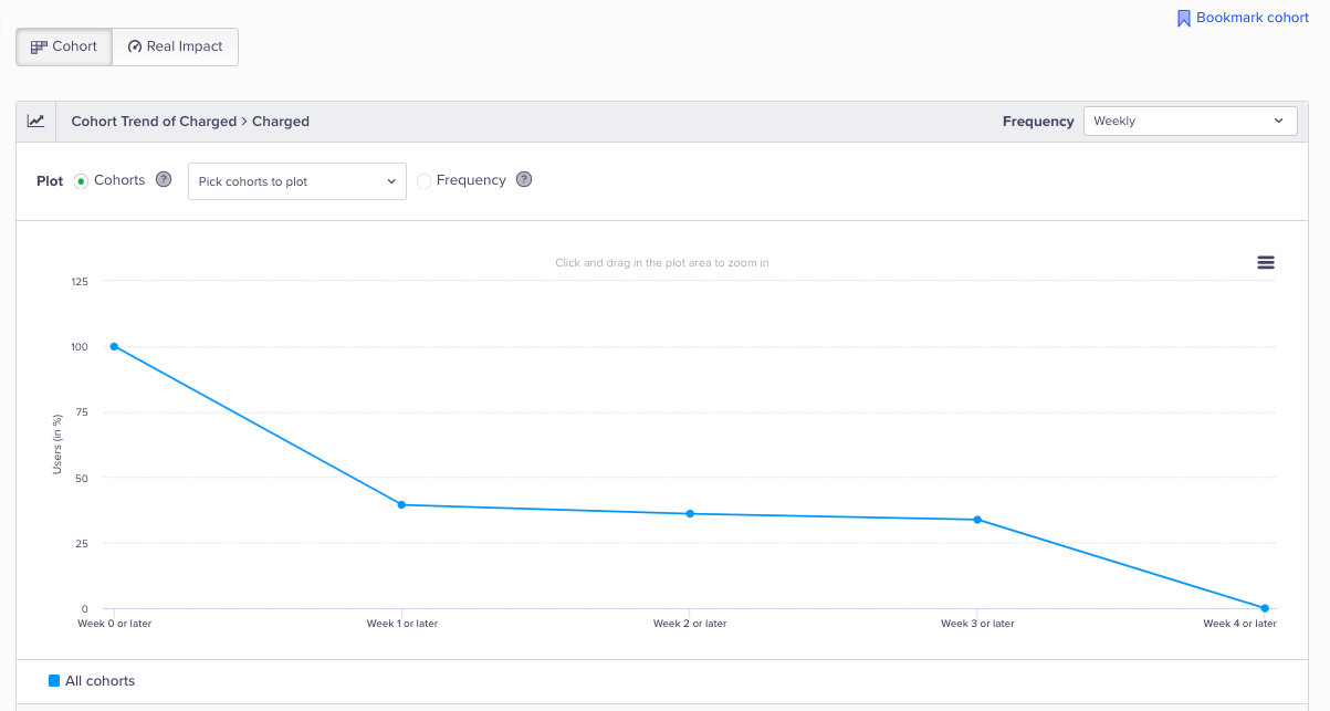
Unbounded Retention Cohort
NoteThis feature is available in the insights add-on.
Advanced Filtering
Advanced filters restrict your analysis to a specific segment of users. Create a segment based on any combination of past behaviors in combination with any set of user properties.
Feature AvailabilitiesAdvanced filters is a general feature available for all analytics features and most campaigns. Read more in Segments.
Read Cohort Results
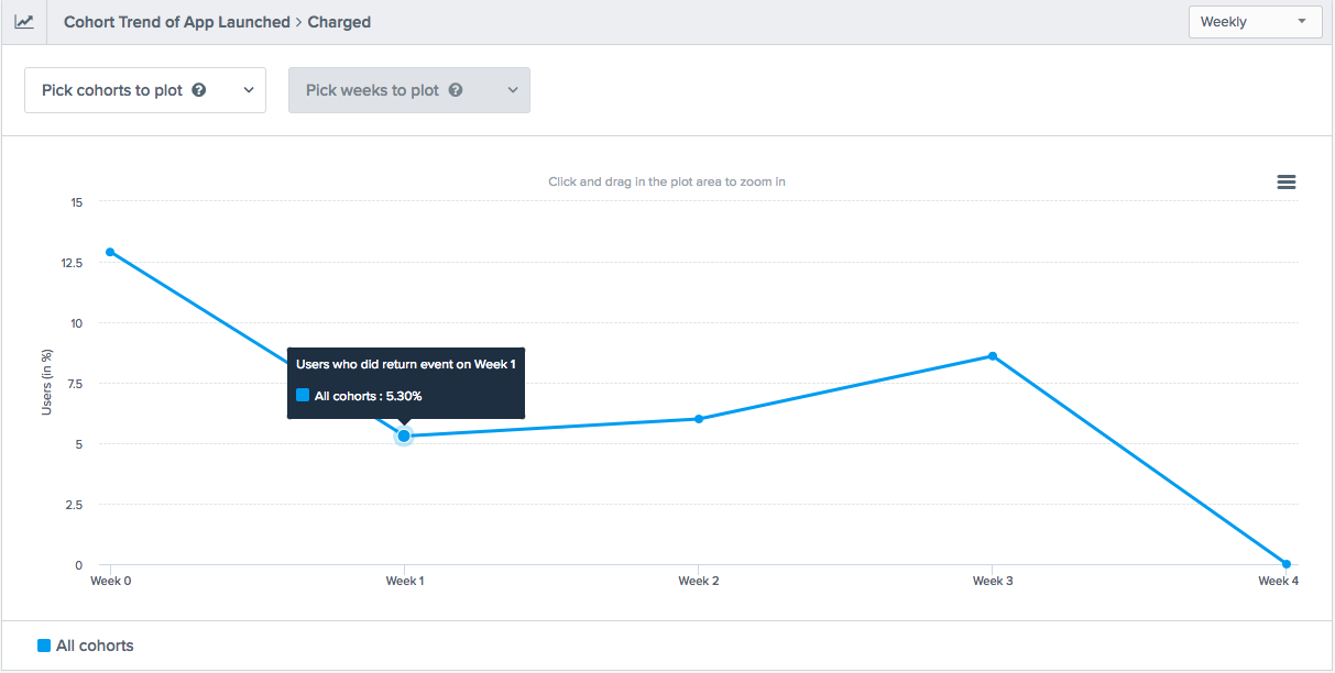
The cohort result first gives you an overview of your result in the form of a trend graph. This graph plots the total percentage of users who came back to perform your return event after performing your first event.
Read Cohort Results
The Y-axis shows the percentage of users who came back to perform your return event and the X-axis shows you the timeframe in which the return event was performed.
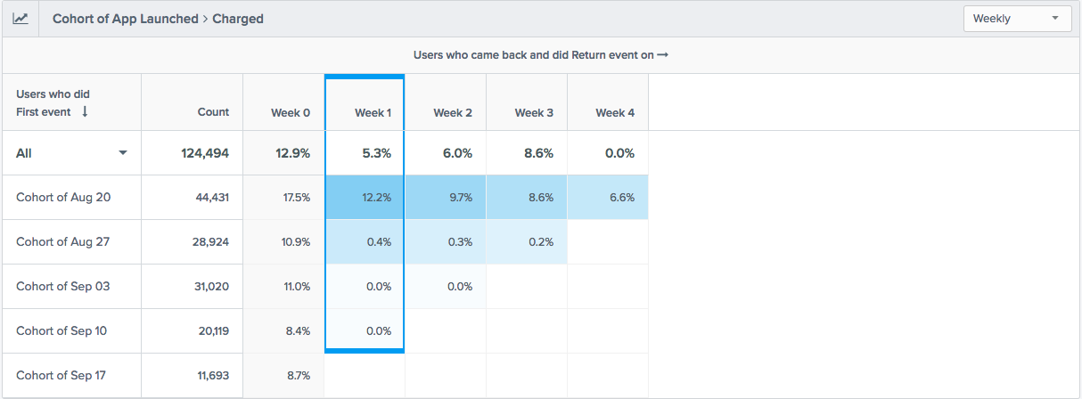
You can also see the details of the trend view in a tabular form in this analysis. The tabular view helps you track the performance of each cohort and also, easily compare it to other cohorts.
For example, in the image below, you can see that in the Cohort of Aug 20, a total of 44,431 users launched the application in Week 0 (the week of August 20). In Week 1, 12.2% of these users returned to perform the Charged event.
Cohort Table
Retention Frequency
You can choose from four frequencies for your cohort results:
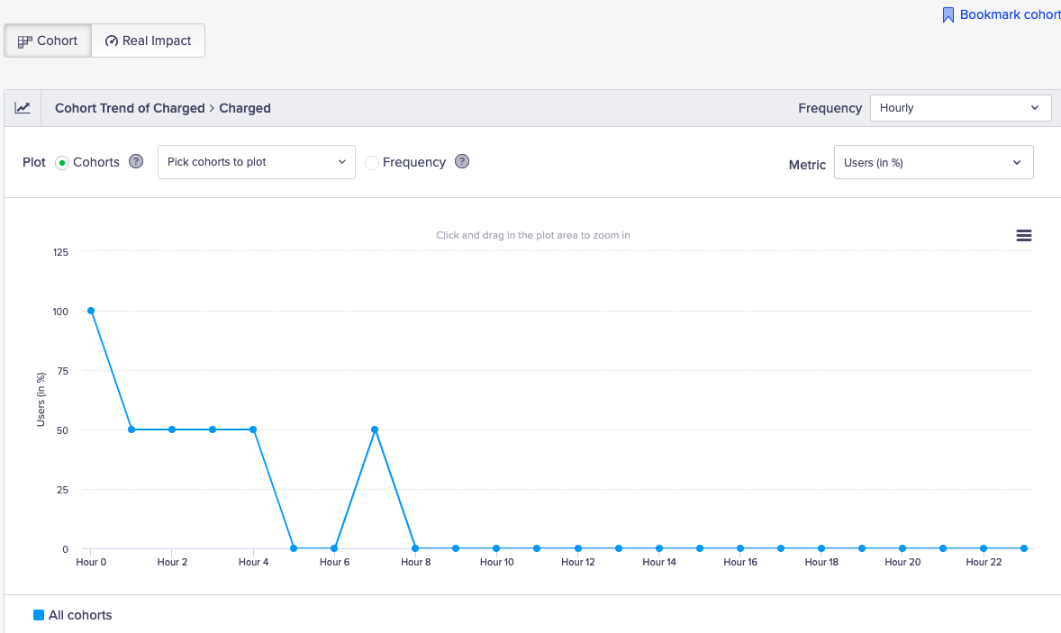
- Hourly: Useful for high engagement apps such as live sports scores, social media, and so on. You can view the users' behavior by the hour.
Hourly Retention Cohort
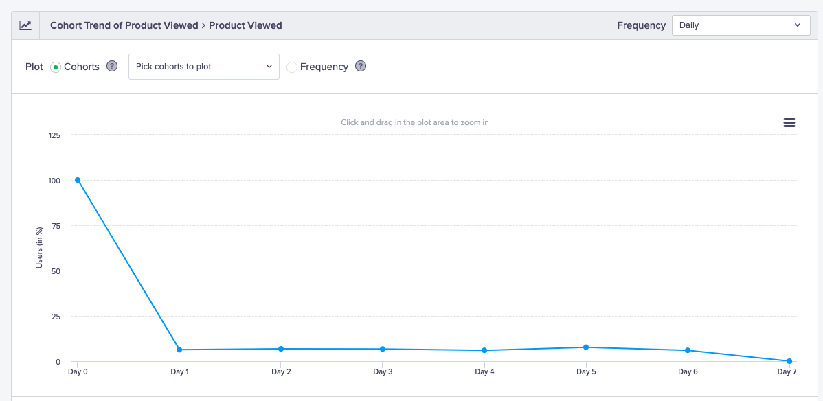
- Daily: Useful for high engagement apps such as news, social media, productivity apps, and so on. You can view the users' behavior by the day.
Daily Retention Cohort
- Weekly: Useful for high engagement apps such as music streaming, video streaming, fitness apps, and so on. You can view the users' behavior by the week.
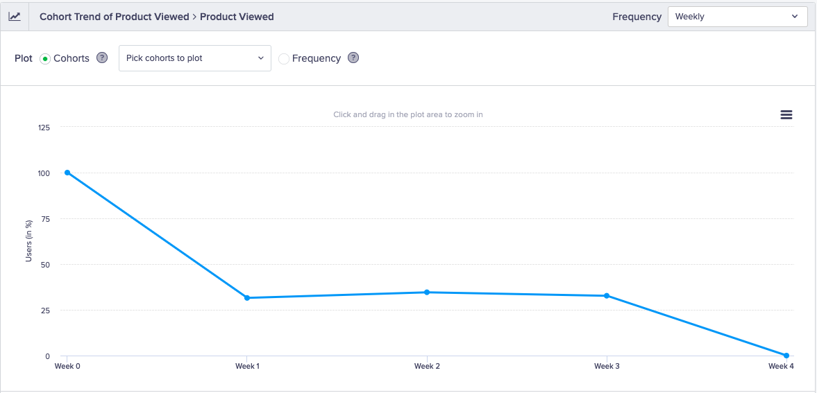
Weekly Retention Cohort
- Monthly: Useful for engagement apps such as grocery, e-commerce, and so on. You can view the users' behavior by the month.
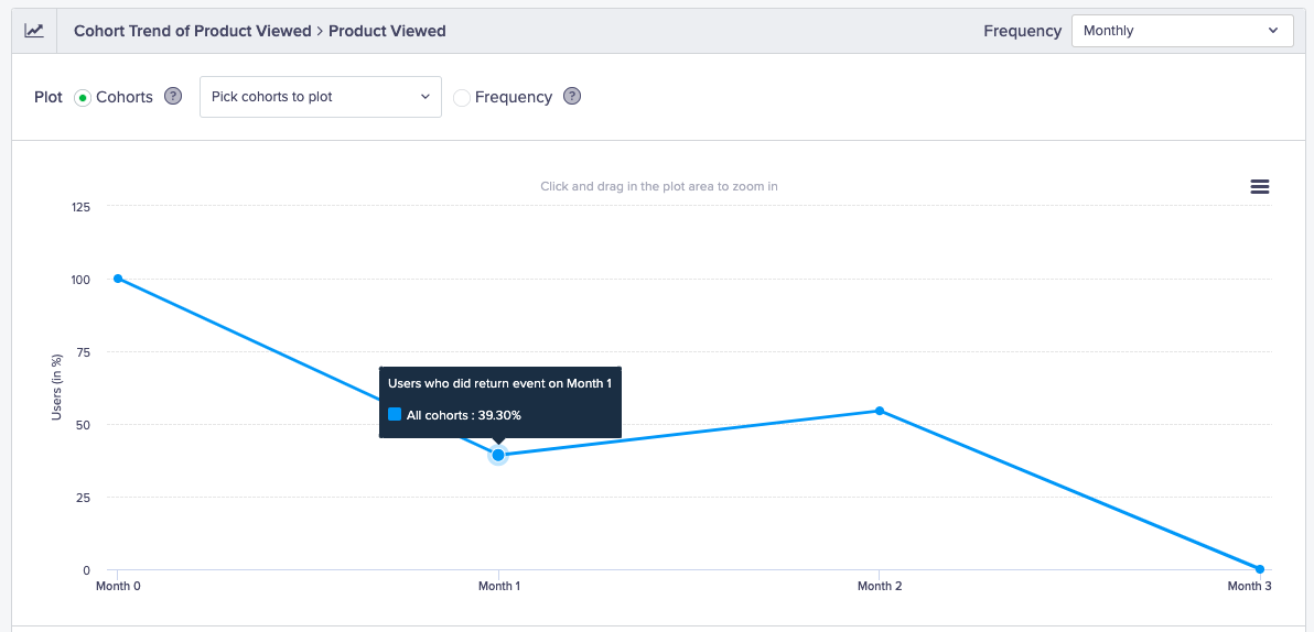
Monthly Retention Cohort
- Custom Bracket: You can define a custom criterion for your cohort. For example, you can see the retention for different time periods such as Day 1, Week 1, Month 1, Month 2, and Month 3.
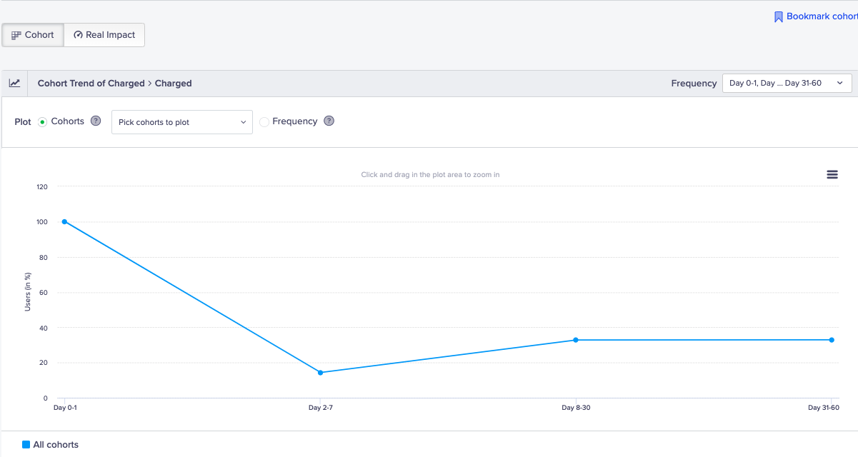
Customized Retention Cohort
NoteThis feature is available in the insights add-on.
Retention Metric
The default metric to view retention is by the percentage of users; however, you can view the retention metric in multiple ways:
- Return Event (Total): You can view retention by the return event, such as the total number of videos streamed over an OTT app.
- Percentage of Users (Total): You can view the retention by the total percentage of users in the app. For example, this can be the total percentage of users who hailed a ride each week. This gives you an insight if there is a dip in a particular week of the month and remedy the dropoff with increased engagement during that week.
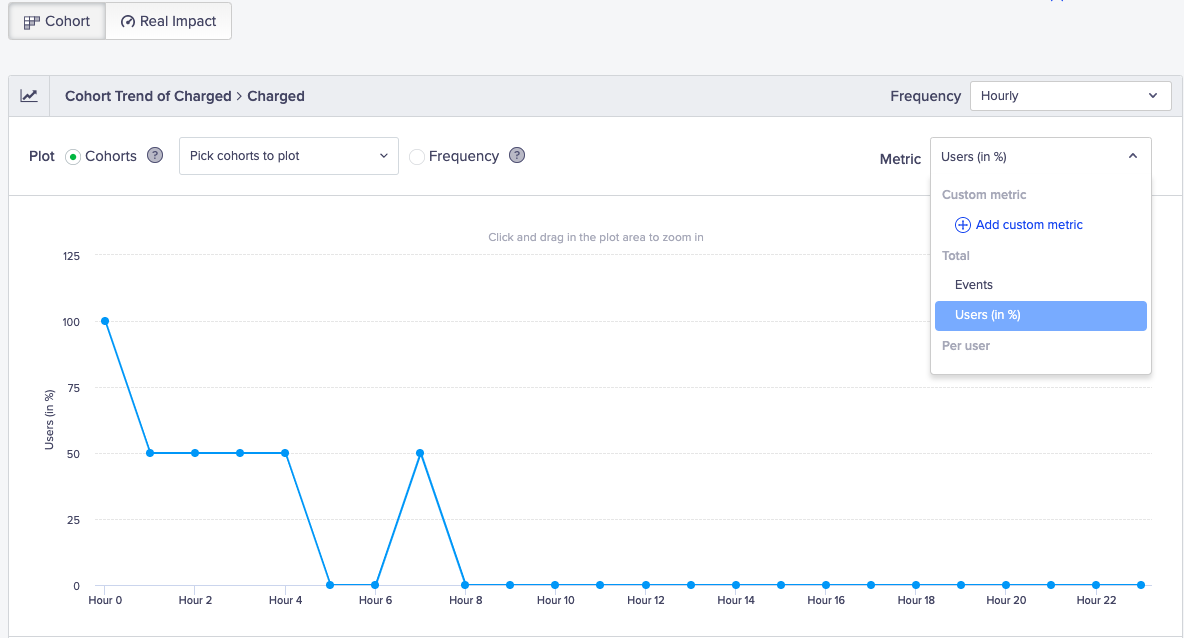
Retention Metrics
- Events per User: You can view the retention by events for each user. For example, this can be the number of times a user listened to songs in week 2.
- Custom Metric: You can sum up by event property. For example, this can be the total revenue earned from all the users who purchased in week 7.
NoteThis feature is available in the insights add-on.
Comparing Cohorts
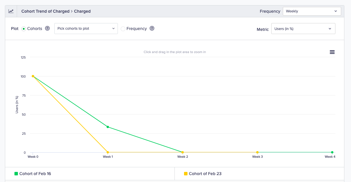
In the default view, you see a trend for all cohorts which is the average progression of all users across cohorts over time. You can choose to compare the performance of one or more cohorts with each other. You can also compare cohorts for different user properties. For example, this can be the retention for Android vs. iOS users.
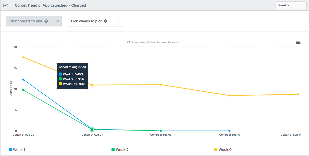
Compare Cohorts
Re-enter Users
A user is counted once in a cohort analysis even if they perform the event multiple times. For example, if a user performs an app launch on January 1, January 3, and January 5, the user is counted only once in the January 1 cohort. If you allow re-entry of users into subsequent cohorts, then these users are counted in each of the cohorts.
Bookmarks
You can bookmark any funnel, cohort or event query and save it to quickly retrieve later. Bookmarks are specific to each logged in user. No other dashboard users will see the bookmarks you save.
Bookmarks are convenient for recalling a specific analysis that you want to see frequently. For example, you can bookmark your important conversion funnels and view them each day or week to see how they are changing over time.
Real Impact
Cohorts retention is measured against the system control group. To see the impact of your engagement, perform the following steps:
- Navigate to Analytics > Cohorts.
- Select events and View cohort.
- Click the Real Impact tab.
For example, if you send engagement campaigns to 100 users, the system control group is 5 percent which is 5 users. Since these 5 users do not receive any engagement, you want to check the boost in retention through your engagement efforts.
The Real Impact results show that you have increased your retention rate by 14.3 % by taking timely action.
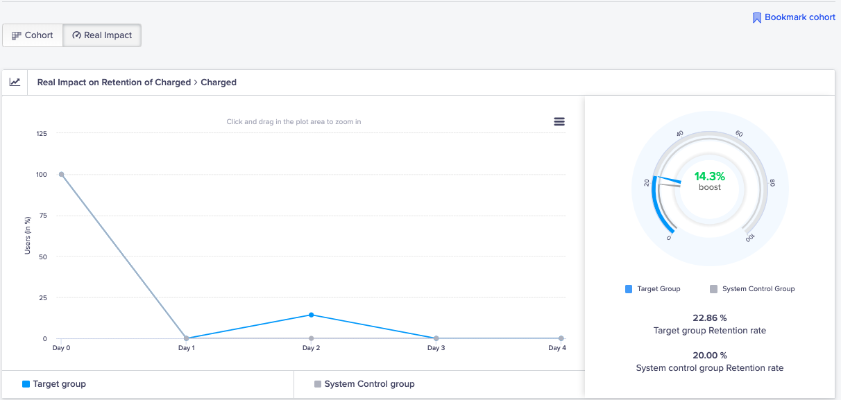
View Real Impact of Cohorts
Any Event
This event is available as the first and return event in cohorts for analysis.
Event Type | Description | How Event is Tracked |
|---|---|---|
Any Event | This event can track any user event performed on the app. | The event is tracked when the user performs any event on the app. Any event includes all the system and custom events except the following:
|
Consideration in CohortsAny event is not actionable in Cohorts. This feature is available in the insights add-on.
Use Cases
Following are scenarios where you may use Any event in cohorts.
For example, you want to calculate your revenue from users. You can create a cohort of all users who may perform Any event in the first step and set the return event as Charged.
Another example can be checking whether users are returning to your app after placing an order. You can create a cohort of all users who performed the Charged event in the first step and select Any event as a return event. This resulting cohort shows all users who performed a purchase and are still active in the app.
Cohort is a powerful tool for understanding user behavior over time. Learn about Cohort analysis to further enhance your user retention.
To improve customer retention, it's essential to track the right Customer Engagement Metrics. Learn about key indicators that can help you analyze user behavior and optimize your campaigns.
Updated 4 months ago
