Conditional Split Stats
Overview
The Conditional Split Stats provide detailed insights about how users enter and move through each defined path. Stats are displayed per path and include counts and percentages under the Node Stats tab.
View Conditional Split Stats
Stats are displayed per path and include counts and percentages under the Node Stats tab. To view the stats, perform the following steps:
- Click the required journey from the All Journeys page.
- Select the Node Stats tab. The stats page opens to show the journey nodes.
- Select the date range to show stats for the journey.
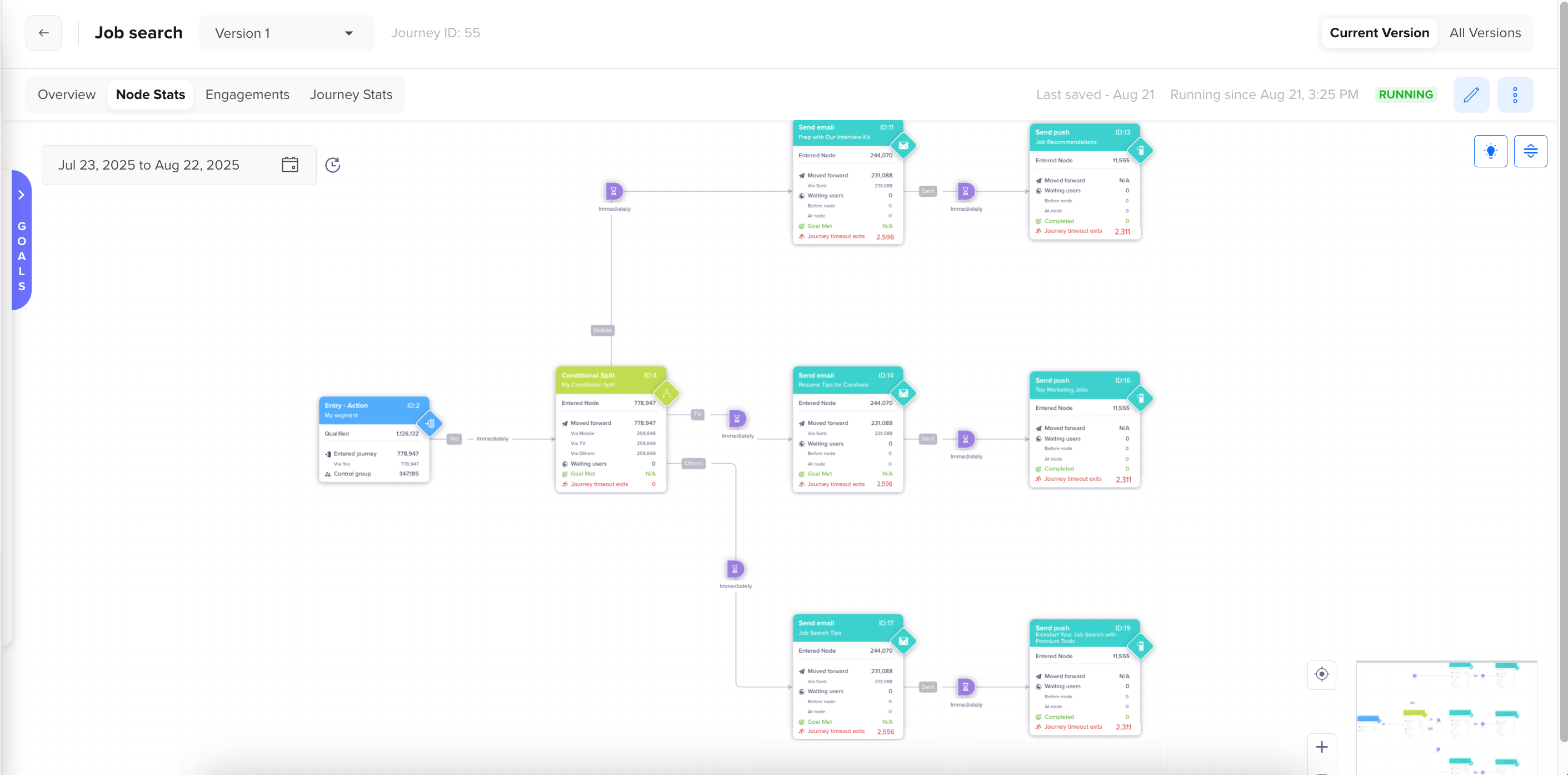
Node Stats for Conditional Split Journey
-
Open the Conditional Split node stats by clicking the node. The following stats are displayed:
Conditional Split Node Stats
Conditional Split stats allow marketers to see how users are segmented across different paths, based on real-time or historical property evaluations. This reveals:
- Which conditions attract the highest volume of users
- How evenly (or unevenly) users are distributed across logic branches
- Whether fallback/default paths are being overused. For example, if 80% of users fall into the fallback path, your segmentation logic may need refining.
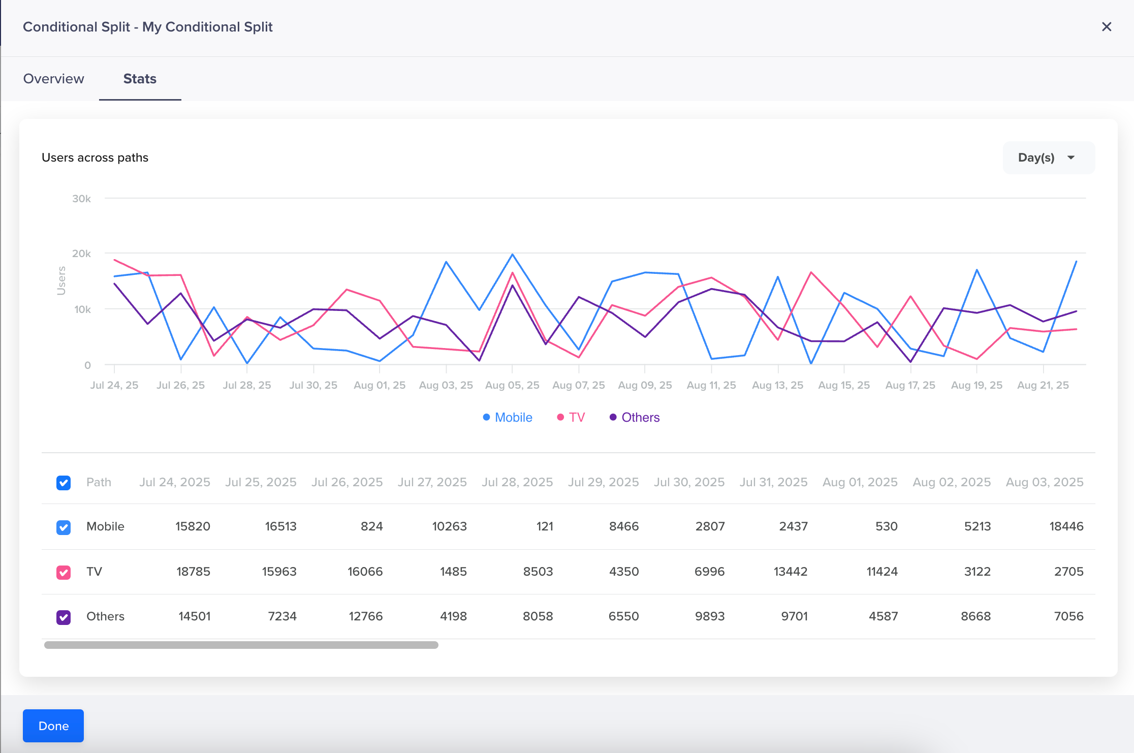
Users Across Paths
This provides a visual and tabular representation of how users are distributed across each defined path over a selected time range. It helps you analyze the performance of your segmentation logic in real time and its effectiveness within the journey.
User Trend by Path
The line chart in the Stats tab helps you quickly analyze user distribution across each conditional path over time. It is especially useful for identifying behavioral trends, spotting anomalies, and validating the performance of your split logic.
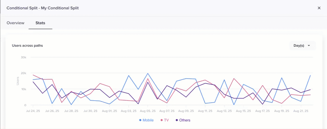
Users Across Conditional Paths
Each line in the chart corresponds to a defined path. The Y-axis represents the number of users who entered a specific path. The X-axis represents the time dimension, displayed based on the selected granularity: Day, Week, or Month. You can use the dropdown menu at the top right of the chart to toggle between:
- Day(s) (default)
- Week(s)
- Month(s)
This helps you zoom in on short-term spikes or zoom out for long-term trends. You can also toggle which paths appear in the graph.
Tabular View of Users Across Path
A tabular view below the graph provides detailed counts of users who entered each path, broken down day-wise (based on the selected filter). You can use the checkboxes to toggle which paths are visible in the graph. The columns in the table are aligned with the date markers in the graph for accurate comparison.

Tabular View of Users Across Path