Trends 2.0
Learn to use the new and improved visualization of your data using Trends to gain deeper insights and make informed decisions.
Overview
CleverTap's Trends feature provides advanced tools for analyzing and visualizing data, offering a comprehensive understanding of user behavior. The key functions include the following:
- Selection Capabilities: Users can choose event-level data, event properties, and user properties and specify analysis periods for deeper insights.
- Advanced Filtering and Segmentation: Robust filtering options and the ability to segment data for a targeted analysis.
- Visualization Tools: Trends can be visualized using various metrics, such as trendlines, conversion metrics, anomaly detection, and retention metrics.
These capabilities give users a powerful way to optimize platform usage and enable them to make informed decisions to drive business outcomes.
Public BetaThis feature is released in Public Beta. For more information about this feature or any queries, contact your Customer Success Manager or the CleverTap Support.
Using the Trends dashboard, users can:
- Plot and analyze trends of event occurrences.
- Compare trends of multiple events to uncover patterns.
- Examine trends across different event property values.
- Compare event trends by user properties.
- Summarize trends using event properties.
- Compare trends across multiple segments.
Getting Started
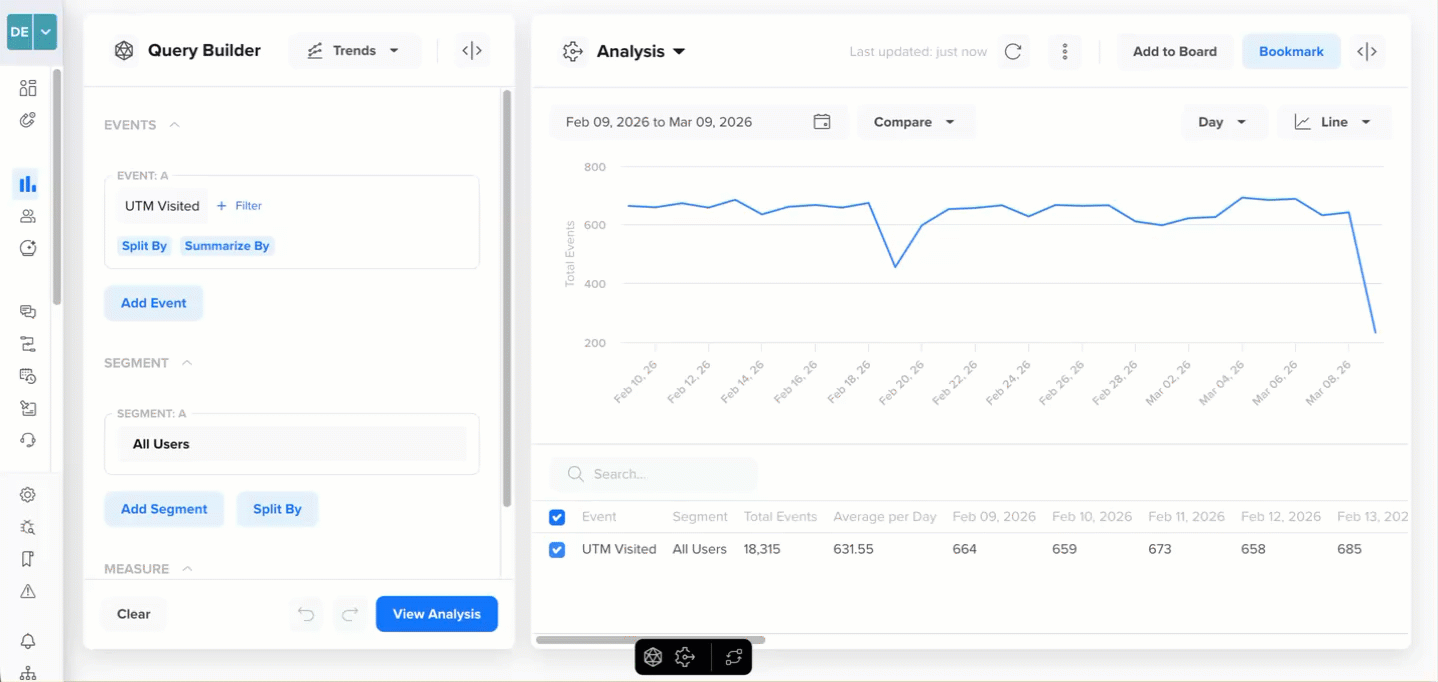
The Trends dashboard enables you to visualize data by segmenting events based on event properties and user-defined segments. You can further refine these segments by splitting them based on user properties.
Results can be displayed in various formats, such as trendlines, pie charts, and more, and can be viewed over different time periods, such as days, or months. You also have the option to download the resulting visualizations or pin the analysis to a board for continuous updates. Additionally, you can download these results in a CSV file.
Event and Segment LimitYou can select up to five events and five segments for analysis.
Trend Analysis
View a Trend
To set up a trend analysis, select the event you would want to analyze. You can also restrict your analysis further to a specific property of that event.
To view a trend:
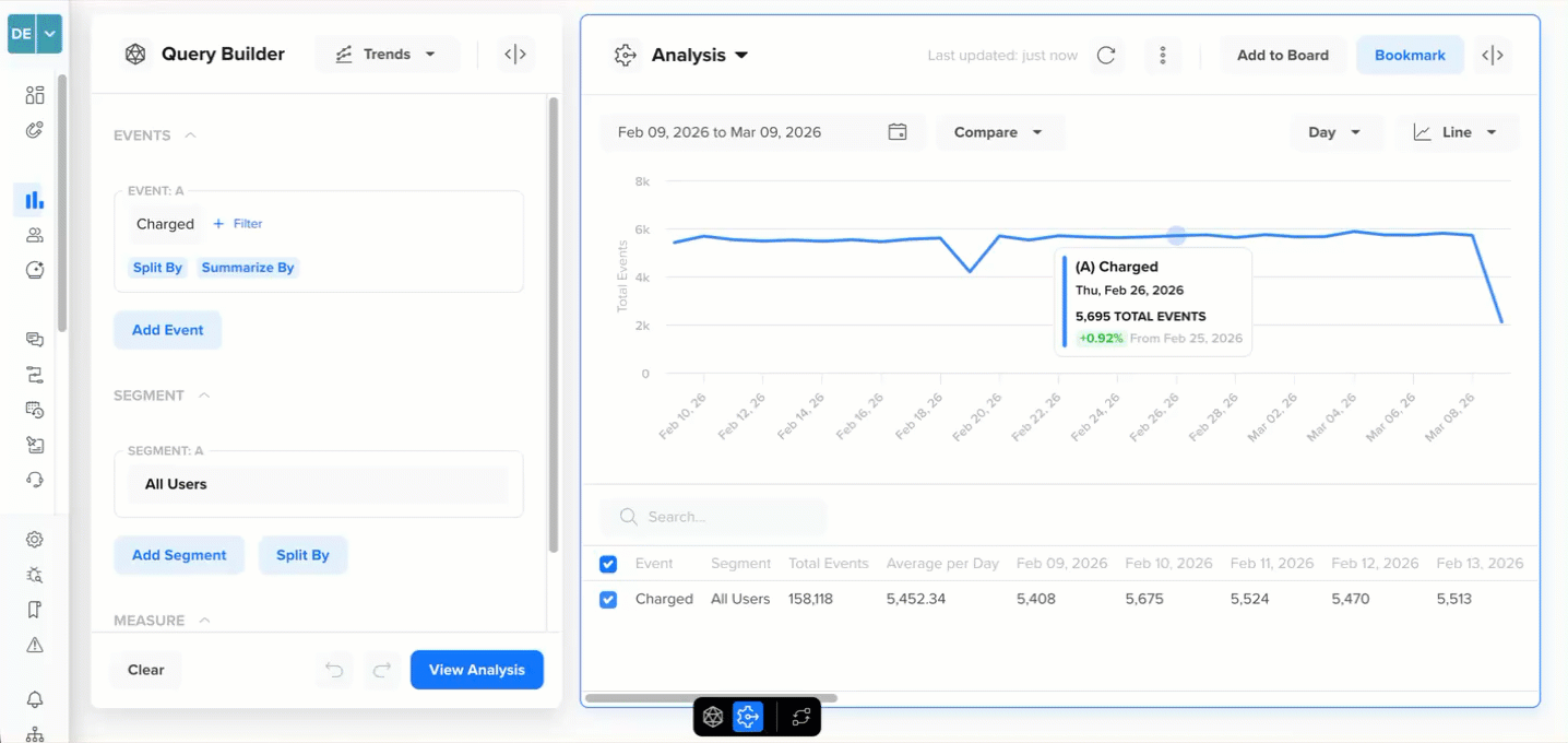
- Go to Analytics > Trends and select an event to analyze from the EVENTS section to view a trend. For example, you want to analyze all the users who launched the app.
- Click View Analysis.
View a Trend
The trend results are displayed. Hovering over the trendline shows the percentage increase or decrease for the selected time frame and other event information.
You can change the view period of the trend on a daily or monthly basis:
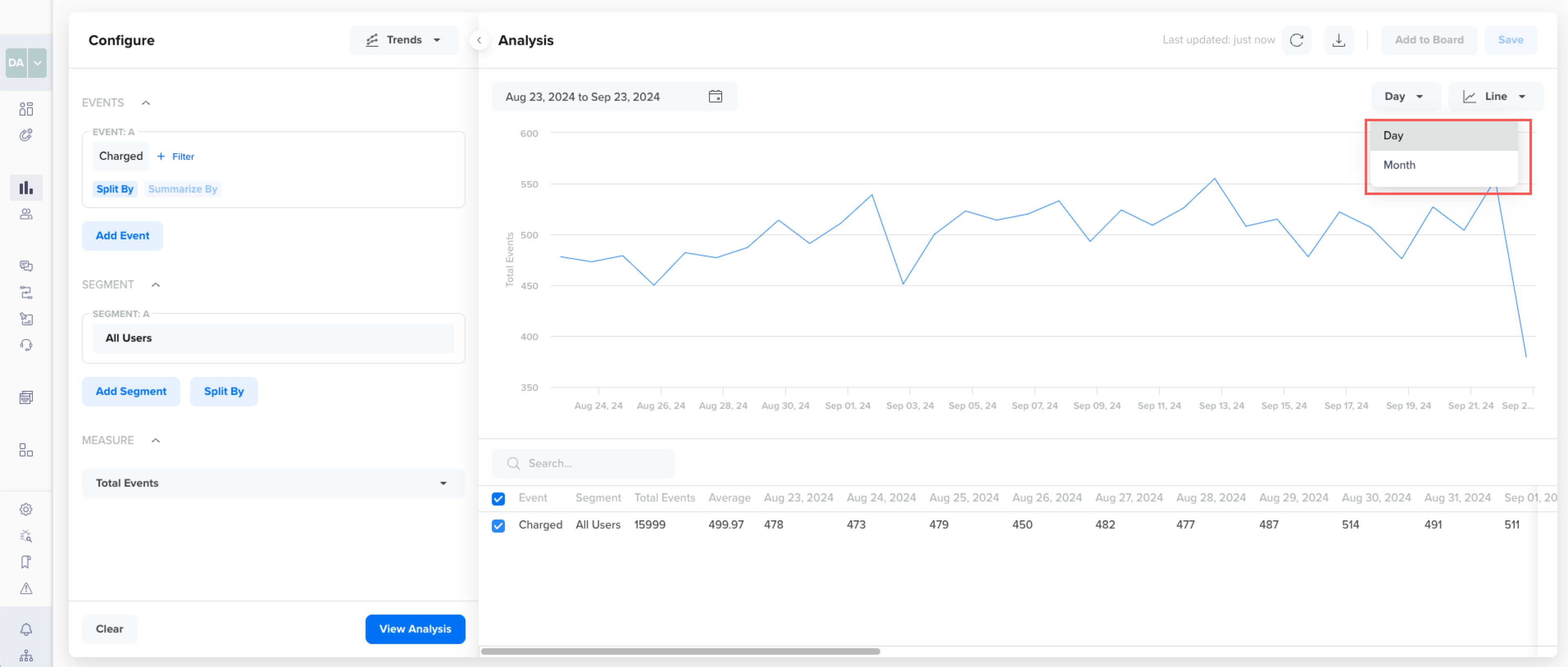
Viewing period
- Daily: The trend and data points are plotted on a daily basis.
- Monthly: The trend and data points are plotted on a daily basis.
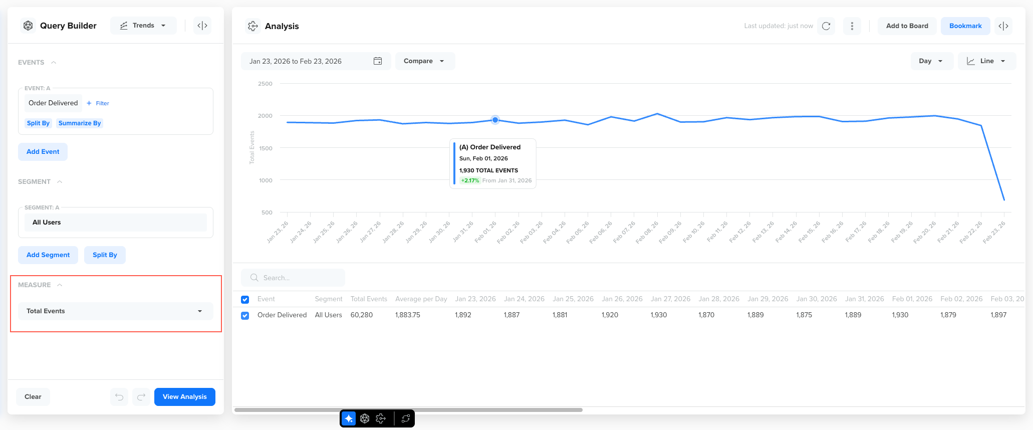
Measure a Trend
The Measure section defines how the selected event is quantified in your trend analysis. While the event determines what user action you are analyzing, the Measure determines how that action is calculated and displayed over time. It gives you the flexibility to switch between volume, participation, intensity, value, penetration, and derived metrics, allowing you to explore trends from multiple analytical perspectives without changing the underlying event selection.
In Trends 2.0, you can choose from the following measurement options:
- Total Events
- Unique Users
- Average per User
- Summarize By (Event Property)
- Active Percentage (%)
- Formula
Each option changes both the trend visualization and the summary statistics displayed in the table.
Total Events
Total Events displays the sum of event occurrences during the selected time period. Every occurrence of the event is counted, even if the same user performs the event multiple times.
For example, if a user places 3 orders in one day, all 3 Order Placed events are counted.
Measure by Total Events
Use this measure when you want to understand overall activity volume, such as:
- Total number of orders placed
- Total number of restaurants viewed
- Total number of app launches
Unique Users
Unique Users displays the number of distinct users who performed the selected event in the specified time period. Each user is counted once per time interval, regardless of how many times they performed the event.
For example, if a user places multiple orders in a single day, they are counted once for that day in the trend.
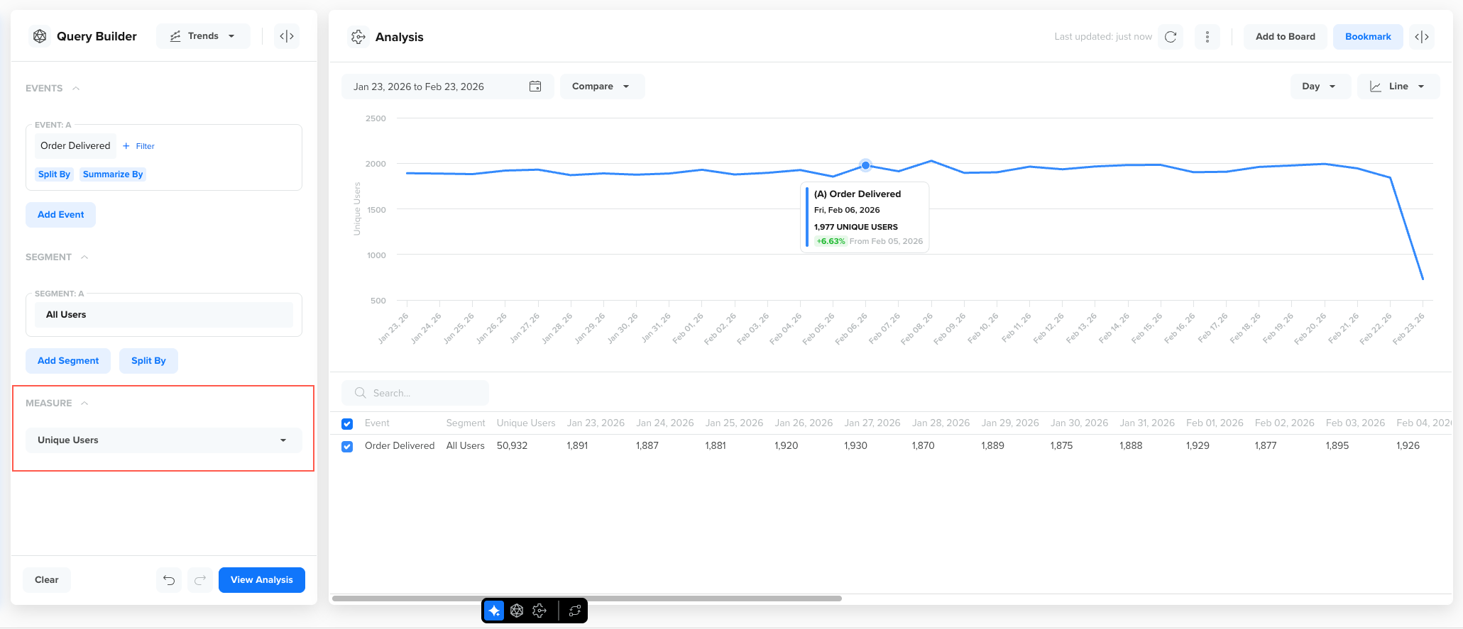
Measure by Unique Users
Use this measure when you want to understand user participation, such as:
- How many users placed at least one order
- How many users viewed a restaurant
- How many users added items to cart
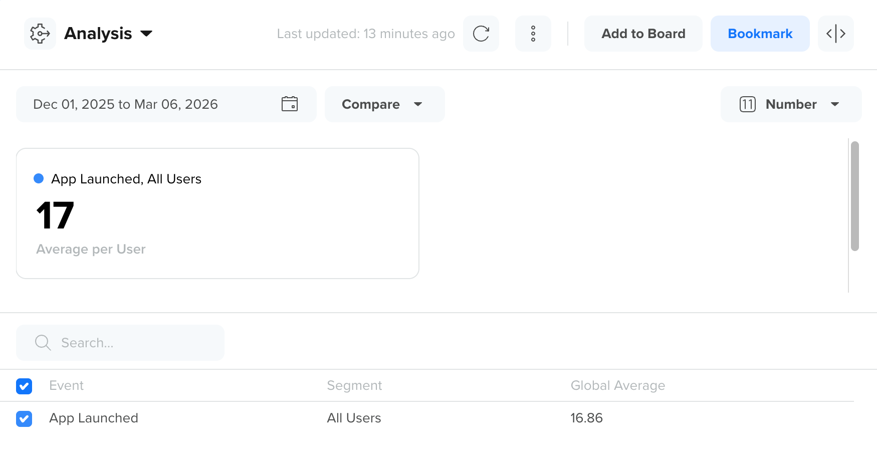
Average per User
Average per User displays the average number of times each unique user performed the selected event in the specified time period. It is calculated as Total Events / Unique Users.
For example, if 1,000 users placed 5,000 orders during the selected period, the average per user is 5 orders.
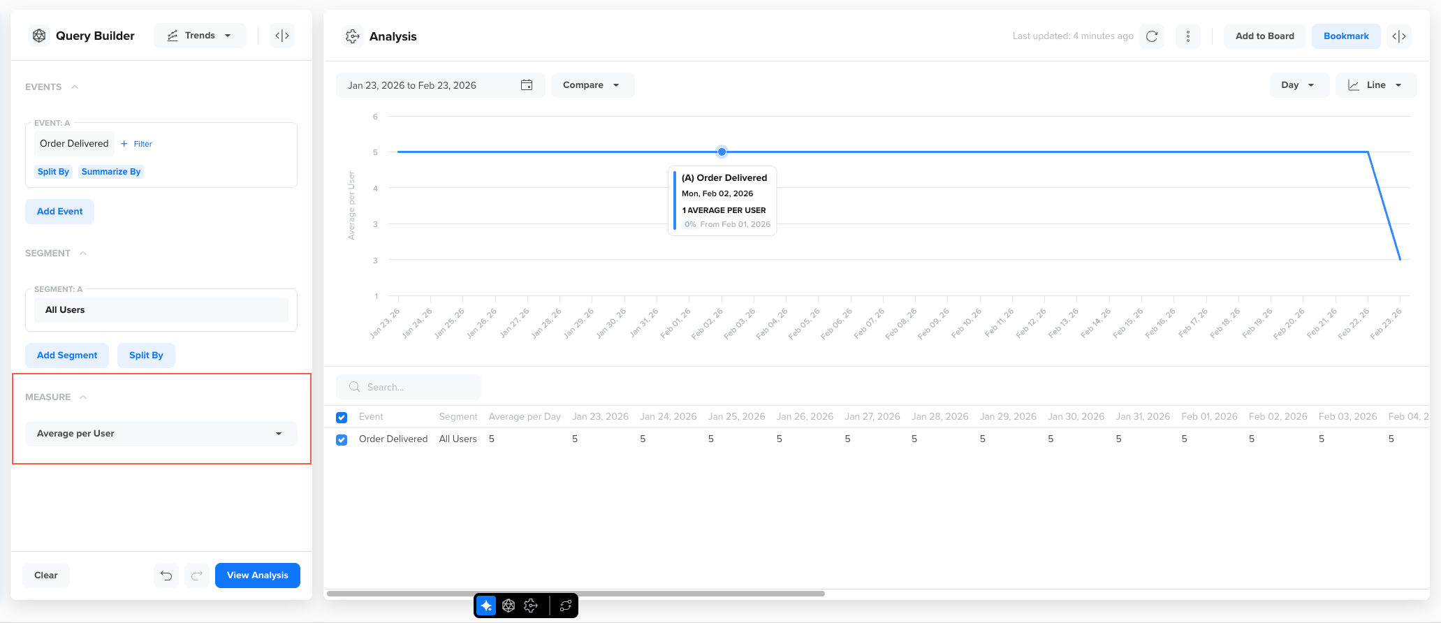
Measure by Average per Users
Use this measure when you want to analyze engagement intensity, such as:
- Average number of orders per user
- Average number of app launches per user
- Average number of items added to cart per user
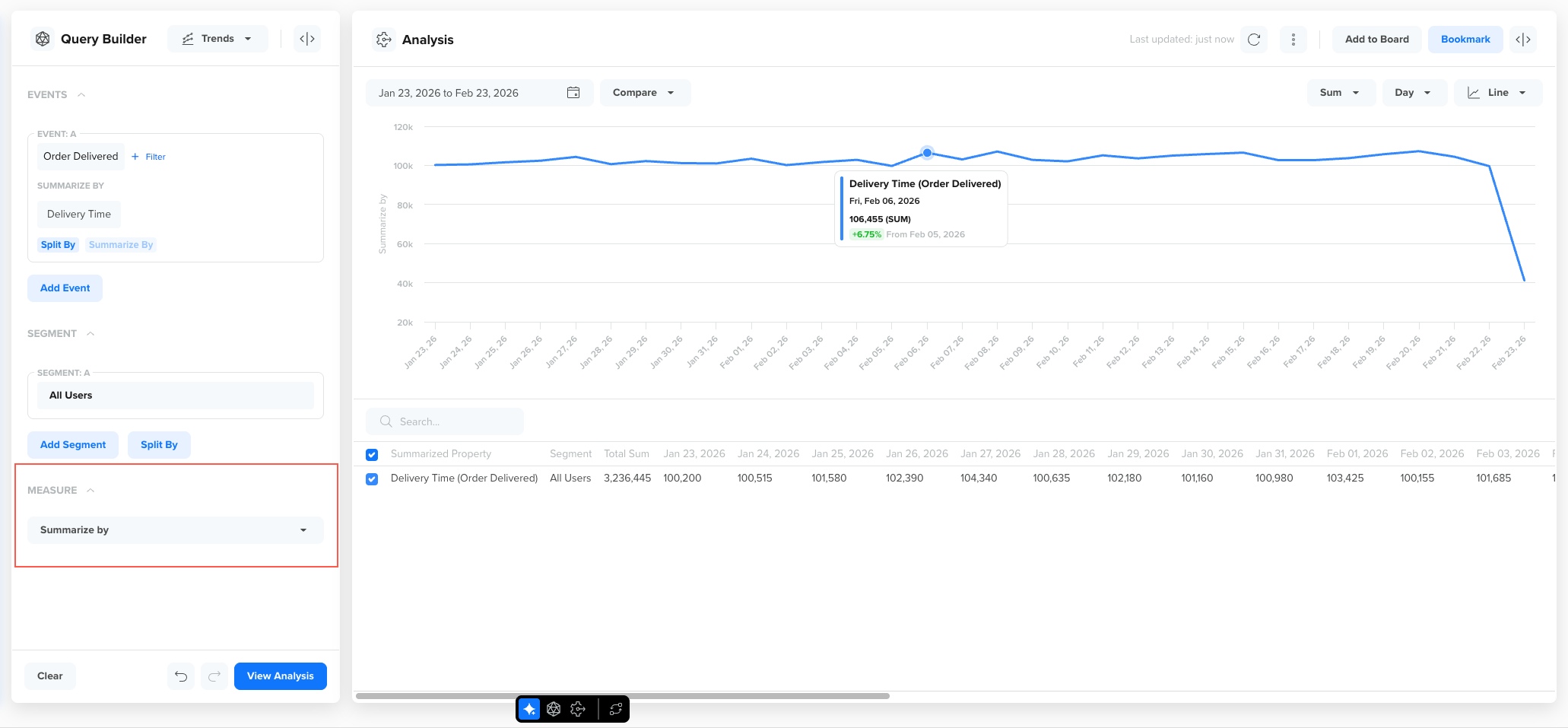
Summarize By (Event Property)
Summarize By allows you to aggregate trends using a numeric event property rather than simply counting events or users. Use Summarize By when analyzing value-based metrics such as revenue, order size, watch time, or duration.
This option becomes available when the selected event contains a numeric property, such as, order_amount, delivery_time, discount_value, duration and so on.
Measure by Summarize by (Event Property)
You can summarize the trend using:
Sum of Property Value
Displays the total value of the selected numeric property across all event occurrences.
For example, summarizing Order Placed by order_amount shows total revenue over time.
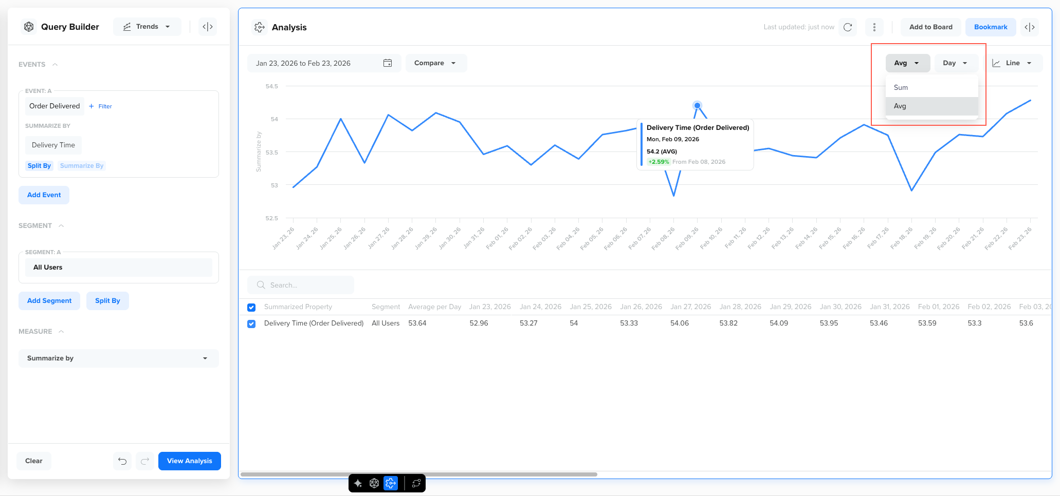
Average of Property Value
Displays the average value of the selected property per event occurrence.
For example, summarizing Order Placed by order_amount using average shows the average order value over time.
Active Percentage (%)
Active Percentage displays the proportion of users who performed the selected event out of the total active users during the selected period.
For example, if 10,000 users launched the app (qualifying event) and 4,000 users placed an order, the Active Percentage for Order Placed is 40%.
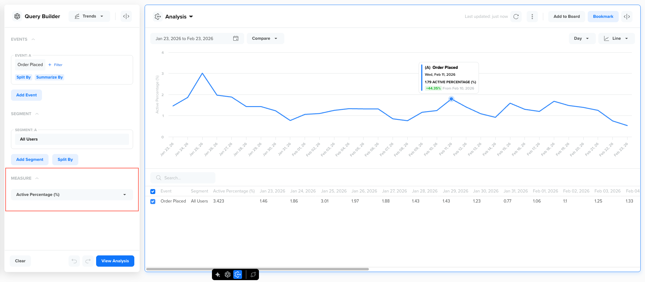
Measure by Active Percentage (%)
Use this measure to understand behavioral penetration among active users, such as:
- What percentage of active users placed an order?
- What percentage of active users added items to cart?
- What percentage of active users completed checkout?
Configure Qualifying EventsActive users are defined based on a qualifying event configured in the Schema settings. To configure the qualifying event, refer to Qualifying Events.
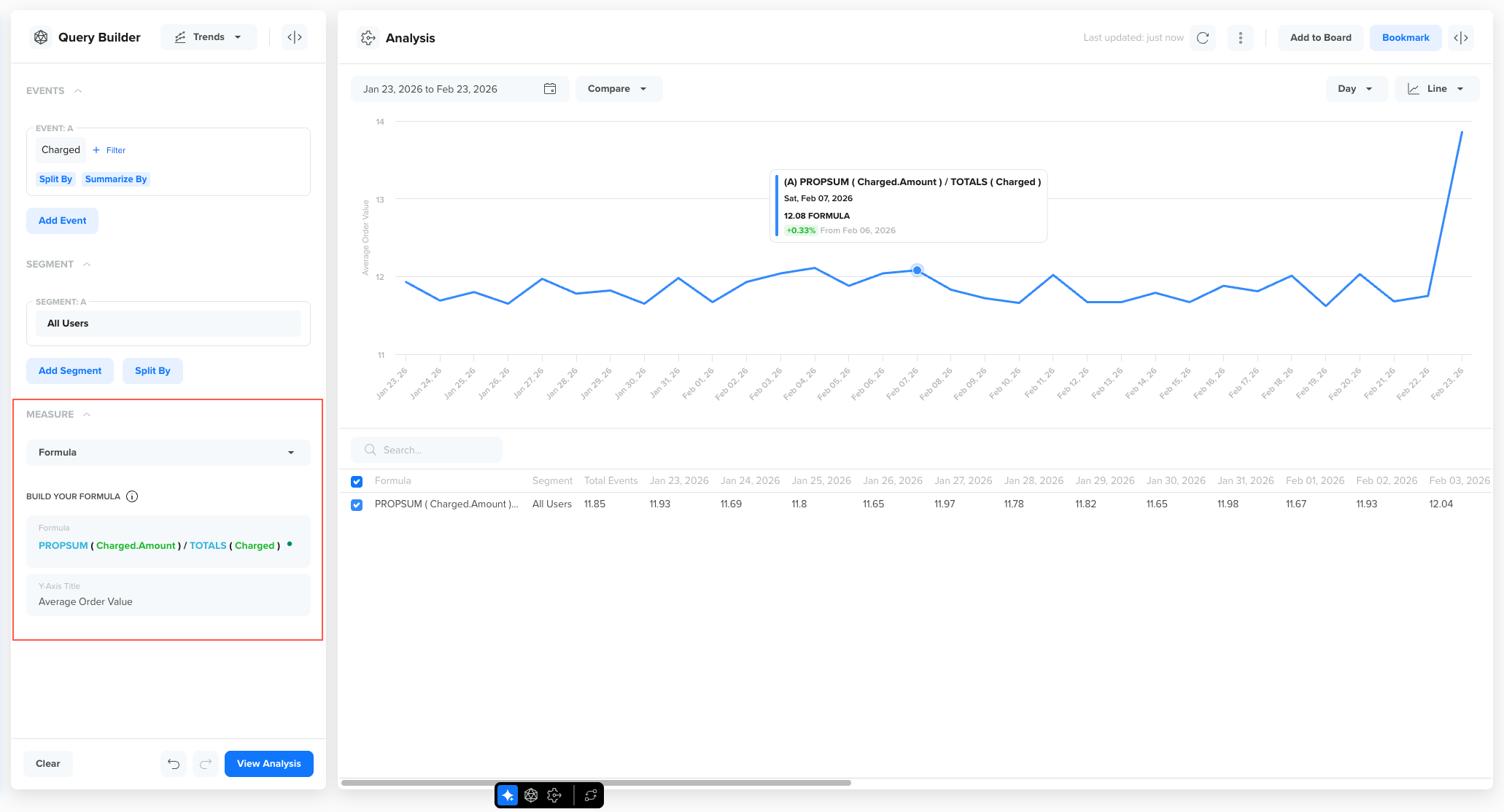
Formula
The Formula option allows you to create custom metrics. You can do so by combining event-level and property-level functions using mathematical expressions. Use Formula when you want to calculate derived business metrics that are not directly available through standard measures, such as Total Events or Unique Users.
For example, in a food delivery app, you may want to:
- Measure revenue per active user
- Compare total orders vs total users
- Track average order value alongside total revenue
- Analyze order conversion relative to app launches
How Formulas Work?
When you select Formula as the measurement, you define a formula using supported functions. The system then computes the result for each time interval, and the computed values are plotted as a trend line. The same values appear in the table view as well.
You can use predefined event-level and property-level functions to create meaningful business trends. These functions must always be written in uppercase.
These functions use the selected event and measure its frequency or user participation:
- TOTALS: Counts every occurrence of the selected event during the chosen time period. For example, if an event such as Video Played occurred 12,000 times, TOTALS returns 12,000 even if the same user triggered the event multiple times.
- UNIQUES: Counts the number of distinct users who performed the selected event. For example, if 2,000 unique users triggered the event, UNIQUES returns 2,000; each user is counted only once, regardless of how many times they performed the event.
- AVERAGE: Shows the average number of times each unique user performed the selected event. For example, if 3,000 users triggered the event 15,000 times in total, AVERAGE returns 5 events per user. This can also be derived using TOTALS / UNIQUES.
- ACTIVE: Counts users who were active by performing the selected event within the chosen time period. For example, if 800 users triggered the event during the selected range, ACTIVE returns 800 active users.
Formula Guidelines
When creating a custom metric, follow these guidelines:
- You can combine available metrics using operators such as +, -, *, /, and parentheses ().
- You can compare up to four formulas in the same configuration by separating them with a semicolon (;).
- The formula must be mathematically valid.
Example Formula: Average Order Value
Consider an example where you want to measure how much revenue each purchasing user generates (that is, Average Order Value) over time.
You can define the following formula as:
PROPSUM ( Charged.Amount) / TOTALS ( Charged )
Measure by Formula
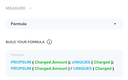
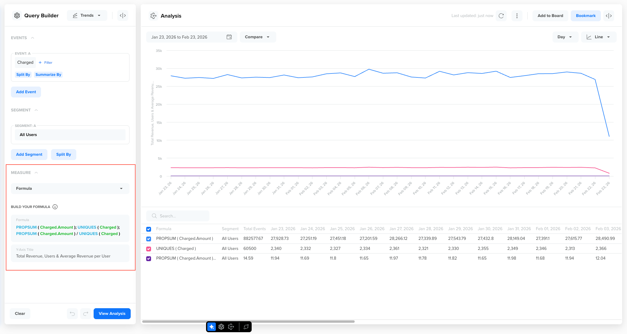
Using Multiple Formulas in One Analysis
Trends 2.0 allows you to compare up to four formulas in a single chart. Each formula is calculated independently and plotted as its own series on the same chart. This allows you to visually compare related business metrics without creating multiple analyses. Keep formulas logically related to avoid clutter and improve interpretability.
Multiple Formulas in One Analysis
Use multiple formulas when you want to:
- Compare volume vs value (for example, orders vs revenue)
- Compare totals vs averages
- Analyze both numerator and denominator of a ratio
- Identify what is driving growth (more users vs higher spend per user)
To add multiple formulas, separate each formula using a semicolon (;).
For example, PROPSUM ( Charged.Amount ); UNIQUES ( Charged ); PROPSUM ( Charged.Amount ) / UNIQUES ( Charged )
This will display the following three separate trend lines:
- Total Revenue
- Total Purchasing Users
- Revenue per Purchasing User
Measure by Multiple Formulas in One Trend
Using the Y-Axis Title Field Effectively
When using formulas, especially ratio or derived metrics, the Y-axis may no longer represent simple counts. The Y-axis Title field allows you to clearly describe what the chart is measuring. The axis title should reflect the metric being calculated, not the underlying event. Using clear axis titles ensures that anyone viewing the chart can immediately understand what the trend represents without needing to interpret the formula itself.
The following examples illustrate how to translate formulas into stakeholder-friendly axis titles:
| Formula | Recommended Y-axis Title |
|---|---|
| PROPSUM ( order.amount ) / UNIQUES ( Order Placed ) | Revenue per Purchasing User |
| PROPSUM ( Order Placed ) / TOTALS ( App Launched ) | Orders per App Launch |
Best Practices for Y-Axis Titles
Follow these best practices when writing Y-Axis Titles for your formulas::
- Use business-friendly language instead of function names
- Avoid technical terms like PROPSUM or UNIQUES
- Clearly indicate if the metric is a percentage or ratio
- Keep titles concise but descriptive
- If comparing multiple formulas, choose a neutral but descriptive title such as:
- Revenue & User Metrics
- Order Performance Ratios
Compare Trends for Events
You can compare trends for multiple events. For example, you can understand the correlation between two events, such as App Launched and Notification Viewed.
To view a trend, perform the following steps:
- Go to Analytics > Trends and select an event to analyze and view a trend. You can also filter your analysis further by the event property.
- Click Add Event to add another event for comparison.
- Click View Analysis.

Compare Trends
Filter by Event Property
When selecting an event for analysis, you can restrict the search criteria by filtering based on the specific event properties. All subsequent analyses are performed using these filtered event properties, while other properties of the selected event are excluded.
To filter a trend by event property:
- Go to Analytics > Trends and select an event to analyze from the EVENTS section and view a trend. For example, you want to analyze only those users who viewed In-App notifications.
- Click + Filter to filter by an event property that is In-App.
- Click View Analysis.
The resulting trend filters users who viewed notifications from an in-app notification. It does not include users who viewed other types of notifications, such as Email or the Web. Any further analysis of this event will focus exclusively on users who viewed notifications from the In-App campaign.
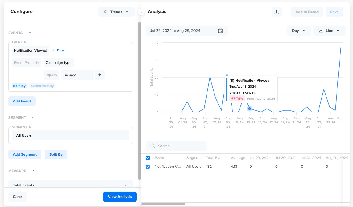
Filter Event by Property
Split by Event Property
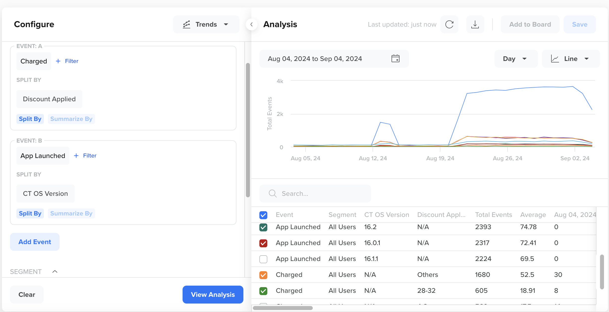
You can split the analysis of your event based on specific event properties. For example, consider the Charged event, which indicates a user has made a purchase. You can split this event by its underlying properties, such as Payment Mode and Amount. This divides your single Charged trend line into multiple lines, with each trend line representing the value of a different event property. This allows you to visualize the payment method your users prefer.
To split a trend by event property:
- Go to Analytics > Trends and select an event to analyze and view a trend. For example,
Charged. - Click + Split by to divide the trend by the event properties, such as
payment method. - Click View Analysis.
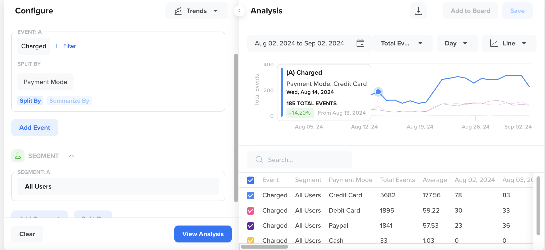
Compare trends by event properties
The trend for each event property is displayed.
All the split event properties are listed at the bottom of the right pane. You can perform the following actions:
- Use the search box to find specific event properties.
- Select or deselect event properties from the trend by selecting the corresponding boxes.
- Sort the event properties from highest to lowest values, or vice versa, by clicking the arrows.
Maximum SplitYou can split an event by up to two event properties at a time.
Compare Trends Between Time Periods
You can compare event trends against the previous period, such as day, week, month, and year.
To compare trends across time periods, perform the following steps:
- Go to Analytics > Trends and select an event to analyze and view a trend. You can also filter your analysis further by the event property.
- Select the date range for the trend. The trend displays.
- From the Analysis pane, select the relevant time period from the Compare list.
A new dotted line appears for each series of the event data to display the difference in the values.
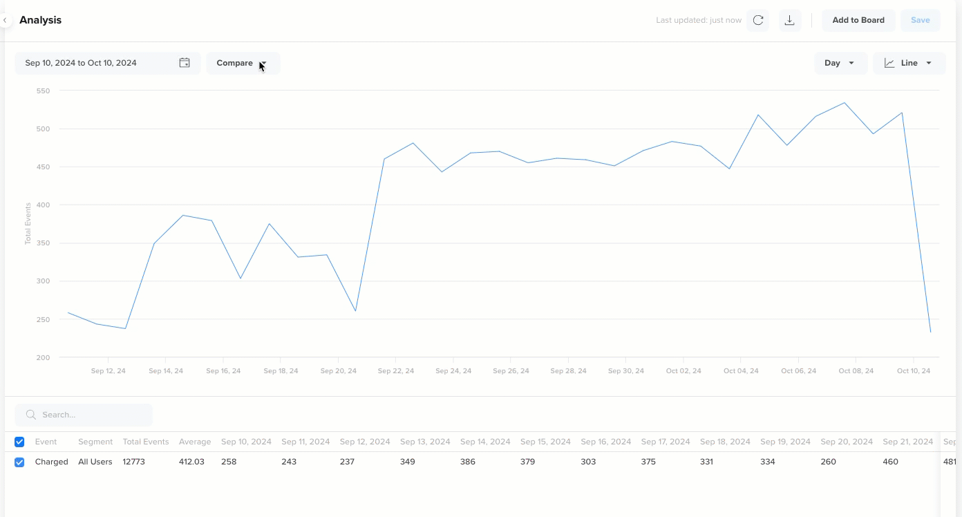
Compare across Time Periods
Compare Trends for Segments
You can compare your event trend across different user segments. For example, you can compare the App Uninstalled event trend across segments, such as Loyal Customers, Champion Users, and Match Day Players. Differences in the segment trends reveal variations in user behavior, providing invaluable insights. For instance, if many Booster Abandoners are uninstalling the app, it may indicate a need for alternative engagement strategies rather than offering them game boosters.
To compare trends across segments:
- Go to Analytics > Trends and select an event to analyze and view a trend. You can also filter your analysis further by the event property.
- Click Add Segment from the SEGMENT section.
- Select a segment from the list or create an Ad hoc segment.
- Click View Analysis.
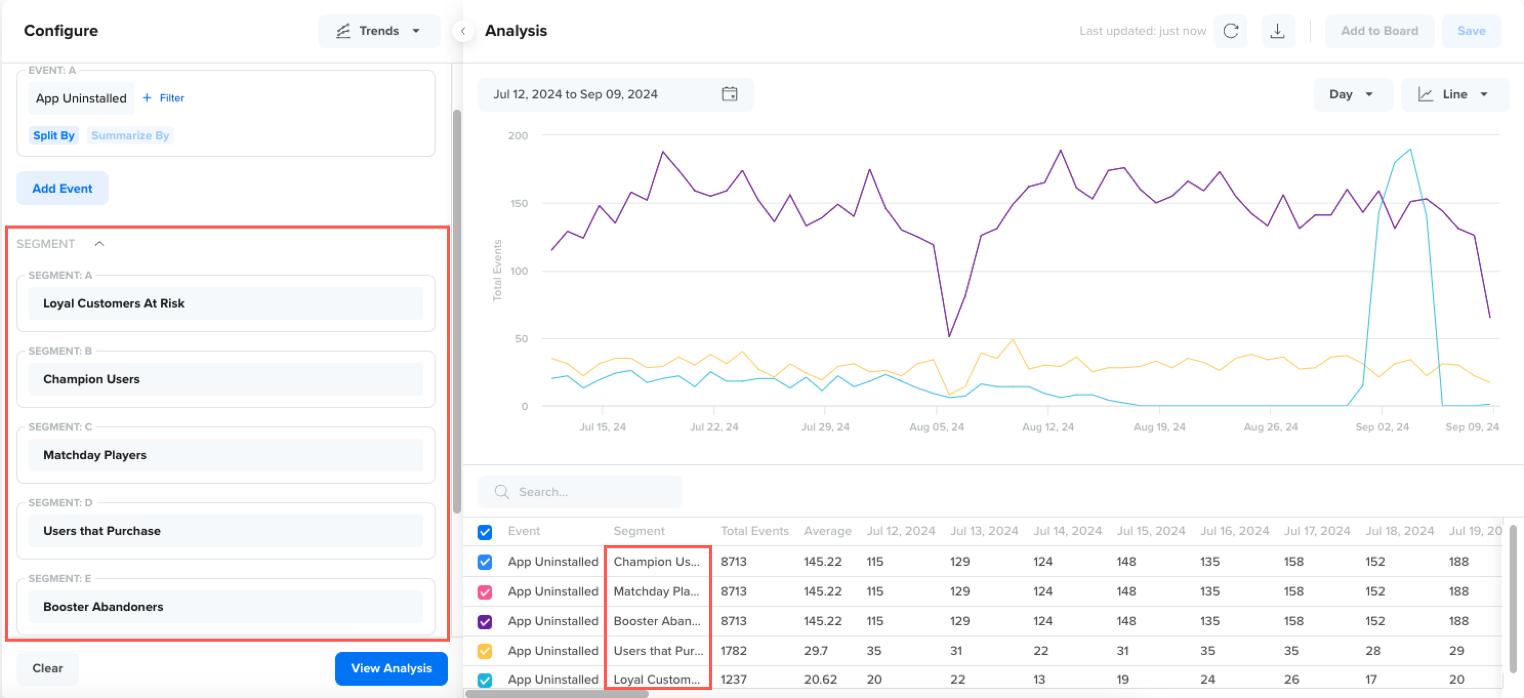
Compare Trends Across Segments
Comparison ConsiderationsYou must consider the following when comparing trends across different segments:
- You can compare a saved or an ad-hoc segment.
- You can compare a maximum of five segments.
- You cannot split the trend by user property and compare it by segments simultaneously.
Ad hoc Segments
When performing a trend analysis, you can use available user segments or create ad-hoc segments at run time. To create ad hoc segments:
- From the SEGMENT section, click the edit icon.
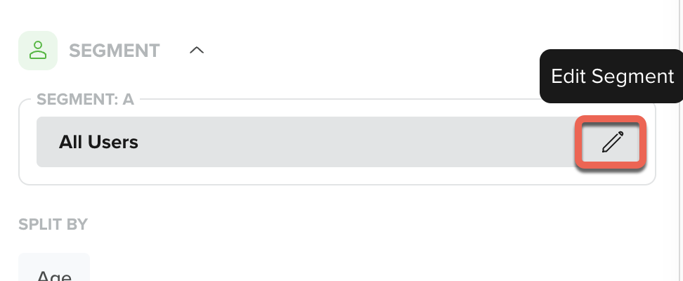
Create Adhoc Segment
- Click Add Rule to add a condition or click Add Rule Group to add multiple conditions.
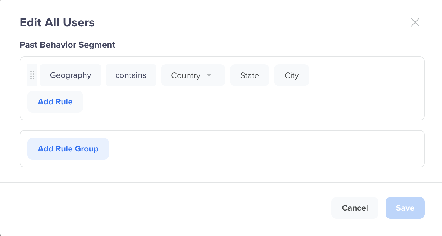
Add Rules
For information about creating segments, refer to Segmentation.
Split by User Property
You can analyze a trend based on the specific user properties. For example, consider the event Charged, which indicates that the user has started watching content. Here, you can split this trend based on the underlying user property, such as Customer_Type.
This splits your single Charged trend line into multiple trend lines, each referencing the user property value. For example, the user property Customer_Type is split by user property values such as Platinum, Silver, and so on.
To split a trend by user property:
- Go to Analytics > Trends and select an event to analyze and view a trend.
- Select the user property from the Split by user property list under the SEGMENT section
- Click View Analysis.
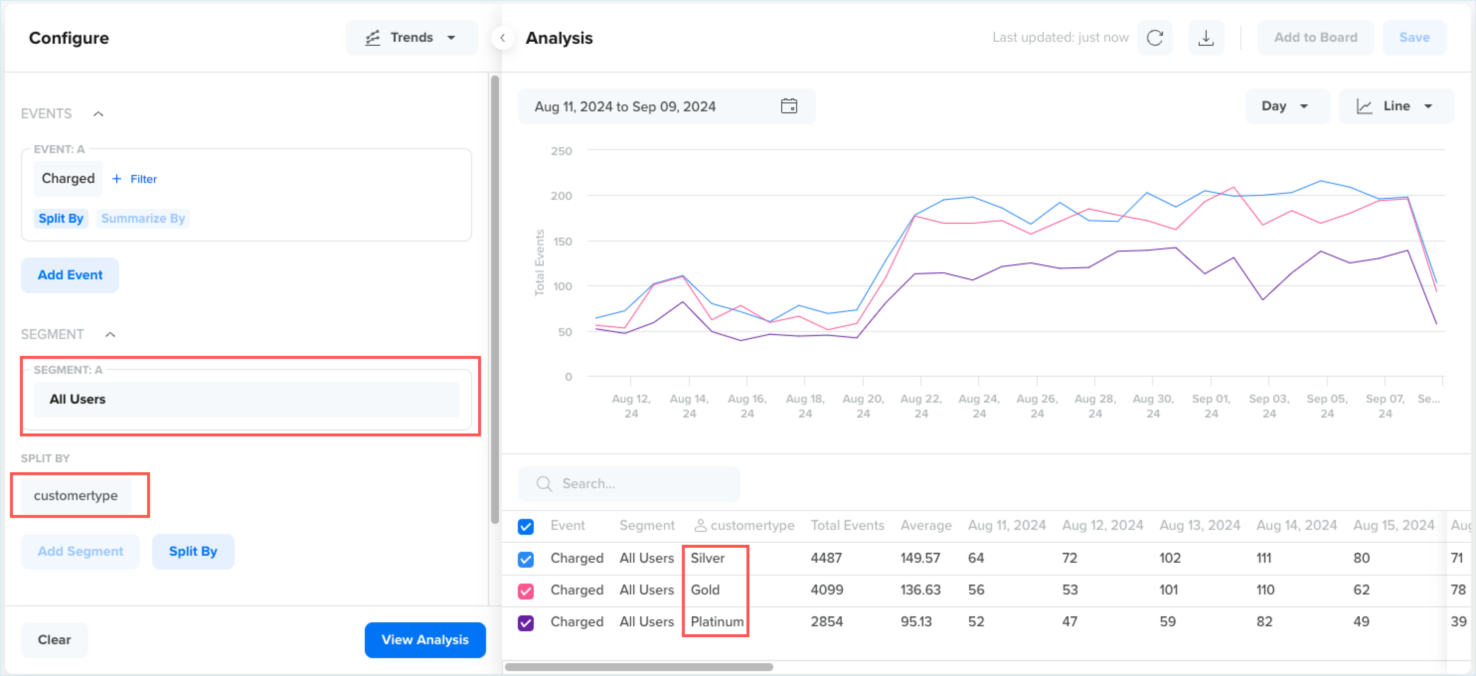
Split Segment by User Property
The trend for each user property displays. All the split user properties are listed at the bottom. You can do the following:
- Search through the listed user properties using the search box.
- Select or clear the user properties from the trend by selecting the specific checkbox.
- Sort the user properties from highest to lowest value and vice versa using the arrows.
Maximum SplitYou can split by a maximum of two user properties. Split by properties is not available when comparing two or more segments.
Operations
Once you generate a trend analysis, you can perform several actions from the Analysis pane to compare results, change visualizations, save the analysis, and take follow-up actions based on the chart data.
The available operations help you move from analysis to action without rebuilding the query.
Compare with Previous Period
You can compare the selected trend against a previous time period to understand whether the metric is increasing, decreasing, or remaining stable.
From the Compare list, you can compare the current analysis with:
- Previous Day
- Previous Week
- Previous Month
- Previous Year
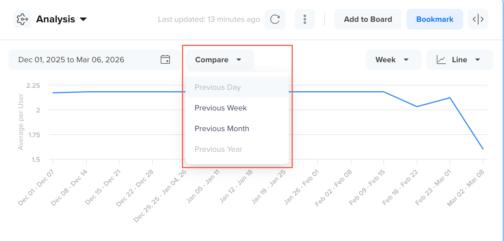
Compare Trends with Previous Period
When a comparison is selected, the chart displays an additional comparison series for each event, for example, two trend lines denoting different weeks. It allows you to visually compare how the selected metric has changed relative to the earlier period.
Use comparison when you want to:
- Measure week-over-week or month-over-month changes
- Identify growth or decline trends
- Evaluate the impact of launches, campaigns, or seasonality
Change Chart Type
You can switch the analysis view to a different chart type to interpret the data differently.
The available chart types are:
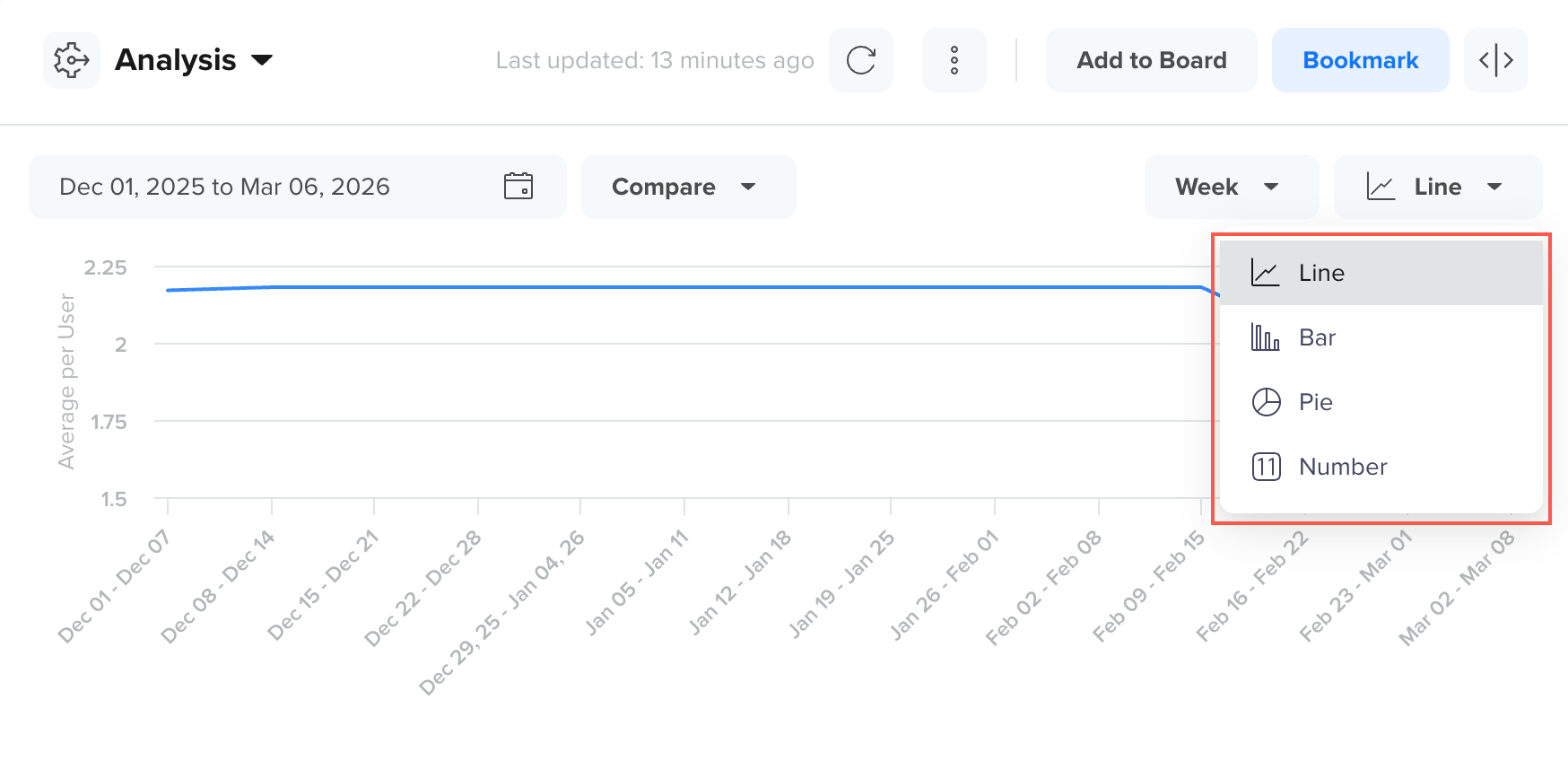
View Trend Types
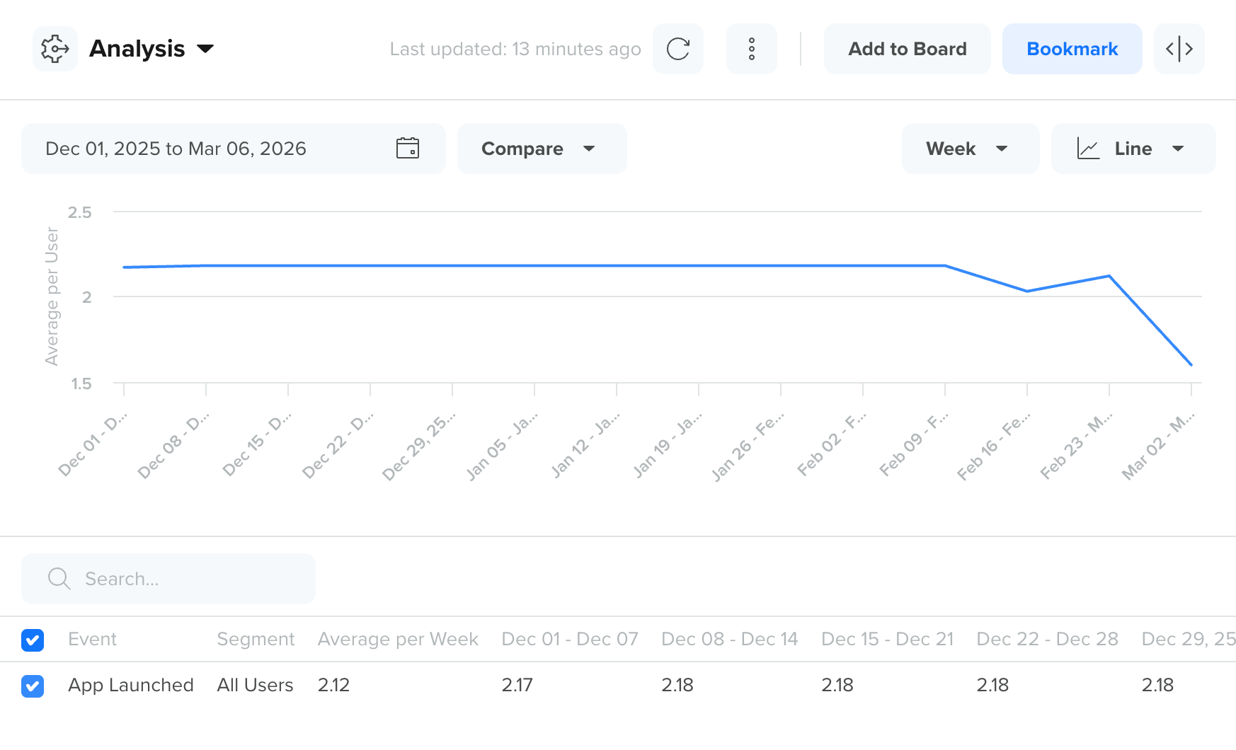
Line
Use the line chart to analyze how the selected metric changes over time. This is the default view for most trend analyses.
View Trend in Line Chart
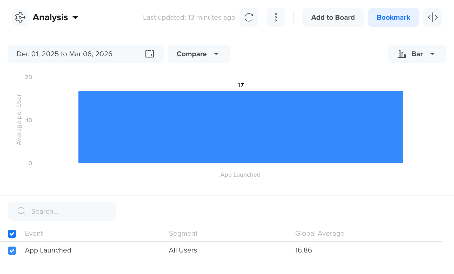
Bar
Use the bar chart to clearly compare metric values across selected events or time buckets.
View Trend in Bar Chart
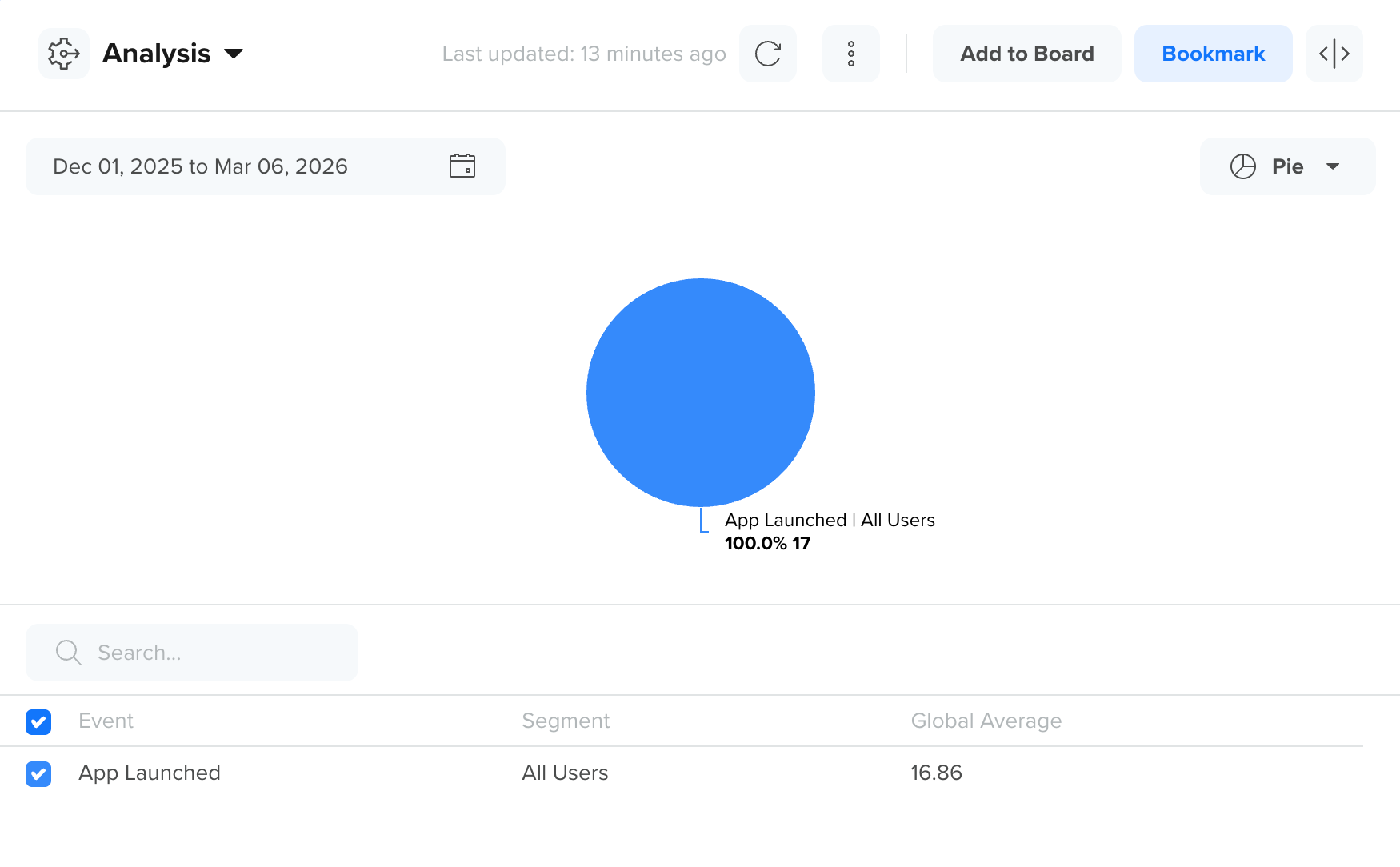
Pie
Use the pie chart to understand the contribution to the total value across selected events or categories.
View Trend in Pie Chart
Number
Use the number view when you want to display the selected metric as a single summarized value rather than as a time-series chart.
View Trend in Number Chart
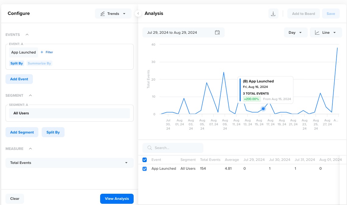
Inspect Data Points
Hover over any point or bar in the chart to view detailed values for that time bucket. This helps you inspect outliers, spikes, and dips without switching to the table view.
The tooltip can show information such as:
- Event name
- Date or time bucket
- Metric value
- Split-by value, if applicable
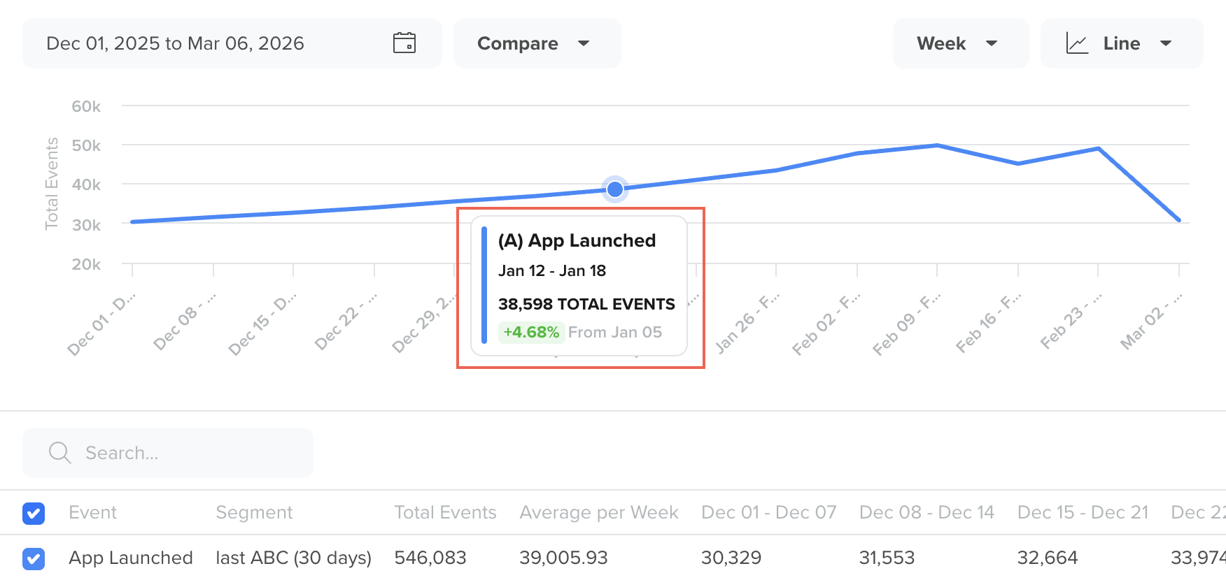
Inspect Data Points from a Trend
Save as Segment
You can create a user segment directly from a data point in the Trend chart to analyze or target users who performed a specific action during a selected time interval.
Click a data point (for example, a point on a line chart or a bar in a bar chart), and an action menu with Save as Segment appears. Selecting Save as Segment opens the Segment Builder, where the system automatically generates a segment query based on the event, filters, segment conditions, and the specific data point you selected.
For example, if you click a data point representing the Charged event on a specific date, the segment builder generates a query for users who perfomed the Charged event during that selected time range.
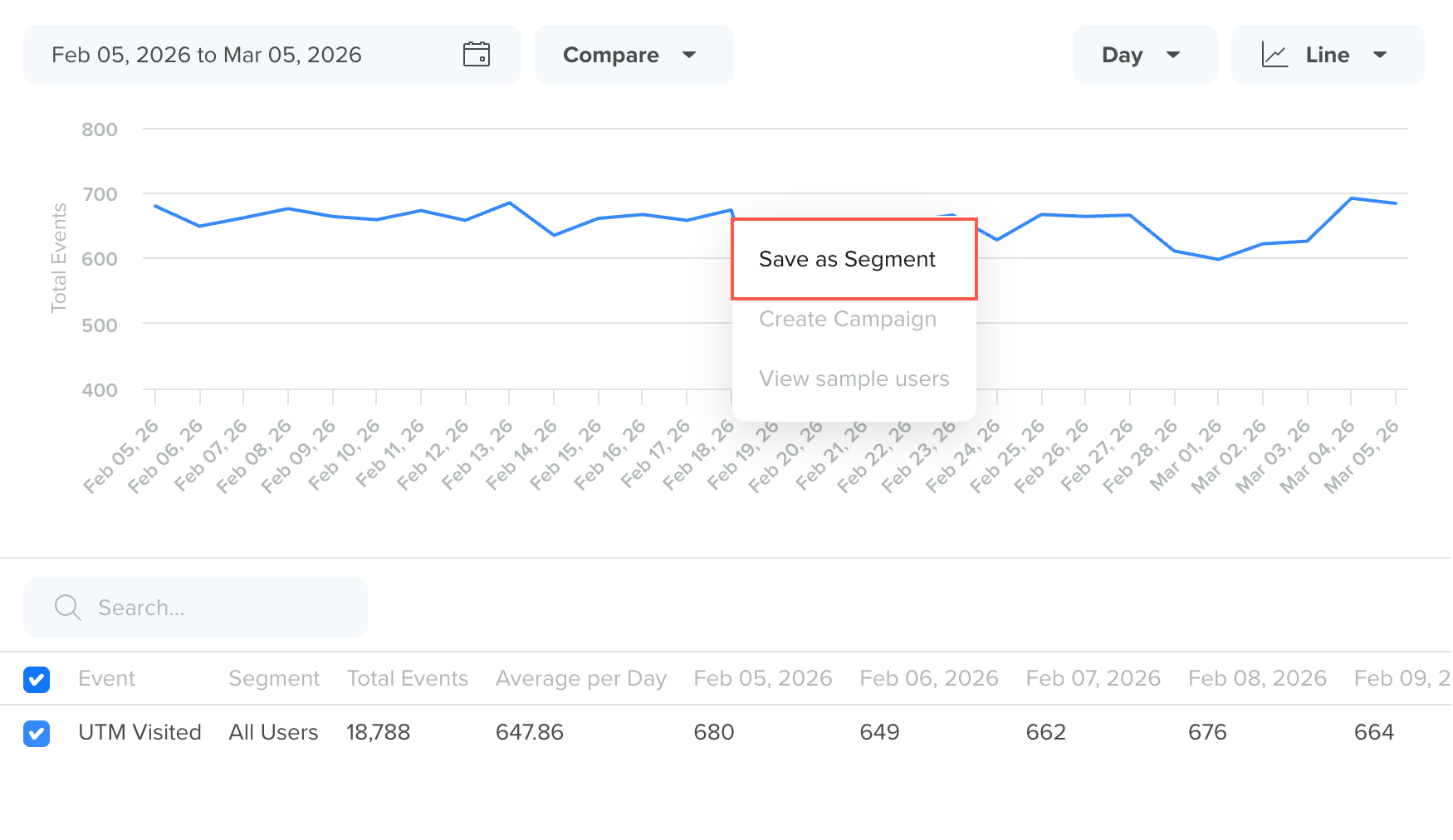
Save as Segment
You can then:
- Review the automatically generated segment query
- Modify the conditions or add additional filters
- Save the segment for future analysis or campaign targeting
This feature is useful when you want to:
- Identify users responsible for spikes or drops in a trend
- Retarget users who performed a specific event within a time window
- Build campaigns based on behavioral insights discovered in the trend analysis
Once save a segment from Trend Analysis, it becomes available across the CleverTap dashboard and can be used in campaign targeting, analytics, segmentation, and other product features.
Add to Board
You can add a Trends analysis to a Board to monitor it alongside other saved analyses.
To add a trend to a board:
- Click Add to Board from the top-right corner of the dashboard after generating the trend analysis.
- Enter the Trend Analysis name in Chart name and select an existing board or create a new one.
- Click Add to board.
Add a Trend Analysis to the Board
Use boards when you want to:
- Track the same trend regularly
- Combine Trends with Funnels, Flows, Cohorts, or Pivots
- Share a monitoring dashboard with your team
Bookmark a Trend Analysis
You can bookmark any Trend analysis to quickly revisit it later. Bookmarks are user-specific, meaning only the logged-in user can view their saved bookmarks on the CleverTap dashboard. You can save up to 50 bookmarks.
Bookmarks are especially useful for tracking frequently accessed trends. For example, if you regularly monitor a trend such as Charged split by Payment Method, bookmarking it lets you instantly return to the same setup without recreating the analysis each time.
To bookmark a Trend:
- Click Bookmark in the top-right corner of the dashboard after generating the trend analysis.
- Enter a descriptive name to help you identify the analysis later.
- Click Bookmark.
Bookmark a Trend Analysis
NoteYou can save up to 50 bookmarks and access all your saved bookmarks from the bookmark list under the Trends section.
Export Trend Analysis
You can export the generated trend analysis for reporting or offline analysis.
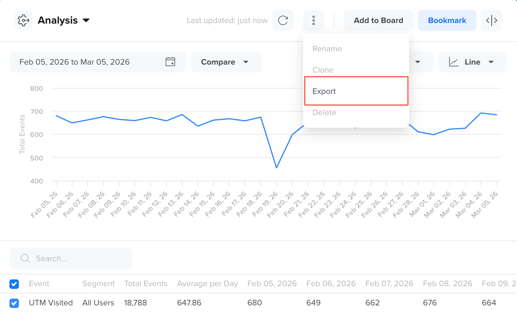
Export a Trend Analysis
Depending on the selected view, Trends supports export options such as:
- PNG image
- PDF document
- CSV file
Use exports when you want to:
- Share the chart in presentations or documents
- Download the raw tabular values for further analysis
- Archive analysis snapshots for reporting