Push Editor
Learn how to design and customize push notifications using pre-built templates from the CleverTap dashboard.
Overview
The Push Editor allows you to create and edit relevant and timely messages for your push campaign. This section explains the different pre-built Push templates designed to cater to your various push-campaigning needs. You can create your push message by selecting the appropriate push template for your campaign.
Public BetaThis feature is released in Public Beta. For more information about this feature, contact your Customer Success Manager or CleverTap Support.
From the What section, select the Message Type for your push notification and click Go To Editor. You can see the various push templates to help you create a contextual and timely message.
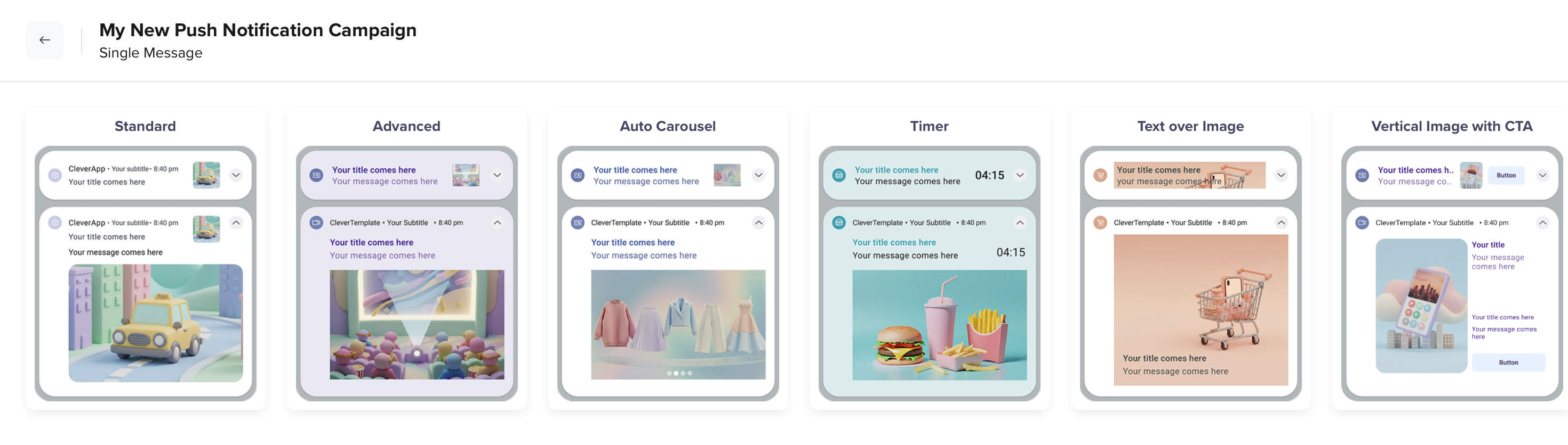
Push Templates
Push Templates
The Push Editor in CleverTap allows you to design and edit impactful push notifications directly from the dashboard. It does not require developer support or SDK updates. It offers a range of pre-built templates tailored for various campaign goals, making it easier to craft relevant, timely, and engaging messages.
You can select from the following template types:
Note
For minimum SDK version requirements and prerequisites, refer to Android Push Templates and iOS Rich Push Notifications.
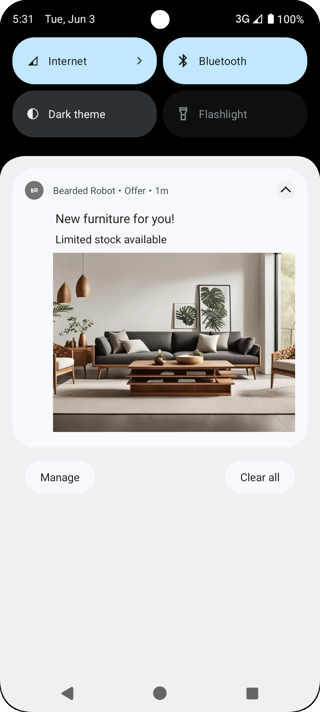
Standard
Supports simple layout with title, message, image, and optional buttons, ideal for quick, informative alerts. For example, a home decor business might want to inform customers that new furniture with limited stock is available. You can add GIFs to your message content using the Standard Template.
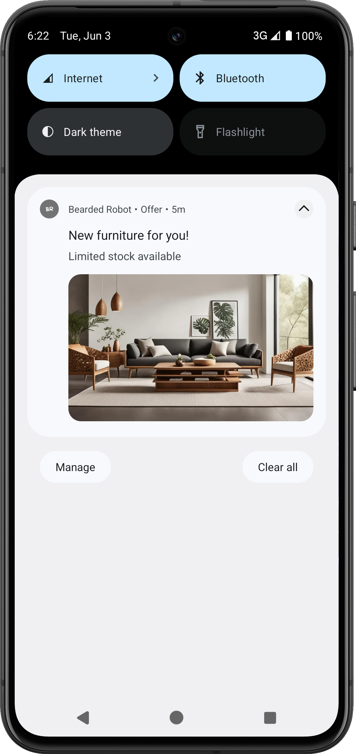
Standard Template
Advanced
Supports rich media, deep links, and enhanced customization for more engaging messages. It is great for interactive, visually appealing messages. For example, businesses can use it to build excitement for new product drops, early access offers, or feature rollouts that benefit from strong visuals and clear Call to Action (CTAs).
Advanced Template
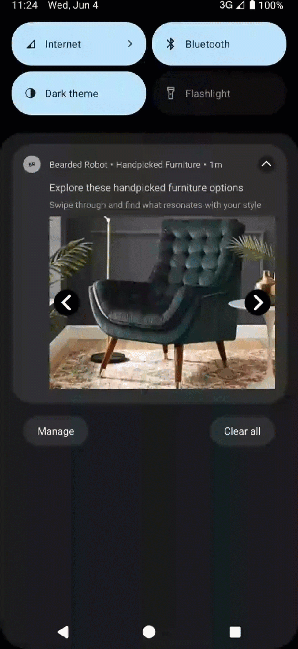
Auto Carousel
Allows multiple images with titles and links that users can swipe through, perfect for showcasing multiple offerings in one message. Businesses can use it to promote new product collections, travel packages, content recommendations, and so on. For example, an interiors business can send a notification with multiple images showing their handpicked furniture options.
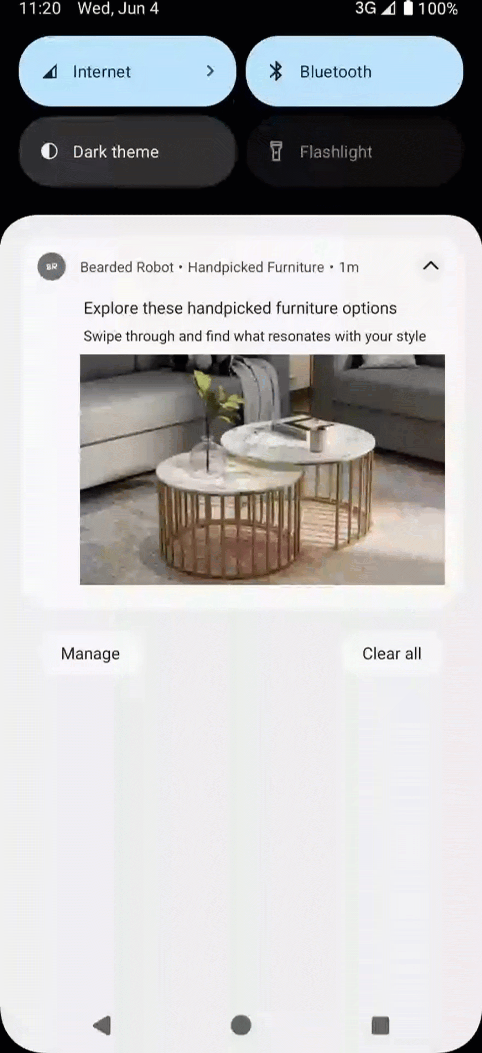
Auto Carousel Template
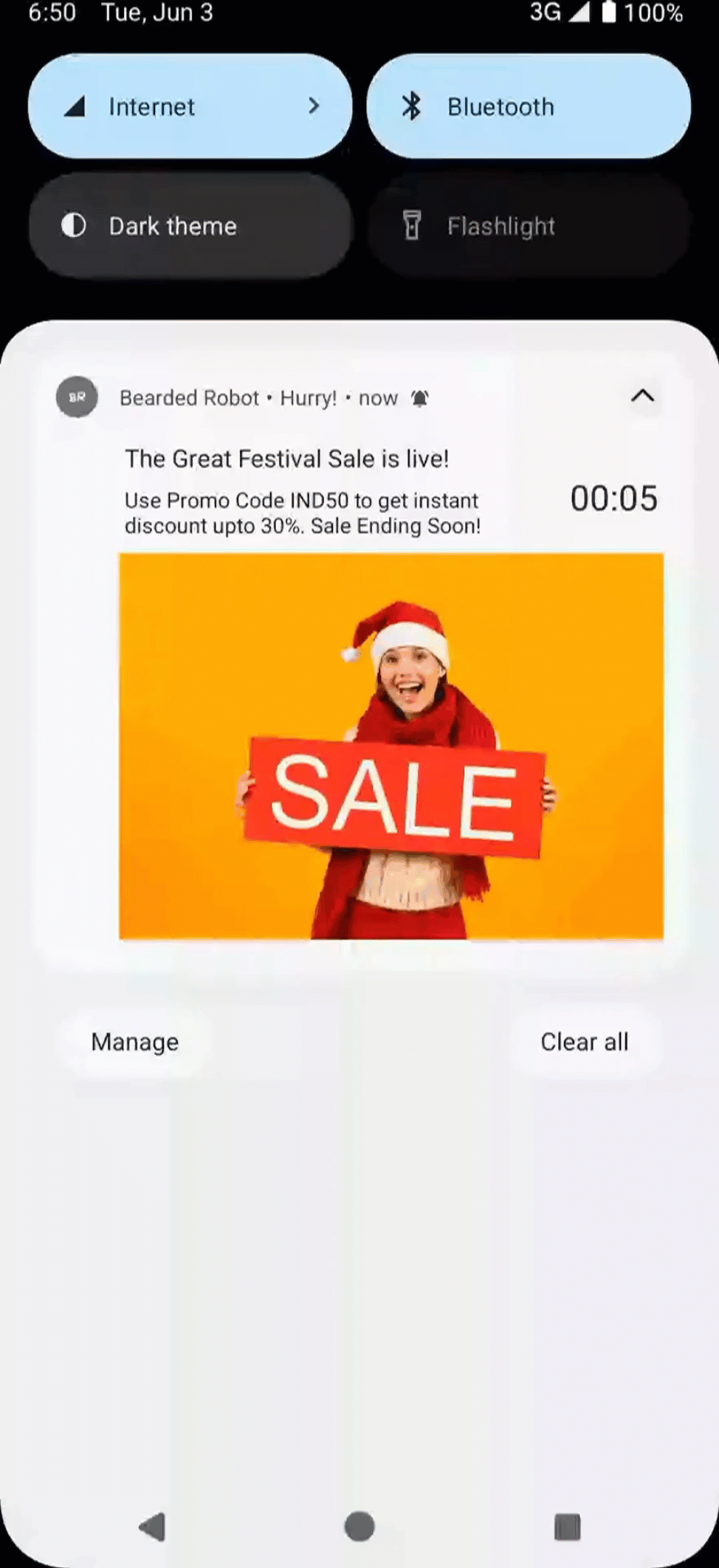
Timer
This template has a countdown timer to enable immediate action from the user. It is ideal for time-sensitive campaigns. For example, businesses can use it for flash sales, limited-time discounts, and so on. This template offers both expanded and collapsed views for Android devices, while iOS supports only the expanded view. Additionally, it includes optional text fields to enhance layouts, as well as a customizable call-to-action (CTA) button with various style options.
Timer Template
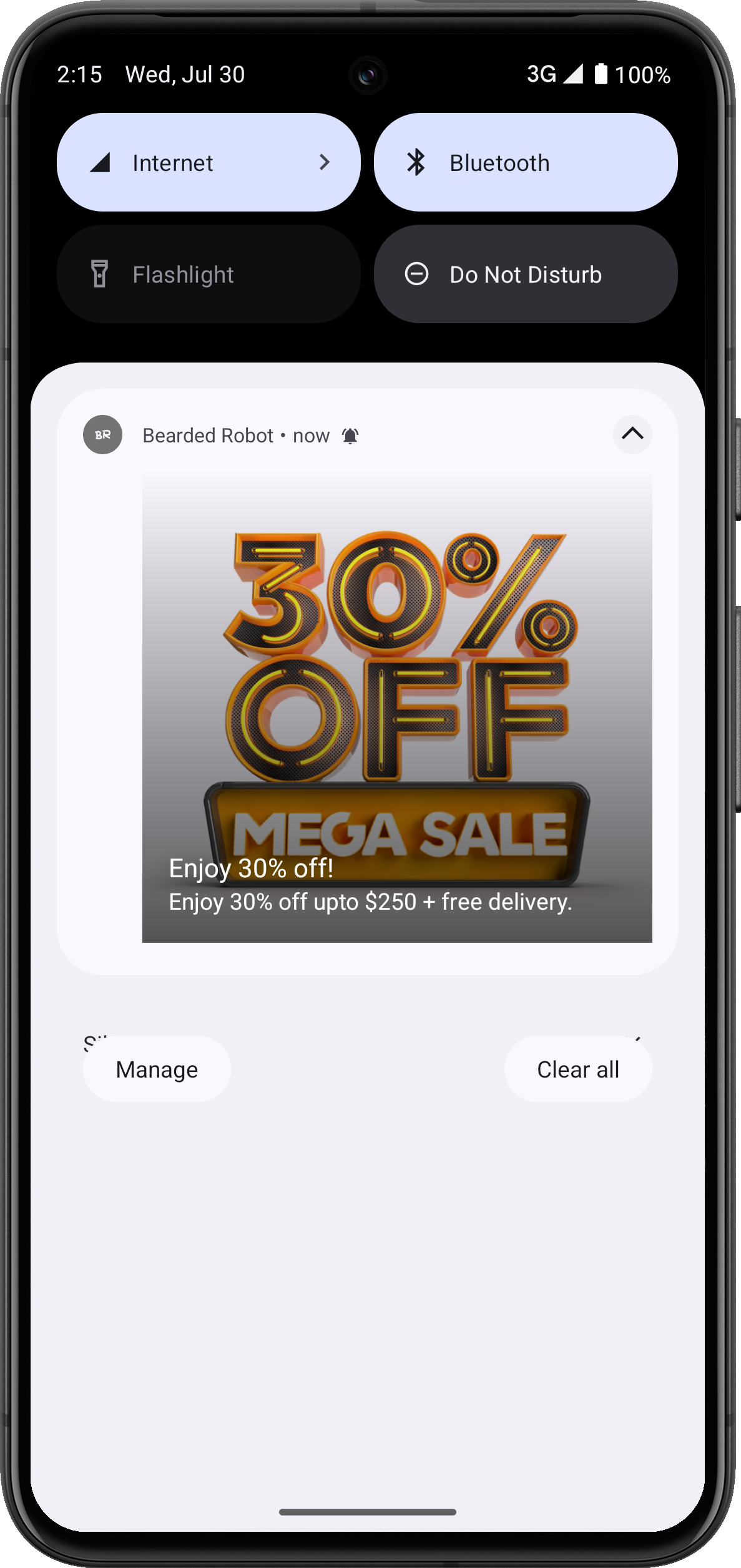
Text over Image
This template supports a bold text over a background image to deliver visually striking messages. For example, businesses can use it to highlight seasonal campaigns, special announcements, event invitations, and so on. This template provides both expanded and collapsed views for Android devices, while iOS only supports the expanded view. It also features optional text fields for improved layouts and includes a customizable call-to-action (CTA) button, offering various style options.
Text over Image Push Template
Collapsed Media Support (Large Icon and Collapsed Image)
The Text over Image push template supports flexible media configurations for the collapsed view. You can use the same image for both expanded and collapsed views, use a different image for the collapsed view, or add a large icon as required. This enables multiple presentation styles depending on your campaign needs.
You can configure the collapsed and expanded views in the following ways:
- Use the same image for both collapsed and expanded views.
- Use a different image for the collapsed view.
- Use an image in expanded view only, with no media in collapsed view.
- Use a large icon in the collapsed view.
- Use a large icon along with an expanded/collapsed image in the collapsed view (supported in SDK PushTemplates
v2.3.0and above).
The image ratio for collapsed and expanded state is 4:1.
The large icon is shown only in the collapsed view. It appears right-aligned next to the notification title and message for SDK PushTemplates v2.3.0 and above, and left-aligned for earlier SDK versions. Refer to the following image for a dashboard preview.
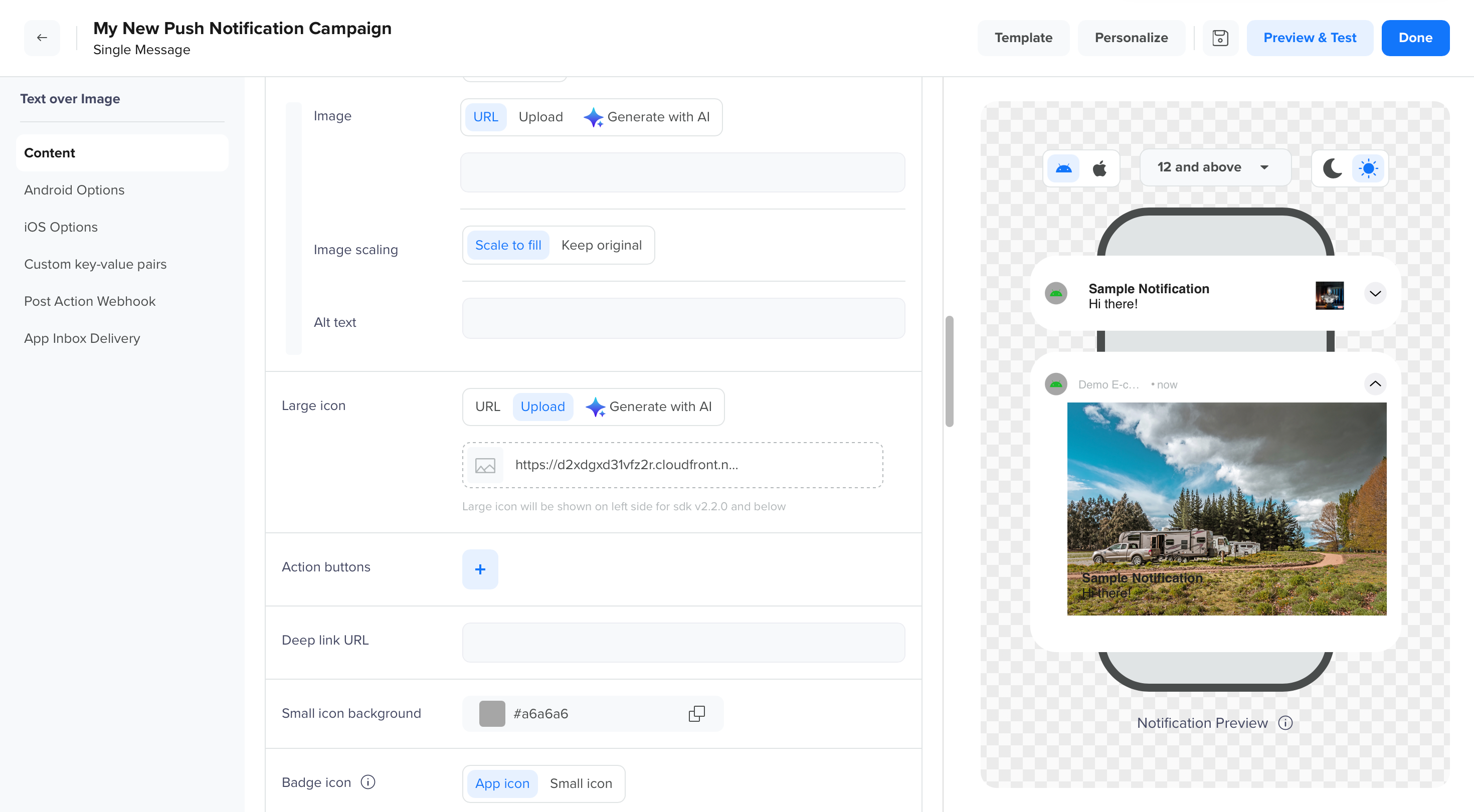
Large Icon Right-aligned to the Notification
Configure Expanded and Collapsed Media
To configure expanded and collapsed push notifications media:
- Go to Campaigns.
- Create or edit a Push Notification campaign.
- Select the Text over Image template.
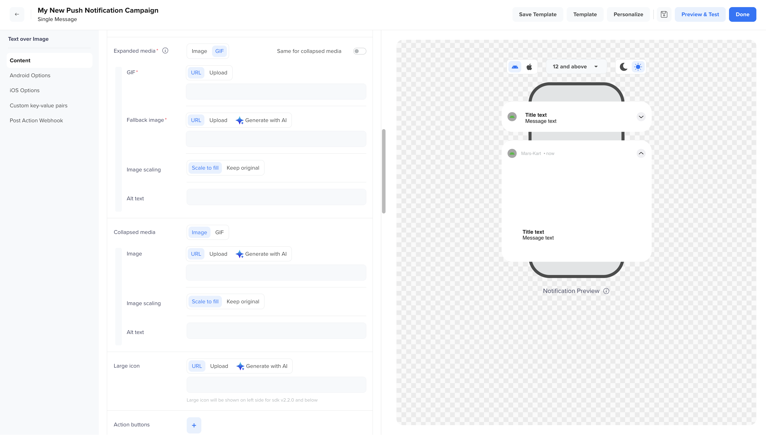
Push Editor
- To add an image or GIF for the expanded view, click Upload, paste the image URL in Expanded Media, or click Generate with AI to generate a new image.
- Toggle Same for collapsed media to use the same media for both collapsed and expanded views.
- To add a different image or GIF for the collapsed view, click Upload, paste the image URL in Collapsed Media, or click Generate with AI.
- Upload the icon image from the Large Icon section, or click Generate with AI.
- Preview and save your changes.
Collapsed View Behavior Across SDK Versions
For SDK versions below PushTemplates v2.3.0, the collapsed view supports only one visual element at a time. Depending on your setup, the notification can render in one of the following ways:
- Collapsed Image + Text
- Expanded Image + Text
- Large Icon + Text
- Text only
Manual Carousel Template
Manual Carousel is an interactive push notification format that lets users scroll through a series of cards or slides at their own pace. Each card can display rich content like images, headlines, brief descriptions, and a call-to-action (CTA). Users navigate between cards manually using swipe gestures or navigation arrows.
If only a single image is available for download, this template falls back to the Basic Template.
Manual Carousel Template
Push Campaign Setup
After you select the required push template for the Title and Message fields, you can use the following options to create personalized and engaging campaigns:
- Text color to change the color of your text.
- Emoticons (
 ) to create more engaging and visually appealing messages that can more effectively capture the audience's attention than plain text. Emojis, unlike simple emoticons, can be more complex and take up varying amounts of space in text.
 - @ personalization or to create more personalized or captivating messages. Enter the required details to create the message.
- Liquid scripts to check the usage.
- Clever AI, the AI-powered writing assistant that can also analyze and adjust the emotional tone of your content. It helps generate attractive and emotionally relevant messages for your campaign.
Based on the selected template, the editor displays configurable fields grouped by functionality as follows:
- Content
- Android Options
- iOS Options
- Custom Key-Value Pairs
- Post Action Webhook
- App Inbox
- Notification Priority
- Collapse Key
- Interruption Level
- Template Variations
- Dark Mode
- Image Scaling
- Notification Behavior
- Dismiss Notification
Content
This section includes the core elements of your push notification, applicable across platforms:
| Field | Description | Required/Optional | Available for Template |
|---|---|---|---|
| Title | The main headline of your notification should be concise and attention-grabbing, defining the exact purpose of your campaign. | Required | All |
| Message | The body text of your notification. The message should clearly convey the purpose of your campaign. | Required | All |
| Background Color | Defines the background color of your push notification. You can use it to match your brand theme or draw visual attention to the notification. It accepts HEX codes or color pickers. | Basic, Auto Carousel, Text over Image | |
| Timer Duration | Sets the countdown duration (in seconds, minutes, or hours) that appears in the push notification. Helps create urgency by indicating how much time is left before an offer expires. The following two options are available: | Required | Timer |
| Timer Text Color | Allows you to customize the color of the timer text using a HEX code. This ensures the timer stands out or aligns with your brand colors. | Optional | Timer |
| Expiry Title | The fallback title that appears when the timer has expired. This helps you communicate a follow-up message or next action. | Optional | Timer |
| Expiry Message | The message body displayed after the timer expires. You can use this to soften the missed opportunity or redirect the user elsewhere. | Optional | Timer |
| Expiry Img | An image that replaces the original notification image after the timer expires. Helps reinforce the expiry visually | Optional | Timer |
You can configure the title, message, subtitle, and so on for your notification.
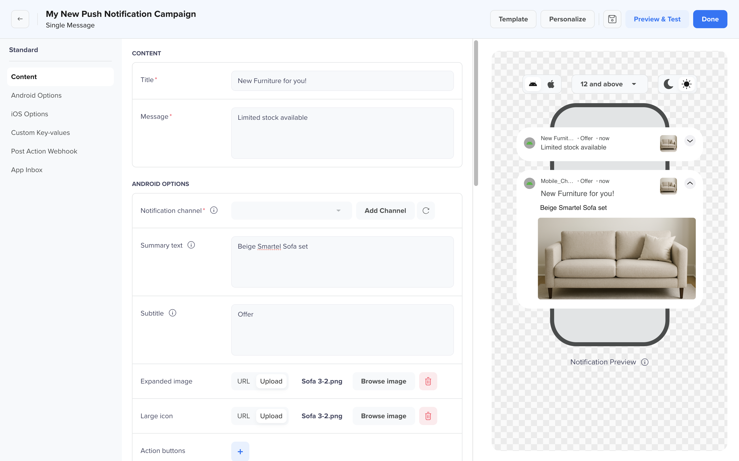
Content Section
Recommended Character LimitsWhile there are no enforced character limits for push notifications, following these best practices ensures your message is displayed seamlessly across devices, thus preventing the title from trimming. The recommended character limits are as follows:
Platform Recommended Title Length Recommended Message Length iOS 25-50 characters 150 characters Android 65 characters 240 character
Android Options
You can use this section to customize Android-specific behavior for your push using the following fields:
| Field | Description | Required/Optional | Available for Template |
|---|---|---|---|
| Notification Channel | Starting from Android version 8.0, all notifications must be assigned to a channel. For each channel, you can customize the visual and auditory behavior. Select the Android notification channel that defines the sound and visual behavior of your notification. | Required | All |
| Summary Text | Summary shown when notifications are grouped or collapsed (especially on Android 7.0 and above). It provides a quick overview of the message content. | Required | All |
| Subtitle | An optional line of text that appears next ti the app name and provides additional context for the message. | Optional | All |
| Expanded Image | A larger image displayed when the user expands the notification. Supports image URL or upload. You can add a fixed or dynamically generated URL to include rich media in your push notifications—images for Android, and both images and videos for iOS. | Optional | All |
| Collapsed Image | An image displayed in the collapsed view of the notification. You can use the same image as the expanded view or provide a separate image. Supports image URL or upload. This allows flexibility in how the notification appears in its compact state. | Optional | All |
| Large Icon | A small icon displayed on the left of the notification, usually used for logos or symbols. Supports image URL or upload. | Optional | All |
| Action Buttons | Add up to two buttons that users can click to take immediate action (for example, Shop Now, View Cart, and so on). | Optional | All |
| Deeplink URL | A link that navigates users to a specific screen inside the app when the notification or button is clicked. The OpenURL method for your app is called with the deep link specified here. If you want to use external URLs, you have to whitelist the IPs or provide HTTP/https before the URL so the SDK can handle them properly. | Optional | All |
| Small Icon Background | HEX color code for the background behind the small icon, matching your brand palette. | Optional | All |
| Badge icon | Choose whether to show the app icon or a notification-specific icon on the status bar. | Optional | All |
| Badge ID | Custom badge ID used for badge counts or grouping, based on app-specific logic. | Optional | All |
| Sound | Defines the notification sound. Choose from the following options: None, Default OS, or Custom sound. | Optional | All |
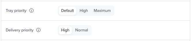
| Tray priority | Determines the prominence of the notification in the tray. Choose from the following options: Default, High, or Maximum. For more information, refer to . | Optional | All |
| Delivery priority | Controls how quickly the push is delivered. Choose from the following options: High or Maximum. Selecting High ensures faster delivery but may shorten battery life. For more information, refer to | Optional | All |
| Render max | Ensures standard rendering on battery-optimized devices. Also, disables custom key values and certain visuals. For more information, refer to RenderMax. | Optional | All |
| Silent Delivery | Choose whether to mute the push notification when the user is currently using the app (app in foreground).
| Optional | All |
| Notification behavior | Defines how the notification behaves when users clear all notifications from their tray. Use this option to keep important alerts accessible even after bulk dismissal. For more information, refer to Notification Behavior. | Optional | All |
| Dismiss notification | Specifies how and when a notification is dismissed. Use this option for time-sensitive messages such as flash sales, daily updates, or event reminders. For more information, refer to Dismiss Notification. | Optional | All |
iOS Options
You can use this section to customize Apple-specific behavior for your push using the following fields:
| Field | Description | Required/Optional | Available for Template |
|---|---|---|---|
| Rich Media | Add a fixed or dynamically generated media URL to enrich push notifications. It supports images for Android and both images and videos for iOS. It is useful for visually engaging promotions or announcements. | Optional | All |
| Deep Link URL | A clickable URL that takes the user to a specific screen or section within your app. Supports deep linking for seamless In-App navigation. | Optional | All |
| Sound | Specifies the custom sound file to be played when the notification arrives. The sound file must be included in your iOS app bundle. Supported formats: .aiff, .caf, and .wav. | Optional | All |
| Badge Count | Updates the app icon badge number to the specified value. Setting it to 0 hides the badge. This must be manually managed at the application level, as it does not auto-increment. | Optional | All |
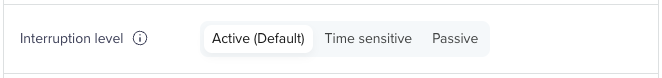
| Interruption Level | Defines the priority and delivery timing of notifications on iOS 15 and above. The following are the three levels: | Optional | All |
| Relevance Score | Determines the importance of a notification when grouped in the iOS notification summary. Marketers can now set up the Relevance Score for every notification when creating a Push campaign. This directly impacts the order of notifications when grouped. The score ranges from0 (lowest) to 1 (highest). Notifications with higher scores take precedence. This feature was introduced in iOS 15 and later versions. | Optional | All |
| Category | Specifies a registered iOS category that groups notifications by type and defines custom actions (for example, buttons). Categories must be pre-registered in the app. Each category can support up to four actions. | Optional | All |
| Mutable Content | Sends the mutable-content flag with the payload, allowing your app’s service extension to modify the push content before it is displayed (for example, attach media, customize text). For more info, refer to Apple’s documentation on Modifying Content in Newly Delivered Notifications. | Optional | All |
Custom Key-Values
Use this section to send additional data in the form of key-value pairs as part of your push notification payload. Your mobile app can use these values to trigger specific in-app behaviors or business logic already configured in your app code.
You can define key-value pairs for:
- All platforms
- iOS only
- Android only
Each pair consists of:
- Key: A unique identifier (for example, discountType)
- Value: The corresponding value the app will read (for example, 20)
Consider an example where you are running a push campaign offering a 20% discount. By adding a custom key-value pair such as offerType: discount20, your app can read this payload and automatically route the user to a discount page upon tapping the notification.
You can add multiple pairs using the Add pair button to support different logic across platforms or campaigns.
Post Action Webhook
Use this section to send a payload to your designated endpoint after a push notification is delivered.
| Field | Description | Required/Optional | Available for Template |
|---|---|---|---|
| Webhook URL | A server endpoint you want to call when the push is clicked. | Required | All |
| Method | HTTP method to use (GET, POST, and so on) | Required | All |
| Payload | Optional data to include in the request (JSON format supported). | Required | All |
App Inbox
Use this section to also save the notification in the App Inbox so users can revisit it later.
| Field | Description | Required/Optional | Available for Template |
|---|---|---|---|
| Title Color | Sets the color of the message title in the inbox card. Accepts HEX codes (for example, #FFFFFF). | Optional | All |
| Message Color | Defines the color of the message body text shown in the inbox. Accepts HEX codes. | Optional | All |
| Background Color | Specifies the background color of the App Inbox notification. Use brand-consistent colors for better visual appeal. | Optional | All |
| Filter Tags | Tags that help categorize and filter App Inbox messages within your app (for example, promotions, reminders). | Optional | All |
Notification Priority
You can set these priority levels from the CleverTap dashboard as you create your Android push campaigns.
Notification Priority
Have your app running our latest SDK (versions v3.1.4 or higher) and follow the steps outlined above to send actionable push notifications and set notification priority on Android devices.
Notification Tray Priority
On Android, you can also set a priority level for each notification to influence how prominently it is displayed. The higher priority items are more noticeable.
Select any of the following options from the Notification tray priority.
- Default Priority: Use for most of your messages that are not time-sensitive, such as general notifications and promotional offers.
- High Priority: Use for important communications that require extra attention, such as chat messages. These will also display as heads-up notifications and be given a higher priority in the user’s tray. Heads up notifications are notifications that pop up on your screen from the top even when you are using other apps. For example, receive a message on your chat app when you’re using the food delivery app. This feature is available for Android N (API 25) and below. For Android Oreo and above, define the priority in the Notification Channel.
- Maximum Priority: Use for urgent, time-sensitive notifications. These notifications will get higher placement inside the user’s tray and display as heads-up notifications.
Notification Delivery Priority
You can assign delivery priority on Android for Push notifications as follows:
- Normal: The data messages with normal priority are delivered immediately when the device is active. However, if the device is inactive to conserve battery, the delivery may be delayed until the device becomes active again. You must set the priority as Normal for less time-sensitive messages (such as notifications of new emails, keeping your UI in sync, or syncing app data in the background).
- High: The messages with high priority are delivered immediately, even if the device is asleep. It wakes the device and allows limited processing (including minimal network use) to ensure the message is received. These messages are meant to provoke user action or response to your app or its notifications. You must set the priority as High for time-sensitive or user-visible content. CleverTap recommends setting the notification priority as High to ensure the time-sensitive content is rendered immediately on end-user devices. If FCM detects a pattern in which messages do not result in user-facing notifications, the messages are deprioritized to normal priority.
The value for this field is set to High by default.
Notification Priority for Cloned CampaignsCloned campaigns retain the priority setting from the original campaign.
Collapse Key
To replace an existing notification with the same collapse key, you can use the collapse notification option. For example, if push X and push Y have a collapse key A. Push X notification is present on the mobile device when push Y notification is received. The push X notification will no longer be visible (it is collapsed), and push Y is displayed. The collapse key must be added under the collapse notification field. For more information, see Collapse Key.
Interruption Level
In iOS versions earlier than 15, users could choose to silence all calls and notifications by enabling Do Not Disturb mode. Starting in iOS 15, users can hone their notification preferences to fit different contexts by setting Work, Sleep, and Personal notification modes. With iOS 15, Apple introduced four interruption levels, including time-sensitive and critical notifications, to ensure urgent alerts, like weather emergencies, reach users effectively.
These interruption levels determine the priority and delivery timing of notifications, allowing users to be in control of their device notifications. The interruption levels are designed to cater to different scenarios while respecting user preferences and focus modes. Here are the three interruption levels:
Set up Interruption Level
Active (Default)
- Behavior: Active notifications replicate the existing notification behavior. Upon delivery, they trigger audible sounds and vibrations and illuminate the screen.
- Focus Mode Compatibility: Active notifications do not break through Focus modes, ensuring that the user's selected focus settings remain undisturbed.
- Purpose: Use this interruption level for notifications that require immediate attention and engagement.
Time Sensitive
- Behavior: Time-sensitive notifications share similarities with active notifications. However, they are accompanied by a distinctive yellow banner, making them visually recognizable as urgent.
- Focus Mode Compatibility: These notifications can break through both scheduled delivery times and active Focus modes.
- Purpose: Reserve the Time Sensitive interruption level for notifications demanding immediate user action. Their unique appearance aids users in identifying critical messages quickly.
Passive
- Behavior: Passive notifications are designed for non-urgent matters. They arrive discreetly without generating sounds or vibrations.
- Focus Mode Compatibility: Passive notifications are considerate of users' Focus modes and do not disrupt them.
- Purpose: Employ the Passive interruption level for notifications that do not require instant attention, minimizing distractions while keeping users informed.
Critical Interruption LevelCurrently, this Interruption level is not availabe in CleverTap dashboard. We recommend contacting your Customer Success Manager and sharing your use case if you want to send the campaign from the dashboard with Interruption level set as Critical.
Template Variations
Users can preview and render different variations of outputs for each Push template type based on the following factors:
- Version-based Rendition- Notifications render differently for Android version 12 and above and version 11 and below. Key considerations include the following:
- Android 13 and above: Use images no larger than 450x450 px for optimal rendering.
- Android 12 and above: Center-align any text within images is centered for to ensure better visibility.
- Android 11 and 12: Use image file size below 100 KB to prevent rendering issues.
- Android 11 and below: Use images of under 3 MB or lower is recommended for better to maintain optimal performance.
- CTA-based Rendition - Notification renders based on whether CTA buttons are included in the payload.
Dark Mode
Push templates automatically adapt to the device's theme settings, rendering notifications in dark or light mode.
| Theme Setting | Notification Appearance | Sample Output |
|---|---|---|
| Dark mode enabled | Notification renders with a dark background | 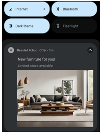 |
| Dark mode disabled | Notification renders with a light background. | 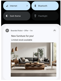 |
Custom Color SupportTemplates support custom color definitions that adapt to both themes for visual consistency.
Image Scaling
Android supports various image scaling options to control how images appear in push notifications. CleverTap optimizes image rendering to maintain visual consistency across devices while leveraging Android native scaling behavior. To handle scaling in a Push template, you must add the key pt_scale_type key and the value is set as fit_center or center_crop based on the requirement.
The following table lists the different scaling settings in Push templates:
| Image Scaling Type | Description | Sample Output |
|---|---|---|
| Keep Original | Applies to all expanded images in Android push templates. The image is scaled proportionally (maintaining the aspect ratio) to ensure that both its width and height fit within the boundaries of the image container. This ensures the entire image is visible without any cropping. | 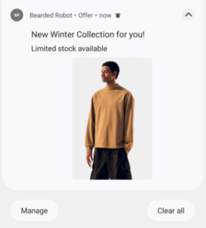 |
| Scale to Fill | Applies to all expanded images in all Android push templates. The image is resized uniformly while preserving the aspect ratio. If necessary, it is scaled down, so that both width and height fit within the image container. This ensures the full image is displayed without any part being cropped. | 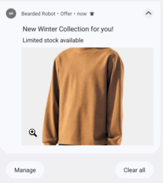 |
Notification Behavior
This option defines how a notification behaves when users clear their notification tray. It determines whether a notification remains visible or gets removed when a bulk dismissal action is performed. It is available only for Android 14 and above, Android SDK v7.6.0, and Push Templates SDK v2.2.0 and above.
The following are the available options:
- Regular: Notifications are cleared when the user dismisses their notification tray or when an automatic dismissal is triggered. This behavior is ideal for general messages or messages that do not require persistent visibility.
- Sticky: On Android 14 and above, notifications remain in the tray even after the user performs a bulk dismissal, ensuring that important alerts such as critical system messages or high-priority updates stay visible until the user explicitly clears them. Use the Sticky option to keep important alerts accessible and prevent accidental dismissal.
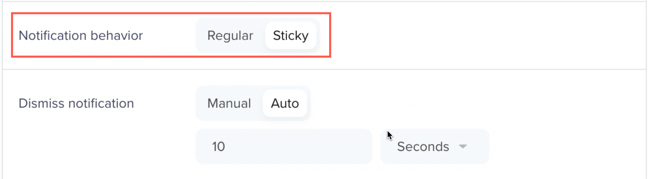
Notification Behavior
Dismiss Notification
This option determines how and when a notification is dismissed from the notification tray. It helps control the duration and visibility of messages, making it useful for time-sensitive messages such as flash sales, daily updates, or event reminders. It is available only for Android OS and is supported for Android SDK v7.6.0 and Push Templates SDK v2.2.0 and above.
The following are the available options:
- Manual: The notification stays in the tray until the user manually removes it. This option is ideal for important messages that must remain visible until acknowledged by the user.
- Auto: The notification is automatically dismissed after a specified duration, up to a maximum of 24 hours. This option works well for temporary or time-bound alerts that do not require user interaction.
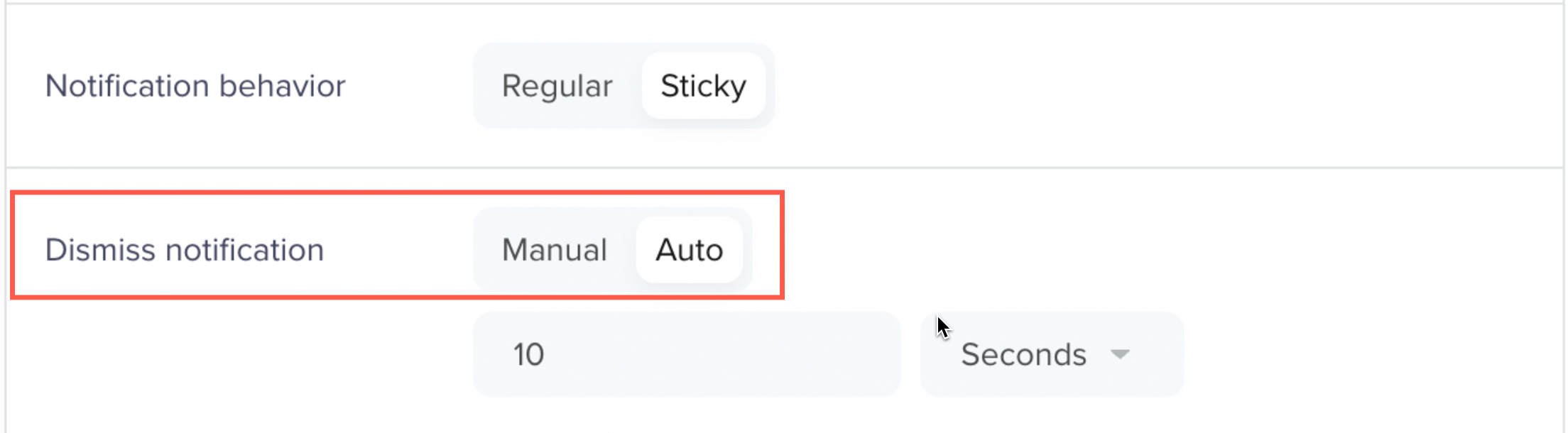
Dismiss Notification
Updated about 1 month ago