Cohorts 2.0
Understand how user behavior evolves over time by grouping users into cohorts and analyzing retention, frequency, and re-engagement patterns.
Overview
Cohorts help you understand how groups of users behave over time after performing a specific action. By organizing users into time-based cohorts and tracking their return behavior, Cohorts enables you to analyze retention, frequency, and re-engagement patterns across days, weeks, or months.
A cohort analysis helps answer questions such as:
- How many users return after their first app launch?
- How frequently do users re-engage after completing a purchase?
- Which acquisition cohorts retain better over time?
- How does retention differ across user segments or regions?
By visualizing user behavior across cohorts, you can identify drop-off points, measure long-term engagement, and optimize retention strategies.
Public BetaThis feature is released in Public Beta. For more information or questions, contact your Customer Success Manager or the CleverTap Support.
Create a Cohort Analysis
To build a cohort analysis, you configure a query in the Query Builder. The Query Builder includes a set of steps that define how cohorts are created, how return behavior is measured, and how results are displayed.
To get started, go to Analytics > Cohorts and configure the following fields:
Select Events
Start a cohort analysis query by selecting the required events. Events define how cohorts are created and how return behavior is measured. These events define the lifecycle stage you want to analyze, from the first action to subsequent engagement.
In a cohort analysis, you select the following two types of events:
Start Event
A Start Event determines when users enter a cohort. Users are grouped into cohorts based on the date on which they perform this event.
For example, common start events include, App Launched, Signed Up, First Purchase, Video Watched and so on.
Start Event
The selected start event determines:
- How cohorts are formed
- The cohort date (Day 0)
- Which users are included in the analysis
Return Event
A Return Event determines what action qualifies as a user returning. The return event can be the same as the start event or a different event, depending on the behavior you want to measure.
Return Event
The selected return event determines:
- What action qualifies as a return
- How user re-engagement is measured
- Which interactions are counted in the retention or frequency calculation
Examples Start and Return Events
For example, the following can be the start and return events in a Cohorts query:
- Start Event:
App Launched→ Return Event:App Launched - Start Event:
Signed Up→ Return Event:App Launched - Start Event:
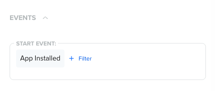
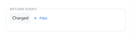
App Installed→ Return Event:Charged - Start Event:
Video Started→ Return Event:Video Watched
Select Segment
Segmenting your cohort analysis helps you compare retention patterns across different user groups. By default, Cohorts analyzes behavior for All Users, but you can restrict the analysis to a specific user segment or create a new segment directly from the Query Builder.
For example, you can:
- Compare retention between New Users and Returning Users
- Analyze retention for Paid vs Free users
- Compare engagement across geographies or acquisition channels
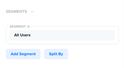
Segments
Add Segments
Use Add Segment to include additional user segments in the same cohort analysis. This allows you to compare retention behavior across multiple segments within a single view.
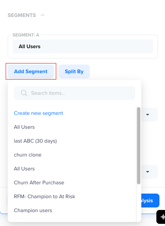
Add Segments
For example, you can:
- Compare retention between New Users and Returning Users
- Analyze retention for Paid vs Free users
- Compare engagement across different acquisition channels
Each added segment appears as a separate row or series in the cohort analysis, making it easy to identify differences in retention patterns.
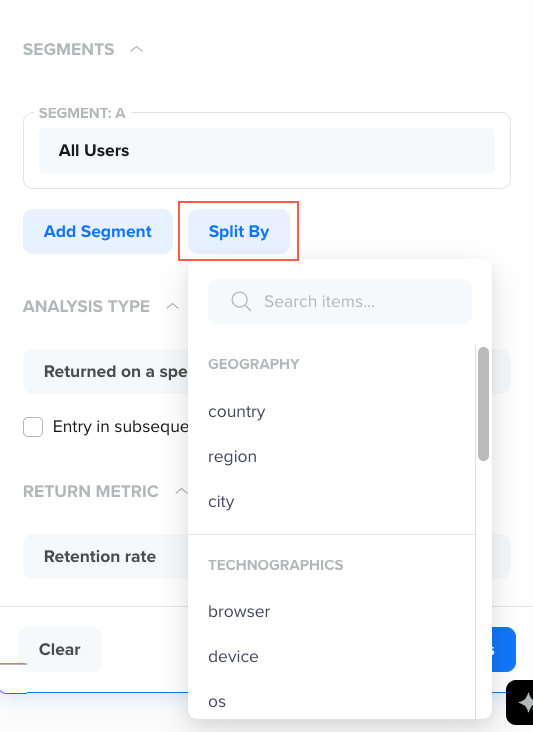
Split By Properties
Use Split By to further break down cohort results by a selected user or event property. For example, you can split a cohort of All Users by Country to compare how retention differs across Regions.
Splitting helps you understand how retention varies within a segment based on attributes such as:
- Geography (for example, country or city)
- Device or OS
- Campaign or source
Split By Properties
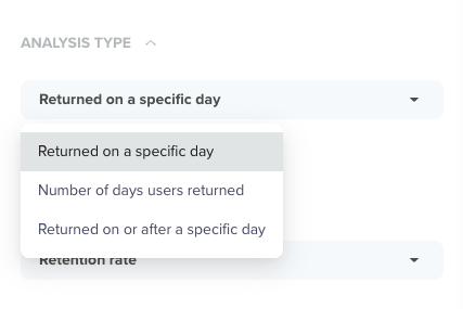
Select Analysis Type
The Analysis Type defines how user return behavior is measured over time after the start event. It determines whether Cohorts tracks exact-day returns, cumulative returns, or return frequency, allowing you to analyze different engagement and retention patterns.
For example, depending on the analysis type you select, you can answer questions such as:
- When do users return for the first time after onboarding?
- How many days do users remain engaged over a period?
- How many users are still active after a certain point in their lifecycle?
Analysis Types
You can choose from the following options:
-
Returned on a Specific Day (N-day Retention): This analysis type counts users who returned on an exact day after the start event. Use this option to understand day-by-day retention behavior, especially during the early lifecycle.
For example, If the start event is App Installed, this analysis shows how many users return exactly on Day 1, Day 3, or Day 7 after installation.
Use this option to answer questions such as:
- How many users returned exactly on Day 3?
- Which cohort has the strongest Day-7 retention?
- On which day do users most commonly return after onboarding?
-
Number of Days User Returned (Power User): This analysis type counts the number of distinct days a user returned after the start event within the selected time range. This view focuses on engagement frequency, rather than when the return happened.
For example, if the start event is Signed Up, this analysis shows how many days users returned within the first 30 days after signup.
Use this option to:
- Measure how frequently users re-engage over time
- Distinguish between one-time returners and highly engaged users
- Understand engagement depth beyond a single return
-
Returned on or After a Specific Day (Unbounded Retention): This analysis type counts users who returned on or after a given day. This view is useful for understanding cumulative retention.
For exmaple, if the start event is App Launched, this analysis shows how many users returned at least once on or after Day 7.
Use this option to:
- Measure long-term retention
- Understand how many users remain active beyond a certain point
- Compare sustained engagement across cohorts
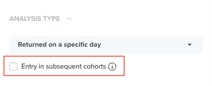
Entry in Subsequent Cohorts
This option modifies the selected analysis type to track whether users from one cohort reappear in later cohorts based on the start event. This option is especially useful for analyzing reactivation and lifecycle movement, such as users returning after periods of inactivity or responding to re-engagement campaigns.
This option works in combination with the selected analysis type and changes how return behavior is interpreted as follows:
- With Returned on a Specific Day: It tracks users who re-enter in later cohorts on an exact day after their original start event.
- With Returned on or After a Specific Day: It tracks users who reappear in later cohorts at any point on or after the specified day.
- With Number of Days User Returned: It tracks how frequently users re-enter across multiple cohorts over time.
Entry in Subsequent Cohorts Checkbox
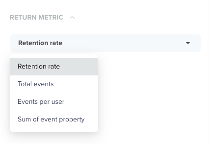
Select Return Metric
The Return Metric defines how return behavior is measured and displayed in the cohort analysis. Choose a metric based on whether you want to analyze retention, frequency, or value-based re-engagement.
Return Metrics
Available return metrics include:
- Retention Rate: Measures the ratio of returning users to the total number of users in the cohort, highlighting retention strength over time. For exmaple, which signup cohort shows the highest Day-14 retention rate?
- Total Events: Measures the total number of return events performed by users in a cohort. For example, how many times did users from a cohort launch the app in the first 7 days?
- Events per User: Measures the average number of return events performed per returning user. For example, on average, how many sessions does a returning user generate per week?
- Sum of Event Property: Measures the aggregated value of a numeric event property for returning users. For example, what is the total revenue generated by users within 14 days of their first purchase?
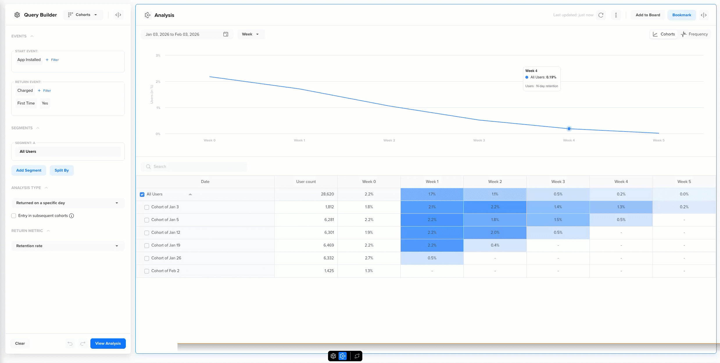
Example Use Case: First Purchase After App Install
An e-commerce app team wants to understand how quickly newly installed users convert into paying customers. Specifically, they want to measure when users make their first purchase after installing the app, and how conversion rates change over time.
This analysis helps the team identify whether users convert early, require longer consideration, or drop off before purchasing.
To answer this question, the team builds the following cohort query:
| Field | Value | Description |
|---|---|---|
| Start Event | App Installed | Defines cohorts based on the day users install the app. Each cohort represents users who installed the app on the same day. |
| Return Event | Charged with filter Frist Time = Yes | Tracks when users make their first-ever purchase after installing the app. Applying the First Time = Yes filter ensures only the initial purchase is counted. |
| Segment | All Users | Analyzes conversion behavior across the entire user base. |
| Analysis Type | Returned on a specific day | Measures the exact day (Day 0, Day 1, Day 2, and so on) on which users complete their first purchase after installation. |
| Return Metric | Retention rate | Shows the percentage of users in each install cohort who make their first purchase on a given day after install. |
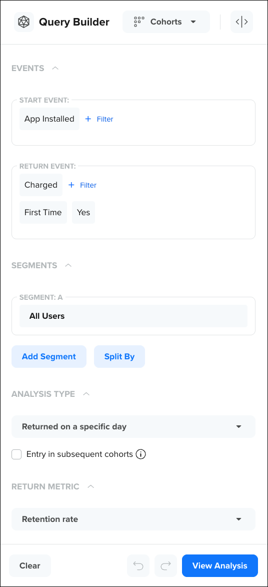
Example Query Builder
This cohort analysis helps the team understand:
- How quickly users convert from install to first purchase
- Whether purchases tend to happen on Day 0, or after multiple days
- The optimal time window to trigger discounts, reminders, or onboarding nudges
- How conversion speed varies when combined with segments or split-by dimensions such as campaign source, platform, or geography
Reading the Cohort Analysis
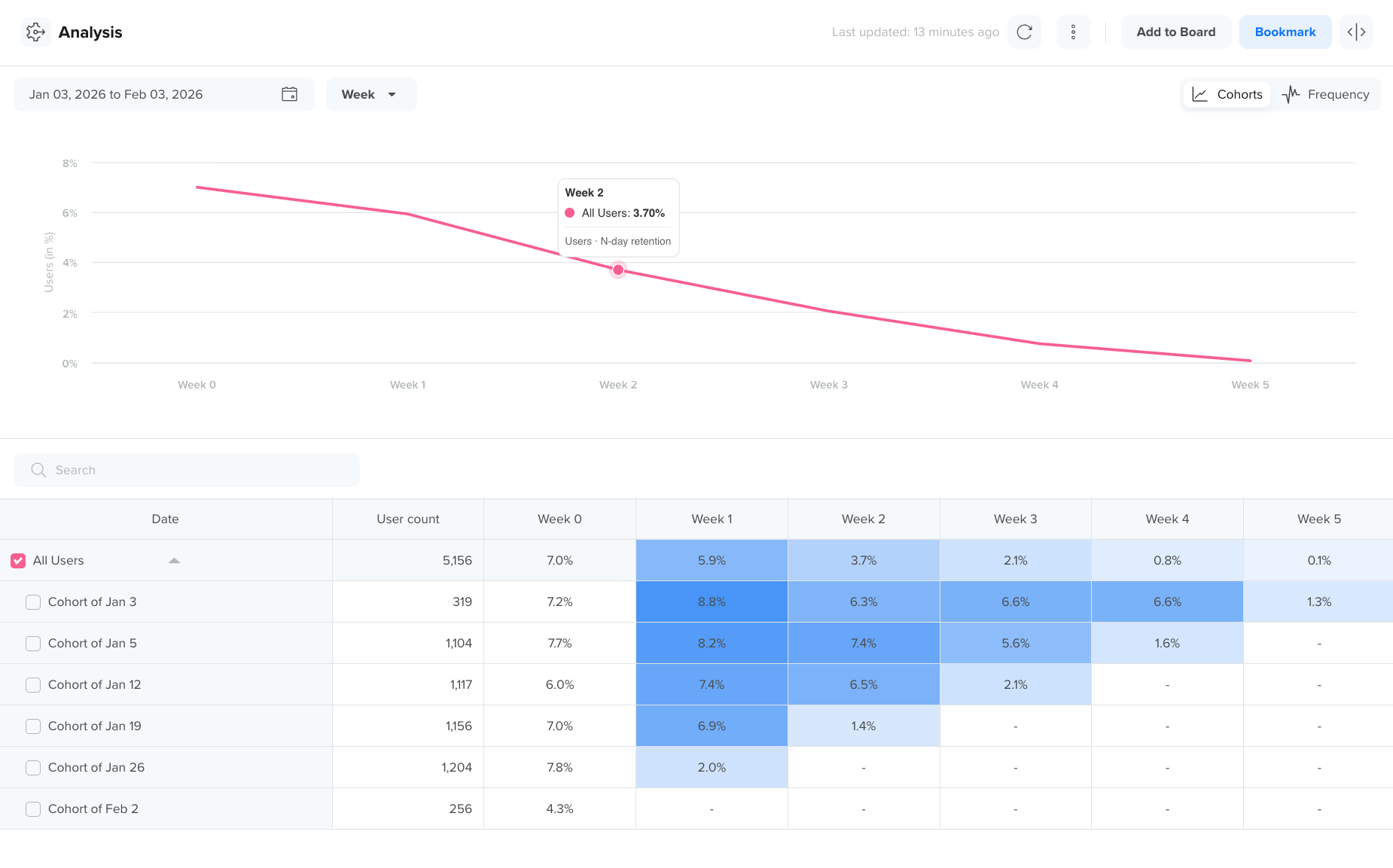
Once you run a cohort query, CleverTap generates a cohort table and supporting visualizations that help you interpret user behavior over time.
The cohort analysis consists of the following visualizations:
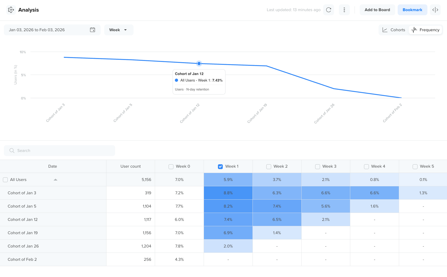
Cohort Table
The table view provides a precise, detailed breakdown of cohort performance over time. Use this view when you need exact values or want to export results.
The cohort table displays users grouped by cohort date (rows) and return periods (columns).
- Each row represents a cohort (for example, users who started on Jan 3)
- Each column represents time since the start event (Week 1, Week 2, Week 3)
- Each cell shows the selected return metric
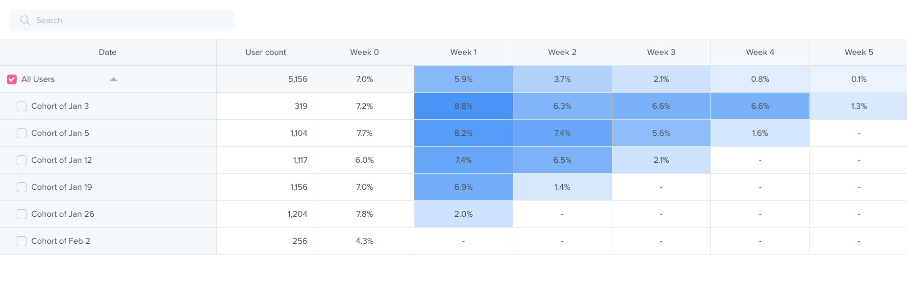
Cohort Table
This structure allows you to:
- Compare retention across cohorts
- Identify decay patterns
- Spot high-performing or underperforming cohorts
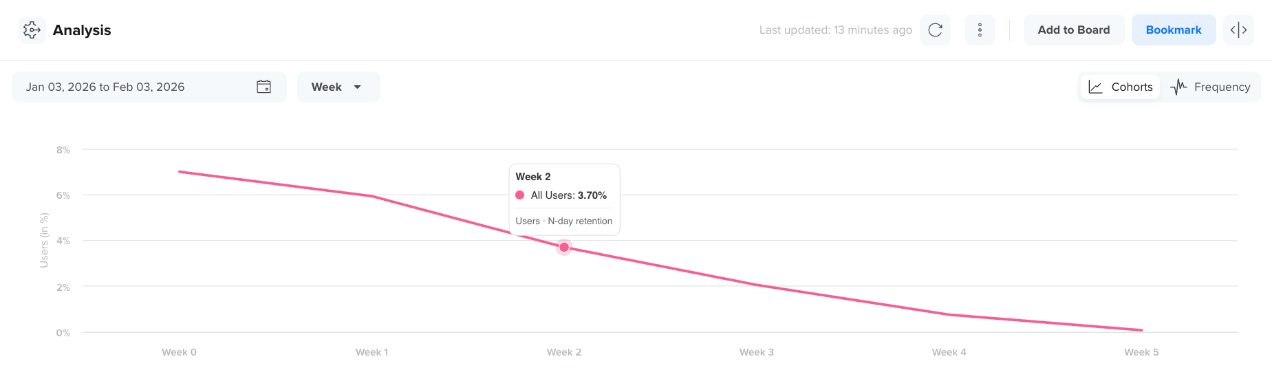
Trend Line
The Trend Line visualizes how retention or frequency changes over time.
Use this view to:
- Identify trends and seasonality
- Compare retention curves across cohorts
- Spot anomalies or sudden changes in engagement
Trend Line
Switch Trend Line Views
You can switch between the following trendline views to view the cohort for rows and columns:
Cohorts View
In the Cohorts trend line view, each line represents a single cohort from the table, plotted over time based on the selected return metric.
The trend line is directly derived from the cohort table:
- The x-axis represents time since the start event (for example, Week 1, Week 2, Week 3).
- The y-axis represents the selected return metric (for example, retention rate).
Each data point on the line corresponds to a value from the same cohort’s row in the table below the trend line. This view helps you visually compare how retention or engagement evolves for different cohorts over time.
For example, you can quickly identify:
- Which cohorts retain users better over time
- How retention decays for newer vs older cohorts
- Sudden drops or improvements in retention patterns
View Cohort Analysis with Cohort View
Frequency View
In the Frequency trend line view, the chart visualizes how often users from a cohort return, rather than whether they return.
This view is also linked directly to the cohort table:
- The x-axis represents time since the start event.
- The y-axis represents the frequency metric (for example, events per user).
Each line maps to frequency values calculated from the corresponding cohort row in the table below the trend line. This view is useful for understanding depth of engagement, such as how actively users continue to interact over time.
For example, you can identify:
- Cohorts that return frequently vs infrequently
- Changes in engagement intensity over time
- Whether engagement drops gradually or sharply after onboarding
View Cohort Analysis with Frequency View
Multi-Select and View Cohorts
Multi-select allows you to isolate and compare specific cohorts by visualizing only the selected rows from the cohort table in the trend view.
Cohorts View
You can select multiple cohorts directly from the cohort table to compare them in the trend line view.
When multiple cohorts are selected:
- Each selected row in the table appears as a separate line in the Cohorts trend chart.
- The chart updates in real time to reflect only the selected cohorts.
- This allows you to isolate and compare specific cohorts without visual noise.
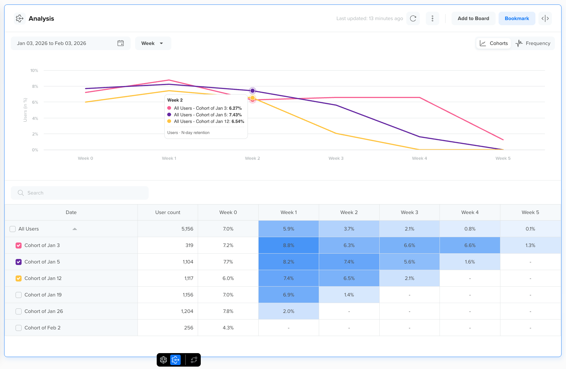
View Multi-Select Cohort Analysis with Cohort View
This interaction helps you focus on:
- Comparing specific time periods (for example, post-campaign cohorts)
- Identifying performance differences between selected cohorts
- Removing outliers from the trend view
Frequency View
When multiple cohorts are selected in the table, the Frequency trend view plots a separate line for each selected cohort, showing how engagement frequency changes over time.
This view highlights differences in repeat behavior across cohorts:
- Some cohorts may return often but drop off quickly
- Others may show lower frequency but sustained engagement

View Multi-select Cohort Analysis with Frequency View
Using multi-select with the Frequency view helps you compare:
- Engagement intensity across cohorts
- Long-term usage patterns
- Behavioral differences that are not visible in retention alone
Bookmark a Cohort Analysis
You can bookmark any Cohort analysis to revisit it later quickly. Bookmarks are useful for tracking frequently monitored retention reports, such as weekly retention or long-term engagement trends. Bookmarks are user-specific and visible only to the logged-in user.
To bookmark a Cohort analysis:
- Click Bookmark in the top-right corner after running the analysis.
- Enter a descriptive bookmark name.
- Click Bookmark.
Book a Cohort Analysis