RCS Message Templates
Learn more about setting up and creating RCS Messaging Templates
Overview
RCS (Rich Communication Services) Message Templates enable businesses to send rich, interactive messages to users, enhancing engagement beyond standard SMS capabilities. These templates support various media types, buttons, and formatting options, allowing for a more dynamic user experience.
Here are the key components that make up an RCS message template.
Template Components
An RCS message template consists of the following key components:
- Title: The headline of the message that appears prominently at the top of the template. It should be concise and engaging to quickly capture the recipient’s attention.
- Description: The main message body where the content of the RCS message is defined. This field provides detailed information to users and can include formatted text such as bold, italics, strikethrough, and emojis to enhance readability and engagement.
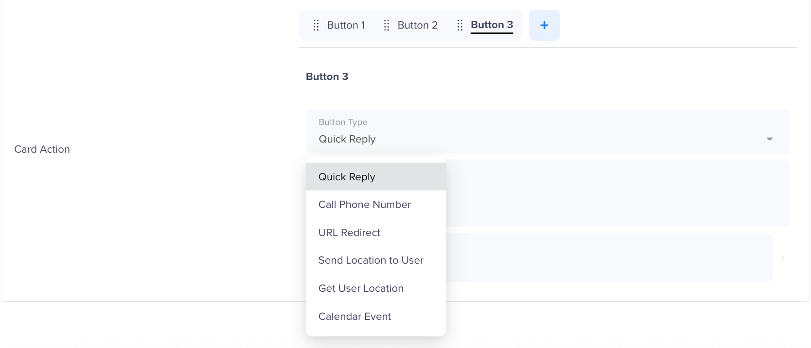
- Buttons: Interactive elements that allow users to take action directly from the message. RCS templates support up to 10 buttons for Text messages and up to 4 buttons for Rich Card and Carousel templates, enabling businesses to drive customer engagement. The number of buttons rendered in an SMS inbox depends on the device's screen dimensions and UI limitations. Some buttons used in the template may not be visible on certain devices due to these constraints. It is recommended to test templates across different devices to ensure optimal rendering. CleverTap allows six types of buttons in RCS templates:
URL Redirect
A button that redirects users to a specific webpage. Opens a specific URL when tapped, directing users to a landing page, website, or app.
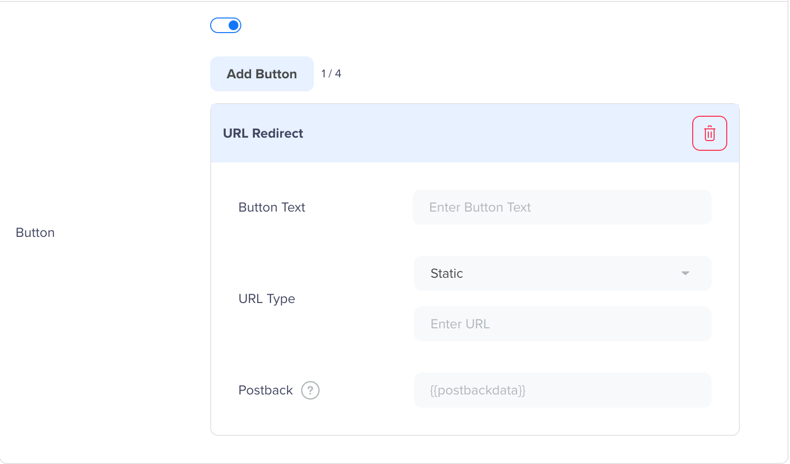
URL Redirect
- Button Text: Enter a label for the button (maximum 25 characters, no special characters).
- URL Type: The destination URL (maximum 2,048 characters). For dynamic URLs, use placeholders, for example: https://example.com/{{1}} . Choose from the following options:
- Static: Fixed URL entered at the time of template creation.
- Dynamic: Brands must provide the URL prefix (URL domain), and the URL suffix can be personalized for each user. Uses dynamic parameters, for example: https://www.clevertap.com/{{1}}.
- CleverTap Link Tracking: Brands can leverage CleverTap link tracking functionality to monitor details of the user who clicked the URL. The entire URL can be personalized for each user during campaign creation.
- URL Appearance for Users: Choose how the URL opens when the user taps the button:
- Browser: Opens the URL in the user's default browser.
- Webview: Opens the URL inside the messaging app. When selected, choose a Webview Layout:
- Full: The message is shown throughout the whole screen.
- Half: Opens the URL in a half-screen webview, with the message visible behind it.
- Tall: Opens the URL in a tall webview covering most of the screen, with a portion of the message visible above.
- Postback: A button identifier that can be used to track button clicks. The Notification Replied event logs this interaction for analytics.
Call Phone Number
Initiates a phone call to a specified number, allowing users to contact a business instantly. Users can tap the button to initiate a phone call.
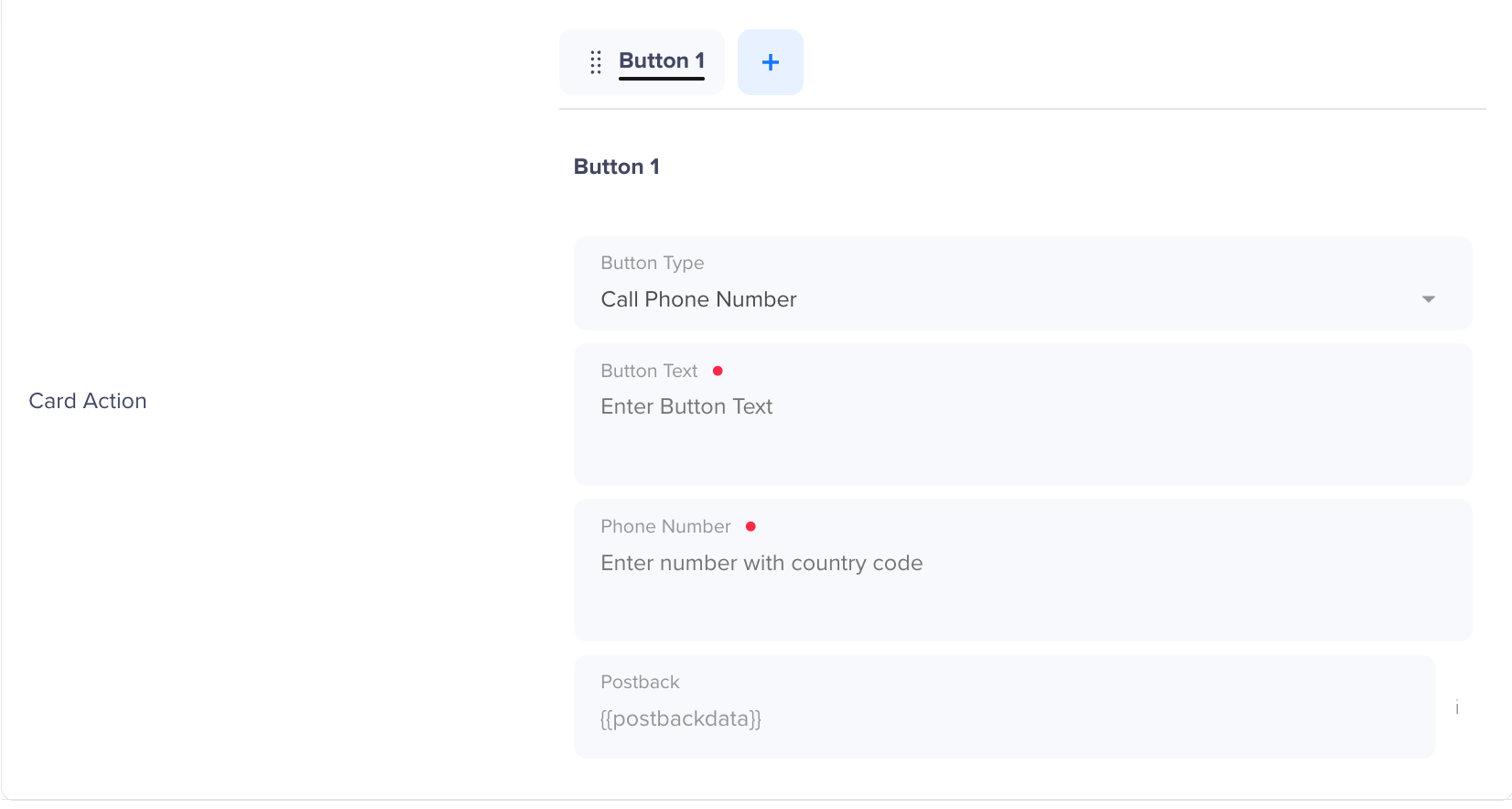
Call Phone Number Button
- Button Text: Enter a label for the button (maximum 25 characters, no special characters).
- Phone number: The number users will call when they tap the button (maximum 20 characters).
- Postback: A button identifier that can be used to track button clicks. The Notification Replied event logs this interaction for analytics.
Quick Reply
A button that allows users to send predefined responses.
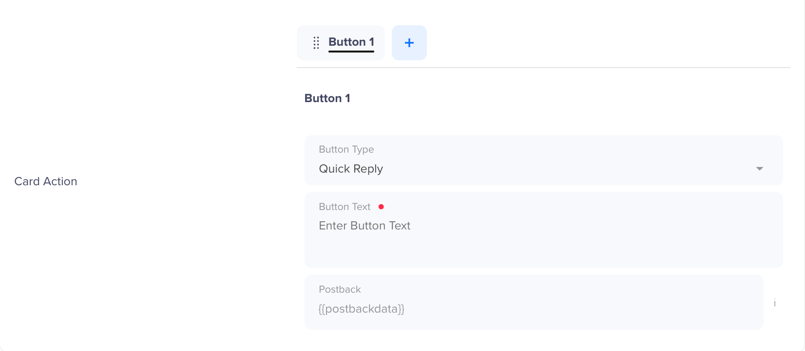
Quick Reply Button
- Button Text: Enter a label for the button (maximum 25 characters, no special characters).
- Postback: A button identifier that can be used to track button clicks. The Notification Replied event logs this interaction for analytics.
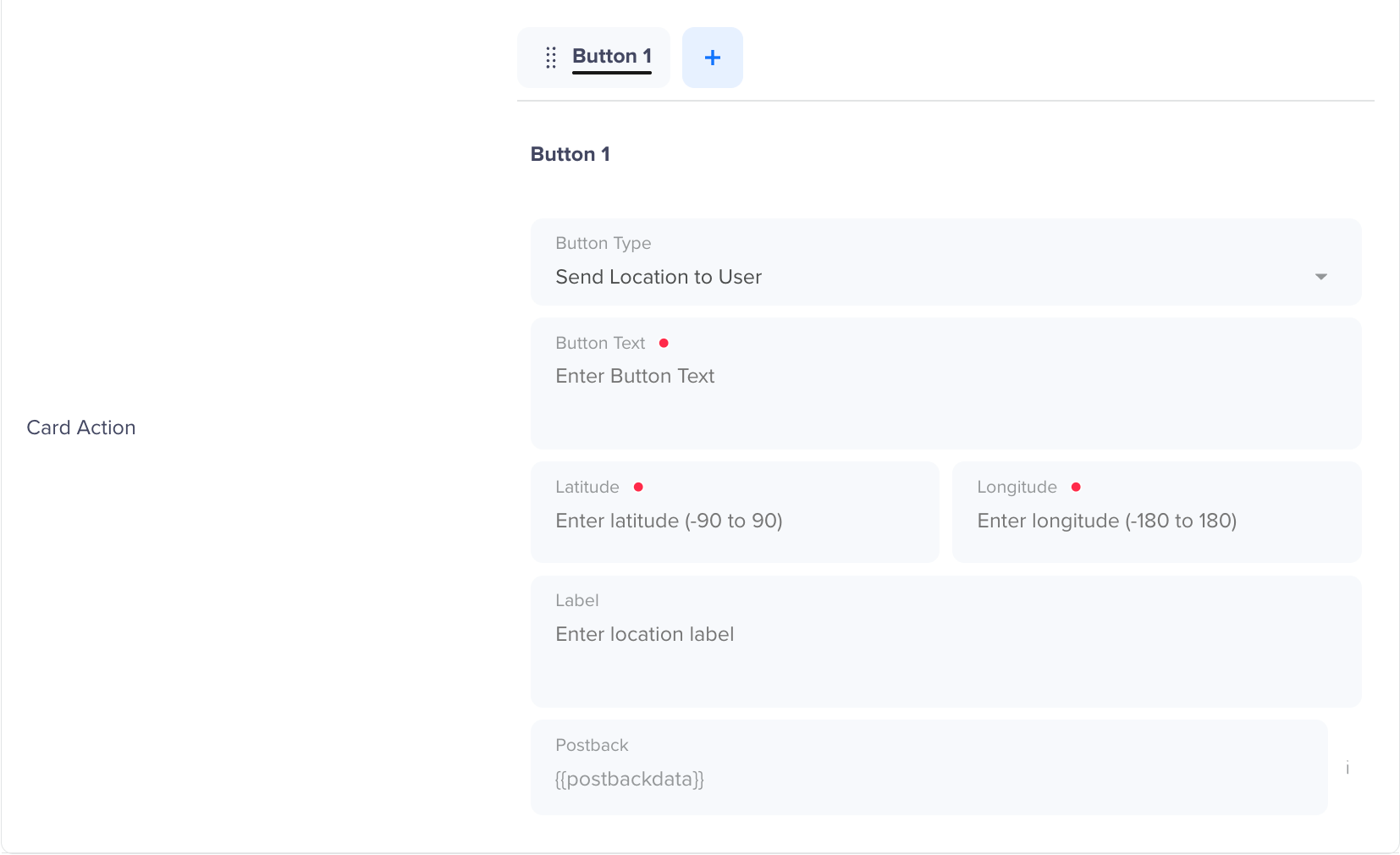
Send Location to User
Opens a specified location in the user's default map app using the coordinates you provide. Use this to share store addresses, event venues, delivery points, or any fixed geographic location.
Send Location to User Button
- Button Text: Enter a label for the button (maximum 25 characters, no special characters).
- Latitude: The latitude coordinate of the location. Enter a value between -90 and 90. Supports Liquid tags for personalization — for example,
{{ Profile.latitude }}. - Longitude: The longitude coordinate of the location. Enter a value between -180 and 180. Supports Liquid tags for personalization — for example,
{{ Profile.longitude }}. - Label: A display name for the location shown to the user in the map app.
- Postback: A button identifier that can be used to track button clicks. The Notification Replied event logs this interaction for analytics.
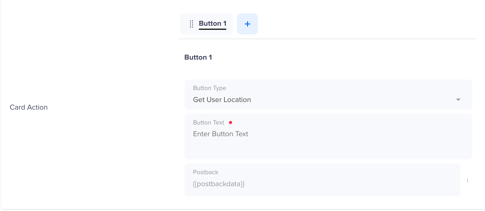
Get User Location
Prompts the user to share their current GPS position or select a location from their map app. The shared coordinates are returned to your system as a message reply. Use this to collect delivery addresses, confirm a user's nearest branch, or support location-based personalization.
Get User Location
- Button Text: Enter a label for the button (maximum 25 characters, no special characters).
- Postback: A button identifier that can be used to track button clicks. The Notification Replied event logs this interaction for analytics.
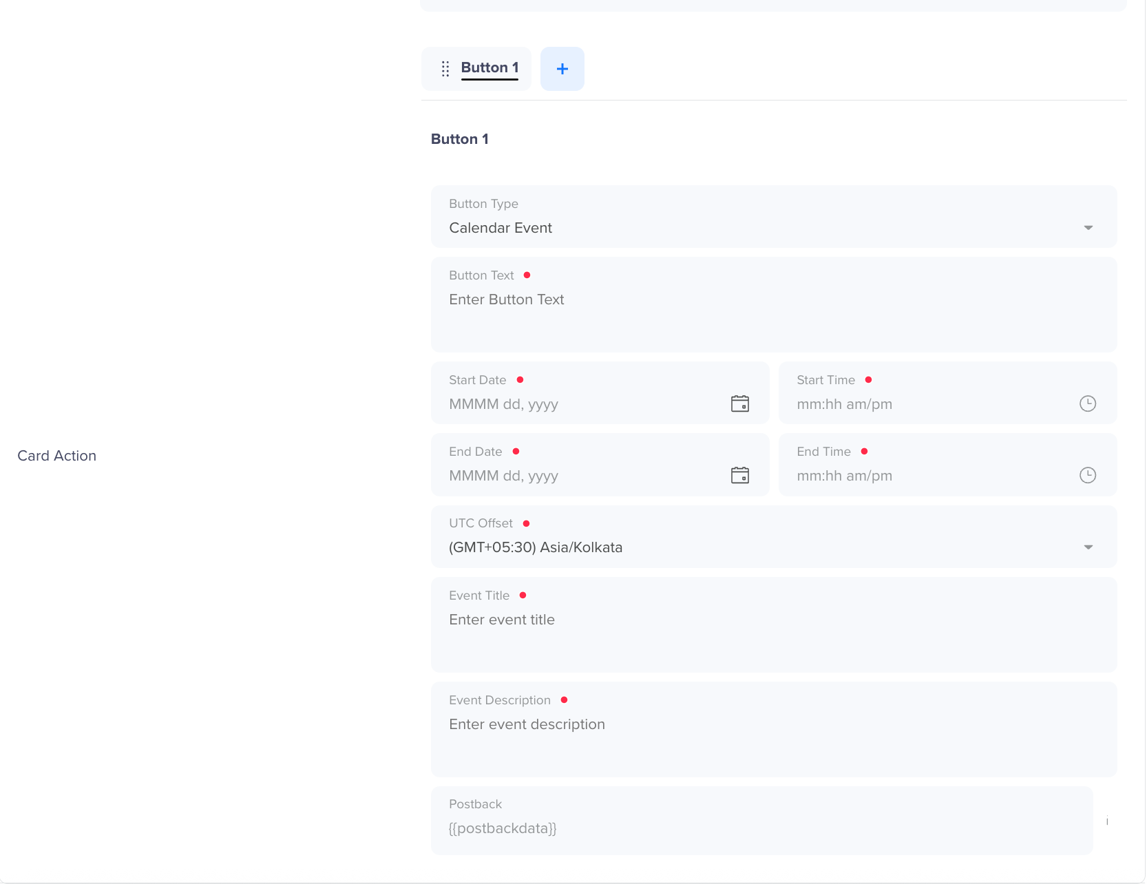
Calendar Event
Opens the user's default calendar app and pre-fills an event entry. Use this for appointment reminders, product launches, sale events, or any time-bound engagement.
Calendar Event Button
- Button Text: Enter a label for the button (maximum 25 characters, no special characters).
- Start Date: The date the event begins, in MMMM dd, yyyy format.
- Start Time: The time the event begins, in mm:hh am/pm format.
- End Date: The date the event ends, in MMMM dd, yyyy format.
- End Time: The time the event ends, in mm:hh am/pm format.
- UTC Offset: The timezone for the event, selected from a dropdown. Defaults to (GMT+05:30) Asia/Kolkata.
- Event Title: The name of the calendar event. Supports Liquid tags for personalization.
- Event Description: A brief description displayed within the calendar entry. Supports Liquid tags for personalization.
- Postback: A button identifier that can be used to track button clicks. The Notification Replied event logs this interaction for analytics.
Add Message Template
Easily create and manage RCS message templates in CleverTap to streamline your messaging campaigns. These templates are automatically sent to the relevant platforms based on registration. For example, if a template is registered with Vodafone, it will be sent to Vodafone. The status of the template will be updated within 24 hours, and you can track it directly within the dashboard.
To create RCS campaigns for Indian users, you must have pre-approved RCS message templates saved in the CleverTap dashboard. Follow the steps below to add a new message template:
-
Navigate to Settings > Channels > SMS > SMS Direct > + Provider
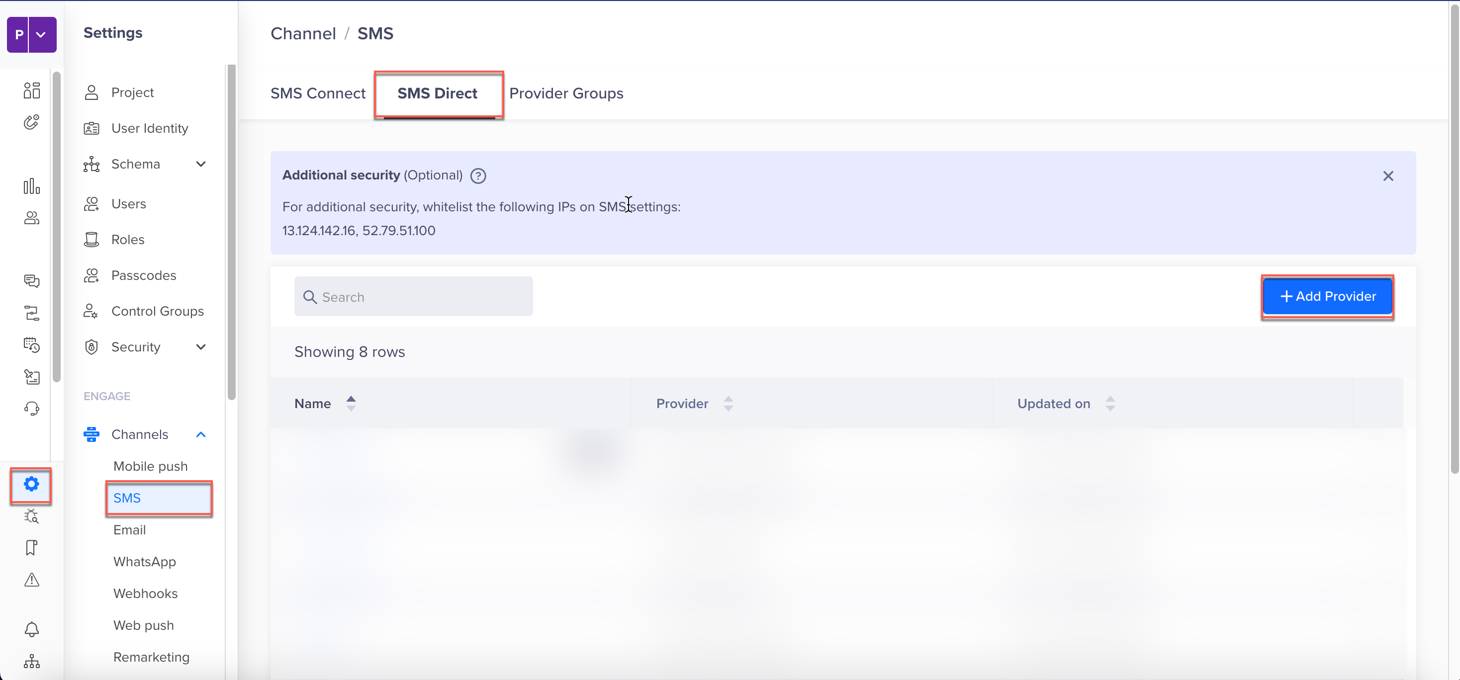
Add Provider
-
In the Provider Nickname select Infobip RCS Provider from the CleverTap dashboard.
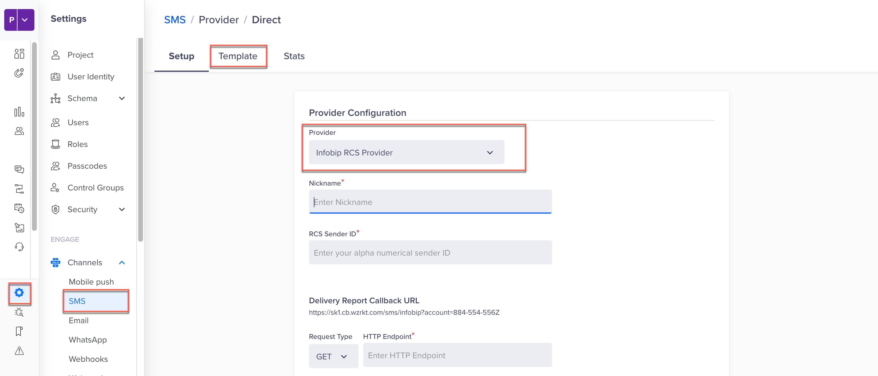
Infobip RCS Provider
-
Select the Templates option and click + Template.
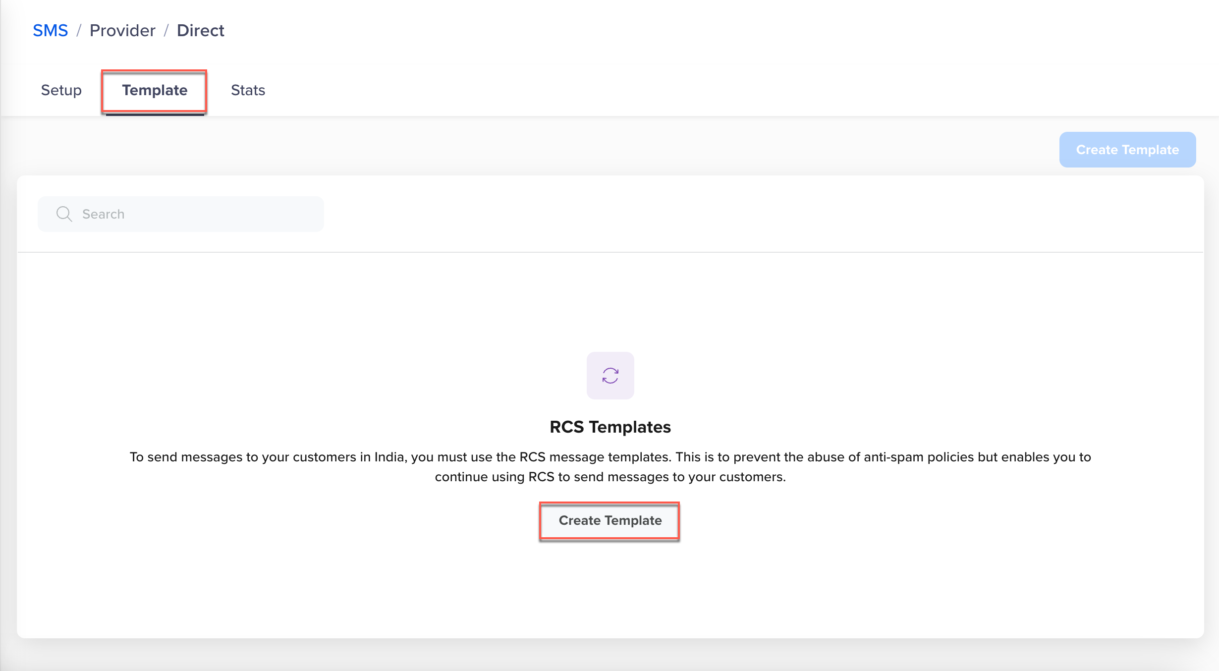
Create Template
-
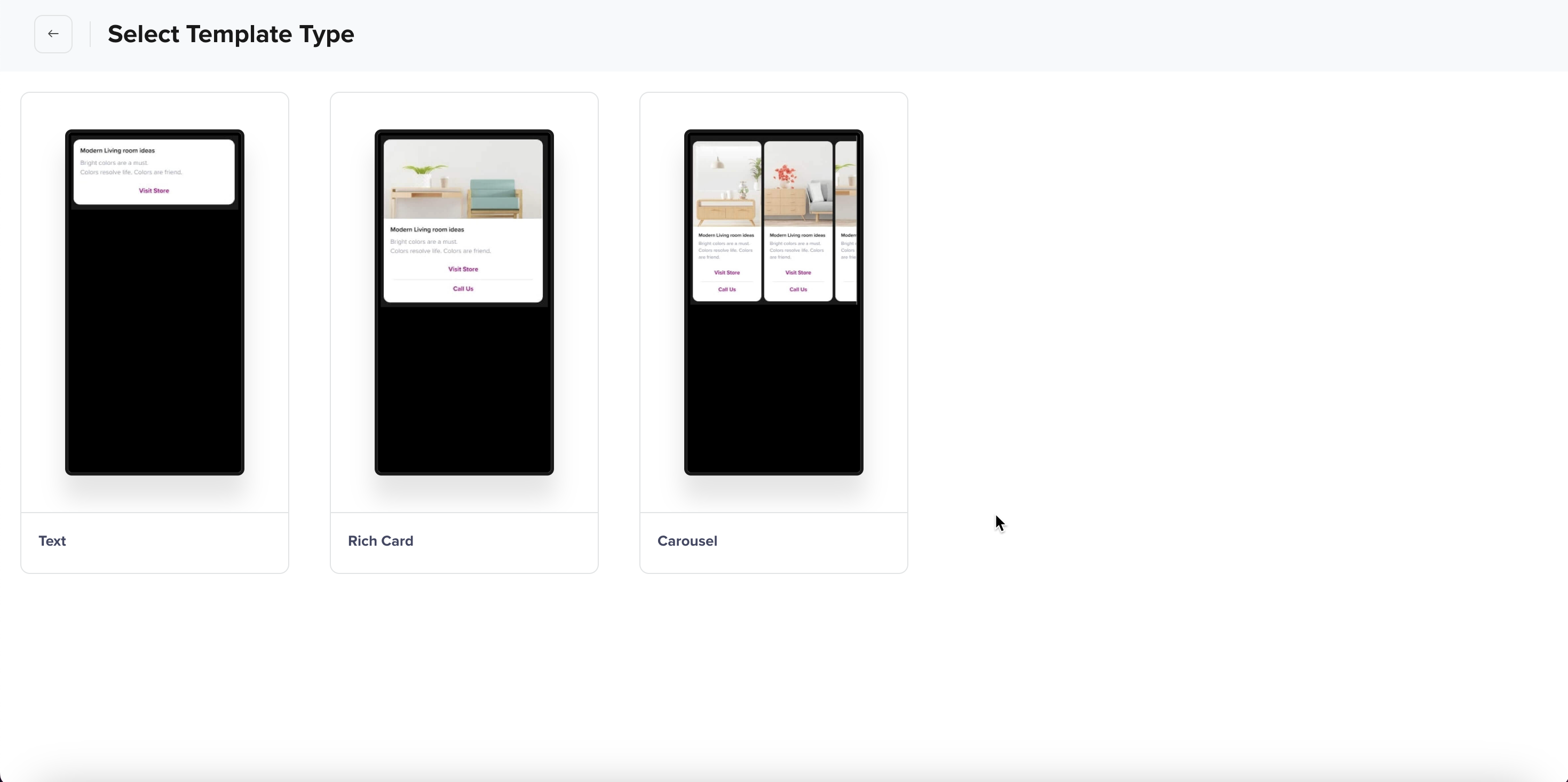
Choose the Template Type:
-
Configure Template Components:
- Title: The headline of the message that appears prominently at the top of the template.
- Description: Enter the main message content.
- Buttons: Add interactive elements to enhance user engagement.
-
Click Save to save the template.
Text
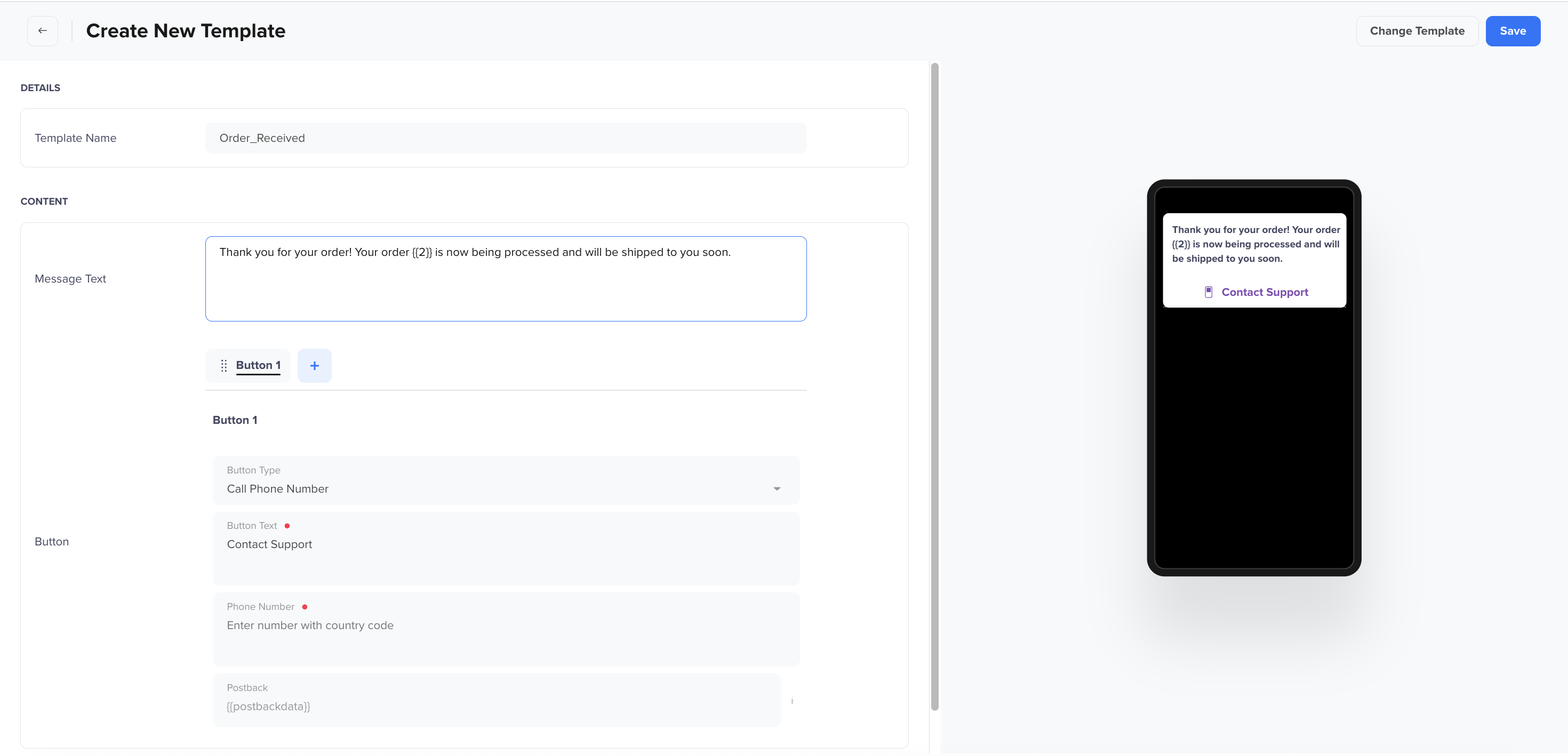
The text template is a simple RCS message format that consists of a plain text message with optional interactive buttons. It allows businesses to send structured messages while incorporating basic text formatting and engagement features. Follow these steps to create a text template:
Text Template
- Template Name: Enter a name for the template (maximum 20 characters).
Naming RCS TemplatesTemplate names and language variants must be unique for each provider configuration. This means that you can use the same template name once for each provider configuration.
For example, if you have multiple provider configurations, such as Phone_1, phone_2, you can use the same template name once within Phone_1 and Phone_2.
- Message Text: Enter the text message content (maximum 1000 characters).
- For body text formatting:
- Adding Emojis: Copy from here and paste in the body.
- Bold: Add asterisks (*) at the beginning and end.
- Italic: Add underscores (_) at the beginning and end.
- Strikethrough: Add tilde (~) at the beginning and end.
- Monospace: Add three consecutive backticks (```) at the beginning and end.
- For body text formatting:
- Enable Buttons: Click + to add buttons to the message (up to 10 buttons). The following button types can be added:
Rich Card Template
A Rich Card Template allow businesses to send RCS messages with images, videos, or other media to enhance engagement.. Rich Cards enhance user engagement by presenting information in an interactive, media-rich format that is more compelling than standard text messages. They are ideal for showcasing products, promotions, event details, and more. Follow the steps below to create a Rich Card template on CleverTap.
-
Template Name: Enter a name for the template (maximum 20 characters, only alphanumeric characters and underscores (_) are allowed.).
-
Choose Card Size & Layout to the layout for how media will be displayed in the message:
-
Vertical · Right · Short (Aspect Ratio 3:1): A tall vertical card for displaying prominent visuals, with content aligned to the right.
-
Vertical · Right · Medium (Aspect Ratio 2:1): A slightly shorter vertical layout with content aligned to the right.
-
Horizontal · Left · Medium (Aspect Ratio 3:4): A horizontal card with the image on the left and text on the right.
-
Horizontal · Right · Medium (Aspect Ratio 3:4): A horizontal card with the image on the right and text on the left.
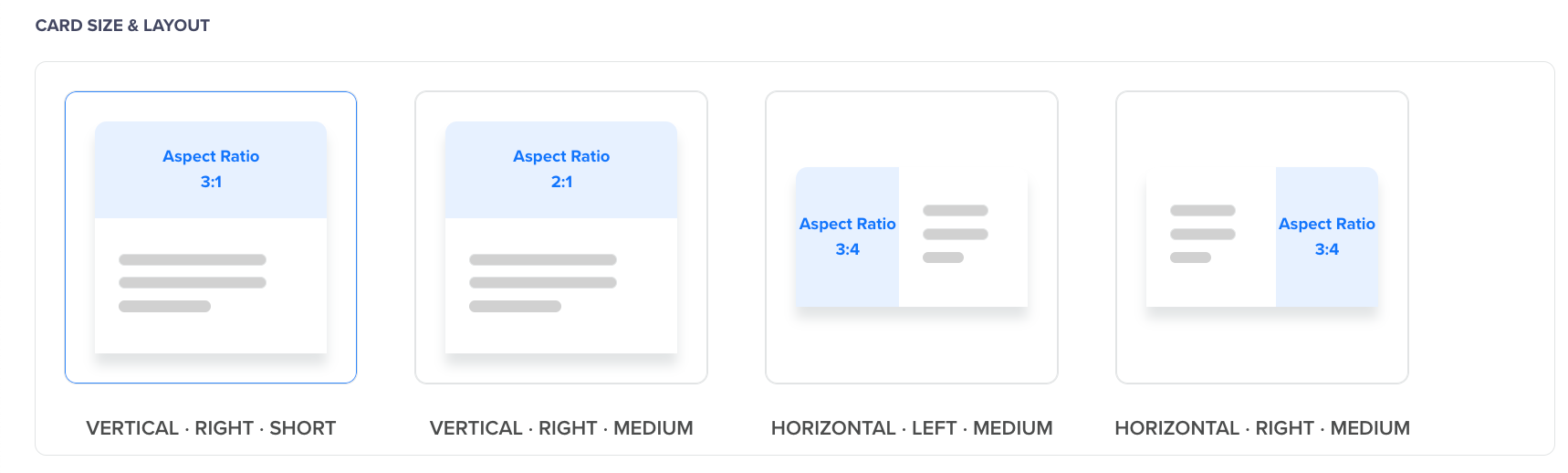
Aspect Ratio
-
-
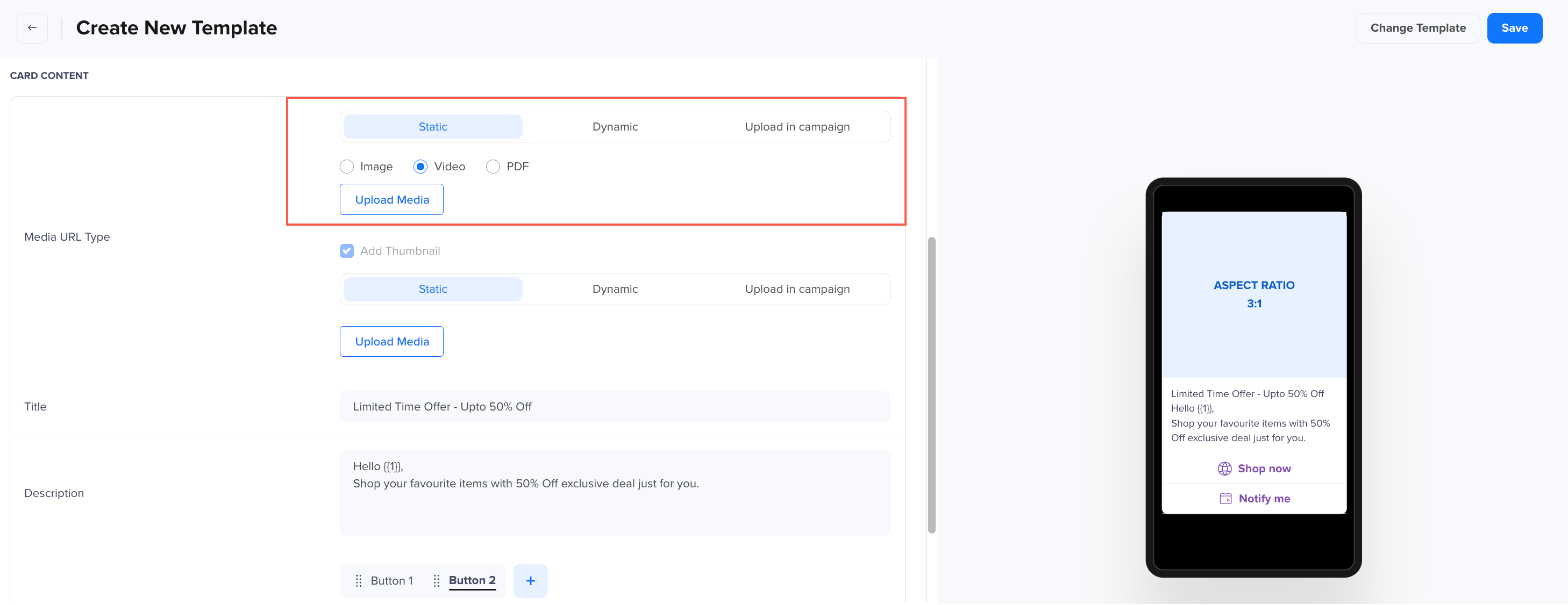
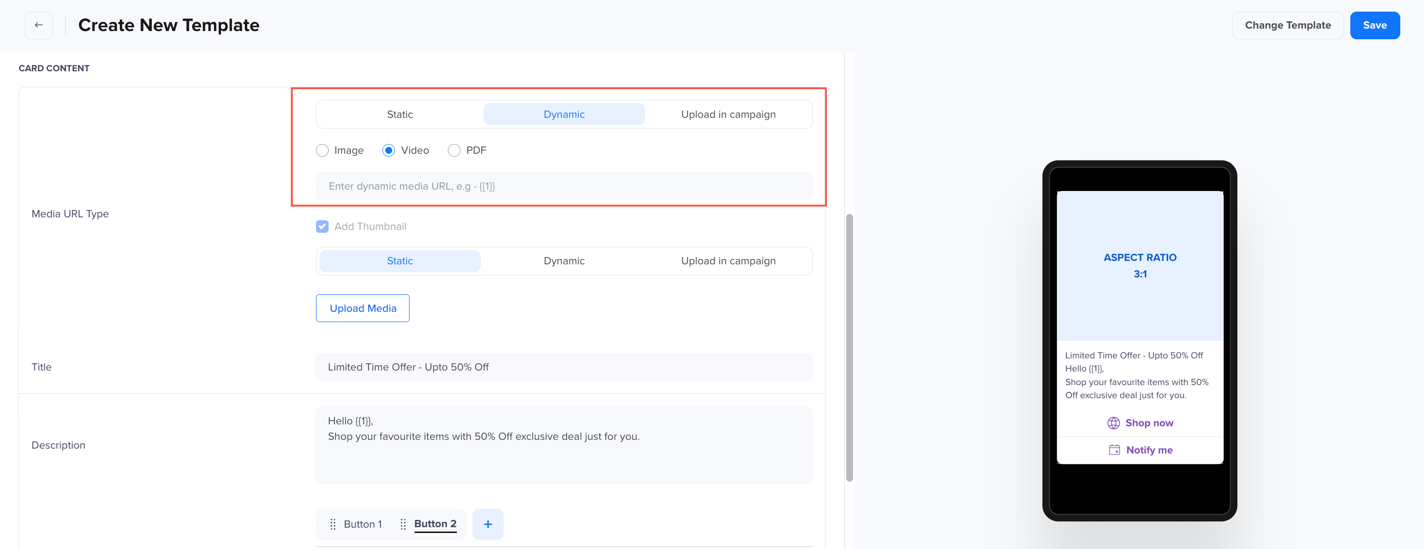
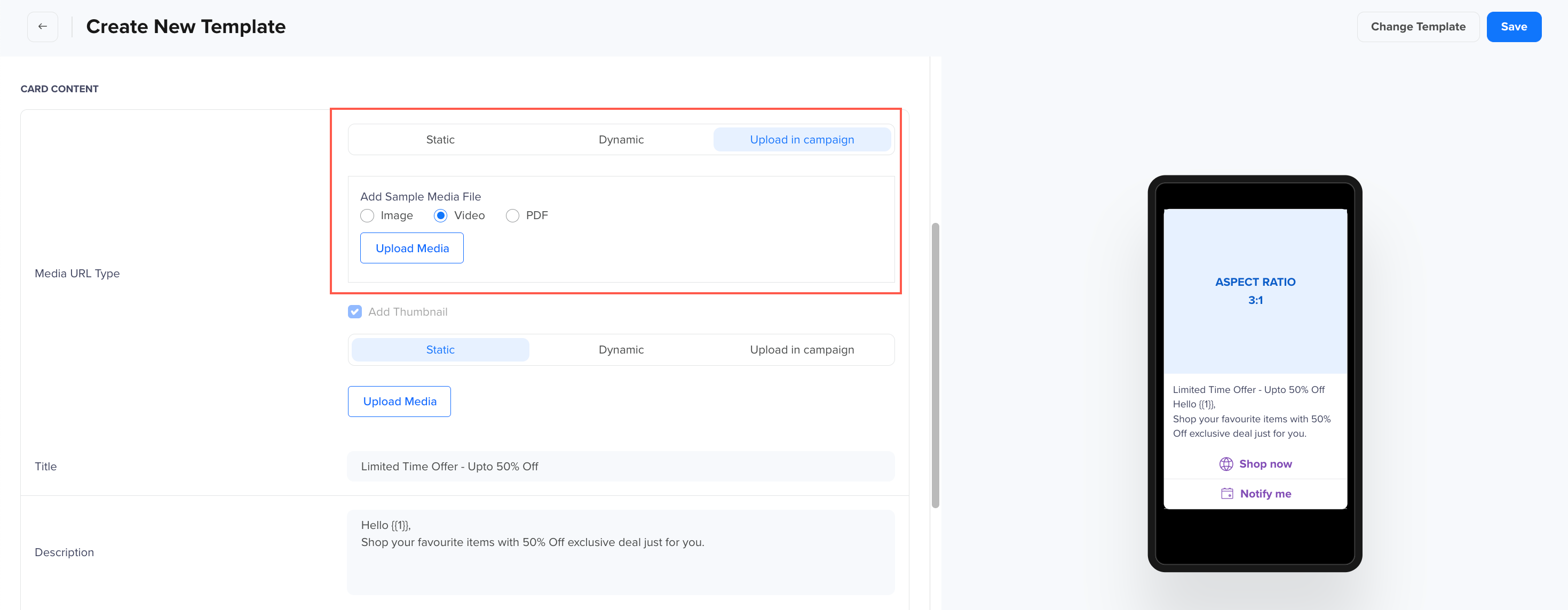
To configure card Content, select the Media type for your Rich Card:
-
Static: The media file is uploaded at the time of template creation and cannot be changed later. Select between Image, Video, or PDF and click Upload Media.
\
Static
-
Dynamic: Brands must provide the URL prefix (URL domain), and the URL suffix can be personalized for each user. For example: https://www.clevertap.com/{{1}}. Enter Media URL. \
Dynamic
-
-
Upload in Campaign: You upload media during campaign creation, but it cannot be personalized per user. Upload media at the campaign level when sending the RCS message. Since CleverTap will register a URL at the time of template creation to provide the flexibility of uploading media URL at the time of campaign creation, personalization will not be available for the URLs at the time of uploading the media while creating a campaign. A pre-determined URL will already be present in the URL field. \
Upload in Campaign
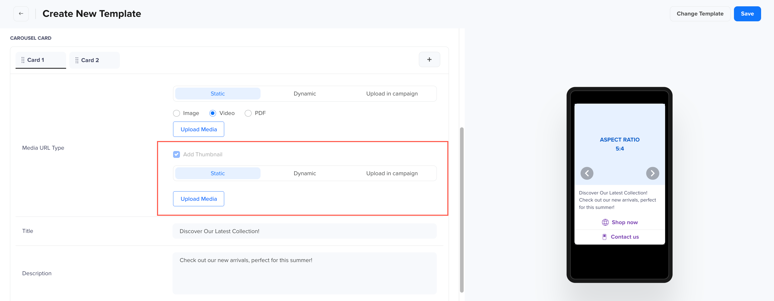
- Add a Thumbnail to provide a preview of the media in the Template. A thumbnail is only applicable for Videos and will be pre-selected automatically. There are three types of media that can be used for the thumbnail.
-
Static: A fixed Video or PDF for the thumbnail. \
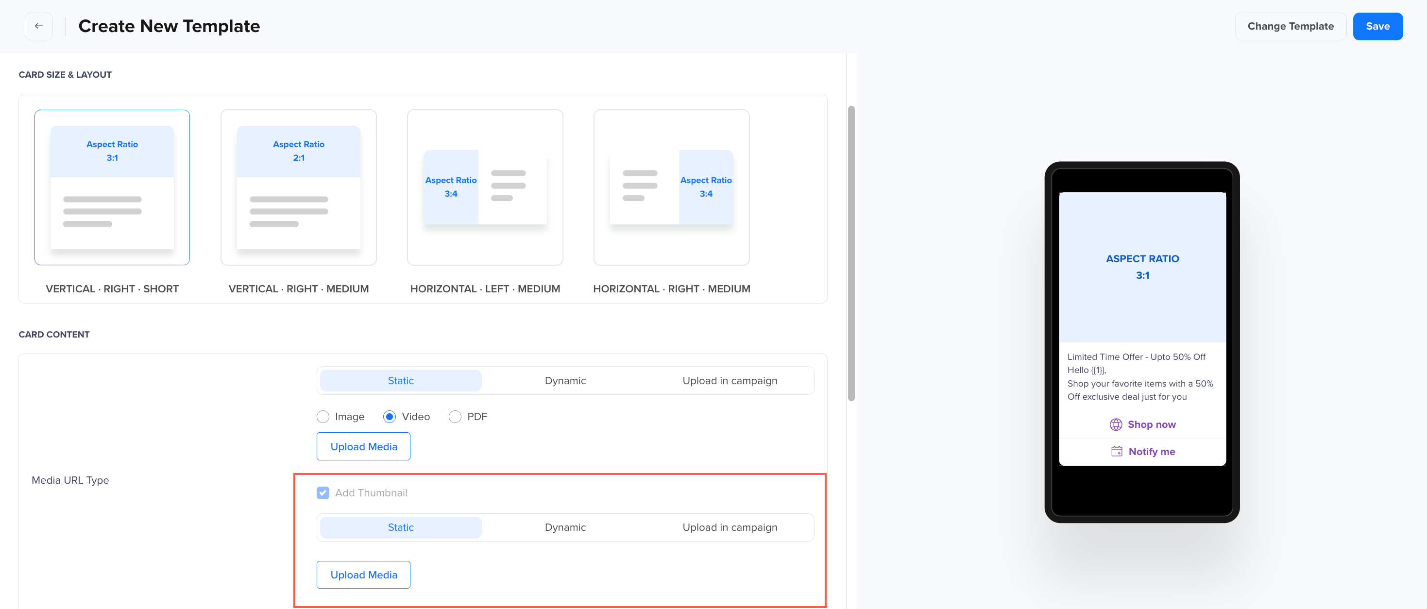
Static Media for Video with Thumbnail
-
-
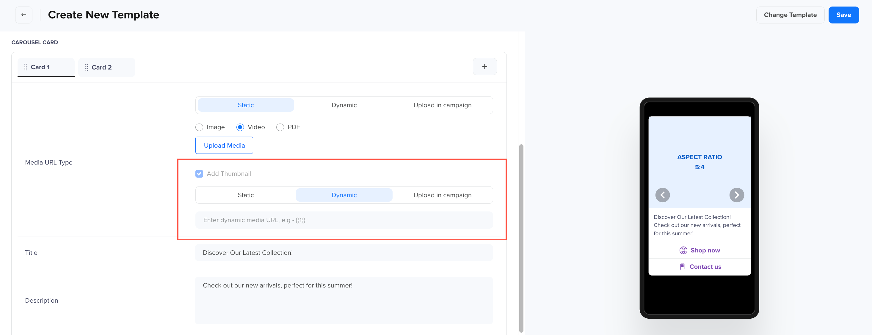
Dynamic: Brands must provide the URL prefix (URL domain), and the URL suffix can be personalized for each user. Select between Image, Video, or PDF and enter the dynamic media URL. For example: https://www.clevertap.com/{\\\\\\\\{\1}}. \
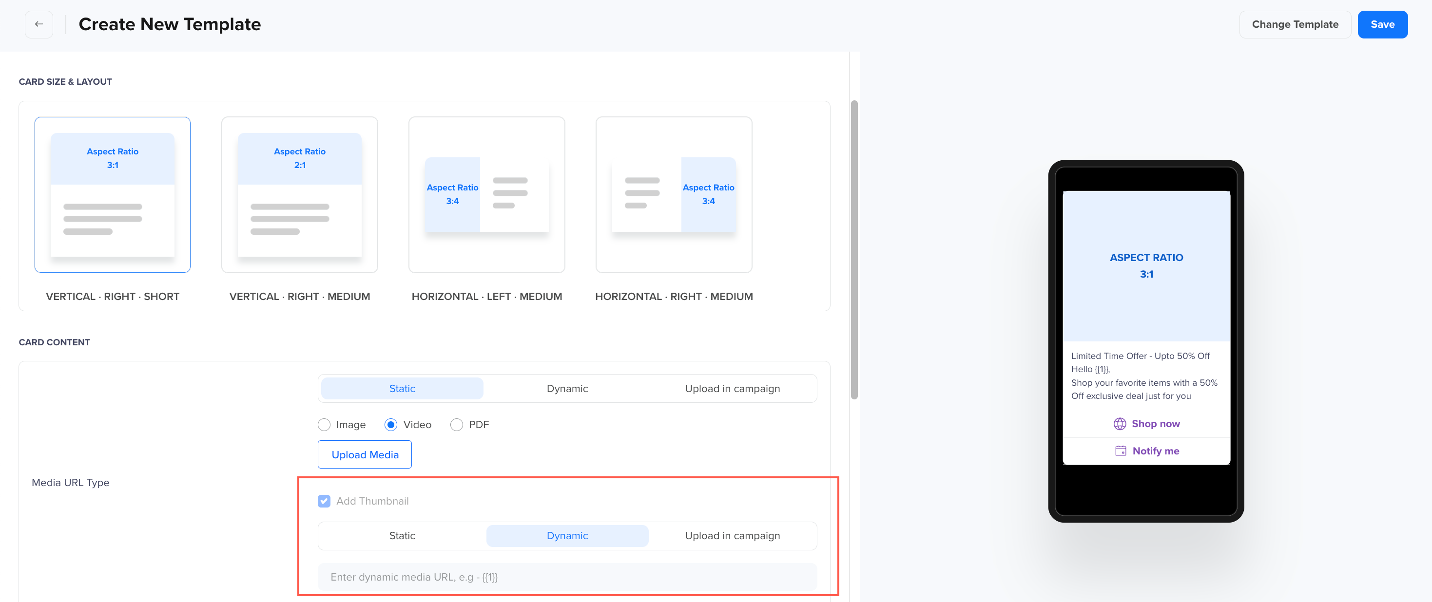
Dynamic Media for Video with Thumbnail
-
Upload in Campaign: You upload media during campaign creation, but it cannot be personalized per user. Select between Image, Video, or PDF under Add Sample Media File and click Upload Media. Since CleverTap will register a URL at the time of template creation to provide the flexibility of uploading media URL at the time of campaign creation, personalization will not be available for the URLs at the time of uploading the media while creating a campaign. A pre-determined URL will already be present in the URL field. \
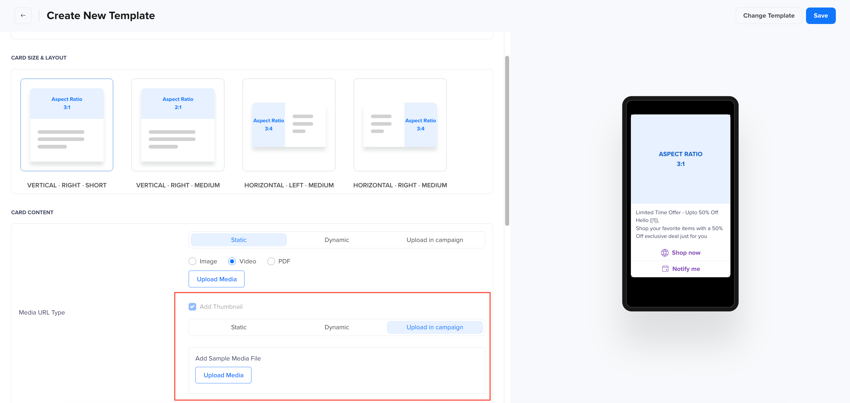
Upload in Campaign for Video with Thumbnail
-
Add a Title: The title will be displayed in bold and can be up to 200 characters long. To add dynamic parameters, use {{1}}, {{2}}, etc., in sequence, where values will be replaced at runtime.
-
Add a Description: Enter the text message content, with a maximum limit of 2000 characters. To add dynamic parameters {{1}}, {{2}}, etc., for personalization.
-
For body text formatting:
-
Adding Emojis: Copy from here and paste in the body.
-
Bold: Add asterisks (*) at the beginning and end.
-
Italic: Add underscores (_) at the beginning and end.
-
Strikethrough: Add tilde (~) at the beginning and end.
-
Monospace: Add three consecutive backticks (```) at the beginning and end.
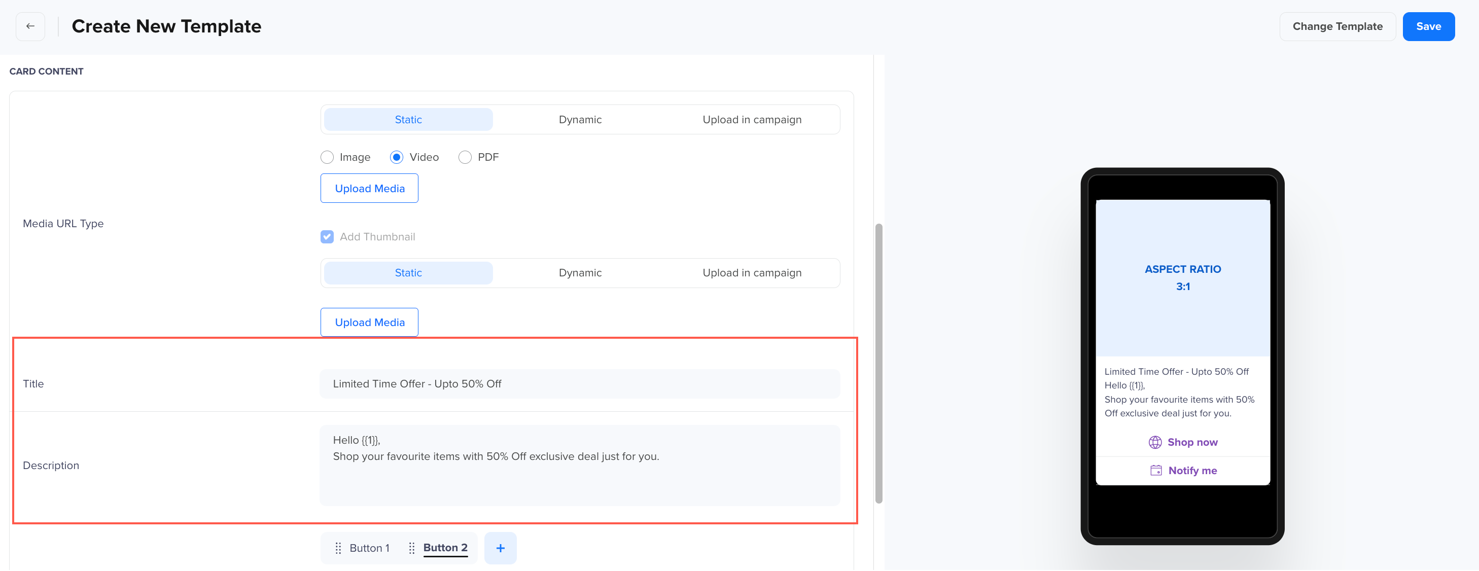
Title and Description
-
-
-
Enable Buttons: Click + to add buttons to the message (up to 4 buttons). The following button types can be added:

Carousel
A Carousel Template is a multi-card format that allows businesses to display multiple Rich Cards within a single message. Users can scroll horizontally through the cards, making it an effective way to showcase multiple products, services, promotions, or event details within a single interaction. Each card in the carousel can contain an image or video, a title, a description, and interactive buttons, enhancing engagement and interactivity.
Follow the steps below to create a Carousel Template on CleverTap. You can add up to 10 cards in the template, with each card containing the following elements:
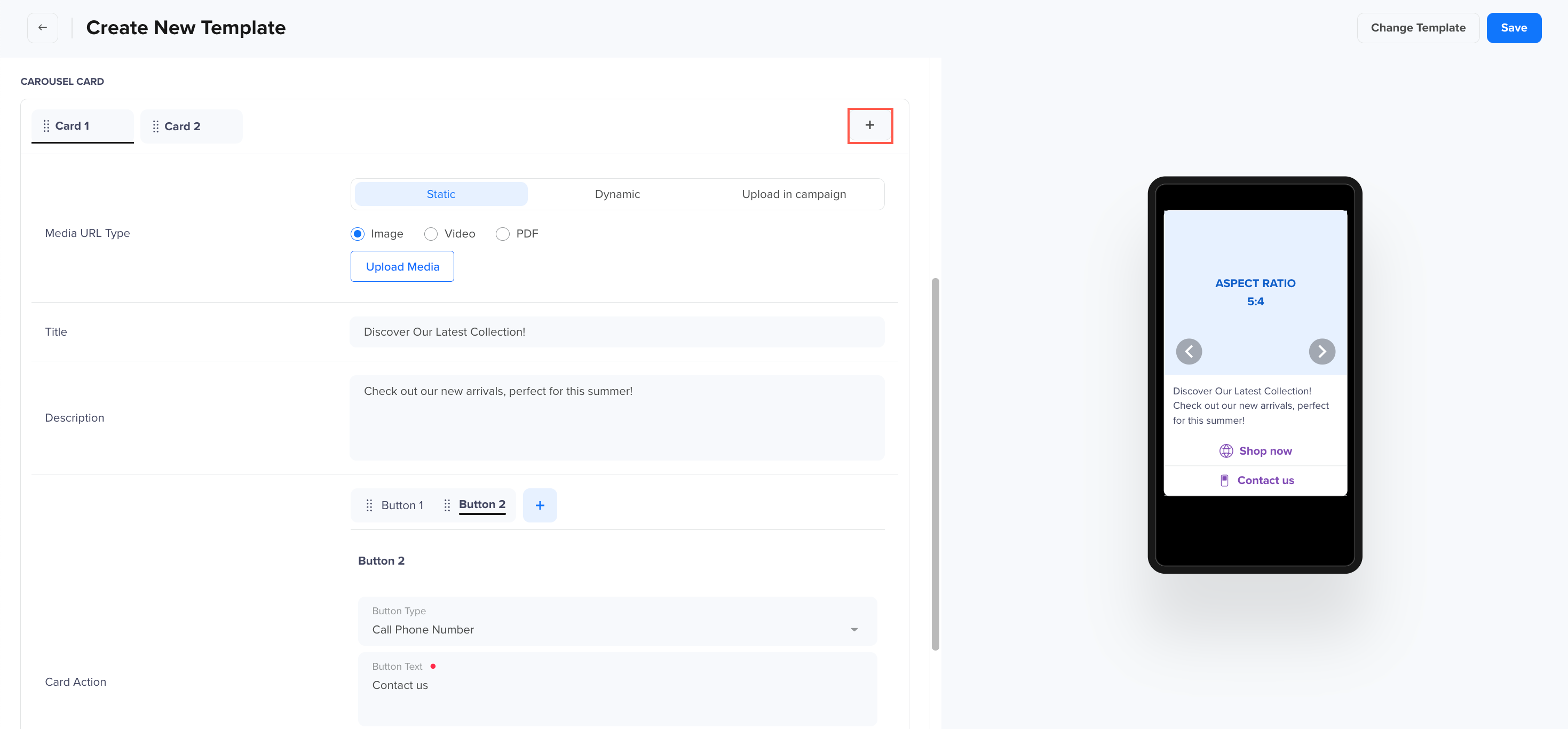
Add Card in Carousel Template
-
Template Name: Enter a name for the template (maximum 20 characters).
-
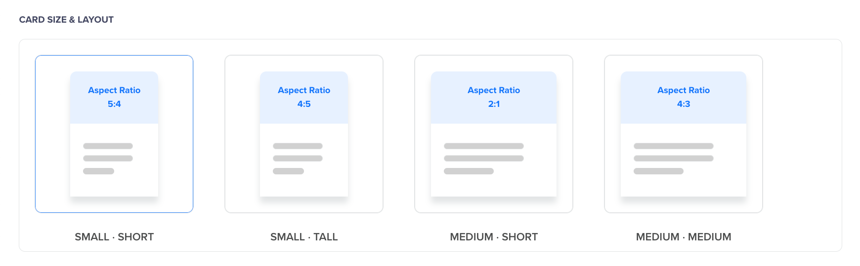
Choose Card Size & Layout to define the appearance of the Carousel:
-
Small · Short (Aspect Ratio 5:4) – A compact card with a shorter image area.
-
Small · Tall (Aspect Ratio 4:5) – A compact card with a taller image area.
-
Medium · Short (Aspect Ratio 2:1) – A medium-width card with a shorter image area.
-
Medium · Medium (Aspect Ratio 4:3) – A medium-width card with a balanced image and content area. \
Aspect Ratio - Carousel Template
-
-
To configure card Content, select the Media type for your Carousel Template:
-
Static: The media file is uploaded at the time of template creation and cannot be changed later. Select between Image, Video, or PDF and click Upload Media. \
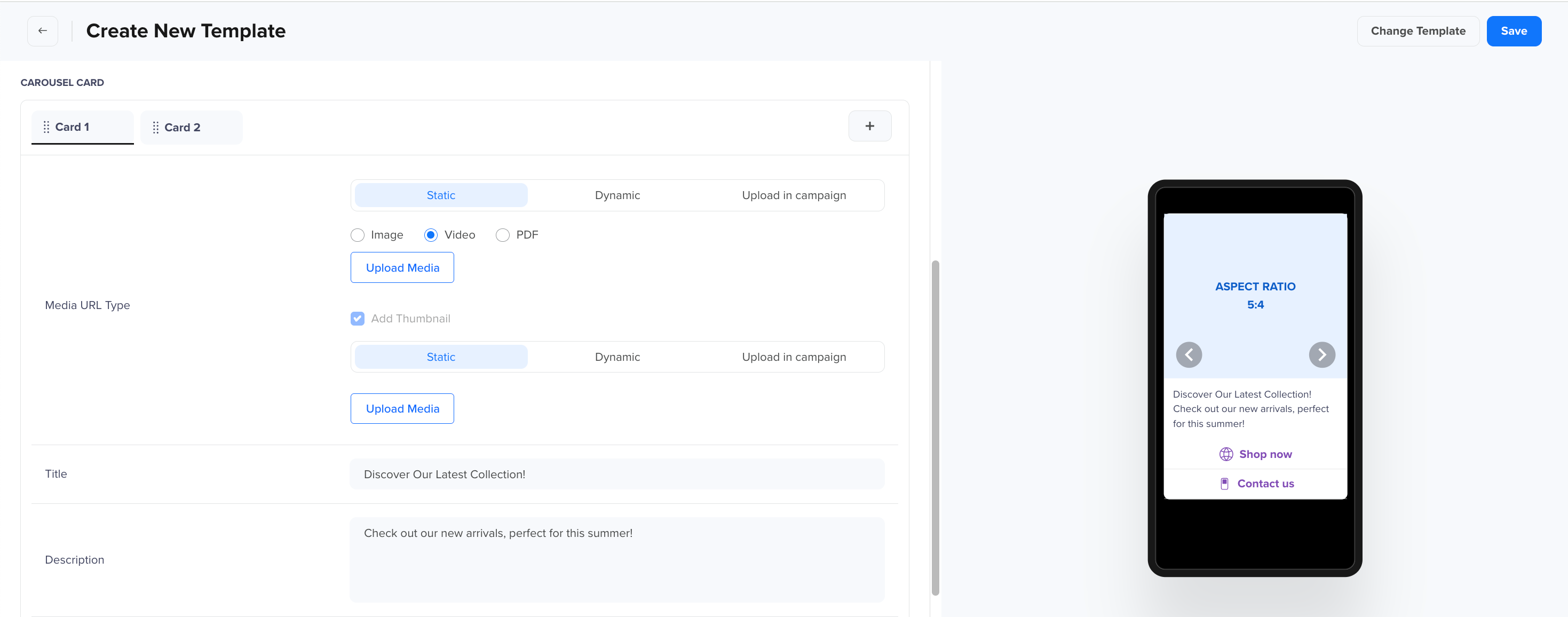
Static
-
Dynamic: Brands must provide the URL prefix (URL domain), and the URL suffix can be personalized for each user. Select between Image, Video, or PDF and enter the dynamic media URL. For example: https://www.clevertap.com/{{1}}. \
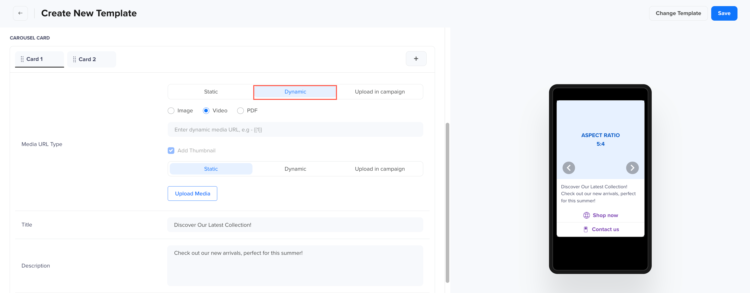
Dynamic
-
Upload in Campaign: Select between Image, Video, or PDF under Add Sample Media File and click Upload Media. Since CleverTap will register a URL at the time of template creation to provide the flexibility of uploading media URL at the time of campaign creation, personalization will not be available for the URLs at the time of uploading the media while creating a campaign. A pre-determined URL will already be present in the URL field. \
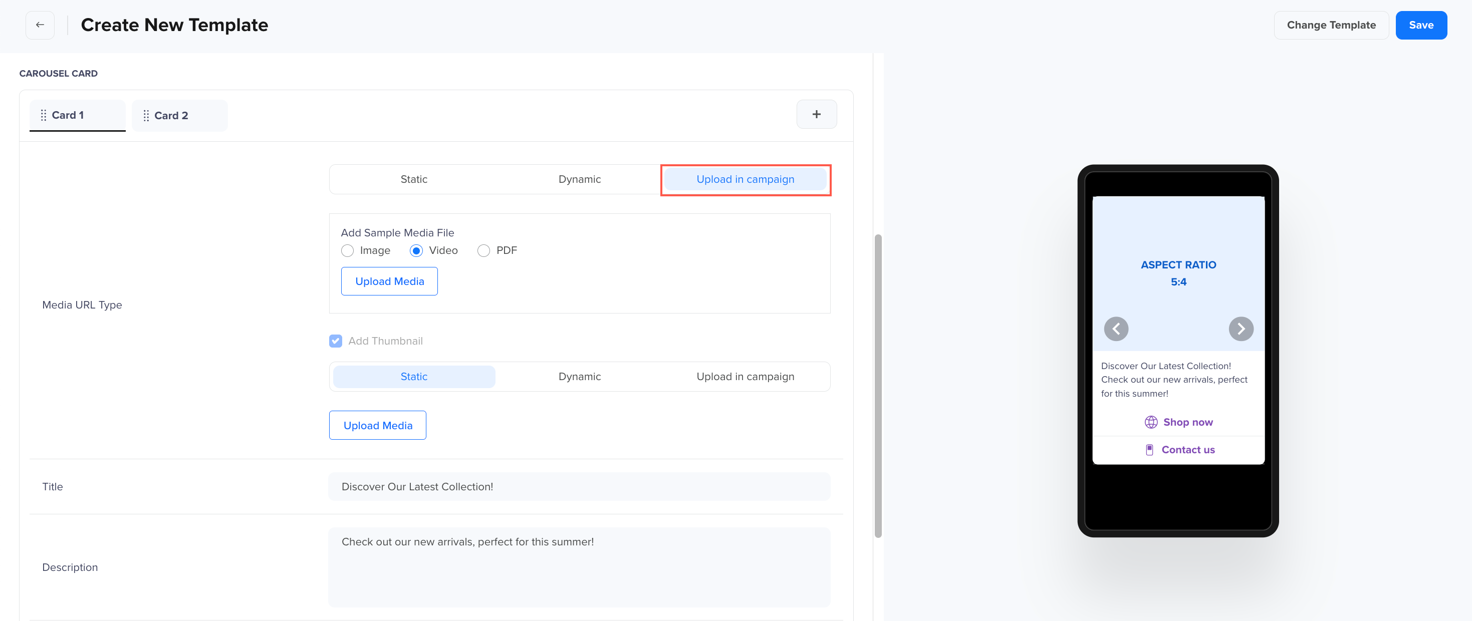
Upload in Campaign
Upload in Campaign
-
-
Add a Thumbnail to provide a preview of the media in the Template. A thumbnail is only applicable for Videos and will be pre-selected automatically. There are three types of media that can be used for the thumbnail.Static: A fixed image or video for the thumbnail. \
-
Static - thumbnail
-
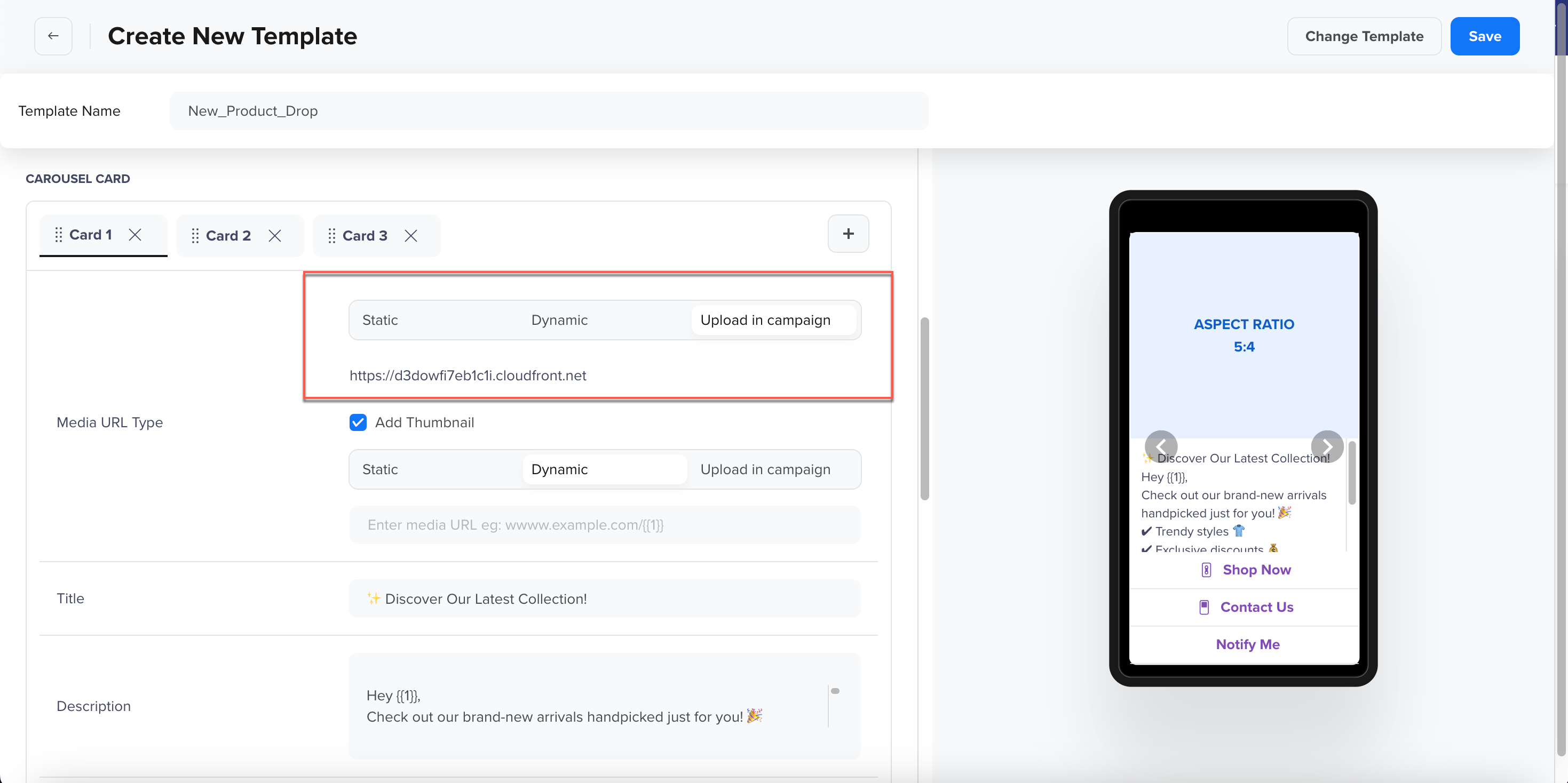
Dynamic: Brands must provide the URL prefix (URL domain), and the URL suffix can be personalized for each user. For example: https://www.clevertap.com/{{1}}. \
Dynamic - thumbnail
-
Upload in Campaign: Upload media at the campaign level when sending the RCS message. Since CleverTap will register a URL at the time of template creation to provide the flexibility of uploading media URL at the time of campaign creation, personalization will not be available for the URLs at the time of uploading the media while creating a campaign. \
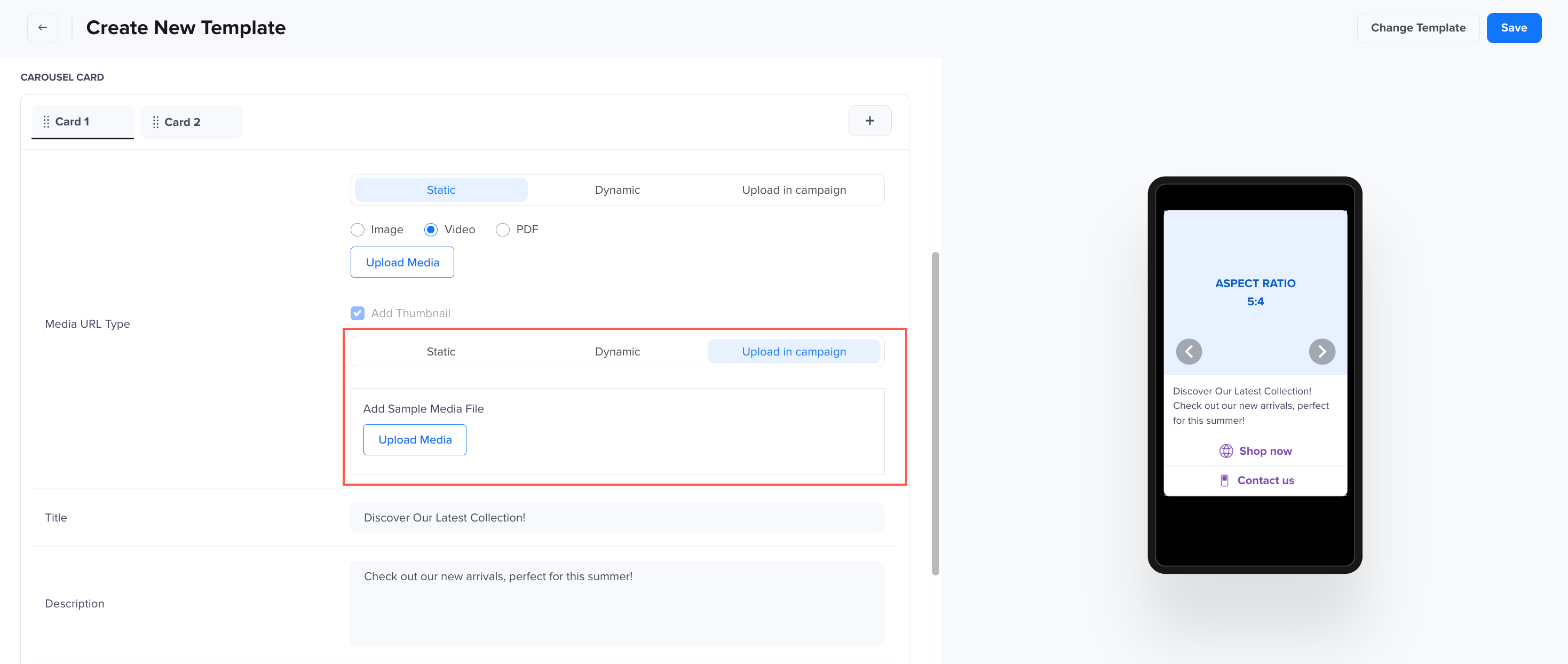
Upload in Campaign thumbnail
-
-
Add a Title: The title will be displayed in bold and can be up to 200 characters long.
-
Add a Description: Enter the text message content, with a maximum limit of 1000 characters.
-
For body text formatting:
-
Adding Emojis: Copy from here and paste in the body.
-
Bold: Add asterisks (*) at the beginning and end.
-
Italic: Add underscores (_) at the beginning and end.
-
Strikethrough: Add tilde (~) at the beginning and end.
-
Monospace: Add three consecutive backticks (```) at the beginning and end.\
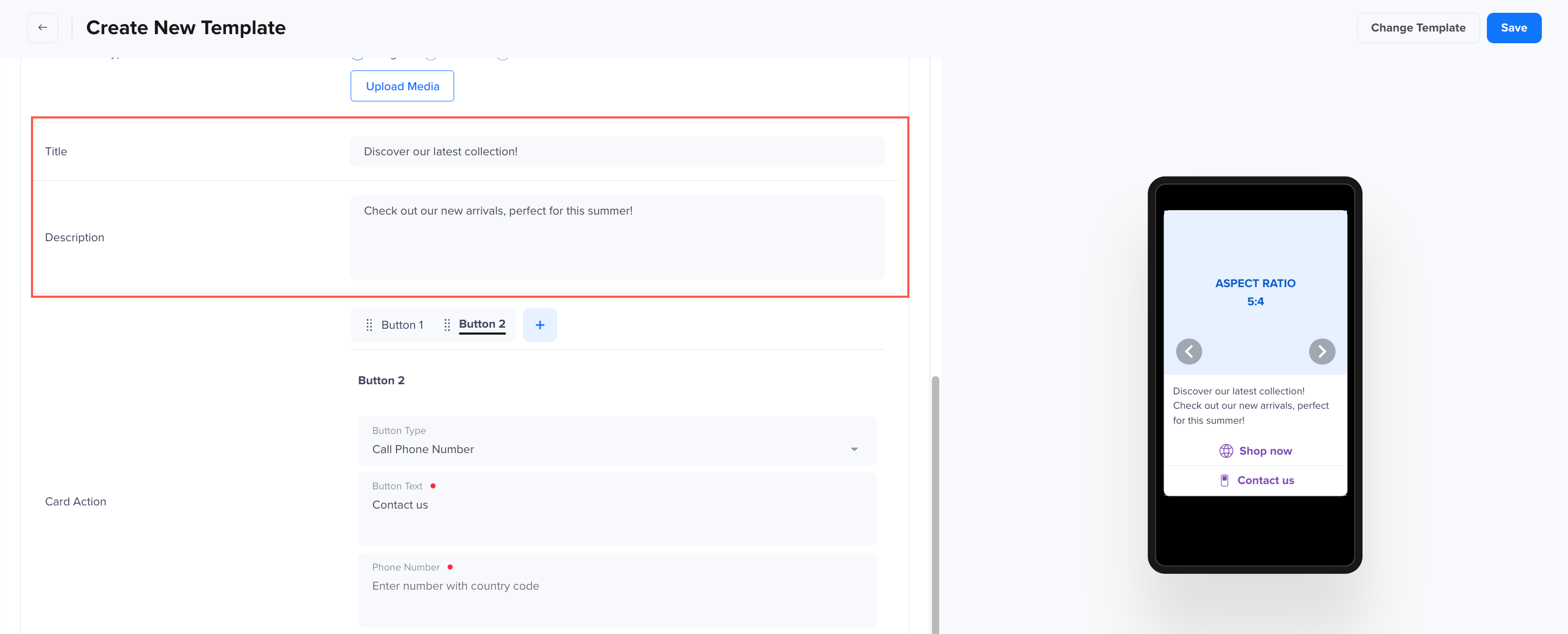
Title and Description
-
-
-
Card Action: Click + to add buttons to the card (up to 4 buttons per card). The following button types can be added: