Advanced Web Pop-up Builder
Overview
CleverTap's Advanced Web Pop-up Builder allows marketers and designers to create visually appealing and engaging desktop and mobile Web Pop-up messages. It is fully interactive, allowing you to easily drag and drop elements and adjust their position and size. Marketers can use such pop-ups to capture leads, announce flash sales, or offer personalized discounts, without disrupting the user experience. This document walks you through the main features of the Web Pop-up Editor and its usage to help you maximize your website's experience.
Private BetaThis feature is a Private Beta Release. If you want access to this feature, contact your Account Manager.
The Advanced Web Pop-up Builder provides flexibility and ease of use to craft visually rich and responsive pop-ups. Using the Web Pop-up Builder you can do the following:
- Custom Layout: Arrange and layer elements in the desired layout to suit your campaign design.
- Element Stacking: Overlay elements such as text, images, and buttons for more visually engaging designs.
- Built-in Animations: Enhance user interaction with entry and exit animations.
- Comprehensive Styling Controls: Access a wide range of styling options for every element, such as color, position, border, and more, giving you precise control over the appearance.
Advanced Web Pop-up Builder Template
The Advanced Web Pop-up Builder Template enables you to create highly customized and responsive web pop-ups directly from the campaign builder, tailored for both desktop and mobile devices. To use the Advanced Web Pop-up Builder template:
- From the What section in the Web Pop-up campaign, select the Message Type and click Go to Editor. The Web Pop-up templates are displayed.
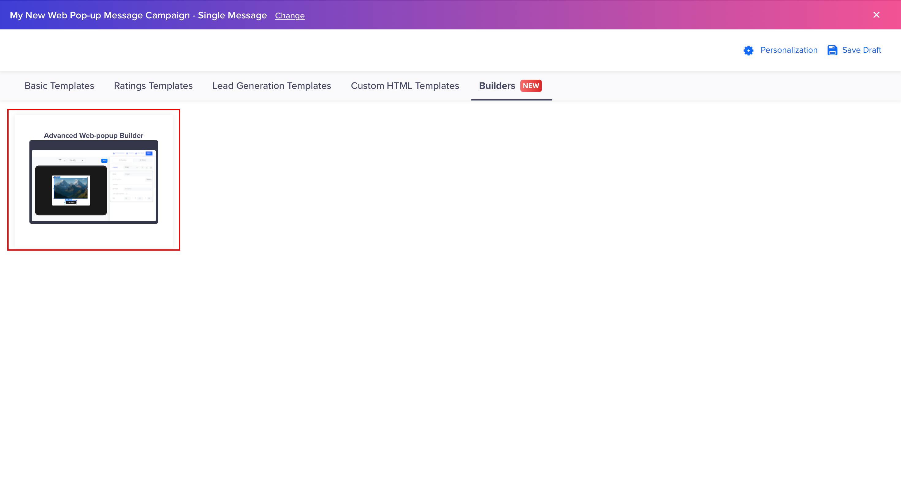
Advanced Web Pop-up Builder
- From Builders, select Advanced Web Pop-up Builder.
Advanced Web Pop-up Builder
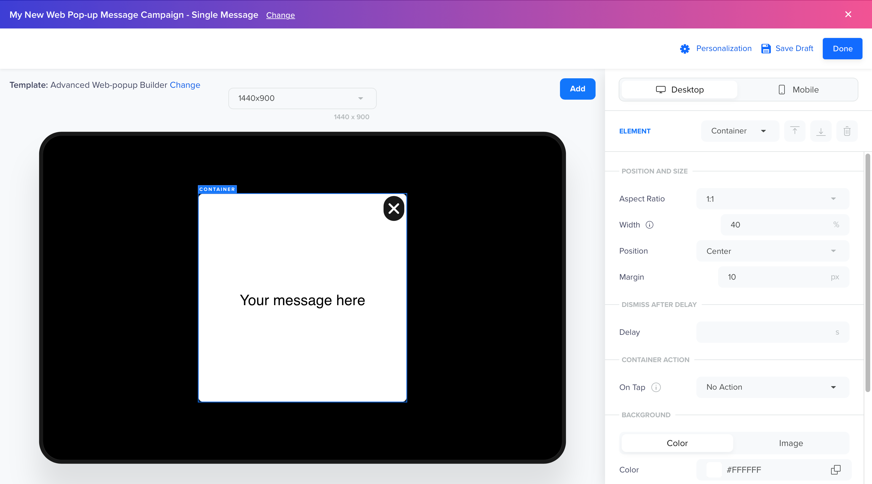
It is divided into two main sections:
- Canvas (Left Side): The canvas is where you design your Web Pop-up.
- Controls & Styling Menu (Right Side): This menu contains controls and styling options for the elements on the canvas. Any changes made here instantly reflect on the canvas in real time.
Element Operations
This section explains how to add, layer, remove, and edit elements in the Advanced Web Pop-up Builder. In the Advanced Web Pop-up Builder, Elements are the core components used to construct your message. You can perform the following operations:
- Device Previews
- Add New Elements
- Layer Elements
- Remove Elements
- Edit Elements
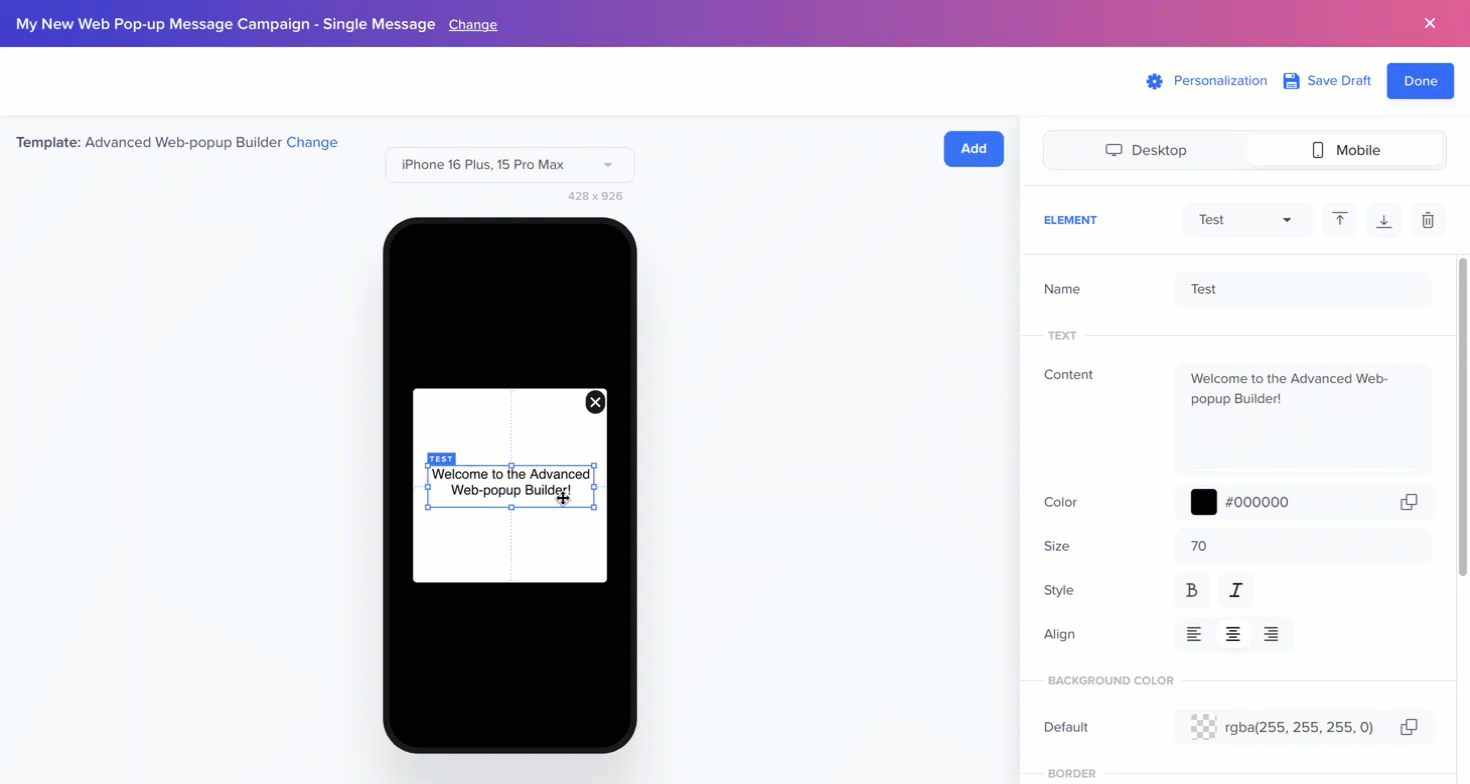
- Text
- Image
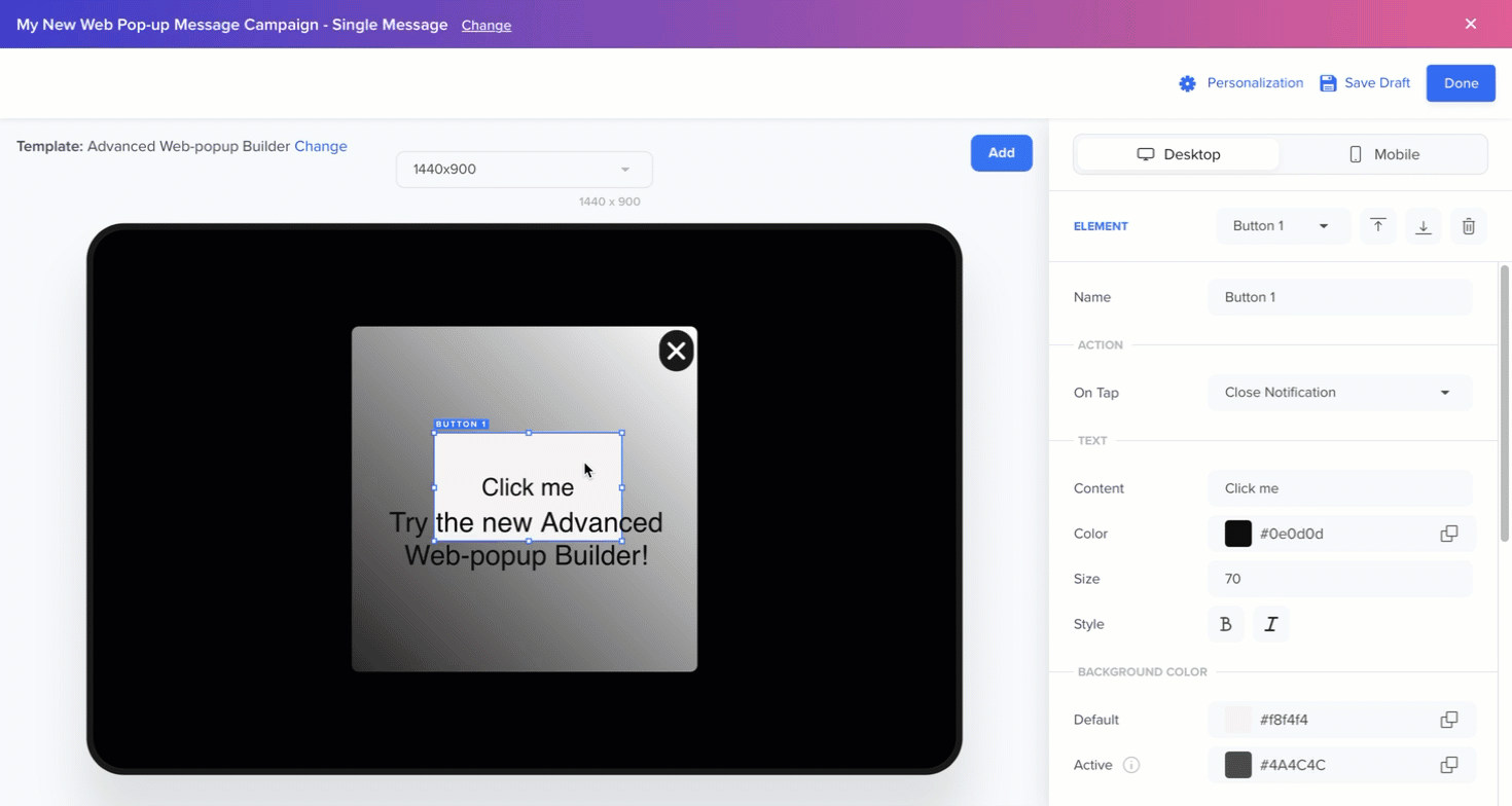
- Button
- Container
Device Previews
Toggle between Desktop and Mobile device views to create the Popups for desktop and mobile users:
- Desktop: Use the Device Preview list to preview the pop-up across various screen widths, such as 320px, 768px, or 1024px. This helps ensure responsive behavior on different browser sizes.
- Mobile: Select the phone or tablet from the Device Preview list to preview the pop-up on a range of phone and tablet models. This allows you to tailor the experience based on screen dimensions and device form factors.
Device Options
NoteDesktop and Mobile sections are independent of each other and you must create separate designs for both device types.
Add New Elements
You can enhance your Web Pop-up message by adding elements and using the available styling options to ensure it aligns with your brand's style/aesthetics. Click Add on the canvas to insert one of the following elements:
- Text: Add text to convey your message.
- Image: Incorporate visuals or branding images to create an engaging experience. Image elements can also function as buttons, enabling call-to-actions directly from the image.
- Button: Create call-to-action buttons, such as Buy Now or Learn More, with precise control over the design and positioning.
- Container: Hold all the content, such as text, images, and buttons, and determine the layout structure.
Add New Elements
Layer Elements
The Web Pop-up Builder supports multiple elements and visual hierarchy. When working with stacked elements such as images, text boxes, or buttons, the Bring Forward and Send Backward buttons manage their visibility on the user's screen.
- Click Bring Forward to move an element to the front.
- Click Send Backward to push it behind other elements.
Position Elements
Remove Elements
To delete an element:
- Select the element on the canvas.
- Click the Remove Element icon.
NoteThis action is permanent and cannot be undone.
Remove Element
Edit Elements
Each element has its own set of editable properties available from the Controls & Styling Menu. Refer to the following table for element-specific styles and behaviors:
| Element | Editable Properties |
|---|---|
| Text |
|
| Image |
|
| Button |
|
| Container |
|
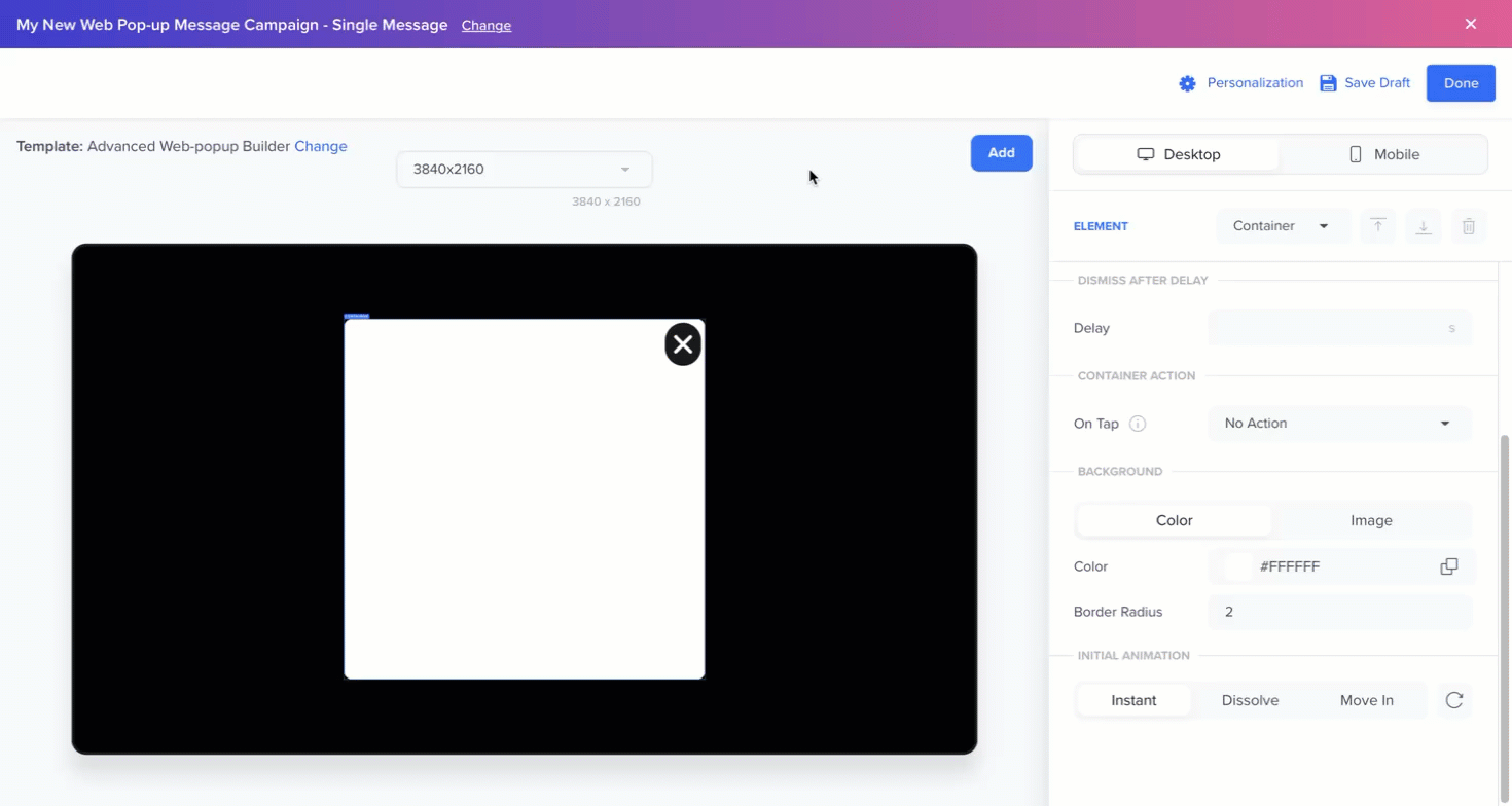
Add Animations
Animations enhance visual appeal and improve user experience. The builder provides built-in animation options for the Container element.
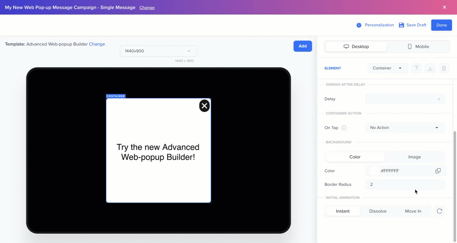
Design Animation
From the Container element, configure various animation options as follows:
- Animation types: Choose from Instant (default), Dissolve, or Move In animations.
- Duration: Duration is set in milliseconds, allowing you to experiment with different values and observe the effect in the canvas.
- Easing: Following options are available for Dissolve and Move In animations.
| Easing Options | Description |
|---|---|
| Linear | Moves at a constant speed from start to finish, creating a uniform motion. |
| Ease In | Fades in, creating a smooth entrance. |
| Ease Out | Fades out, creating a smooth exit. |
| Ease In and Out | Fades in and out from start to finish. |
| Cubic Bezier | A customizable easing option where you define the exact acceleration curve using Bézier control points (ideal for fine-tuning advanced animations). |
- Replay Animation: Preview the effect by replaying the animation in the Canvas.
Configuring Web Pop-up Campaigns
Once the Web Pop-up is designed using the builder, you can set up the Web Pop-up campaign to control when, where, and to whom the pop-up is displayed. These targeting and delivery rules are defined during the campaign creation process.
For more information on how to configure these options, refer to Create Message.
FAQs
Can I stack images, buttons, and text?
Yes. Use the Bring Forward and Send Backward options to control the visual layering of elements.
Can I preview my Web Pop-up before launch?
The Preview and Test feature is currently unavailable for the Builder. To test your Web Pop-up message on a real device, exclusively send the campaign to a specific test user or segment for testing. After you are done testing, recreate the campaign and send it to your intended audience. For more information on test users, refer to Mark a User Profile as a Test Profile.
What happens if I only configure the desktop version and not the mobile version, or vice versa?
The Desktop and Mobile sections are independent of each other and you must explicitly configure pop-ups for both device types. Pop-ups created for desktop do not automatically adapt to mobile, and vice versa.
Is Liquid Tag personalization supported in the Advanced builder?
Yes. Liquid Tags are supported, allowing you to personalize content dynamically within your Web Pop-up campaigns. For more information, refer to Liquid Tags.