Advanced In-App Builder
Overview
CleverTap's Advanced In-App Builder enables you to create visually appealing, engaging mobile In-App messages that align with your brand's aesthetics. This document guides you through the main features of the In-App Editor and its use, helping you maximize its potential.
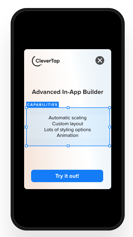
Sample In-App Message with Advanced Editor
The Advanced In-App Builder offers remarkable flexibility and ease of use. Here are the key features:
- Automatic Scaling: Content automatically adjusts to fit any device size, ensuring consistent presentation across all platforms.
- Custom Layout: Arrange elements in the container to create any desired layout.
- Stacking Elements: Overlay images or other elements to create more complex, visually engaging designs.
- Styling Options: Access a wide range of styling options for every element, giving you precise control over the appearance.
- Dismiss Button Controls: Customize the appearance and behavior of the dismiss button, including its style and placement.
- Animation: Enhance user interaction with dynamic effects such as slide or fade-in animations.
Advanced In-App Builder Template
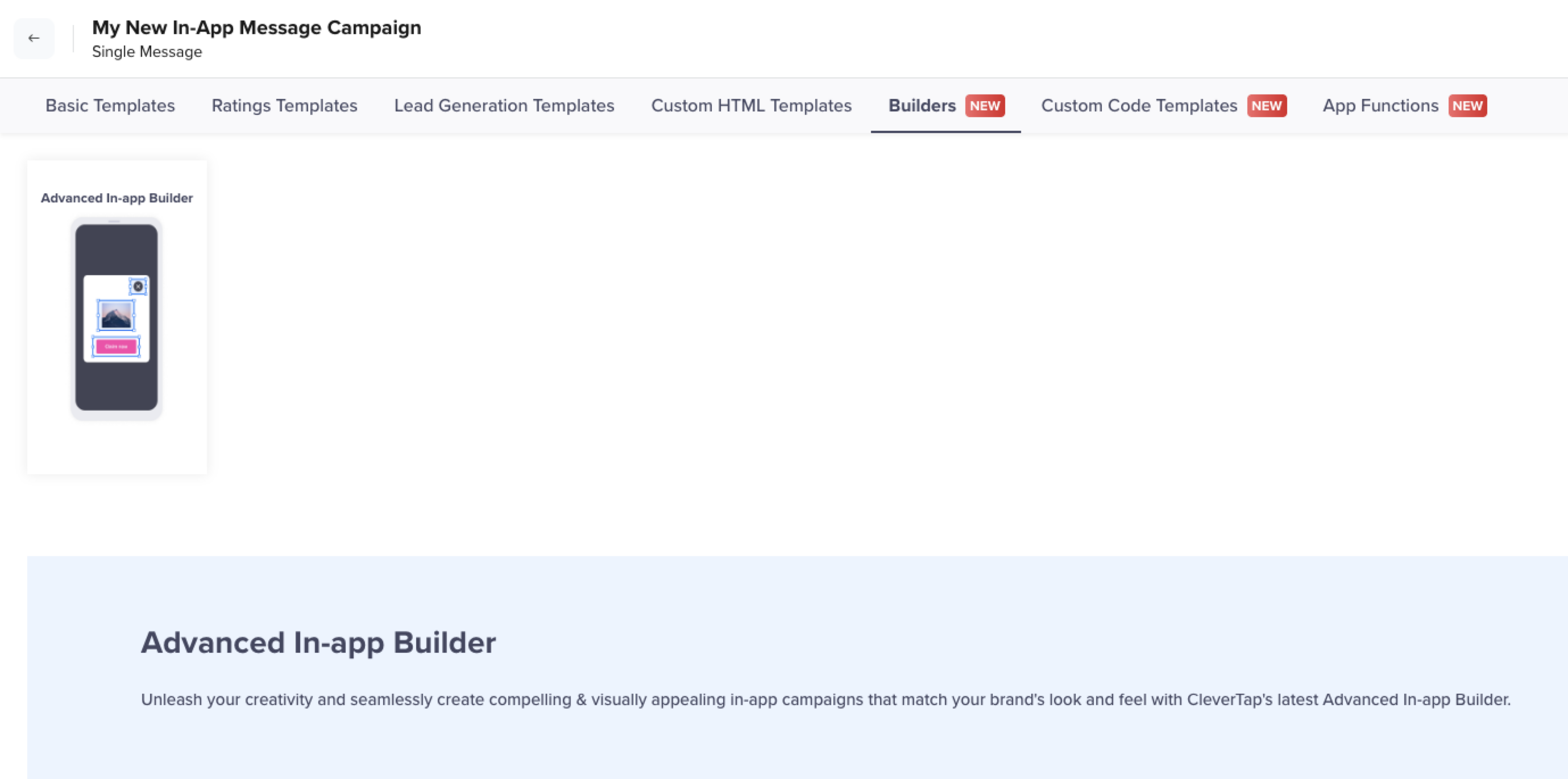
To use the Advanced In-app Builder template:
- From the What section in the In-App builder, select the Message Type and click Go to Editor. The In-App templates are displayed.
Select Advanced In-App Builder
- From Basic Templates, select Advanced In-app Builder. The Advanced In-App Builder displays.
Advanced In-App Builder
The Advanced In-App Builder has a What You See Is What You Get (WYSIWYG) interface, which allows you to make modifications in real-time.
It is divided into two main sections:
- Canvas (Right Side): The canvas is where you design your In-App message. It is fully interactive, allowing you to drag and drop elements and adjust their position and size with ease.
- Controls & Styling Menu (Left Side): This menu contains controls and styling options for the elements on the canvas. Any changes made here are instantly reflected on the canvas in real-time.
Builder Elements
In the Advanced In-App Builder, Elements are the core components used to construct your message. Upon opening the builder, three default elements are available: Overlay, Container, and Dismiss Button.
The following image shows the default elements:
Builder Elements
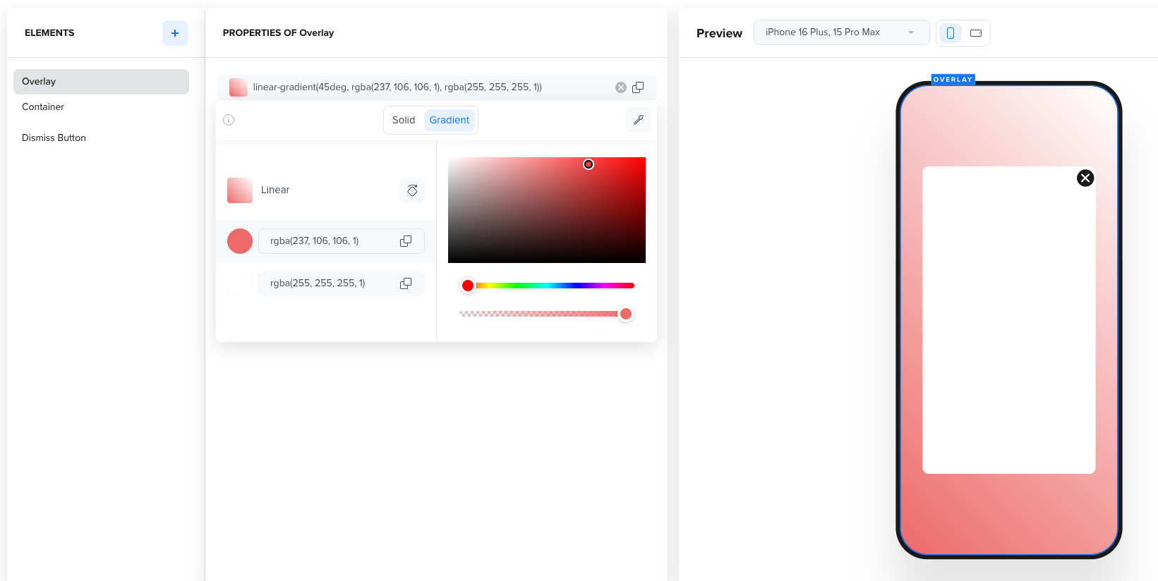
Overlay
The overlay provides a background for your In-App message, ensuring a seamless, integrated look.
Design Overlay
The overlay allows you to modify the following:
- Transparency level: Control the transparency level of the Overlay.
- Color Background: Add a color background.
- Image Background: Add an image as a background. Click Upload to add an image.
Container
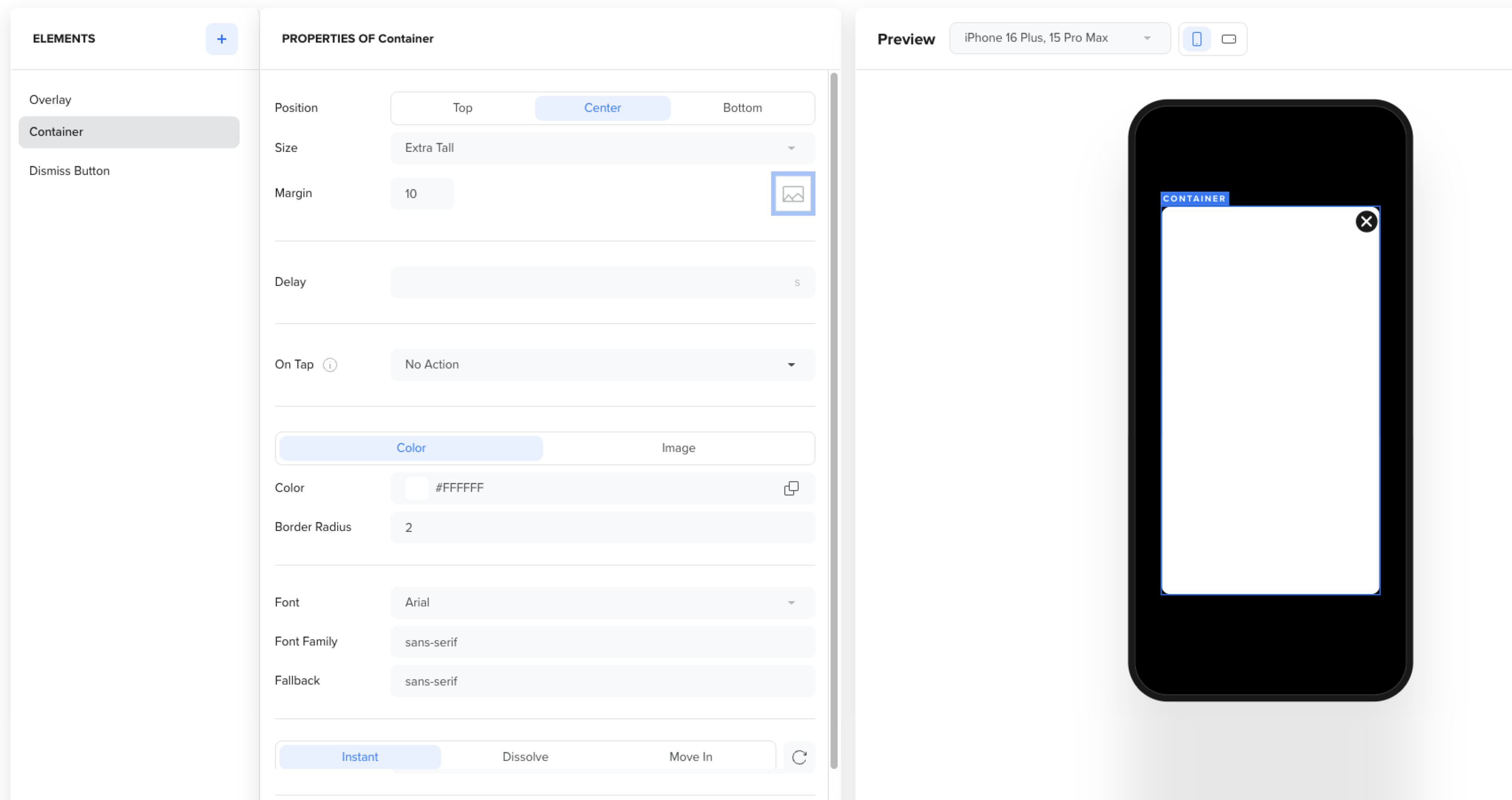
The Container holds all the content in your In-App message, such as text, images, and buttons, and defines how the message appears on a user’s screen.
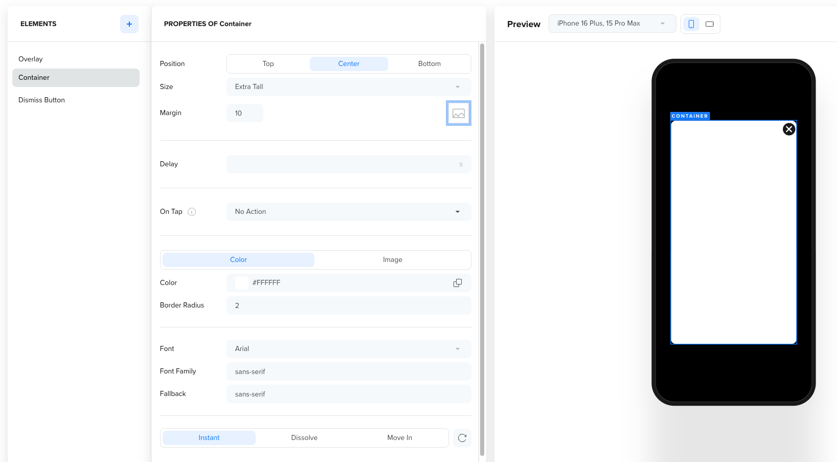
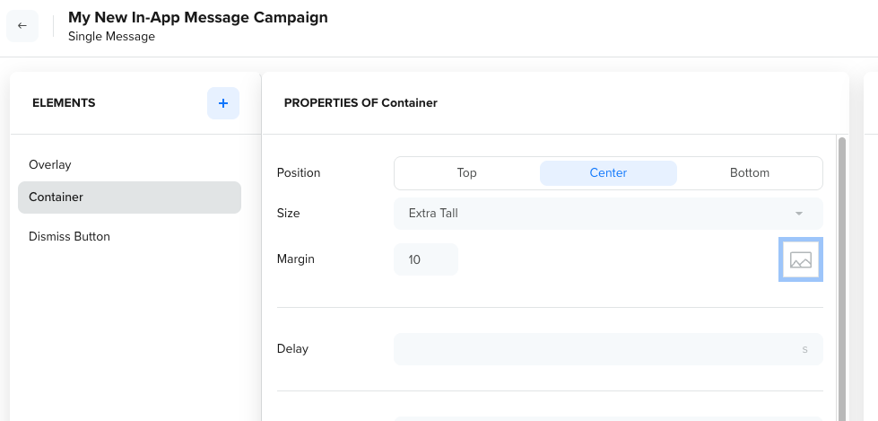
Container Properties
Click the + button to add a container element such as Text, Media, or Button.
Container Properties
You can customize the following properties to control the look, behavior, and visual design of your In-App message:
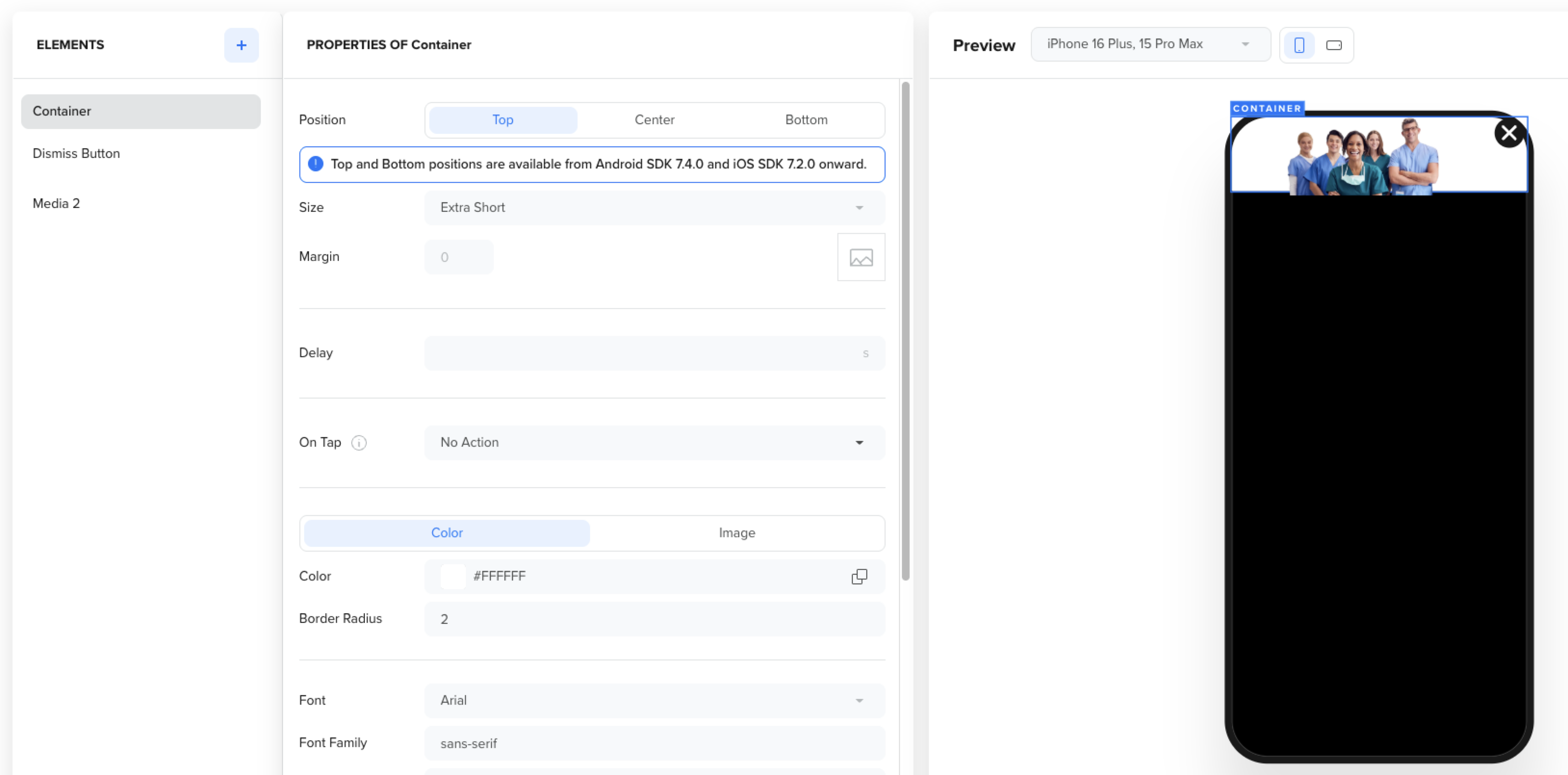
- Position: Choose where the message appears on the screen (Top, Center, or Bottom).
- Size: Select from predefined size options such as Wide, Square, Tall, or Extra Tall, depending on your layout.
- Margin: Adjust the margin percentage to create space between the message and the device edges.
- Delay: Set a delay after which the in-app message automatically dismisses.
On Tap Container Action
Define what happens when users tap the container.
| Action Type | Description |
|---|---|
| No Action | No behavior is triggered when the container is tapped. |
| Close Notification | Closes the in-app message. |
| Open URL | Opens a specified URL link. |
| Key–Value Pair | Adds a key-value pair for tracking or personalization. |
| App Function | Triggers app-level functions such as requesting push permission or app rating. For more information, refer to App Functions. |
Background
Apply a background color or image to your design. You can do the following:
- Choose a solid color using a color picker or hex code.
- Upload an image directly from your system and add alt text for accessibility and search. For more information on images, refer to Image Size and Aspect Ratios.
Font and Text
Control how text appears within your container. For more information, refer to Custom Fonts.
Border Radius
Adjust the level of rounding on the container’s corners. A higher value results in more rounded corners.
For example: Border Radius: 2 gives slightly curved edges, while higher values create a more pill-shaped container.
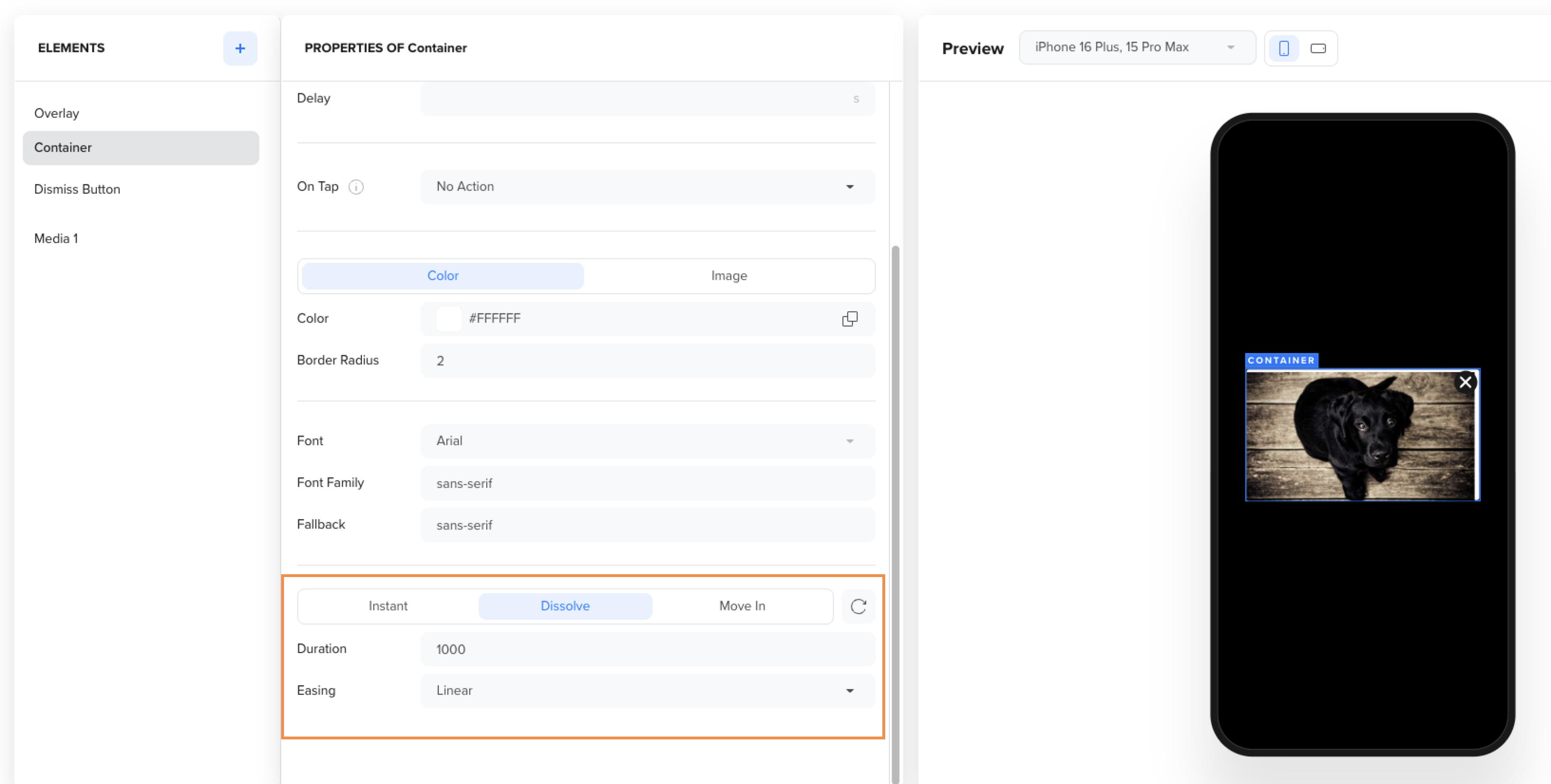
Initial Animation
Control how your container appears when the in-app message loads.
| Animation Type | Description |
|---|---|
| Instant | The container appears immediately without animation. |
| Dissolve | The container fades into view smoothly. |
| Move In | The container slides into the screen from a predefined direction. |
Image Size and Aspect Ratios
The available container size options vary depending on the orientation of the container. Use the following tables to understand the aspect ratio of each option.
NoteAspect ratios ensure your in-app content appears correctly across different devices and orientations. Confirm the correct orientation before finalizing your design.
Welcome to the content that you can only see inside the first Tab.
| Size Option | Aspect Ratio |
|---|---|
| Extra Short | 4:1 |
| Short | 7:2 |
| Mid | 3:1 |
| Tall | 2:1 |
| Extra Tall | 5:4 |
| Square | 1:1 |
| Wide | 16:9 |
Supported Media
You can use the following media for your content:
| File Format | Description |
|---|---|
| JPEG | Best for photos and detailed images. |
| PNG | Ideal for transparent or high-quality graphics. |
| GIF | Use for lightweight animations. |
| Video: | Use for short videos (up to 50 MB). |
Best PracticesOptimize your images to improve message load time and prevent rendering issues on low-performance devices.
Dismiss Button
The Dismiss Button allows users to close the In-App message.
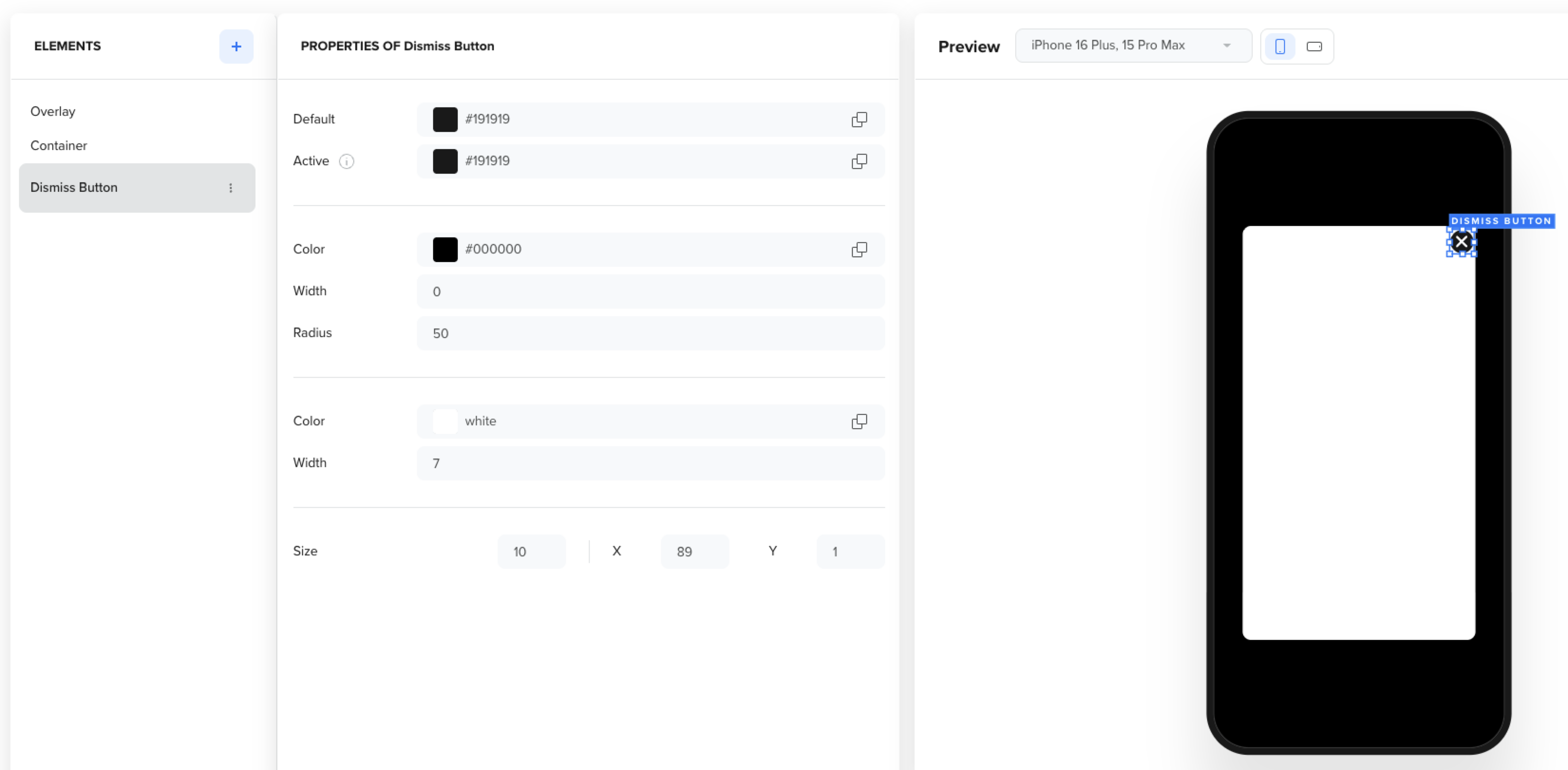
Hide/Display Dismiss Button
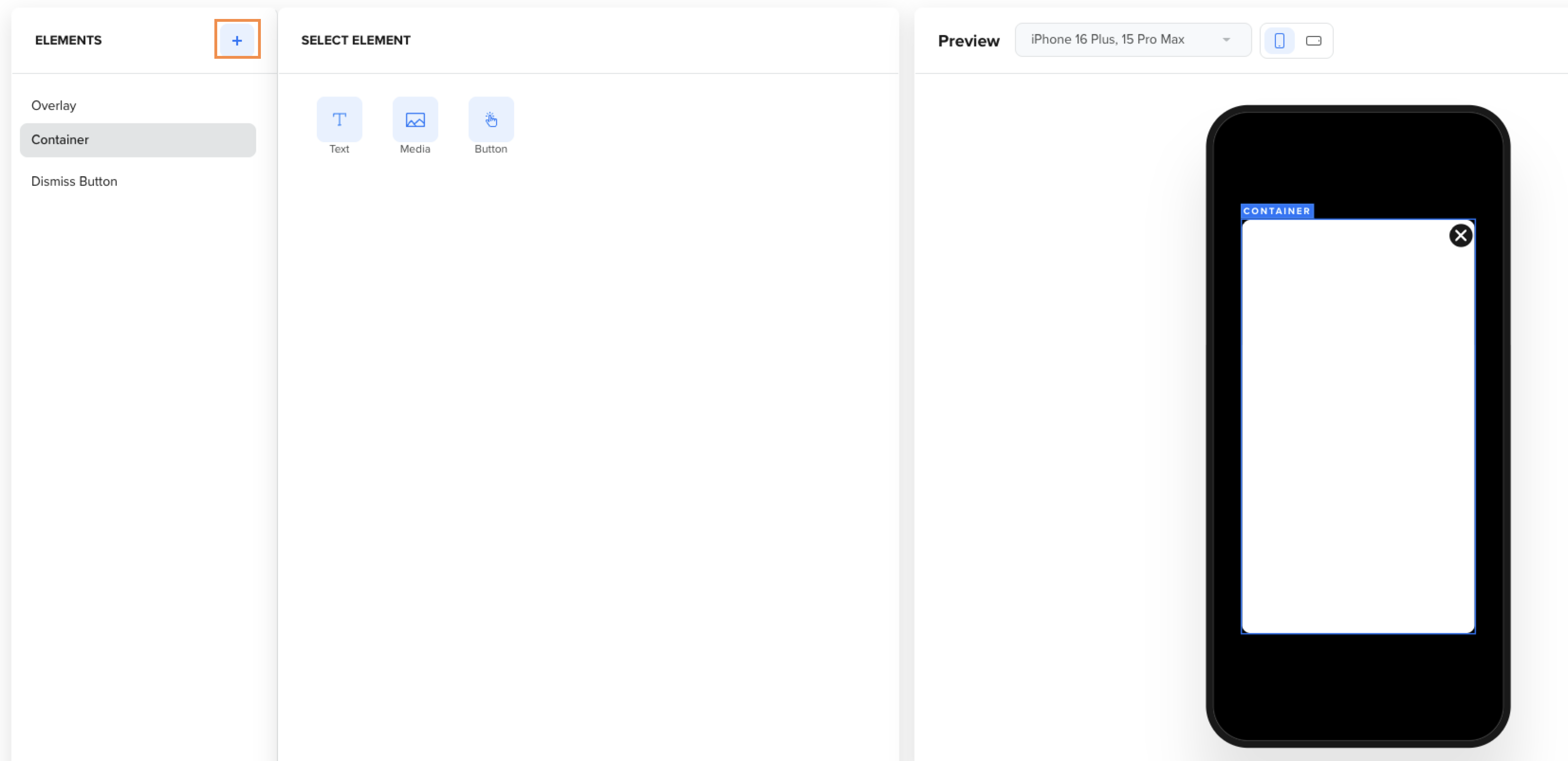
Add New Elements Inside Container
Click Add on the canvas to add Text, Image, or Button.
Design Container
You can enhance your In-App message by adding the following elements inside the container:
- Text: Add text to convey your message. Use the available styling options to ensure it aligns with your brand's style.
- Image: Incorporate visuals or branding images to create an engaging experience.
- The builder supports multiple image elements, which you can stack on top of each other.
- Image elements can also function as buttons, enabling a call-to-action directly from the image.
- Button: Create call-to-action buttons, such as Shop Now or Learn More, with precise control over the design and positioning.
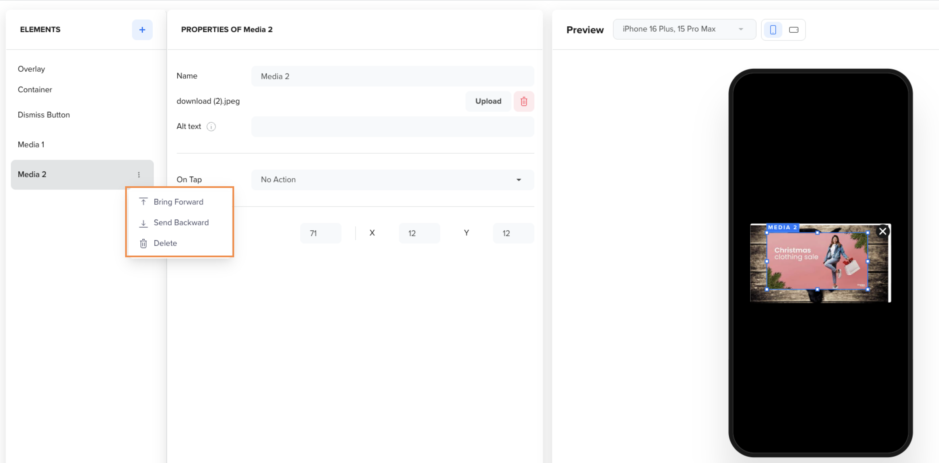
Display Element Over or Behind an Element
When working with stacked elements such as images, text boxes, or buttons, the Bring Forward and Send Backward buttons manage their visibility on the user's screen. If one element overlaps another, clicking Bring Forward brings the selected element to the front, ensuring it is fully visible.
Position Elements
Add Animations
The builder offers built-in animation options to enhance the user experience flow. Animations are configured from the Container element.
Animate Element
You can enhance user interaction with the help of various animation options as follows:
- Animation types: Choose from Instant (default), Dissolve, or Move In animations.
The Duration is set in milliseconds, allowing you to experiment with different values and observe the effect in the canvas. - The Duration value can be set in milliseconds, and you can try different settings and see how they behave in the Canvas.
- The Repeat button replays the animation in the Canvas.
Banners
Mobile Banner ads are a type of in-app message designed to subtly engage users without interrupting their app experience. They appear as small, rectangular strips anchored to either the top or bottom of the screen and can be static or animated using rich media.
Unlike Interstitial messages or full-screen Covers, Banners are nonintrusive. They do not block app interactions or obscure the rest of the screen. They allow seamless user activity while still effectively delivering your message.
In-App Banner
Create Banners
You can customize Mobile Banners using the Container Element, which gives you complete control over the banner’s design, content, and behavior.
To create a Banner, follow these steps:
- Go to Advanced In-App Builder from the Builders tab when creating an In-App message campaign.
- Select the Container element and apply the Top or Bottom position to create a Banner.
- Customize your Banner by adding text or images. For more information, refer to Adding New Elements inside Container.
- Configure optional behaviors such as animations, tap actions, or dismiss rules.
Your Banner is ready to be used in an In-App campaign.
Custom Fonts
The Advanced In-app Builder supports Custom Fonts for all Text content in your Mobile In-app Campaign. To use custom fonts, follow these steps:
- Select Advanced In-App Builder from the Builders tab when creating an in-app message campaign.
- Select the Container element to add or manage custom fonts.
- From the Font list, select a font from System Fonts or your Custom Fonts, which will be applied to all elements with Text in your Campaign.
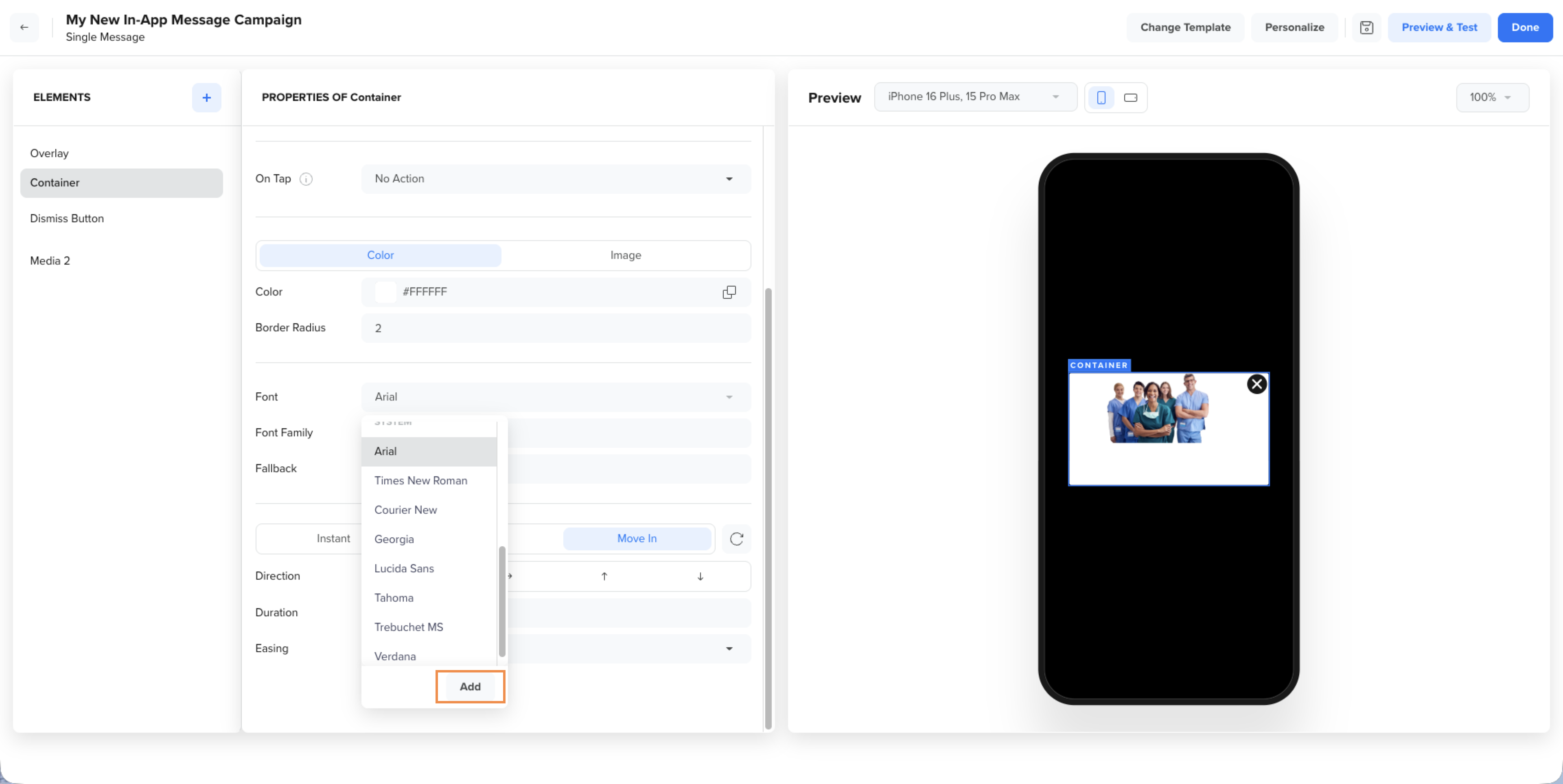
Select or Add Font
- Click the Add button to add your new Custom Font. You can either upload a CSS file containing your Custom Font or use the URL of an already hosted file.
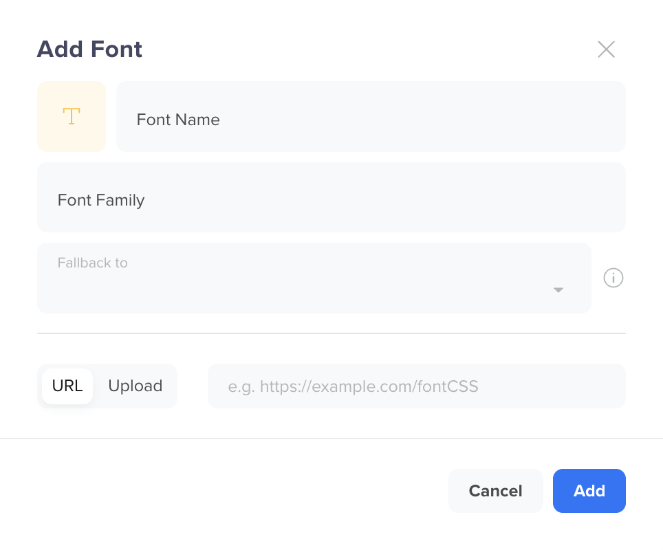
Add New Custom Font
-
Enter the following details to create your Custom Font:
Field Name Description Font Name Uniquely identifies the font. This field has a limit of up to 50 characters. Font Family Defines the style applied to the font. This field has a limit of up to 50 characters. The custom font family must match the name of the font face in the CSS file. Fallback to If the Custom Font fails to load on the device, we will use one of the FallBack Fonts to render the In-app Campaign. Font URL If the font is not on your local system, you can select this option to add the URL for the required font. The URL must point to a CSS file.
- If your custom font is a public font available on the web, you can add the URL for the font.
- If you upload the font to your private server, check that CORS is enabled on the server to provide the custom font file.
The custom font file must have the following header:Access-Control-Allow-Origin: *. When defining font URLs in thesrcattribute, utilizing thehttpsprotocol is essential. Refer to the Sample CSS Code.Upload Font If you already have a font file on your local system, choose Upload Font, and click Upload to upload the CSS file for your custom font. The file size should be a maximum of 1 MB.
Sample CSS Code
@font-face {
  font-family: 'Dancing Script';
  font-style: normal;
  font-weight: 400;
  font-display: swap;
  src: url(https://fonts.gstatic.com/s/dancingscript/v25/If2RXTr6YS-zF4S-kcSWSVi_szLgiuEHiC4W.woff2) format('woff2');
  unicode-range: U+0000-00FF, U+0131, U+0152-0153, U+02BB-02BC, U+02C6, U+02DA, U+02DC, U+0304, U+0308, U+0329, U+2000-206F, U+2074, U+20AC, U+2122, U+2191, U+2193, U+2212, U+2215, U+FEFF, U+FFFD;
}
FAQs
How do I add new elements other than the default ones?
To add new elements, use the controls on the right side of the builder to drag and drop images, text, and buttons directly into the container.
Can I preview my In-App message before sending it out?
Yes. The Preview and Test feature is available from Android SDK v7.7.0 and CleverTap iOS SDK v7.4.0 and later.
Can I use personalized message content?
Yes. You can use the Inline Personalization in the preview message.
Are there limitations on device sizes or layouts
No, the content automatically scales to fit any device size, ensuring consistency across platforms.
What aspect ratio should I pick for landscape orientation?
Aspect Ratios of 1:1 and 16:9 are ideal for creating In-App content in landscape orientation.