In-App Editor
Overview
The In-App editor enables you to add content to pre-built templates or customize and build them. You can select the ready-to-use template of your choice or create a custom HTML template as per your requirements. From the What section in the In-App builder, select the Message Type and click Go to Editor.
The In-App Editor tool displays.
In-App Templates
The following are the four main types of In-App templates for creating engaging and personalized In-App campaigns:
- Basic Templates
- Ratings Templates
- Lead Generation Templates
- Picture-in-Picture (PiP) Template
- Custom HTML Templates
Basic Templates:
Basic Templates are ready-to-use templates that enable you to send tailored and personalized In-App engagements to your mobile users. You can use both text and images with CTAs to send personalized In-App messages basis your business use case.
Using basic templates, you can create the following two types of In-App messages:
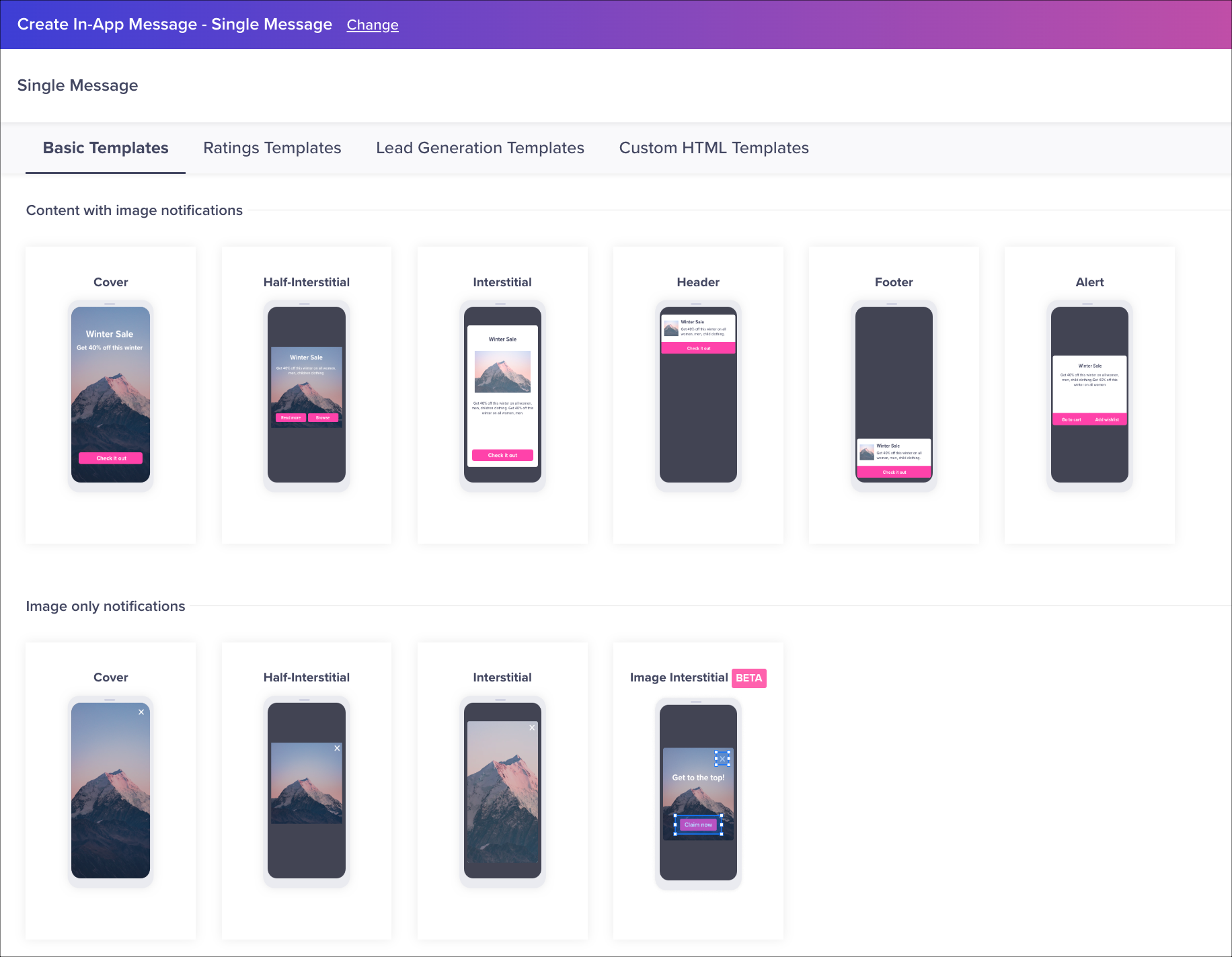
Content with Image notifications
These templates allow you to use images in combination with text for effective messaging. You can choose from a range of templates such as Cover, Half Interstitial, Interstitial, Header, Footer, and Alert based on your use case.
Image-only notifications
These templates allow you to send visually engaging images that can quickly capture users' attention and encourage them to engage with the message when they launch the app. When selecting an image only template, you can send a message containing only an image (without CTAs, title, or message).
You can choose from the following four types of Image only notifications:
Cover
It is a full-screen notification template that is valuable when the intention is to direct the user's focus toward essential actions, such as requiring them to install a necessary app update.
Half Interstitial
It is a center-aligned image notification template for driving better engagements. You can use this template when you want to gain the user's attention towards a sale or discount.
Interstitial
It is a center-aligned image notification template you can use for driving better engagements on app launch.
Image Interstitial
AvailabilityThe Image Interstitial template is available only with CleverTap Advanced and Cutting Edge plans.
This template helps craft personalized In-App messages that seamlessly match your app's aesthetics. You upload an image and elevate the experience by incorporating up to 10 interactive hotspots, each with its own unique actions. For example, you can use this template to create a rewarding offer for your gaming app users. The following image represents a sample In-App campaign for rewarding users using the Image Interstitial template:
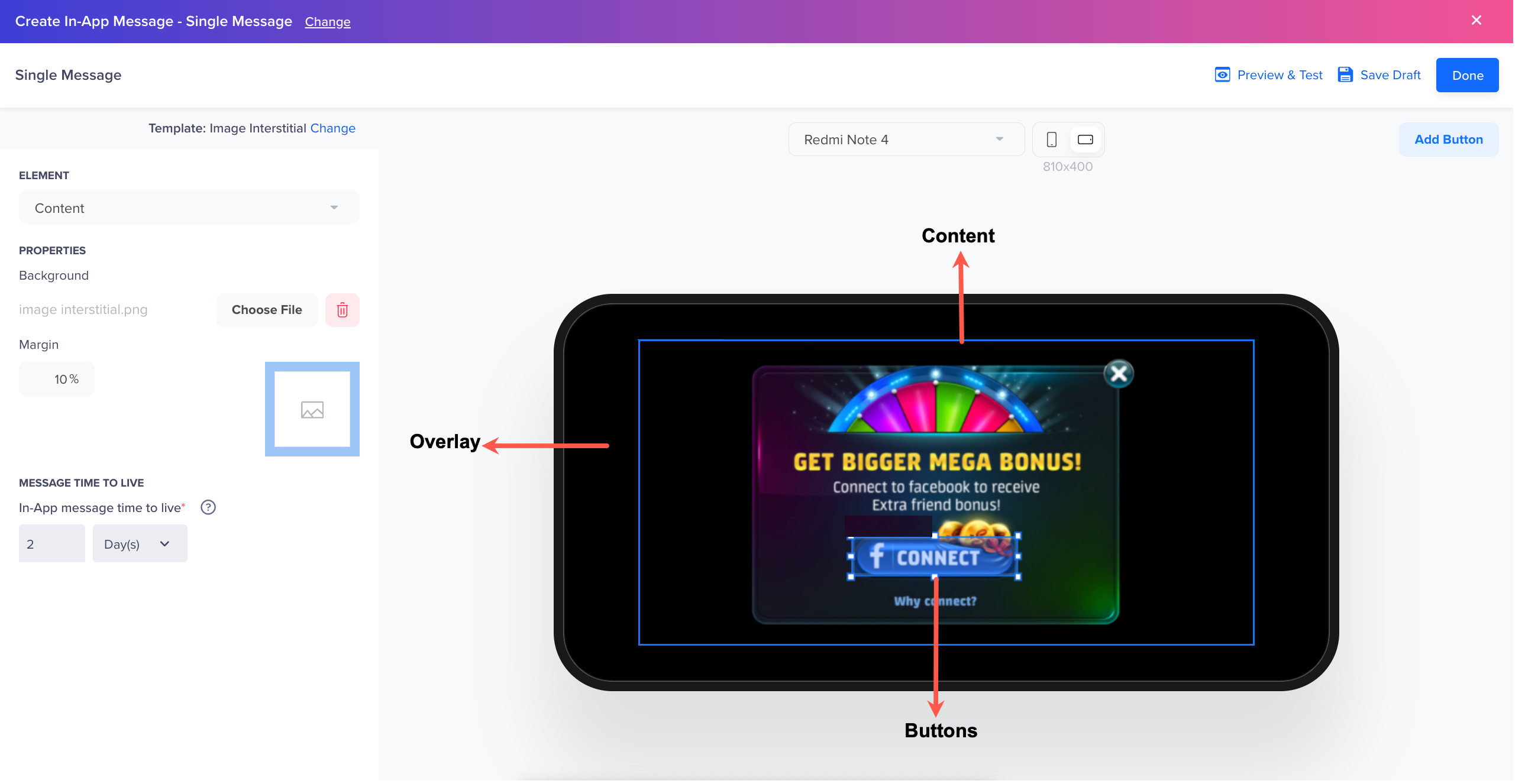
Sample In-App Campaign using Image Interstitial Template
The Image Interstitial template primarily comprises the following three elements:
- Overlay: This element is a middle layer between your In-App message and your app in the background. By default, it is transparent; however, you can select a color of your choice or upload an image to it. Using the Overlay configuration, you can:
- Opt for a semi-transparent color to softly mask the app in the background, drawing more attention to the in-app message in the foreground.
- Upload a patterned image to create a captivating, full-screen, layered in-app message experience.
- Content: It is the core element of the template. Click in the center of a blank device or select the Content option from the Element dropdown to activate it. Further, upload an image (JPG, PNG, or GIF) consisting of all In-App message elements such as background, text, and buttons.
The editor fits the image within the Content container while preserving its aspect ratio without any cropping. By default, a 10% margin is applied to the Content container. However, you can change that from the Margin field. - Buttons: The Image Interstitial buttons are transparent regions that you can place over a Content layer. You can easily move and adjust their size to align with the button elements on the image.
The selection area within the Content Container automatically adapts to various device screen sizes, eliminating the need to create multiple versions for different devices. To see how the image and buttons scale across different aspect ratios, use the dropdown menu with different device viewport sizes located at the top for a preview.
Preview & TestThe Preview & Test feature for sending tests on the device is not available for iOS or Android SDK versions lower than 6.0.0 and Unity 3.0.0. If you need to test on a device with a lower SDK version, send the campaign exclusively to the user first, and then recreate and send it to the intended audience.
Guidelines for Template Aspect Ratio and File Size
The following tables include the guidelines that you must keep in mind when creating In-App messages:
| Canvas Type | Canvas Aspect Ratio | Sample Image Sizes | Media Type Supported | Video Preview |
|---|---|---|---|---|
| Cover | Full Screen | Screen Resolution | Image, GIF | Not supported |
| Interstitial | 1.78:1 | 16:9 | Image, GIF, Video | Supported (Play / Replay) |
| Half Interstitial | 1.30:1 | 3:4 | Image, GIF | Not supported |
| Alert | Native | N/A | N/A | Not supported |
| Image Only Cover | Full Screen | Screen Resolution | Image, GIF, Video | Supported (Play / Replay) |
| Image Only Half Interstitial | 1.30:1 | 3:4 | Image, GIF, Video | Supported (Play / Replay) |
| Image Only Interstitial | 1.78:1 | 16:9 | Image, GIF, Video | Supported (Play / Replay) |
| Header | Height: 1:1 Width: Fit to screen | N/A | Logo Image, GIF | Supported (Play / Replay) |
| Footer | Height: 1:1 Width: Fit to screen | N/A | Logo Image, GIF | Supported (Play / Replay) |
| Picture-in-Picture (PiP) | Varies by size | N/A | Image, GIF, Video | Supported (Autoplay, Mute/Unmute, Play/Pause, Loop) |
File Size Guidelines
- Image: Less than 1 MB.
- Audio: Less than 5 MB.
- Video: Less than 50 MB.
Message Character Limit
| Language | Title | Message |
|---|---|---|
| English | 30 | 128 |
| Chinese | 9 (Approximate) | 38 (Approximate) |
Image CroppingDue to the multiple phone sizes on both Android and iOS, we will center crop images if the image does not fit the screen resolution.
We scale the image uniformly (maintaining the image's aspect ratio) so that both dimensions (width and height) of the image will be equal to or larger than the corresponding dimension of the phone (minus padding). The image is then center-aligned.Image Cropping does not apply for Image Interstitial template.
Video MessagesWhen adding video messages to In-App, ensure an audio track is always present.
If required, insert a blank audio track to the video.
Ratings Template
Marketers can now create feedback-related popups for their mobile app users using the Ratings Template.
They can now create two types of rating templates for gaining feedback from their customers:
- User Rating Popup - It helps assess how happy your customers are with your services by taking feedback in the form of star ratings.
- NPS Popup - It enables you to measure the loyalty of your customers by distinguishing them in three categories - Promoters, Passives, Detractors. One can view the NPS performance by navigating to the NPS board available under the Boards section.
The following images represent a sample User Rating Popup and NPS popup in a mobile app.

User Ratings Popup

NPS Popup
Marketers get the complete flexibility to explicitly define the rating scale, style, shape (Star, Heart, Emojis), labels, and the overall content of the popup. One can also choose to add a comment box to get accurate user feedback/comments.

In-App Editor Style
Besides, additional styling, such as configuring the color for the message, question, background, and rating scale is also possible from the editor, as shown in the image above. The In-App notification text fields shown below can be personalized for every user based on specific user property or event property values. To learn more about tracking and monitoring user rating data, refer to Analysing User Rating.

Compose In-App Message
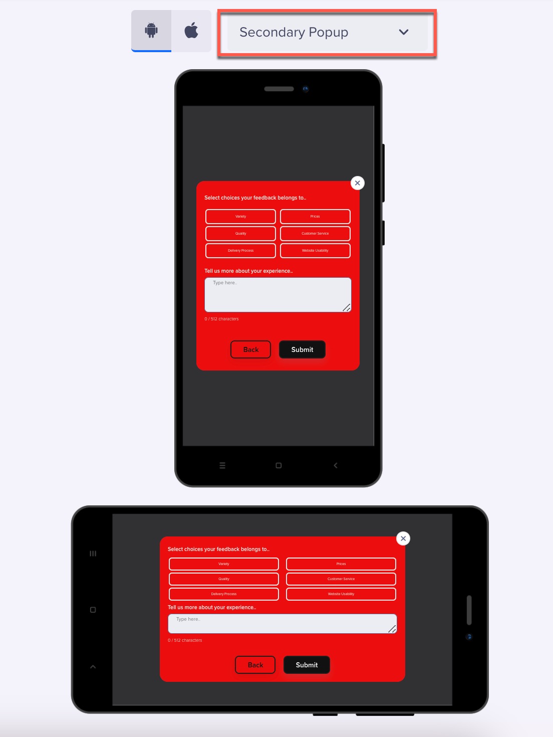
Follow-up Question Templates
A follow-up question to your ratings can provide more insights about the user experience. CleverTap provides the following Follow-up Question templates:
- NPS with Follow-up Question
- User Ratings with Follow-up Question
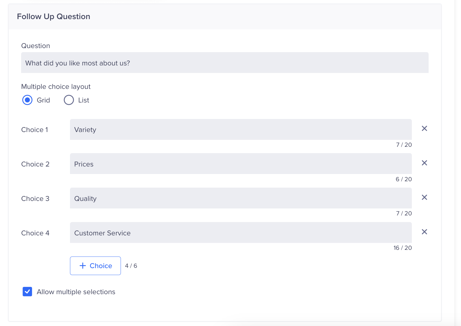
For example, after a user has submitted a rating on your app, you can ask follow-up questions such as What did you like most about us? and provide reply choices such as Variety, Prices, Quality, Customer Service, Delivery Process, and Website Usability. This can help you get more specific feedback to improve your product and services. Following is an image from the in-app editor:
Short Keyword-Based Choices
You can also list descriptive choices such as, I like the available options and variety, I like the quality and durability of the products, and so on. Following is an image from the in-app editor:
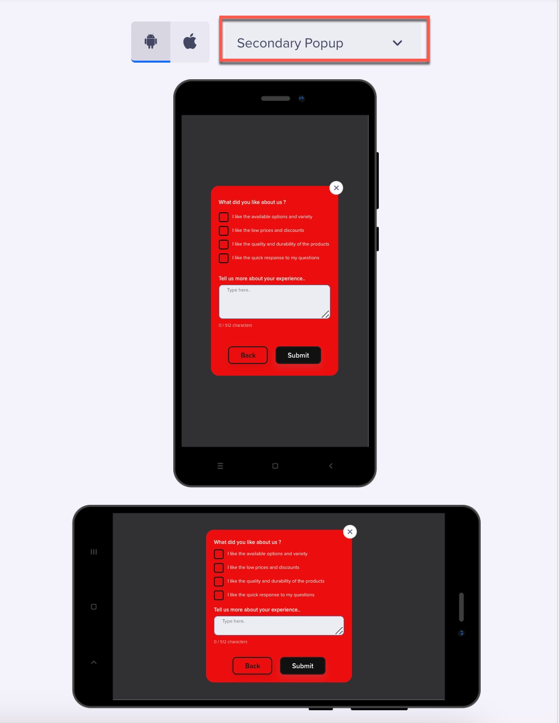
Descriptive Choices
You can configure the follow-up question from the Web Popup editor with a short keyword-based grid (up to six choices) or a longer sentence-based list (up to four choices).
The label will be the text you want to display to your users. If you want to allow the user to select multiple choices, select Allow multiple selections.
Configure Follow-up Popup
NoteIn the case of the User Ratings template, the Notification Clicked event is raised that records the user's clicks on the CTA buttons and the Close button
Lead Generation Template
We know that a significant number of App users may remain anonymous. This poses a challenge to continue engaging with potential customers after they leave your App. A lead generation template can solve this issue.
Integrating a lead generation form into your App lets you get important customer details such as name, email address, phone number, etc. This information is helpful for further communication through channels such as SMS, Email, WhatsApp, and others. This post-visit communication helps stay connected with your audience and opens doors for future business opportunities. You can turn anonymous visitors into loyal customers with your App's CleverTap Lead Generation Template.
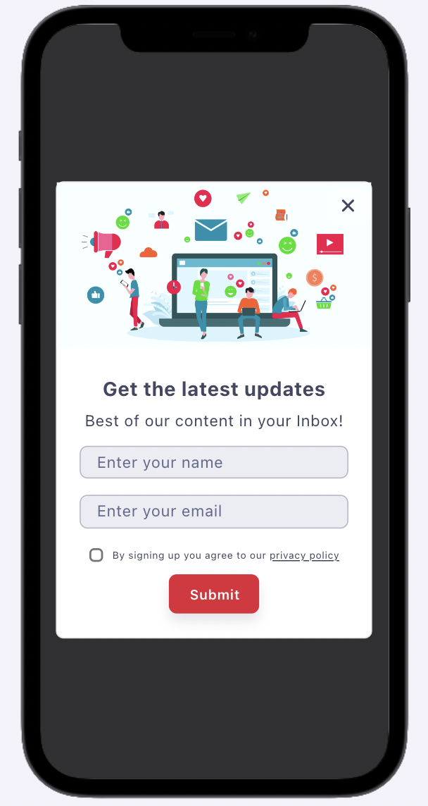
Sample Lead Generation Template
Post Submit Actions
When a user submits information on your Lead Generation template:
-
A Notification Clicked event is raised that records the click on the CTA.
-
A custom event named Lead Submitted records the details submitted by the user as of event properties. Following is a sample form image:
Form Submit Actions
Following is a table that records the relevant properties for the fields displayed on the form:
| Submitted Event Properties | Sample Property Value |
|---|---|
| First Name | John |
| Last Name | Smith |
| Email ID | [email protected] |
| Phone Number | +11234567890 |
| Campaign ID | 121110987654 |
| Variant | wzrk_default |
- The user profile is automatically updated with the submitted event properties. For example, the lead generation template can ask for additional details from an anonymous user, such as first name, last name, email, and phone number. His profile will be updated with these details, and now you can identify the user as John Smith.
Lead Generation Template Variants
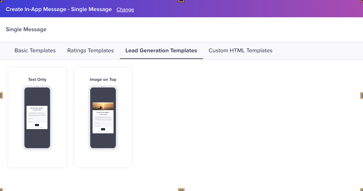
The following are the two types of Lead Generation templates:
- Text: You can create a text-only lead generation template to record user information.
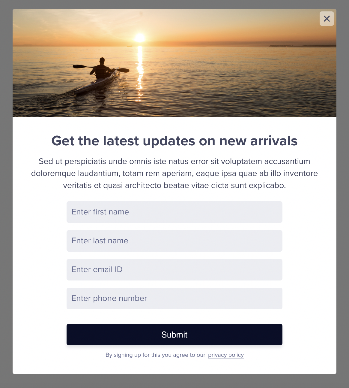
- Image on Top: You can add an image on the top to the lead generation template.
Create the content to record information from your users. The following image displays a preview of the form:
Create Lead Generation Template
Select the button style and card positions from the Style tab.
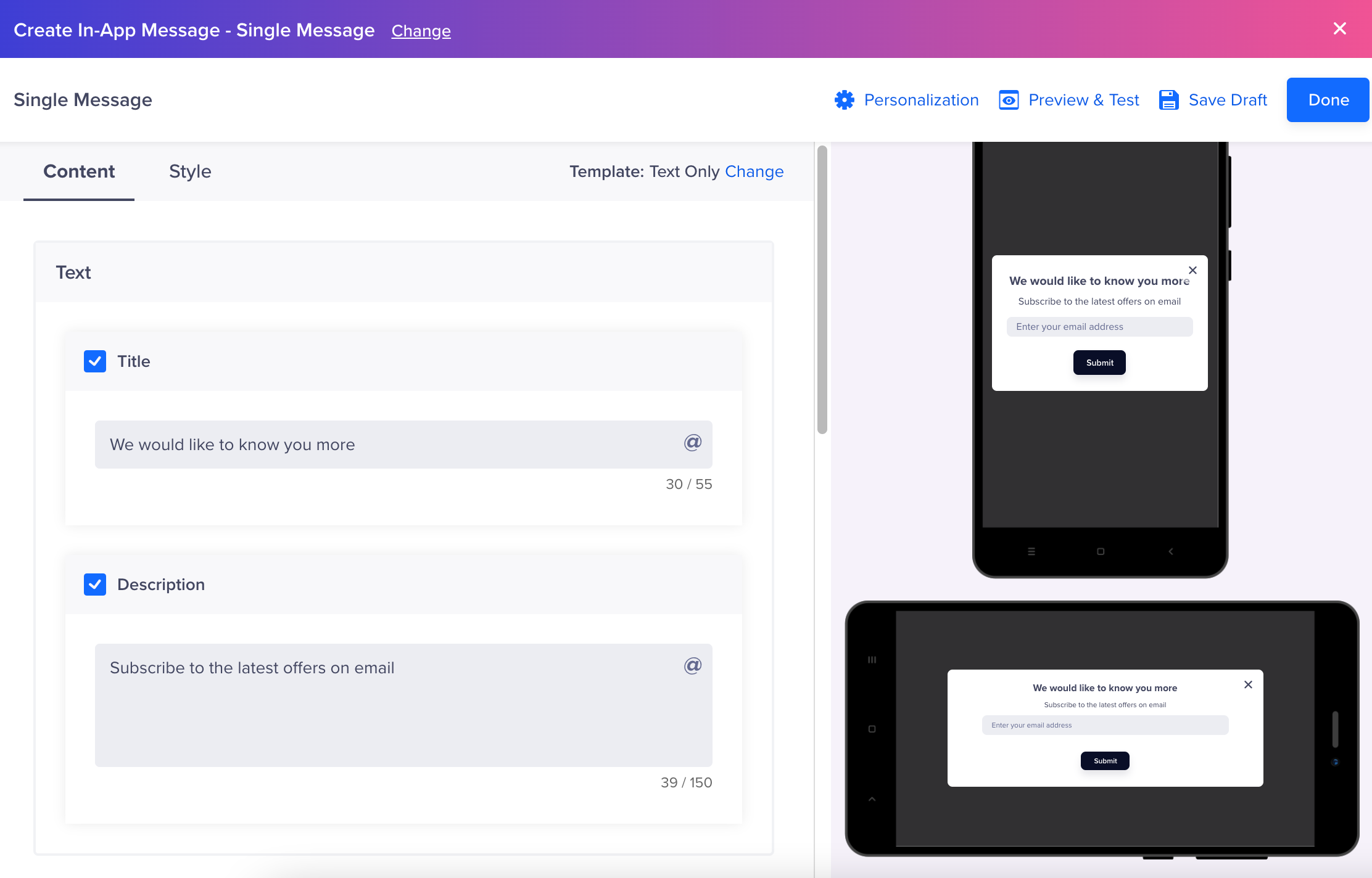
Style Lead Generation Elements
Enter all the required information.
- Text: Personalize the Title and Description.
- Media: Add the image URL or upload an image.
- Input Fields: You can add up to four input fields. Select input fields such as Name, Phone Number, Birthday, or Email Address for the template.

Upto Four Input Fields
- Buttons: The Close button is selected by default. Add a button name such as Submit or Upload.
- Subtext: Add subtext such as privacy policy to your lead generation template.

Add Subtext
The hyperlinked part must be closed between two asterisks. Add the URL where the user will be directed. You can also add a checkbox for your subtext.

Subtext and redirect URL
- Acknowledgement: You can show appreciation to your user by adding an Acknowledgement popup. Select the auto-close timer for the popup.
Select the button style and card positions from the Style tab.
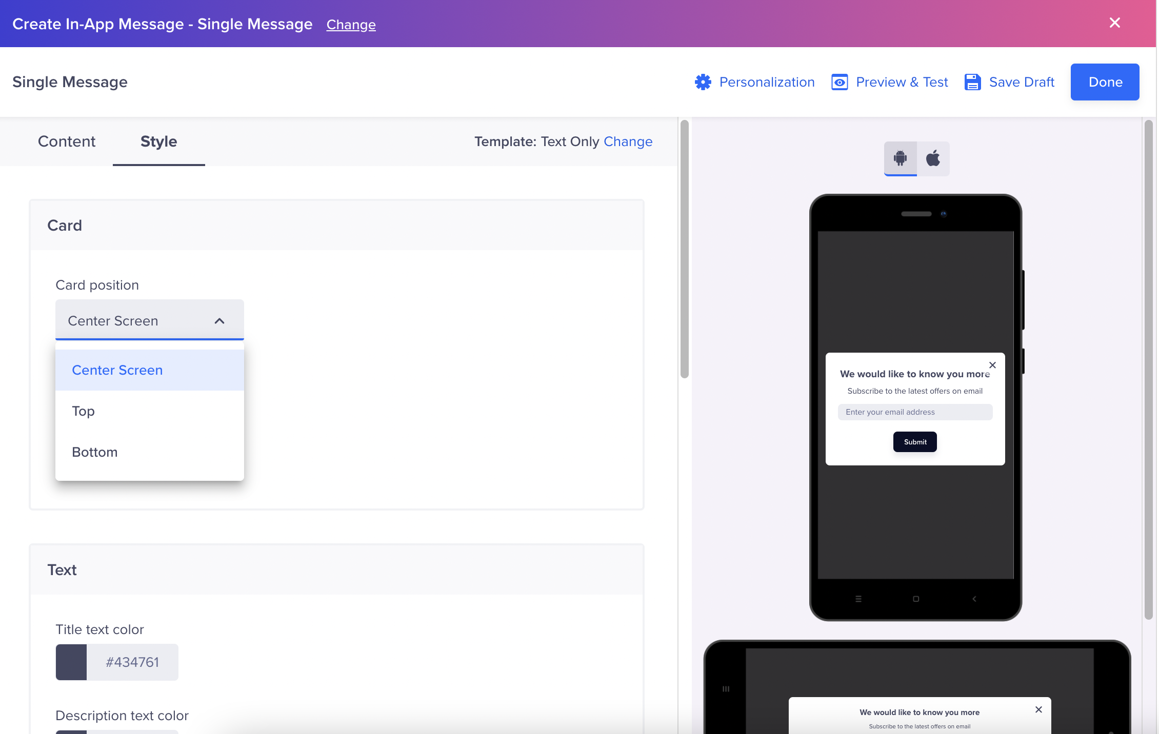
Card Orientation
Picture-in-Picture (PiP) Template
The Picture-in-Picture (PiP) template enables you to deliver media-rich In-App messages as a floating, draggable window that overlays the app without interrupting the user's primary task. Unlike full-screen or half-screen formats, PiP keeps your promotion persistently visible as the user continues browsing, improving discoverability and enabling engagement at the right moment.
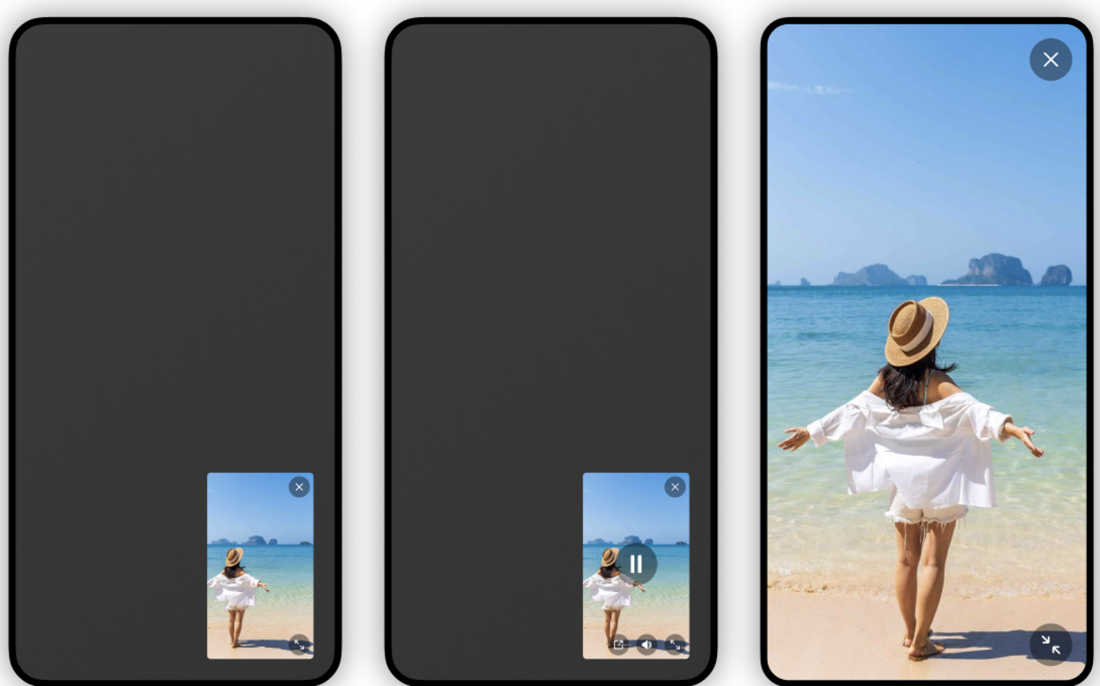
Sample Pip In-App Message
The PiP window floats over the app content at the specified position. The user can drag this window to reposition it, expand it to full screen, or close it entirely, depending on the enabled controls.
The PiP template supports Images, GIFs, and short autoplay videos (muted by default, with user controls).
SDK Version RequirementsTo send a test message using the PiP template, use CleverTap Android SDK version 8.1.0 or above and iOS SDK version 7.6.0 or above.
Use Cases for PiP
The PiP template is a good choice when you want your promotion to stay visible without blocking the user's current activity. Common use cases where you can use PiP can be the following:
- Flash sales or limited-time offers: Show a countdown or discount while the user continues browsing the app.
- Promotional videos: Autoplay a short video in a corner of the screen during a browsing or checkout session.
- Persistent reminders: Keep a coupon or reward visible across multiple screens without requiring an immediate tap.
- Re-engagement nudges: Show a dormant offer at a natural pause point without forcing a full-screen interruption.
Create a PiP Campaign
To create an In-App campaign using the PiP template:
- Go to Campaigns and create a new In-App campaign.
- In the What section, select the message type and click Go to Editor.
- In the editor, select the Picture in Picture template.
- In the Content section, upload your media and configure the position, size, and appearance.
- In the Controls section, enable the end-user interactions you want to allow.
- Set the On Tap action and Initial Animation.
- Preview across device sizes, then publish the campaign.
Content
The content section allows you to configure the PiP.
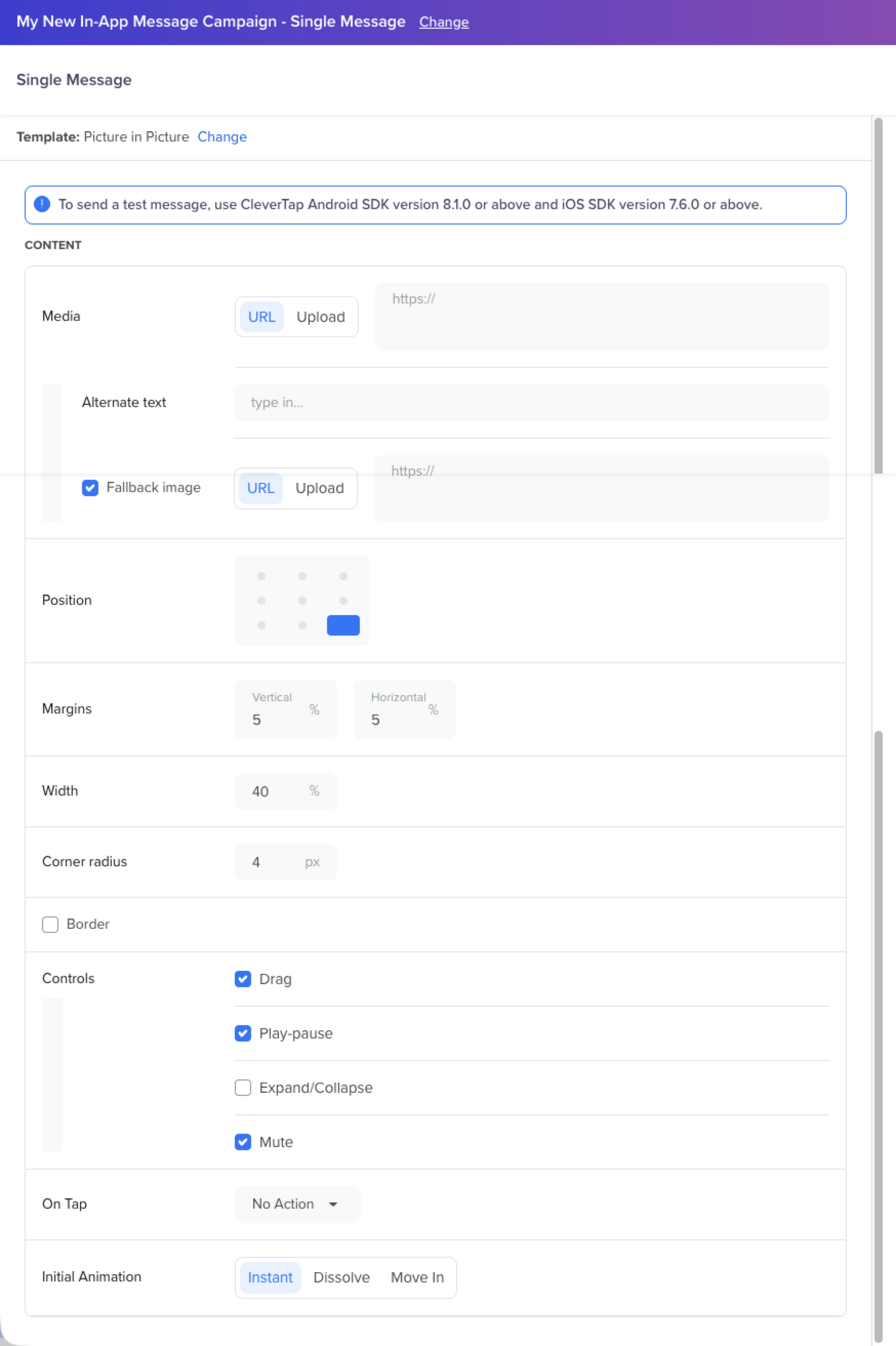
Content
Media
Upload the media to display in the PiP window. You can provide a URL or upload a file directly. Supported media types are Image, GIF, and Video.
- Alternate text: Provide a text description of the media for accessibility. This is announced to users who rely on screen readers.
- Fallback image: Enable this to specify a static image that the SDK displays if the selected media fails to load. You can provide a URL or upload the image directly.
Position
Use the 3×3 grid selector to set the initial position of the PiP window. You can place it in any of the nine positions: corners, edge centers, or the screen center.
Appearance
The following properties control the size and visual style of the PiP window. Default values differ by platform.
| Property | Description | Default (Android) | Default (iOS) |
|---|---|---|---|
| Width | PiP window width as a percentage of screen width | 35% | 30% |
| Vertical Margin | Distance between the PiP window and the top/bottom screen edge | 3% | 2% |
| Horizontal Margin | Distance between the PiP window and the left/right screen edge | 3% | 2% |
| Corner Radius | Roundness of the PiP window corners | 0 dp (square) | 4 pt |
| Border | Optional border around the PiP window | Off | Off |
Controls
Use the Controls section to enable or disable the following end-user interactions on the PiP window:
| Control | What It Does | Default State |
|---|---|---|
| Drag | The user can drag the PiP window to reposition it. On release, it snaps to the nearest screen edge. | On |
| Play-pause | Displays a play/pause toggle for video creatives. | On |
| Expand/Collapse | The user can expand the PiP to full screen and collapse it back to the default size. | Off |
| Mute | Displays a mute or unmute toggle for video creatives. | Off |
On Tap
Select the action that occurs when the user taps the PiP window:
| Option | Behavior |
|---|---|
| No Action | Tapping the PiP performs no action. |
| Open URL | Opens a specified URL, deep link, or in-app WebView destination. |
| Key-Value pairs | Sends custom key-value data back to the app. |
| App Function | Triggers a defined function within the app. For more information, refer to App Functions. |
Initial Animation
Select how the PiP window enters the screen when it first appears:
-
Appear: The PiP appears immediately with no animation.
-
Fade In: The PiP fades into view. Configure the following:
- Duration: Length of the fade in milliseconds.
- Easing: Easing function for the animation (for example, Linear).
-
Fly In: The PiP slides into position from the edge of the screen. Configure the following:
- Direction: Direction of entry, that is, Left (←), Right (→), Up (↑), or Down (↓).
- Duration: Length of the slide in milliseconds.
- Easing: Easing function for the animation (for example, Linear).
Event Tracking
The following events are emitted for PiP campaigns:
| Event | Trigger |
|---|---|
| Notification Viewed | The PiP becomes visible to the user. |
| Notification Clicked | The user taps the PiP, and the app is redirected via the configured On Tap action. |
Fallback Behavior
If the SDK version or device does not support the PiP format or the chosen media type, the SDK does not render the In-App notification.
Custom Templates
You can use the Custom HTML templates in the In-App editor to add more customization to the In-App messages with Javascript.
Ensure that you select the Include Javascript box to add your custom Javascript.

Custom HTML and Actions
Create Interactive In-App MessagesYou can create interactive in-app campaigns such as scratch card campaigns and swipe interaction campaigns using JavaScript.
Using the Custom HTML option, you can use Javascript in the HTML and create deep interactive in-app campaigns by adding the JavaScript code along with the HTML code.
JavaScript-based campaigns are available for versions 3.5.0 and above.
In-App Gamification Templates
Use CleverTap's out-of-the-box (OOTB) Scratch the Card and Spin the Wheel In-App message templates to engage users through interactive rewards, and can be easily customized using editable HTML settings.
Private BetaCurrently, this feature is a Private Beta Release. If you want access to this feature, contact your Account Manager.
Gamification templates let you create interactive in-app experiences with minimal effort. With CleverTap, you can:
- Increase engagement and conversions through game-like interfaces
- Offer personalized rewards dynamically
- Fully customize the look and feel using the Custom HTML Templates tab
These templates include configurable variables for visuals, copy, animation, rewards, and behavior.
Using the Templates
-
Go to Create In-App Message > Single Message.
-
Select the Custom HTML Templates tab.
-
Select either:
-
Edit the settings and the Custom HTML to publish.
Spin the Wheel Template
This template adds a fun, gamified interaction to your In-App by letting users spin a virtual wheel to unlock a discount, reward, or surprise offer directly within it. This interactive format helps boost engagement and click-through rates while creating a sense of excitement and urgency.
Interactive Elements
- Wheel animation with easing
- Pointer interaction + spin trigger
- Shimmer effect on reveal
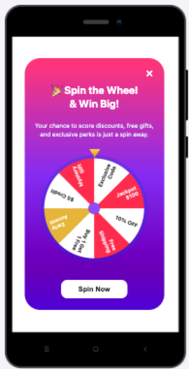
Spin the Wheel Template
Expand to know more about the template.
Use Case Examples
- Drive conversions during sales events or festivals with spin-to-win deals.
- Run promotional campaigns that reward users with random offers.
- Re-engage dormant users with a playful incentive.
- Launch loyalty or referral-based programs with interactive rewards.
Template Customization Variables
This template allows you to tweak the appearance, messaging, and reward logic without the need to understand or modify the full code. Each setting explained here lets you control how the in-app experience looks and behaves, so you can launch high-converting, on-brand campaigns effortlessly. The following are the settings:
includeDmissButton: Show or hide the close (X) button.background: Set the modal background color or gradient.enableConfettiOnWin: Toggle confetti animation after a win.spinDurationSeconds: Set how long the wheel spins (in seconds).spinButton: Customize the spin button’s text, color, background, and visibility.claimButton: Configure the claim button after spinning, text, color, background, and link (URL).mainTitle: Set the main headline text, font size, and color.subtitle: Set the subheading or description under the title, text, font size, and color.copyInstruction: Define the message color before and after users copy a reward code.centerCircle: Style the center hub of the wheel — color, border, and size.rewards: Define each reward option with the following:title: Message shown on winningtext: Reward label (shown on wheel)value: Copyable codesubtitle: Description/detailsprobability: Win chancecolour: Slice background color
Configurable Settings in Template Explained
The following is a description of the customizable variables in CleverTap's Spin the Wheel gamification template.
includeDismissButton
Shows or hides the close (X) button on the modal. Set this to false if you want users to stay on the message until they take action.
includeDismissButton: true,background
Defines the background style of the spin screen. You can use a flat color or a gradient to match your campaign theme.
background: "linear-gradient(180deg, #FF3672 0%, #8332F9 46.63%, #6708BC 84.62%, #4E15DD 100%)",enableConfettiOnWin
Adds celebratory confetti after the wheel stops to boost delight. Use it to make wins feel exciting.
enableConfettiOnWin: true,spinDurationSeconds
Sets the number of seconds the wheel spins before revealing the reward. A longer duration adds suspense.
spinDurationSeconds: 5,spinButton
Customize the call-to-action (CTA) that users click to start the spin. Update the text to match your promotion (for example, "Try Your Luck", "Spin to Save").
spinButton: {
  enabled: true,
  text: "Spin Now",
  background: "#ffffff",
  color: "#1d1d1d",
},
claimButton
Configure the button that appears after a spin. You can drive users to a landing page or apply a reward using a custom link.
claimButton: {
  enabled: true,
  text: "Collect Now",
  background: "#F4357D",
  color: "#ffffff",
  url: "wzkr://thisleadstonowhere",
},
mainTitle
Control the headline at the top of the spin modal. Use this to grab attention with bold and fun messaging.
mainTitle: {
  text: "🎉 Spin the Wheel <br>& Win Big!",
  fontSize: "24px",
  color: "#ffffff",
},
subtitle
Add supportive messaging under the title. This is where you reinforce the benefit (for example, savings, gifts, exclusives).
subtitle: {
  text: "Your chance to score discounts, free gifts, and exclusive perks is just a spin away.",
  fontSize: "14px",
  color: "#e8f5ff",
},
copyInstruction
Set the message and color when users copy a reward code. You can highlight that the code was successfully copied.
copyInstruction: {
  color: "#606060",
  copiedColor: "#F4357D",
},
centerCircle
Adjust the style of the central hub of the wheel (the spinner core). You can tweak the color, border, and size to match your brand.
centerCircle: {
  color: "#914DFF",
  borderColor: "#2B2B2B33",
  borderWidth: 2,
  radius: 15,
},
rewards
It is the core of the experience. Each entry defines a reward slice on the wheel: what it says, the code it provides, a description, color, and the chance it gets selected. Check that the probabilities add up reasonably (they don’t need to equal 1).
rewards: [
  {
    title: "Congrats! You just won a Promo Code!",
    text: "10% OFF",
    value: "DISCOUNT10",
    subtitle: "Use DISCOUNT10 at checkout to get 10% off your order. Valid through April 30.",
    probability: 0.15,
    colour: "#ffffff",
  },
  {
    title: "Congrats! You just won a Free Shipping!",
    text: "Free Shipping",
    value: "FREESHIP",
    subtitle: "Use FREESHIP at checkout to enjoy free shipping on your order. Valid through April 30.",
    probability: 0.15,
    colour: "#fc2b46",
  },
  // Add more rewards as needed
],
Scratch the Card Template
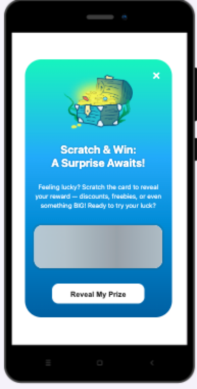
This interactive template is designed to gamify the user experience by letting users "scratch" to reveal a reward, such as a coupon, discount, or points. The surprise element boosts engagement and reactivation rates while offering a delightful experience.
Scratch the Card Template
Interactive Elements
- Scratch-to-reveal animation
- Shimmer effect on reward
- Confetti animation post-reveal
- Claim button redirect
- Copy reward to clipboard
Expand to know more about the template.
Use Case Examples
- Engage users during festive or seasonal campaigns with surprise offers.
- Reactivate dormant users by giving them a chance to win a reward.
- Reward loyal customers with a fun, interactive coupon reveal.
- Launch a limited-time “scratch-to-win” contest to drive urgency and clicks.
Template Customization Variables
This template allows you to tweak the appearance, messaging, and reward logic without the need to understand or modify the full code. Each setting explained here lets you control how the in-app experience looks and behaves, so you can launch high-converting, on-brand campaigns effortlessly. The following are the settings:
imageUrl: URL of the image displayed above the scratch card (e.g., treasure chest).includeDismissButton: Toggle visibility of the close (X) button.background: Initial background color or gradient.revealedBackground: Background after scratching completes.enableConfettiOnReveal: Show celebratory confetti after reveal.revealButton: CTA before scratching. Customize text, color, and background.claimButton: CTA after reveal. Customize text, color, background, and destination URL.mainTitle: Controls headline text, color, font size, and optional text shadow.subtitle: Supports descriptive text below the title. Customize color and size.rewards– Define each potential reward with:title: Message shown after revealvalue: Copyable codesubtext: Description or redemption detailsprobability: Chance of appearing
Config Snippets Explained
The following is a description of the customizable variables in CleverTap's Scratch the Card gamification template.
imageUrl
Sets the image shown above the scratch card.
imageUrl: "https://.../scratch-the-card-chest.png",includeDismissButton
Set to false if you want the user to complete the interaction.
includeDismissButton: true,background
Defines the initial background of the scratch card.
background: "linear-gradient(180deg, #41F4BC 0%, #35ABFF 37.98%, #0060A5 100%)",revealedBackground
Changes the background after the reward is revealed.
revealedBackground: "linear-gradient(180deg, #41F4BC 0%, #35ABFF 100%)",enableConfettiOnReveal
Celebratory animation to increase visual delight.
enableConfettiOnReveal: true,revealButton
Customize the call-to-action before the reward is shown.
revealButton: {
  enabled: true,
  text: "Reveal My Prize",
  background: "#ffffff",
  color: "#1d1d1d",
},
claimButton
Configure how users can claim or use the reward.
claimButton: {
  enabled: true,
  text: "Claim",
  background: "linear-gradient(180deg, #A4FFE4 -0.8%, #41F2BE 99.2%)",
  color: "#000000",
  url: "wzkr://thisleadstonowhere"
},
mainTitle
Control the primary heading inside the card.
mainTitle: {
  text: "Scratch & Win: <br>A Surprise Awaits!",
  fontSize: "24px",
  color: "#ffffff",
  textShadow: "0 2px 4px rgba(0, 0, 0, 0.3)",
},
subtitle
Supplementary text below the title.
subtitle: {
  text: "Feeling lucky? Scratch the card to reveal your reward...",
  fontSize: "14px",
  color: "#e8f5ff",
},
rewards
Each reward entry has:
rewards: [
  {
    title: "Congrats! You just won a Promo Code!",
    value: "DISCOUNT10",
    subtext: "Use DISCOUNT10 at checkout...",
    probability: 0.45,
  },
  // Add more reward options here
],
Best Practices
- Keep reward probabilities realistic; the total does not need to equal 1.
- Use high-contrast text over bright gradients for readability.
- Add expiration dates in reward subtext to create urgency.
- Use consistent reward identifiers across campaigns for tracking.
Time to Live (TTL)
You can configure the number of days (or hours) to keep the message on the user's device by setting the time to live.

Time to Live for a Message
The TTL can range from 1 day to 365 days. The default value for TTL is two days. The message on the user's device stays there for the specified TTL, after which it is automatically removed.
Choosing the Right TTLYou should choose a TTL that resonates with the purpose of your campaign. Some messages need to stay on the user's device for a longer period (coupon codes which are valid for a month) while some should last for a day or two (weekend discount offers).
In-App Editor
Use the In-App editor to craft your In-app campaign with the desired messaging and styling best suited for your business. You can choose from a range of In-App templates. Alternatively, you can also use the Custom HTML option to build your own campaign.
The elements of the editor vary based on the type of template you select for creating your In-App campaign.
The following image represents the Content with image notifications template editor.

In-App Editor for Content with Image notifications
At a high level, the In-App editor has the following two primary sections: Content and Style.
Content
The Content section allows you to define your In-App message's overall text and visual content. Use this section to create engaging, and personalized In-App messages by entering enticing Title and Message. To personalize the message, click the Personalization (@) icon in the Title and Description fields.
Using the Insert image option, you can upload the desired image to make your In-App campaign visually appealing when the app is in Portrait or Landscape mode.
You can choose to add the same image with different form factors or completely different images to give a unique experience on portrait and landscape.
Additionally, you can add up to two CTAs and configure their On Click Action as per your requirement. You can use the following three types of action buttons:
- Close notification: It closes the notification after a tap.
- Open URL: A special type of CTA that enables the user to open a deep link for Android or iOS.
- Custom key-value pairs: The key-value pairs send back custom data when a user clicks the in-app button
You can also configure the number of days (or hours) to keep the In-App message on the user's device by setting the Message Time to Live field as per your use case.
Image Interstitial Template ExceptionThe elements of the In-App editor for the Image only notifications templates are similar to those of the Content with Image notifications templates except for the Title and Message fields.
Style
The Style section enables you to customize the appearance of your In-App message elements, such as title color, background color, message color, button text color, and so on.
Customize the overall In-App message elements as per your brand style guidelines to make them visually appealing.

Style Elements from Editor
Typeform and Character LimitWe do not currently support Typeform because its rendering requires access to local storage which is a security risk. CleverTap SDK WebView does not allow access to local storage.
The character limit for a message in English is 30 for the title and 128 for the message.
The character limit for a message in Chinese is 9 for the title and 38 for the message.