Pivots 2.0
Learn how to analyze event data across multiple dimensions using interactive tables and visualizations to uncover patterns, trends, and insights.
Overview
Pivots 2.0 is an analytics capability that helps you derive meaningful insights from your user data by summarizing events in interactive tables and visualizations. It lets you break down large volumes of data across multiple dimensions, such as events, segments, properties, and time, so you can quickly spot patterns, trends, and outliers without writing complex queries.
A pivot analysis helps answer questions such as:
- Which product categories are performing best, and at what time of day?
- In which city are sales for a specific brand or product the lowest?
- How much sports content do premium users consume across different days of the week?
Public BetaThis feature is released in Public Beta. For more information about this feature or any queries, contact your Customer Success Manager or the CleverTap Support.
Create a Pivot Analysis
To build a pivot analysis, you configure a query in the Query Builder. The Query Builder is organized into four core steps that define what data you analyze, which users it applies to, how results are grouped, and what metric is calculated.
To get started, go to Analytics > Pivots and select the following fields:
Select Event
Start by selecting the event you want to analyze. The selected event serves as the foundation for the pivot. It defines the underlying dataset and determines which event properties are available for grouping and filtering.
For example, you can analyze events such as App Launched, UTM Visited, Product Viewed, Video Watched, or Charged. Choose an event that represents the user action you want to measure. For value-based analysis (for example, revenue or watch time), select an event that includes a numeric property you can aggregate.
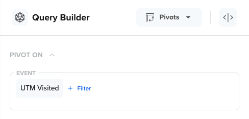
Select an Event
The selected event determines:
- The event data included in the analysis
- The event properties available to pivot on
- The metric options available (for example, event count or sum of a numeric property)
Select Segment
After you select an event, choose who you want to analyze it for. By default, Pivots analyzes the event for All Users, but you can restrict the analysis to a specific segment. You can also create a new segment directly from the Query Builder.
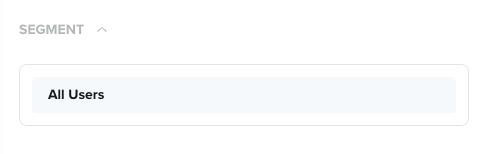
Select a Segment
Segmenting is useful because user behavior often varies significantly across segments. For example, you can:
- Compare engagement between New Users and Returning Users
- Analyze purchases for High-Value Users
- Understand content consumption for Subscribed vs Free users
Content Consumption ExampleViewing behavior for new users is often different from users who have already consumed 50+ hours of content. Segmenting helps you compare these groups and tailor campaigns accordingly.
Select Properties
Properties define how you break down the selected event and compare results across dimensions. In Pivots, you can mix and match properties to explore different analytical angles. Selected properties can be used as rows, columns, or axes (depending on the visualization).
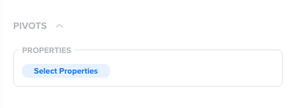
Select Properties
You can pivot on:
- Event properties (for example, product name, content category)
- User profile properties (for example, language, customer type)
- Geographic properties (for example, city, country)
- Technographic properties (for example, device type, OS)
- App fields (for example, app version)
Property Selection LimitIn a pivot analysis, you can select a maximum of seven properties at once. Using too many properties at once can make results harder to interpret, especially for properties with highly unique values (for example, user IDs or URLs). Therefore, we recommend that you start with one or two properties and expand gradually.
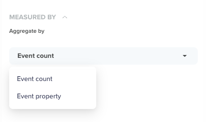
Select Metric
The Metric setting defines what you want to measure for the selected event. It controls whether Pivots reports results as event frequency, property values, or aggregated totals.)
Select a Metric
Pivots 2.0 supports the following metric types:
Event Count
Event Count measures the number of times the selected event occurred. Use this option to measure how often something happens.
For example, count of Product Viewed events by Product Category and Day of Week.
Event Property
Event Property lets you measure event data using a specific event property. Use this option when you want to measure how much value is generated.
For example, you can analyze Charged events broken down by the payment_method property to compare conversion contribution across payment types.
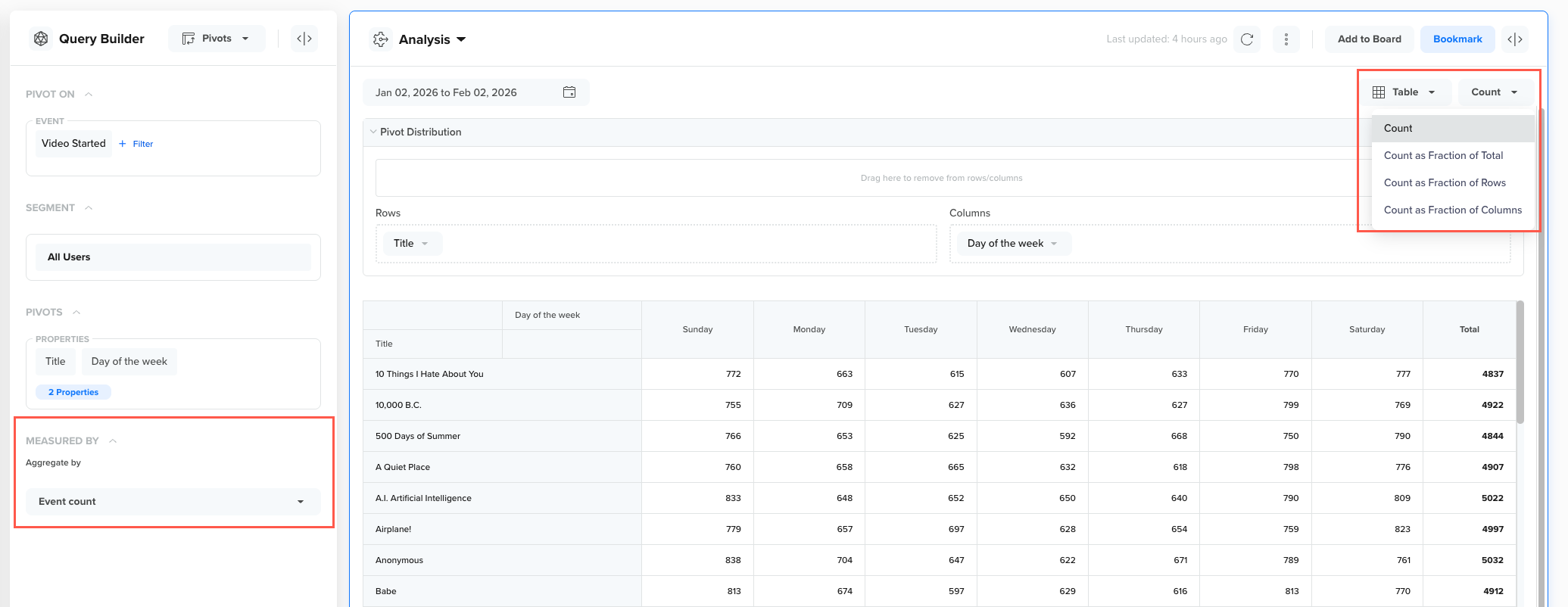
Metric Display Options
The Metric Display dropdown controls how the selected metric is calculated and presented in the pivot table. The available options in this dropdown depend on whether you are analyzing Event Count or an Event Property.
When Event Count is Selected
If no event property is selected and the metric is set to Event Count, the following display options are available:
- Count: Displays the absolute number of times the event occurred.
- Count as Fraction of Total: Displays each value as a percentage of the total event count across the entire table. Use this option to understand overall contribution.
- Count as Fraction of Rows: Displays each value as a percentage of the total count within the same row. Use this option to compare distribution across columns for each row.
- Count as Fraction of Columns: Displays each value as a percentage of the total count within the same column. Use this option to compare distribution across rows for each column.
These options are useful when your analysis focuses on frequency and distribution rather than numeric values.
When Event Count is Selected
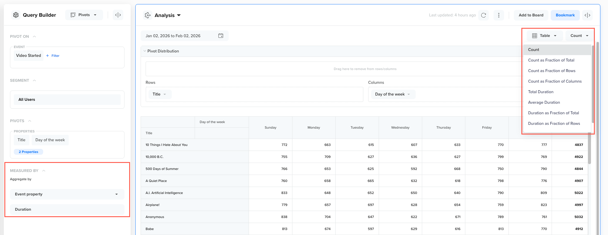
When an Event Property is Selected
When you select an Event Property as the metric (for example, CT App Version, amount, or duration), additional information is displayed. This information is dynamically generated based on the selected property.
For example, if the selected event property is Duration, the following options appear:
- Total Duration: Displays the total aggregated value of the selected event property
- Average Duration: Displays the average value of the selected event property for each cell.
- Duration as Fraction of Total: Displays each value as a percentage of the total aggregated value across the entire table. Use this option to understand overall contribution of each segment or category.
- Duration as Fraction of Rows: Displays each value as a percentage of the total aggregated value within the same row. Use this option to compare how values are distributed across columns for each row.
These additional options allow you to move beyond event frequency and analyze value-based performance, such as revenue contribution, average duration, or property-level impact.
When Event Property is Selected
Dynamic Metric OptionsThe names of these metric display options change automatically based on the event property you select. For example, selecting the
Durationproperty will show options such asTotal Duration,Average Duration,Duration as Fraction of Total, andDuration as Fraction of Rows.
Best Practices
Follow these best practices to choose the right metric display and interpret pivot results accurately:
- Use Count-based options to analyze how often an event occurs.
- Use Total or Average property options to analyze value-driven metrics.
- Use Fraction of Total, Rows, or Columns to understand distribution and relative contribution.
Example Use Case: Content Consumption Analysis
A video streaming app that wants to understand content performance beyond simple view counts. Instead of measuring only how often a video is watched, the team wants to measure total watch time per video, which better reflects engagement.
To do this, the team builds the following pivot query:
- Event:
Video Started(triggered when a user starts watching a video) - Segment: All Users
- Properties:
- Day of Week (Session)
- Title (Event Property)
- Rows: Day of Week
- Columns: Title (Video name)
- Metric: Duration (Event Property)
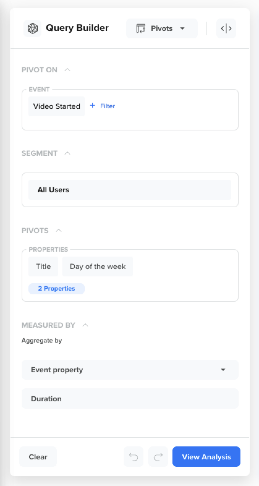
Pivot Query
Using the Duration event property measures performance by total consumption time, not just the number of views. This is useful when some videos have fewer views but generate more watch time due to longer duration or stronger retention.
With this pivot query, you can derive insights such as:
- Which videos drive the highest total watch time?
- Which days of the week contribute most to consumption for each video?
- Which videos have consistent engagement vs. sharp spikes on specific days?
- Where to optimize promotion and scheduling based on consumption patterns?
Reading the Pivot Analysis
After you run a pivot query, Pivots generates an analysis that you can explore and interpret using the following components:
Together, these components help you rearrange your data and view it from multiple perspectives to uncover patterns, contributors, and trends.
Pivot Distribution
Pivot distribution allows you to arrange the set of properties you selected in the query builder. You can use these properties in different combinations by dragging and dropping to break down the selected event and explore patterns in the data.
Depending on the view you choose, these properties can be applied as Rows and Columns in a table.
- Rows: Represent the primary dimension used to group results in the table view. For example, a row can represent the video Title in your analysis table.
- Columns: Represent the secondary dimension used to group results in the table view. For example, a column can represent Day of the Week in your analysis table.
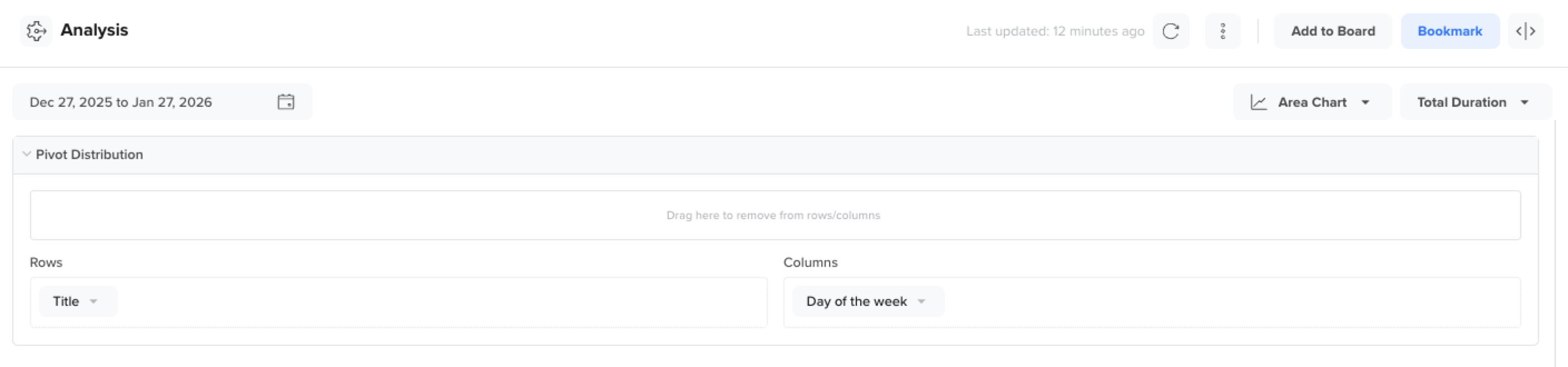
Arranging Rows and Columns
Using rows and columns together creates a matrix that makes it easy to compare values across multiple dimensions.
Visualizations
Pivots support multiple visualization types to help you interpret the same grouped data in different ways. Each visualization highlights a different aspect of your data, depending on whether you want precision, comparison, or trend-based insights.
You can switch between the following visualization options without changing the underlying query:
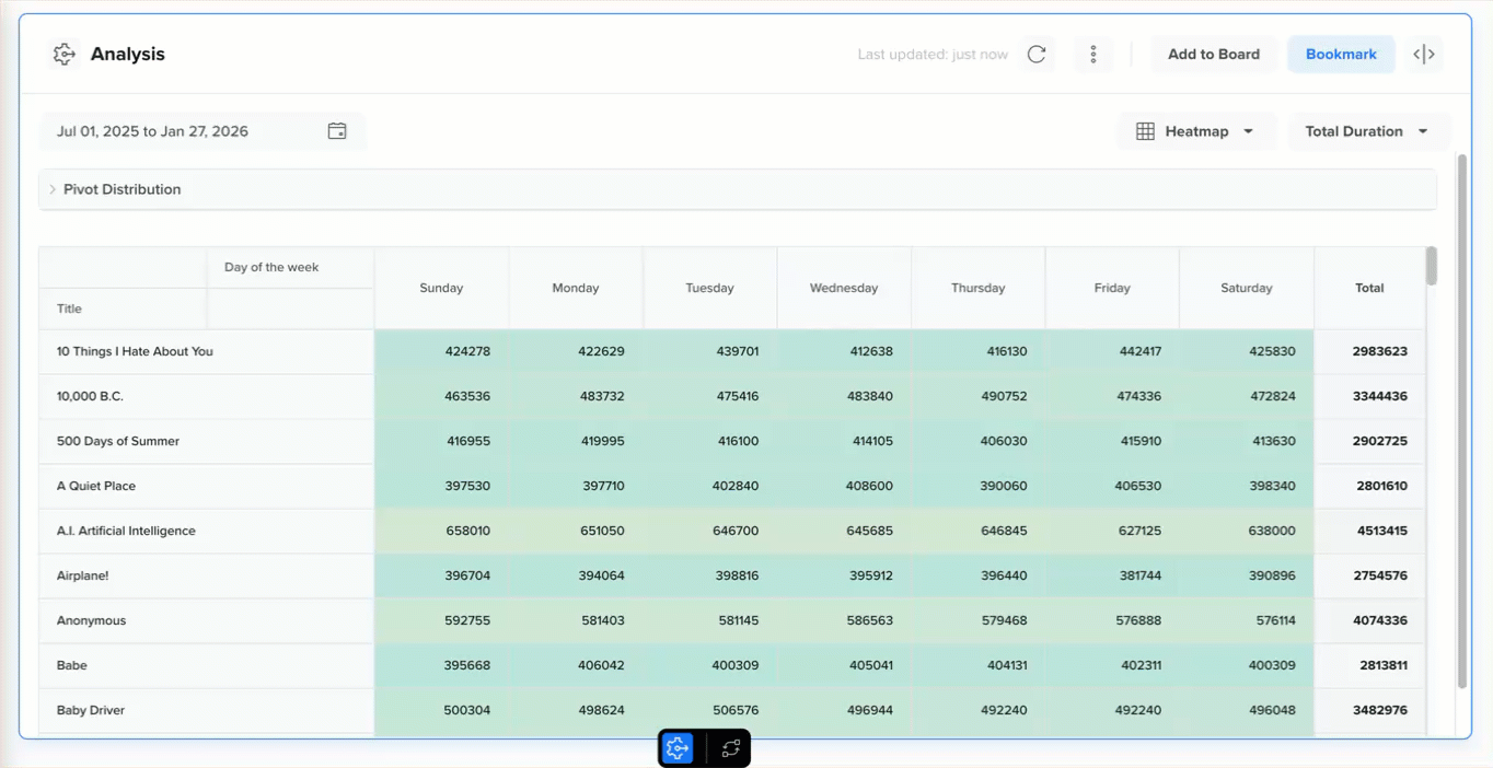
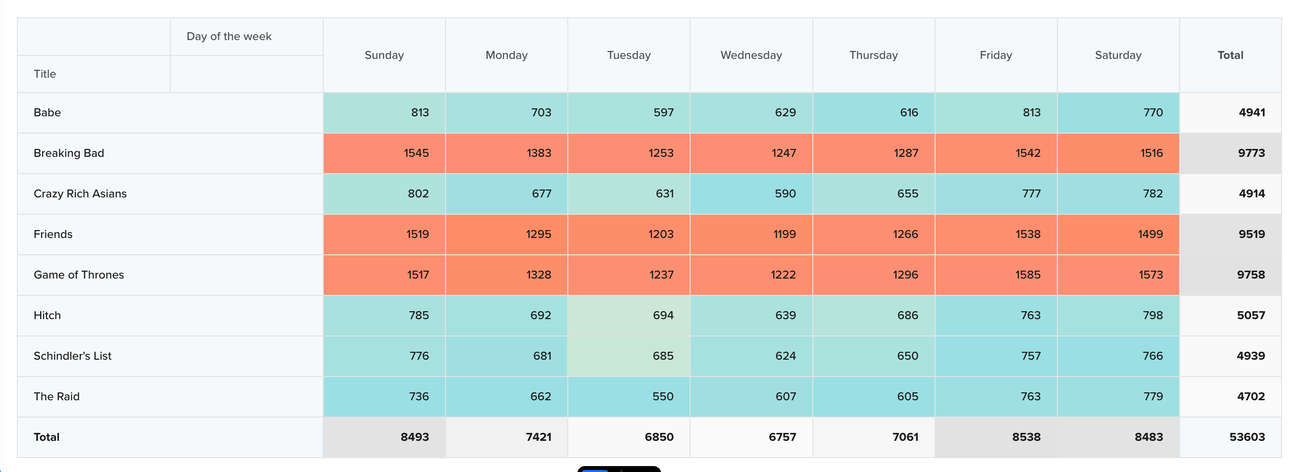
Table
Tables are best for getting a quick, precise overview of the selected breakdown. Use this view when you need exact numbers or want to export results. This view is best for identifying the highest contributors in the dataset.
For example, if the rows are Day of the Week and the columns are Title, this view helps you quickly identify which video contributes the most watch time and which day it peaks.
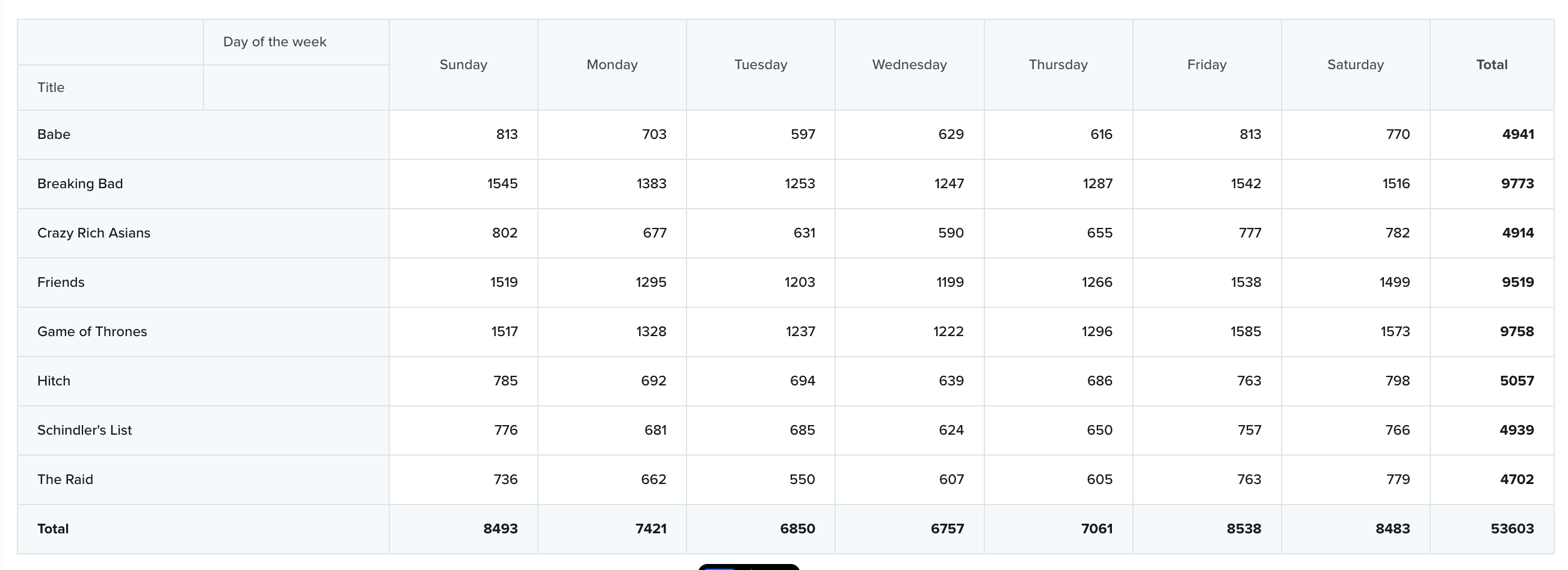
Table View
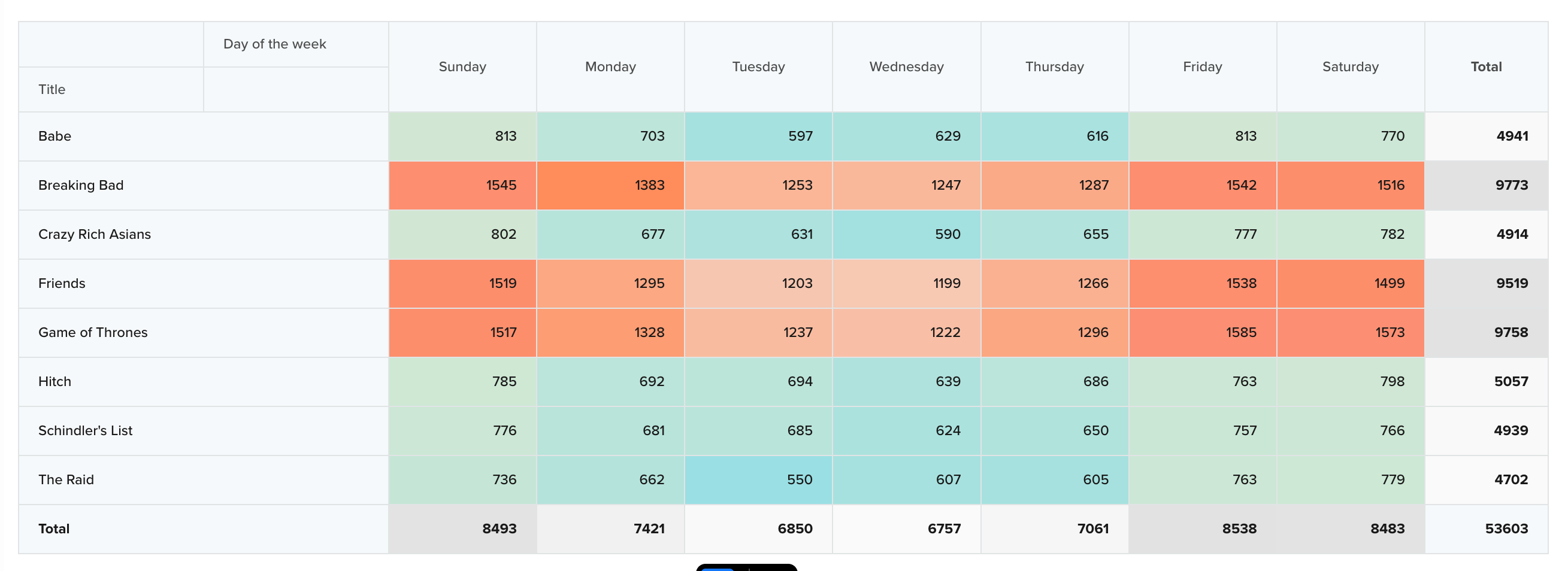
Heatmaps
Heatmaps use color intensity to represent magnitude, making it easy to identify high-performing and low-performing areas in your data at a glance. This view is especially useful when you want to quickly spot patterns across rows and columns, identify peaks, dips, and anomalies, or compare relative performance without focusing on exact values.
For example, if rows represent Day of the Week and columns represent Title, the heatmap helps you quickly identify which videos and days contribute the most watch time.
Row Heatmap View
Row Heatmap
The Row Heatmap highlights variations within each row, making it easy to identify outliers and strong performers for a given row dimension.
Use this view when you want to:
- Understand how different values perform within the same row group
- Detect row-specific patterns or preferences
- Identify which columns stand out for a particular row
For example, if each row represents a Day of the Week and columns represent Title, this view helps you identify which videos perform best on each day. This is useful for spotting day-specific engagement patterns, such as certain videos peaking on weekends.
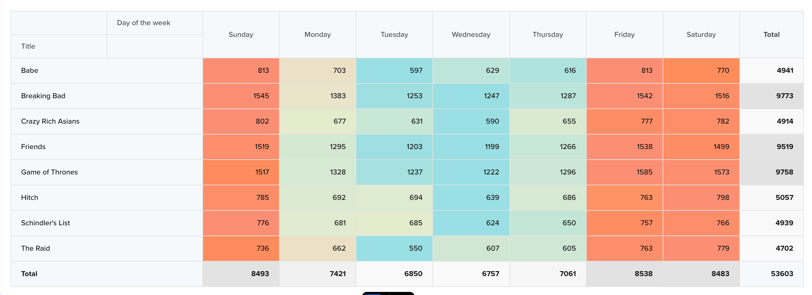
Row Heatmap View
Column Heatmap
The Column Heatmap highlights variations within each column, helping you compare how values perform relative to other entries in the same column.
Use this view when you want to:
- Identify the strongest and weakest values for each column dimension
- Compare performance patterns across columns independently
- Spot deviations from a column’s typical trend
For example, if each rows represent Day of the Week, and column represents a Title, this view helps you identify:
- The best-performing day for each video
- Days where a specific video significantly outperforms or underperforms its usual behavior
Column Heatmap View
Zero Event Occurrences in Heatmap ViewsIf there are zero event occurrences for a given combination of row and column values, heatmap views may show that cell as whitespace.
Bar Chart
The Bar Chart is best for comparing categorical performance along a primary dimension, with clearly distinguishable bars.
Use this view when you want to:
- Compare values across categories at a glance
- Highlight differences between groups
- Focus on relative performance rather than trends over time
For example, you can compare watch time for a specific video across different days of the week to quickly see which days perform better or worse.
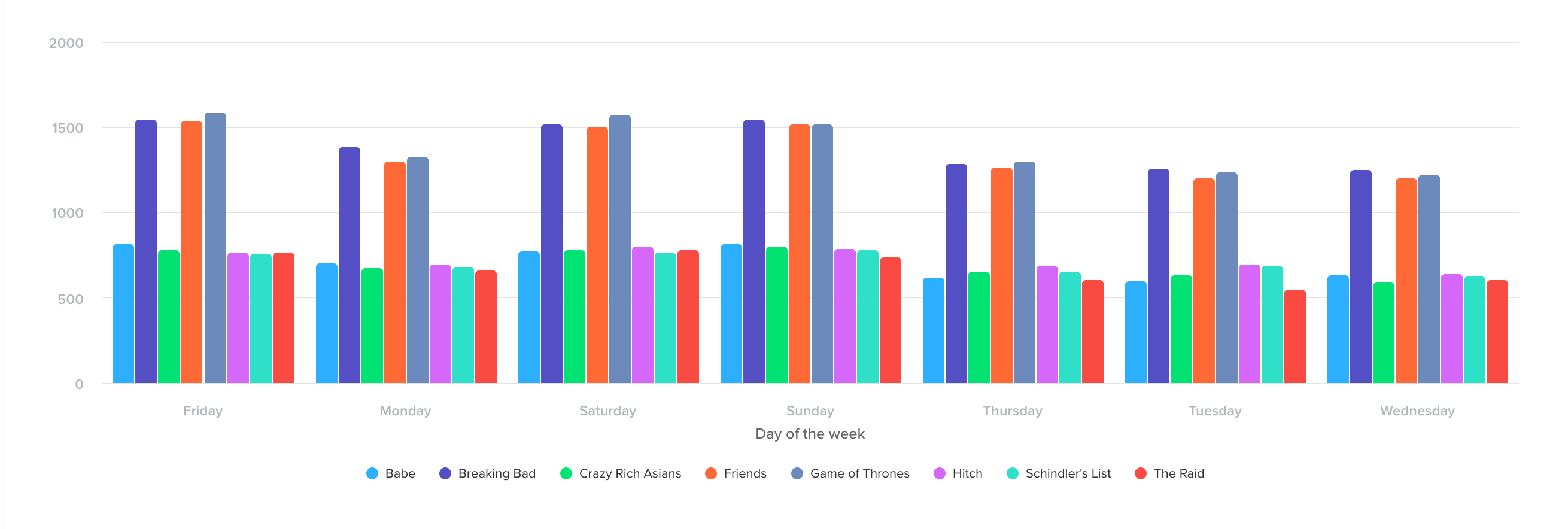
Bar Chart View
Stacked Bar Chart
The Stacked Bar Chart shows how multiple categories contribute to a total across a primary dimension. Each bar represents the total value for a category on the x-axis, while the stacked segments within the bar show the contribution of individual subcategories.
Use this view when you want to:
- Understand how different categories contribute to an overall total
- Compare contributors within the same category
- Identify which segments or properties drive overall performance
For example, if the x-axis represents Day of Week and each stacked segment represents a Title, this view shows how different videos contribute to total watch time on each day. This helps you identify which titles dominate consumption on specific days, which remain consistent across the week, and where spikes or drop-offs occur.
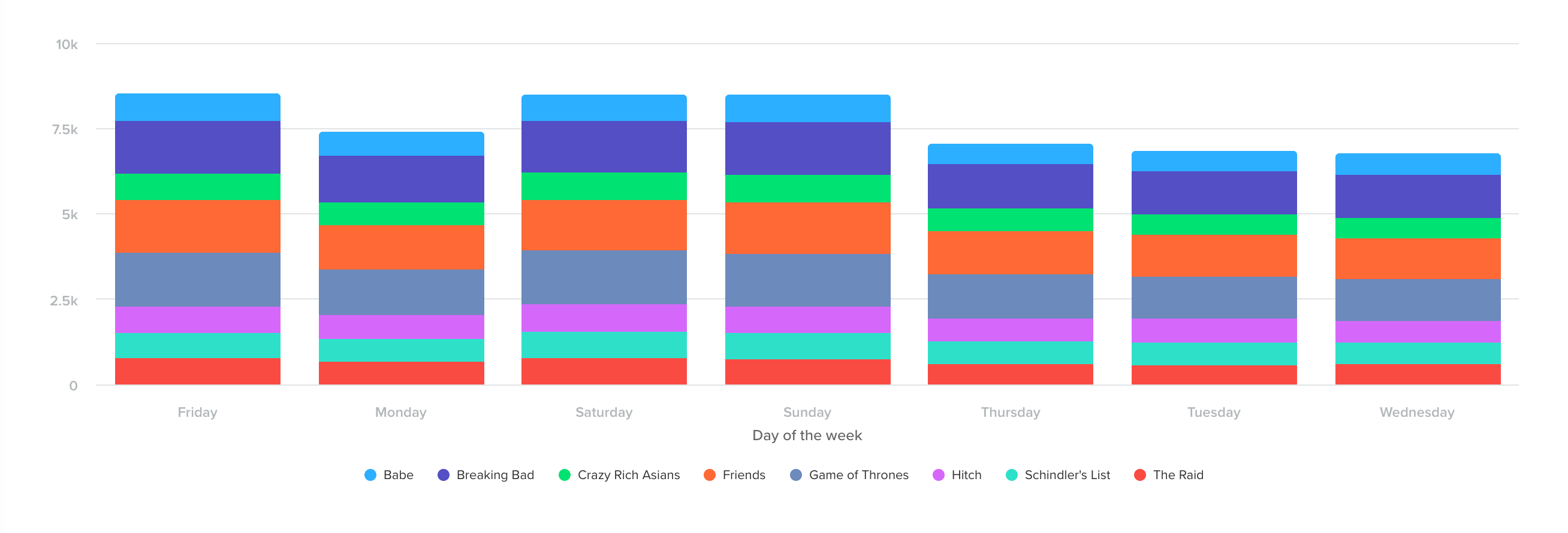
Stacked Bar Chart View
Line Chart
The Line Chart is best for visualizing changes over time and comparing trends across multiple categories on the same timeline.
Use this view when you want to:
- Track how values evolve over time
- Compare trend patterns across categories
- Identify correlations or parallel behavior
For example, you can identify videos that follow similar engagement trends across the week, which may indicate comparable audience interest or content affinity.
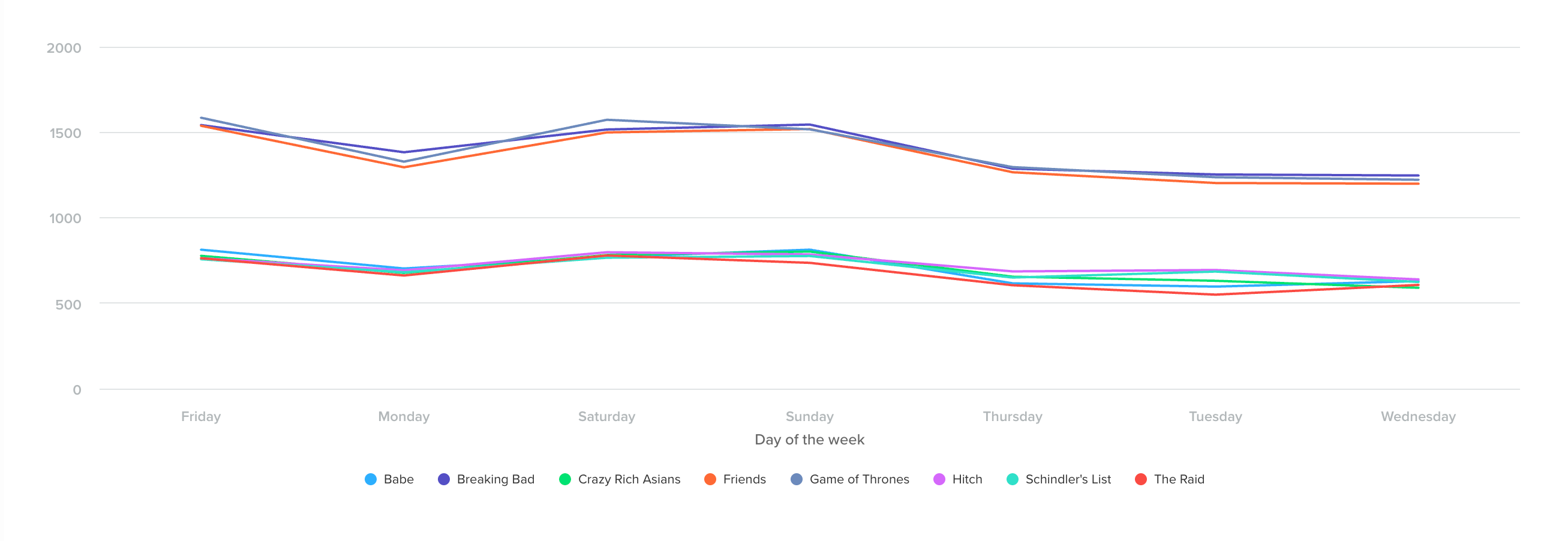
Line Chart View
Area Chart
The Area Chart is similar to a line chart but emphasizes part-to-whole relationships by stacking or filling values.
Use this view when you want to:
- Understand how individual categories contribute to the total over time
- Visualize cumulative impact
- Compare relative contribution alongside trends
For example, you can track how a single video contributes to total watch time across the week compared to all other videos combined.
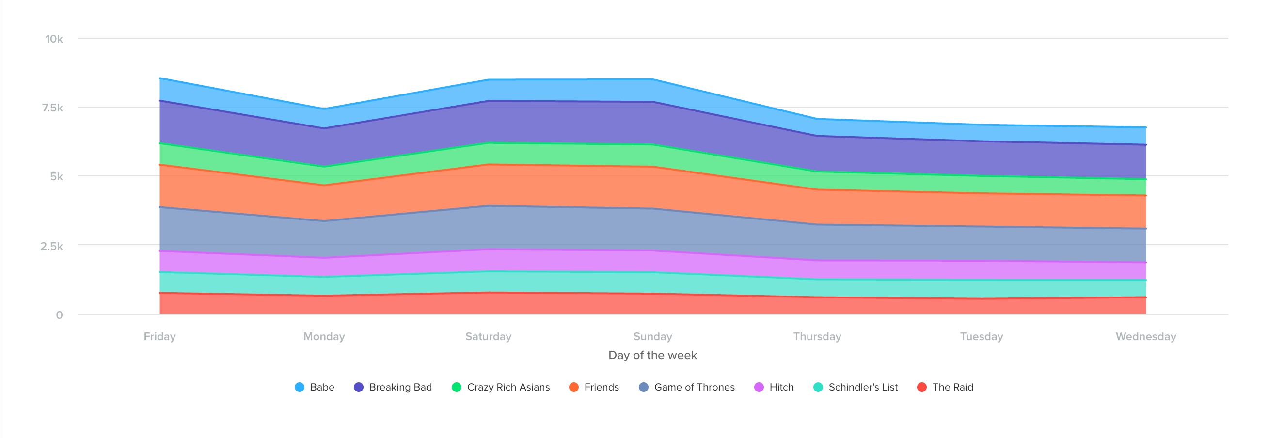
Area Chart View
Bookmark a Pivot Analysis
You can bookmark any Pivot analysis to revisit it later quickly. Bookmarks are user-specific, meaning only the logged-in user can view their saved Pivot analyses in the CleverTap dashboard.
Bookmarks are especially useful for tracking frequently used analyses. For example, if you regularly monitor revenue by product and day of week, bookmarking the Pivot analysis allows you to return to the same configuration without rebuilding the query each time.
To bookmark a Pivot analysis:
- Click Bookmark in the top-right corner of the dashboard after running the Pivot analysis.
- Enter a descriptive name to help you easily identify the analysis later.
- Click Bookmark.