RFM Analysis
Overview
CleverTap's RFM Analysis feature helps you analyze the health of your user base, and run engagement campaigns to target specific user segments that need improvement.
RFM Analysis is a user segmentation model that segments your users based on how recently and frequently they performed a specific event. The output of RFM Analysis is a segmentation of your users into ten RFM user types, which range from Champion users who are your best customers to Hibernating users who are likely to churn.
E-commerce App ExampleWith an e-commerce app, you can run an RFM analysis to understand the segmentation of the user base based on how recently and frequently they purchased a product. If you discover you have a lot of hibernating users, you can run a campaign to re-engage these users and encourage them to make a purchase by sending them a discount code.
As part of our RFM Analysis feature, we provide two tools:
- RFM Grid: Visualization to show the number of users in each RFM segment, their average monetary value, and their reachability on different marketing channels.
- RFM Transition: Visualization to show the flow of users from one RFM segment to another.
RFM Grid
RFM Grid is a visualization tool available in the CleverTap dashboard. This tool presents the results of the RFM Analysis for your user base in a simple chart highlighting the number of users in each RFM segment, their average monetary value, and their reachability on different marketing channels.
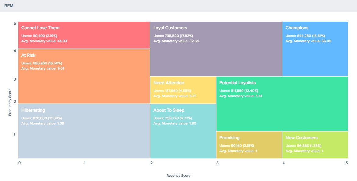
RFM Grid
RFM Grid Guide
To access RFM Grid, login to the CleverTap dashboard, and click on the RFM button under the Segment tab.
Select the date range and event for your RFM Analysis. For your first analysis, App Launches over the past 30 days is a good choice. Click the Calculate button to run the analysis.

Calculate RFM Analysis for Grid
The RFM Grid will be shown on the bottom of the same page. You can click on any segment to get more information or save it for later analysis. You can also create a campaign directly from the RFM Grid by clicking on the Create message button.
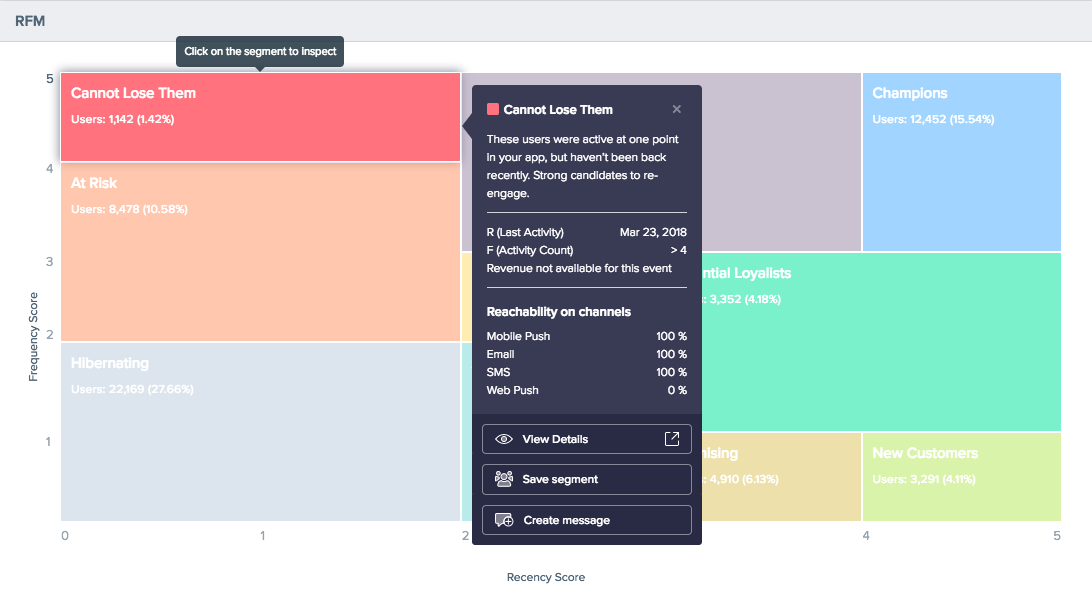
Create Campaign from RFM Grid
RFM Transitions
RFM Transition is a visualization tool available in the CleverTap dashboard. This tool helps you understand the flow of your users from one RFM segment to another, such as how many New Users became Champions.
For example, if you notice that a lot of your hibernating users are coming from the New Users segment, you can now pinpoint where your new users' churn is coming from. With this new information, you can improve the situation by creating a better onboarding experience.
Hibernating vs. InactiveThe difference between a hibernating user and an inactive user is a hibernating user has performed the selected event at least once in the defined time range.
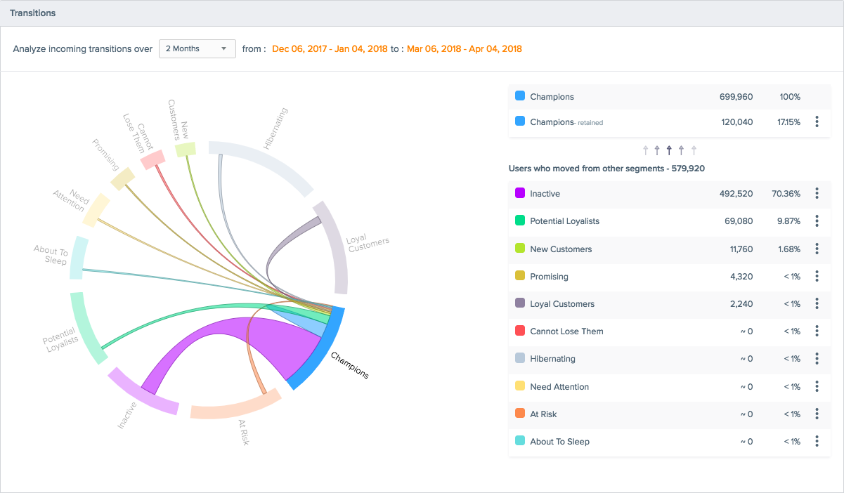
RFM Transition
RFM Transition Guide
To access RFM Transition, login to the CleverTap dashboard, and then click on the RFM button under the Segment tab.
Select the date range and event for your analysis. For your first analysis, App Launches over the past 30 days is a good starting place. Click the Calculate button to run the analysis.
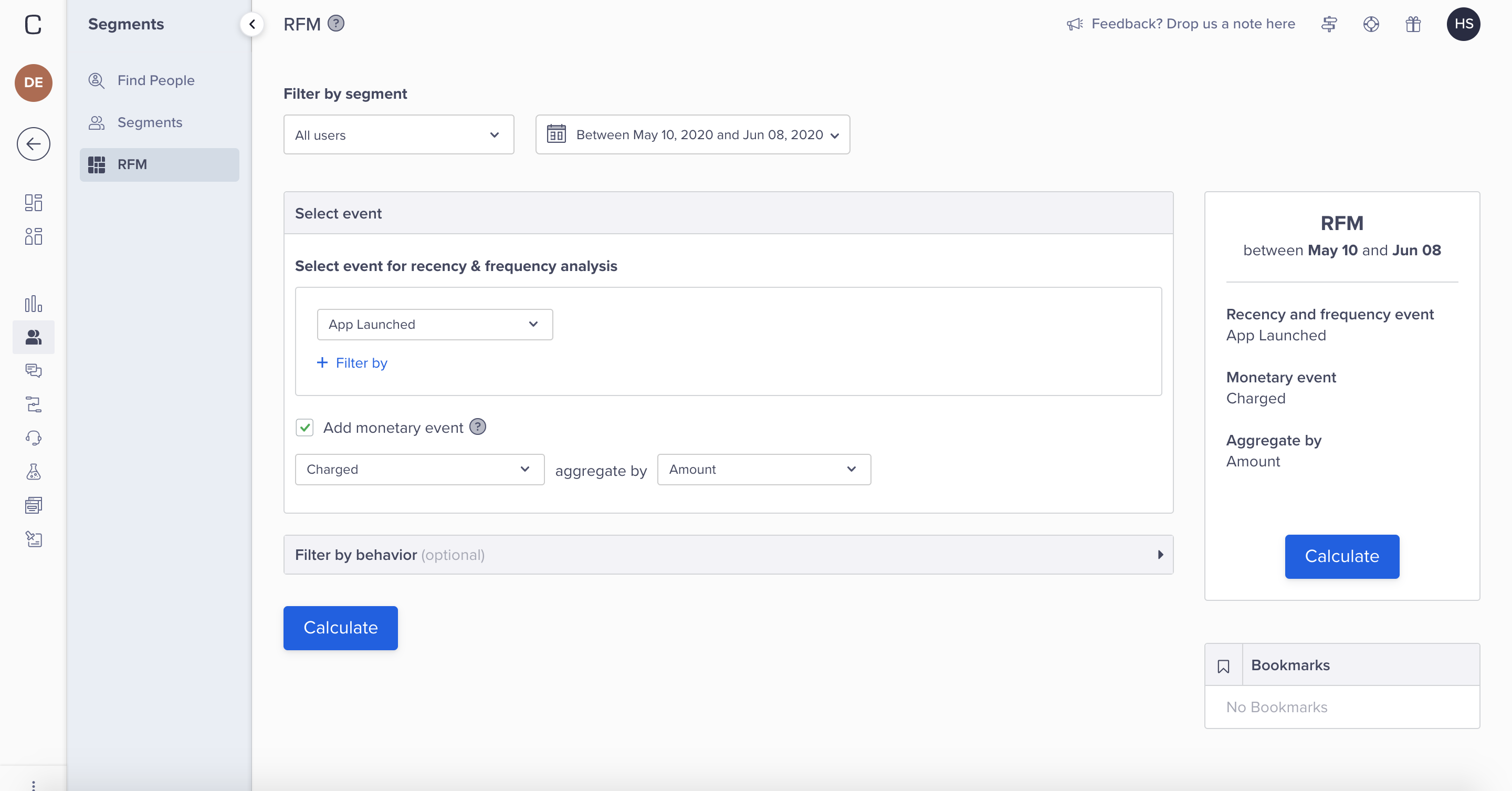
Calculate RFM Analysis for
NoteFor optimum results, check that the selected date range for the events is less than 512 days.
Click on the RFM Transitions button.
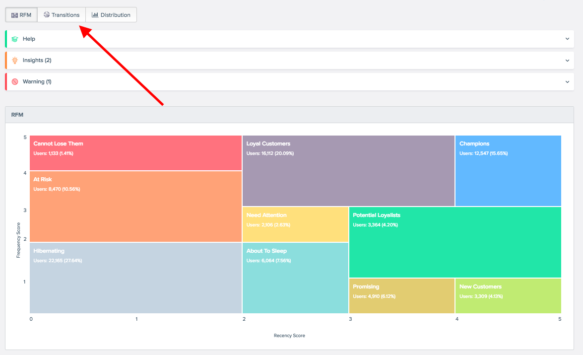
RFM Transitions
Once the RFM Transitions tool loads, you can click on any segment to understand the flow of users into that segment. Click on the Champions segment to find out the sources of its users.
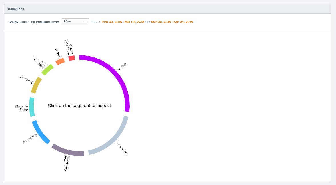
Analyze Incoming Transitions
You will see a visualization on the left and table with data on the right. Both of these show the sources of users into the Champions segment.
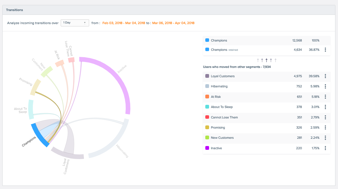
Analyze Sources of Transitions
From the table on the right, you can click the three vertical dots to save a user segment for later analysis or to create a campaign targeting that user segment.
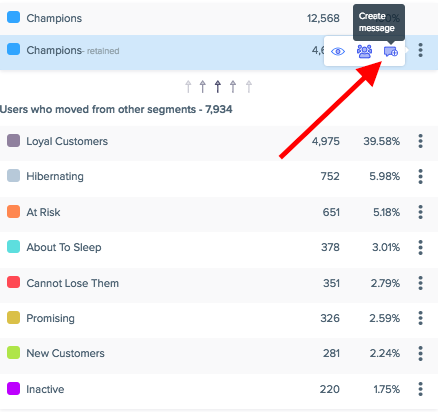
Create Message from Analysis
RFM User Segments
| User Segment | Description |
|---|---|
| Champions | These users are your most active users. They have the highest recency and frequency scores. |
| Loyal Users | These users have the highest frequency of use with strong recency scores. |
| Potential Loyalists | These users have visited your app very recently and have the potential to become loyalists or champions. |
| New Users | These users are your most recent users with low frequency scores. Strong candidates to encourage repeat use. |
| Promising | These users have high recency scores with the potential to become high frequency users. |
| Needing Attention | These users have above average recency and frequency scores. |
| About to Sleep | These users have below average recency and frequency scores. May slip away if not engaged with. |
| At Risk | These users have above average frequency but low recency scores. Strong candidates to re-engage. |
| Cannot Lose Them | These users were active at one point in your app, but haven’t been back recently. Strong candidates to re-engage. |
| Hibernating | These users have the lowest recency and frequency scores. May be lost. |
How RFM Analysis Works
For every user who has performed the selected event, our RFM Analysis will segment users based on:
- How many times a user performed the event.
- The last time a user performed the event.
Calculating Recency Score
Once we’ve determined how recently each user in your analysis performed the selected event, we rank them in order of percentile (person who has performed it most recently would constitute the 100th percentile), then we rank the users on a score of 1 to 5 based on their percentile, with 5 being the highest.
Calculating Frequency Score
Once we’ve figured out how frequently each user in your analysis performed the event, we rank them in order of percentile (person who has performed it most frequently would constitute the 100th percentile), then we rank the users on a score of 1 to 5 based on their percentile, with 5 being the highest.
Average Monetary Value
The Average Monetary Value (AVM) is the average spend for each user in the RFM user segment. The monetary value can be any kind of user spend on your app, such as money or time. The formula for calculating AVM is the ‘sum of all user spend/ number of users’.
For example, assume there are 100 users in your champion segment. If the combined spend for all champion users is $ 500, then the AVM is 500/100 = $5 for each champion user.
Another example can be calculating the number of videos watched by each user for a video streaming app or the number of hours spent by each user for watching those videos.
User Counts in RFM TilesThe counts shown in the RFM grid are obtained through a sampling method, which implies that the analysis is accurate but not precise in terms of numbers. As a result, you may see a minor difference in counts when you compare these numbers with those on your dashboard. While the numbers may not match exactly, they provide an accurate size estimation of the different segments.
Refer to What is RFM Analysis for more details on leveraging RFM customer segmentation.
Updated 5 months ago
