Pivots
Understand what are Pivots in CleverTap.
Overview
Pivots provide the capability to derive significance and insights from your user data. The pivot analysis tool summarizes your data with the help of tables and other data visualizations. When dealing with a large volume of data, this useful tool helps marketers create incisive summaries and view custom reports to glean user insights.
A pivot analysis helps answer questions, such as:
- Which categories of my products are selling best, and at what time of the day?
- In which city are my sales for Nike shoes the lowest?
- How many minutes of sports content do my platinum customers consume each day of the week?
Pivot Video Tutorial
Discover the video tutorial for the Pivot overview and a sample use case.
Getting Started with Pivots
Let's start exploring Pivots together. To do so:
Pick Your Event
To pick your event:
- Navigate to Analytics > Pivots.
- Select the event you want to analyze.
This event forms the basis of your analytics that can be coupled with its properties along with all the information CleverTap has for your users.
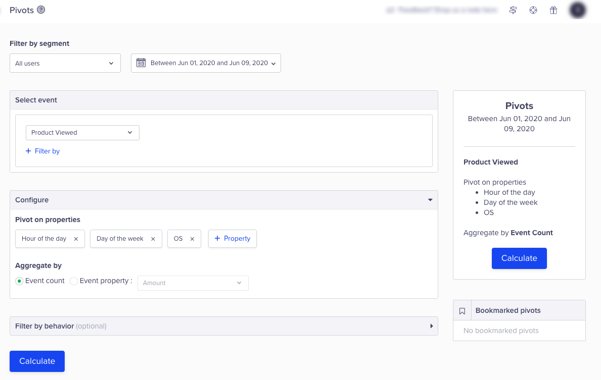
Select Pivot Calculation Options
Select Your Segment
After you have selected the event to analyze, decide if you want to analyze this event for all your users or for a particular segment of users. This feature is useful as the behavior of users varies across segments.
Content Consumption Example
The content consumption for a new user segment will be very different from the consumption of people who have already consumed at least 50 hours of content.
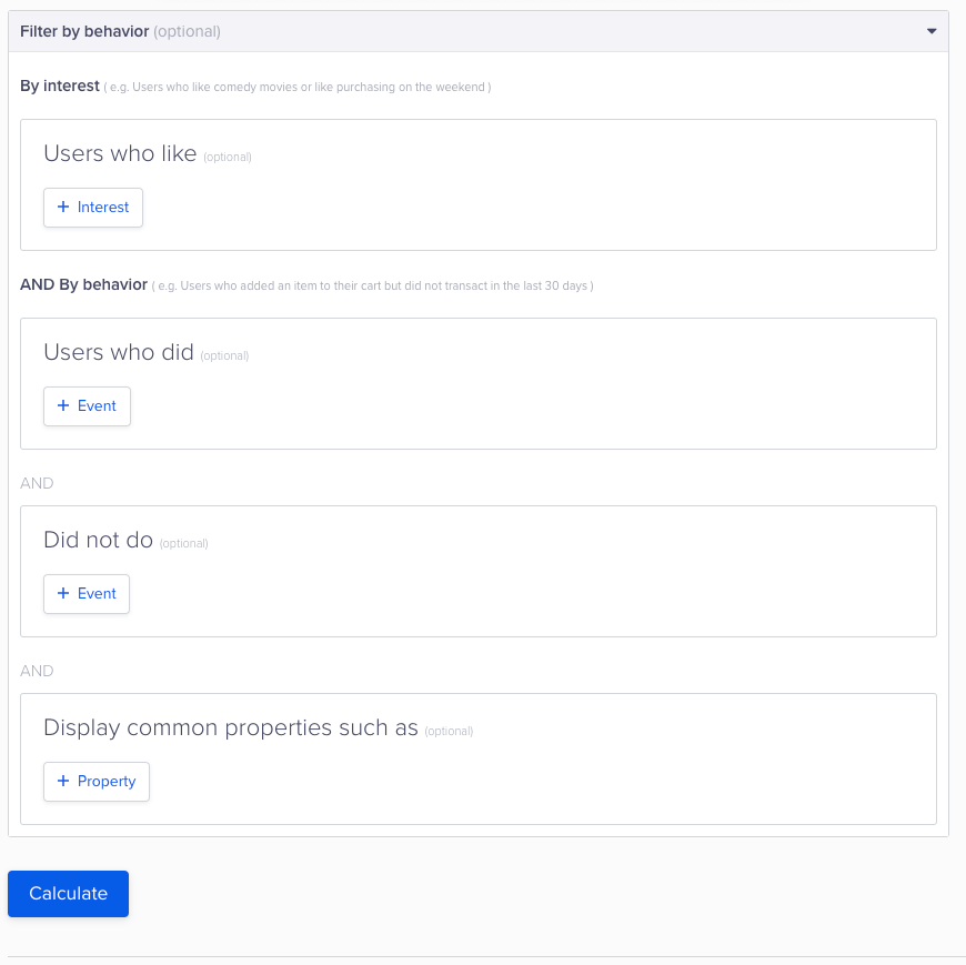
Select Segment
Picking the Properties to Pivot On
Select the properties to analyze, such as:
- Event properties
- User properties
- Geography
- Technographics
- App fields

Select Pivot On Properties
Aggregating Your Query by Count vs. Conversion Property
You can group your data by the occurrences of an event which are the number of times this event has happened.
If the event you are analyzing is your conversion event and your conversion property is an integer, you can group your data by the sum of this property.
Flight Aggregator Example
A flight aggregator can view data by the count of flight booked event or by the sum of the amount property.
Understanding the Pivot Analysis
The pivot analysis consists of:
- Pool of available properties: This is a list of properties you selected while creating the pivot table. You can use these properties in any combination to slice and dice your data to derive insights. These properties could act as rows or columns in the tabular view and as cartesian axes in the graphical view.
- Row(s): The properties you select as rows in your tabular views.
- Column(s): The properties you select as columns in your tabular views.
- Data visualizations: You can select what visualization you want to see the data you have sliced and diced in.
Example Analysis
For example, with a video application, we can use the pivot analysis to understand its output and content consumption patterns in our platform. To do so, we have selected the event video watched which is raised after someone is done watching a video.
For this pivot analysis, we select the following properties:
- Hour of the day
- Day of the week
- Video name
We also pick our measurement property as video duration watched since it is critical for us to measure video performance, not just by the number of views, but also by the duration of content consumption.
Now, we explain each view and tell you what insights can be drawn for each view supported by our pivot analysis.
Table
This is best for getting a quick overview of selected data.
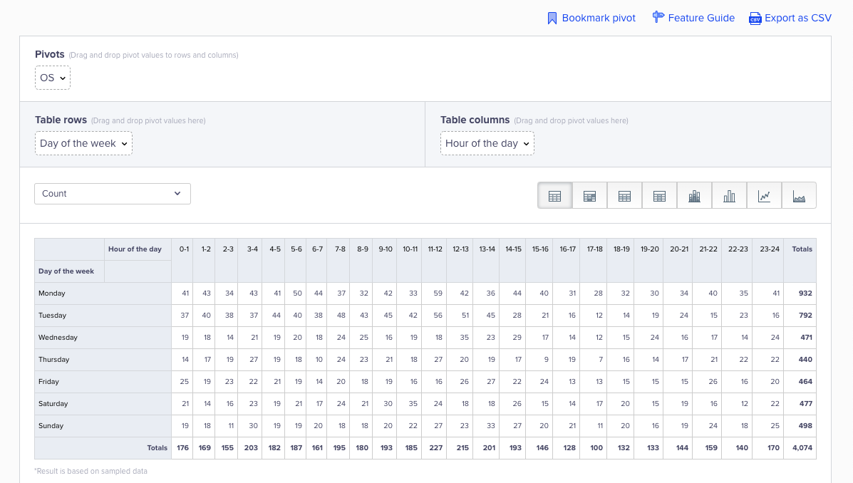
View Pivot Table
Table Heat Map
This is best for analyzing highest contributor in a given data set.
For example, if your row is day of the week and your column is video name, this heat map tells you which video was played the most and on which day of the week it happened.
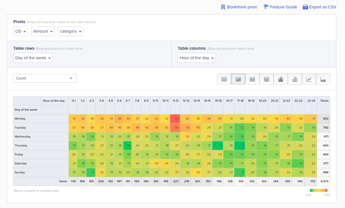
View Pivot Table - Heat Map
Columnar Heatmap
This is best for analyzing outliers in any column.
For example, if your row is day of the week and your column is video name, this heat map tells you which video was played the most on each day of the week.
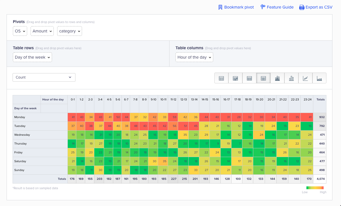
View Pivot Table - Columnar Heatmap
Row-wise Heatmap
This is best for analyzing outliers in any row.
For example, if your row is day of the week and and your column is video name, this heat map tells you on which day of the week each video has performed well. Game of Thrones performs best on Sundays whereas Friends works best on Saturdays.
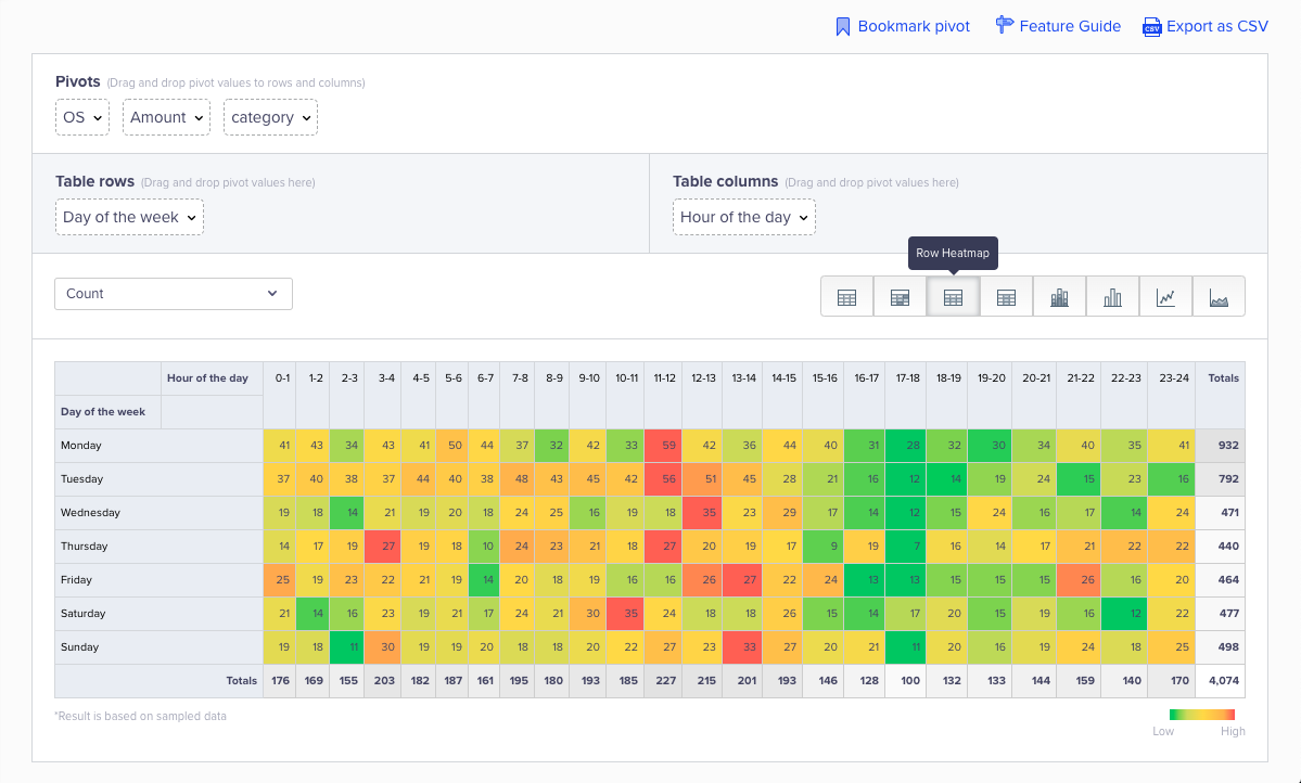
View Pivot Table - Row-wise Heatmap
Zero Event Occurrences
In case of zero event occurrences for a given time, the Table, Columnar, and Row-wise heatmaps indicate whitespaces.
Stacked Bar Chart
This is best best for visualizing the change in performance of one variable over time when compared to several other variables.
For example, if your row is day of the week and your column is video name, you might see that the performance of Game of Thrones peaks around Sunday/Monday. Game of Thrones is a lot lower for the rest of the week as compared to the consumption of Friends, Prison Break, and Breaking Bad which are all consistent across the week.
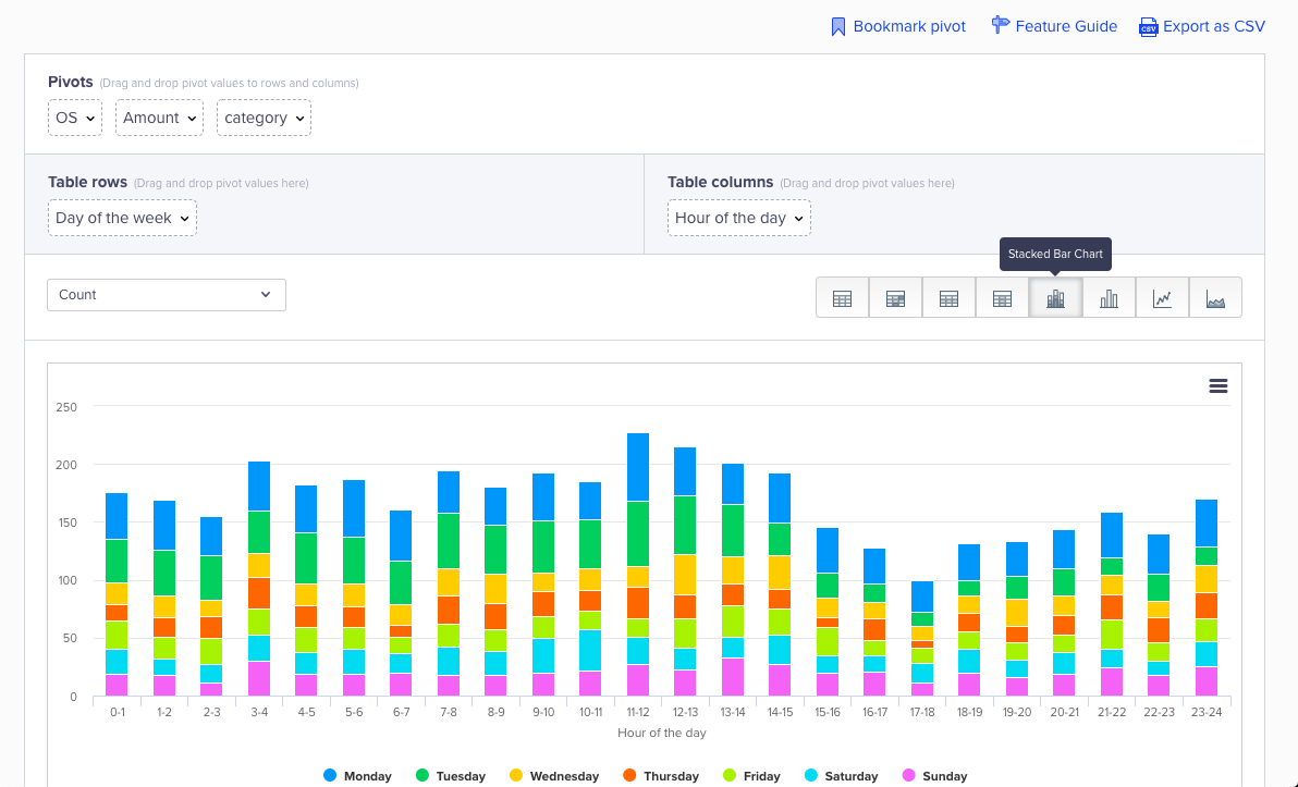
View Pivot - Stacked Bar Chart
Bar Chart
This is best for visualizing categorical or qualitative data over time.
For example, if your row is day of the week and your column is video name, you can see how the consumption of Game of Thrones has been over the week.
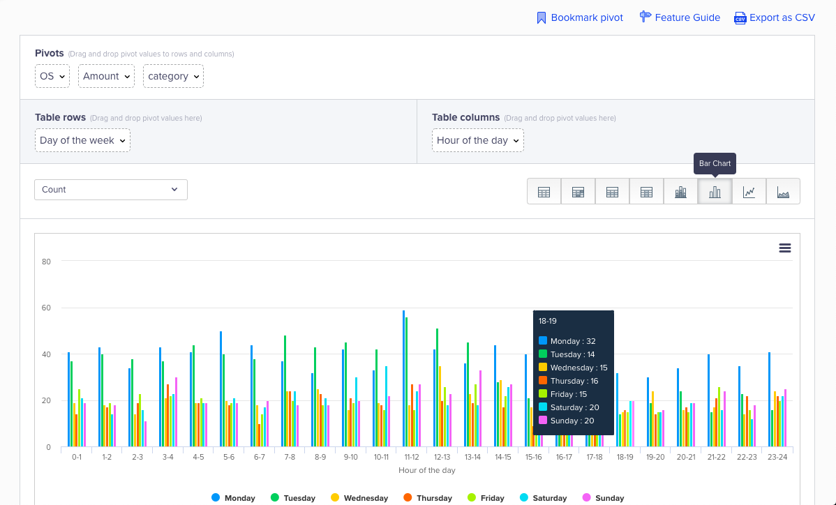
View Pivot - Bar Chart
Line Chart
This is best for visualizing the change of variables over time. Since all lines are plotted on the same graph, this visualization helps you determine the relationship between different variables.
For example, if your row is day of the week and your column is video name, you might see that Breaking Bad and Prison Break follow the same trend across the week. This implies that the demand for these videos is consistent.
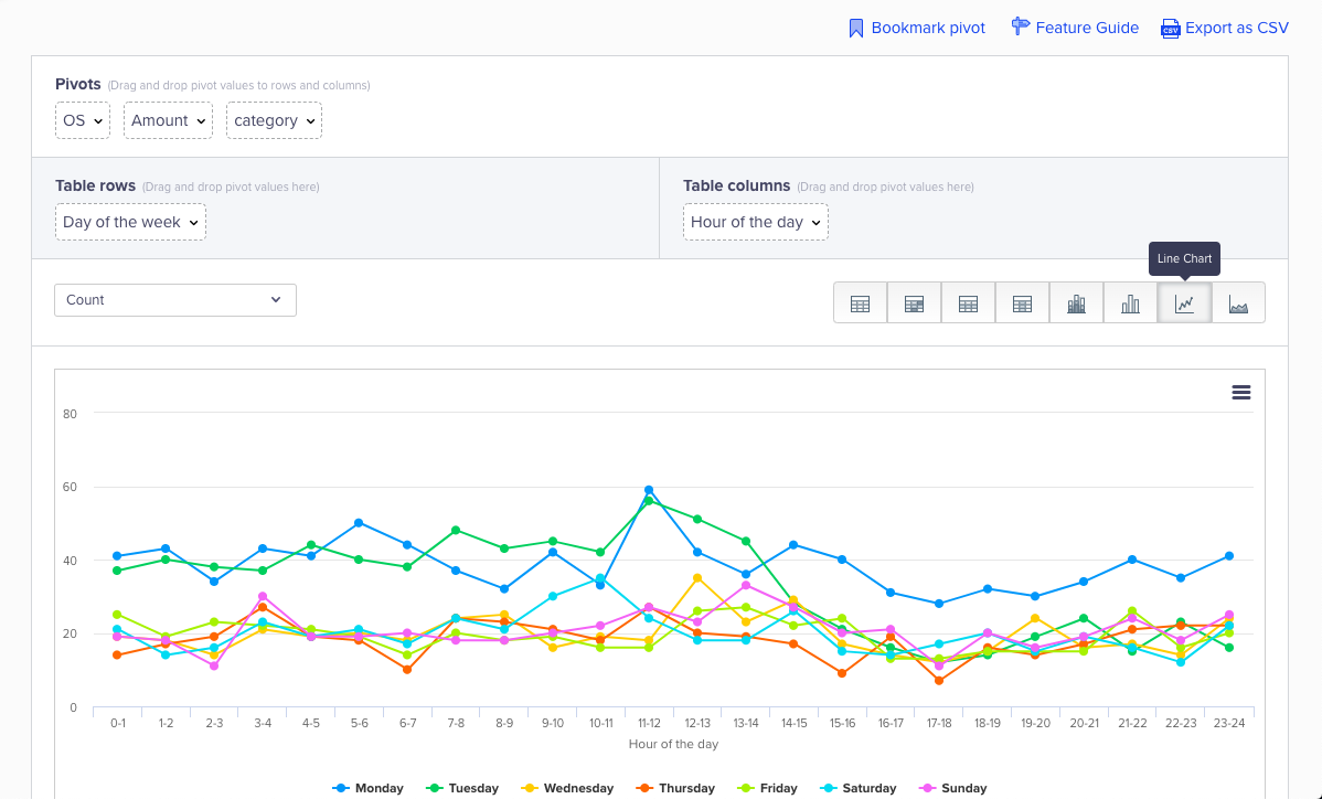
View Pivot - Line Chart
Area Chart
While similar to line charts, this is better for analyzing part to whole relationships.
For example, if your row is day of the week and your column is show name, the area chart will not only show you the trend variation of Game of Thrones over the week, but it will also show you the contribution of Game of Thrones to your total video views as compared to the rest of your titles.
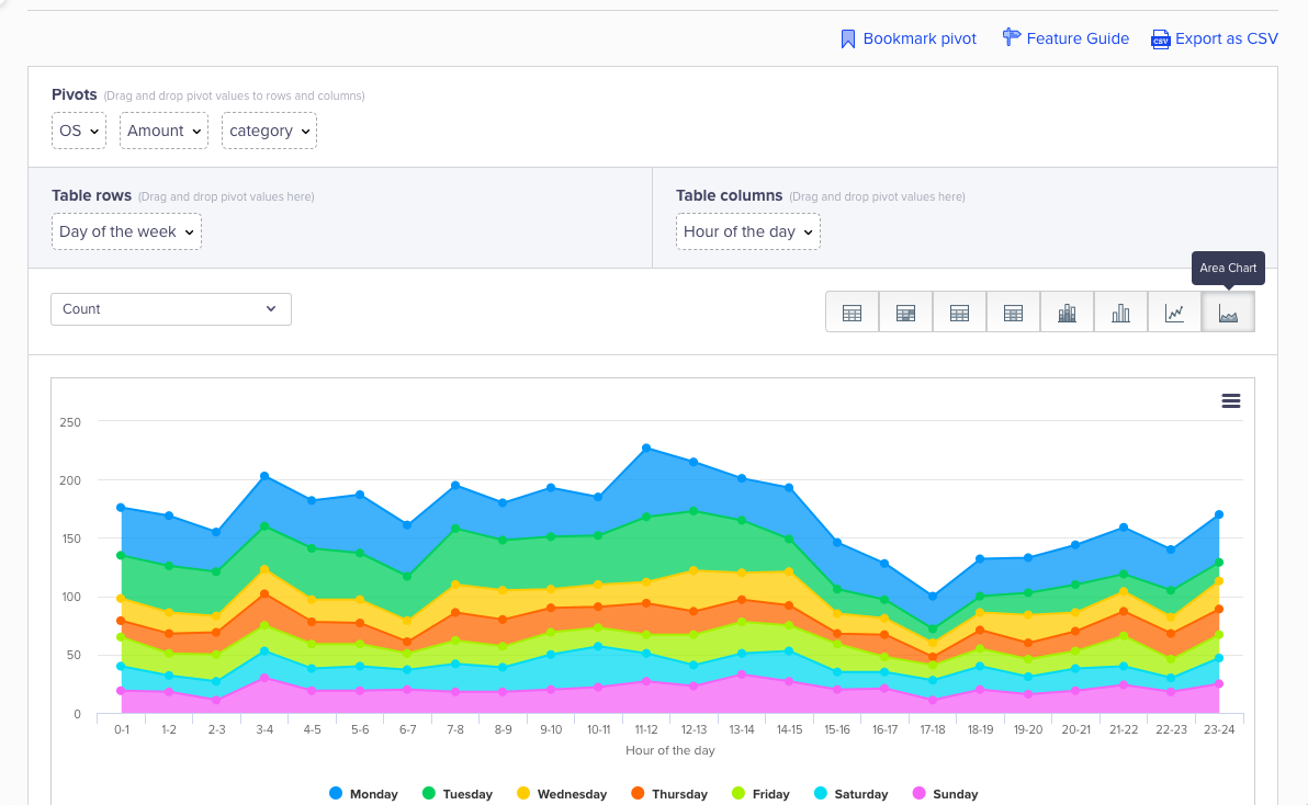
View Pivot - Area Chart
Note
We sample your data to ensure that results load faster, so you might see a minor difference in counts when you compare these numbers to the numbers on the rest of your dashboard.
This sampling has been optimized for accuracy and your numbers will be directionally correct. Sampling kicks in if the query contains more than 100,000 events, and the sample rate beyond 100,000 events is 10%.
Updated over 1 year ago
